📅2024. 04. 02 77일차
React
MUI 테마 커스터마이징
import { createTheme } from '@mui/material';

const theme = createTheme({
  palette: {
    type: 'dark',
    primary: {
      main: '#4caf50',
    },
    secondary: {
      main: '#4caf50',
    },
  },
});

export default theme;
import { ThemeProvider } from '@mui/material/styles';
import theme from './theme';- 테마 관련 import하기
export default function App() {
  return (
    <>
      <ThemeProvider theme={theme}>
        <Button variant="contained">버튼</Button>
      </ThemeProvider>
    </>
  );
}
<ThemeProvider theme={theme}>로 감싸기
MUI button 컴포넌트, React Icons
-
npm install react-icons --save 쳐서 다운받기
react-icons에서 아이콘 사용할 수 있음 -
import { MdDeleteForever } from 'react-icons/md';import해서 사용가능

MUI App Bar 컴포넌트
- import { AppBar, Toolbar } from '@mui/material'; import 해서 사용가능!!
export default function App() {
  return (
    <>
      <ThemeProvider theme={theme}>
        <AppBar position="static">
          <Toolbar className="tw-justify-center">
            <a href="/" className="tw-font-bold">
              NOTE!
            </a>
          </Toolbar>
        </AppBar>
      </ThemeProvider>
    </>
  );
}
MUI App bar 컴포넌트
- MUI 이용해서 App bar 만들기
'use client';
import * as React from 'react';
import { ThemeProvider } from '@mui/material/styles';
import { Button, Box, AppBar, Toolbar } from '@mui/material';
import theme from './theme';
import { FaBars } from 'react-icons/fa';
export default function App() {
return (
<>
<ThemeProvider theme={theme}>
<AppBar position="fixed">
<Toolbar>
<div className="tw-flex-1">
<FaBars className="tw-cursor-pointer" />
</div>
<div className="logo-box">
<a href="/" className="tw-font-bold">
NOTE!
</a>
</div>
<div className="tw-flex-1 tw-flex tw-justify-end">
<a href="/write">글쓰기</a>
</div>
</Toolbar>
</AppBar>
<Toolbar />
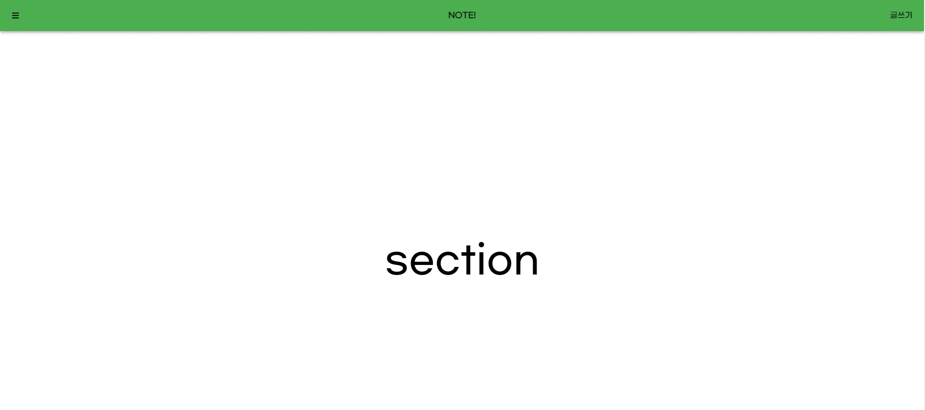
<section className="tw-h-screen tw-flex tw-items-center tw-justify-center tw-text-[5rem]">
section
</section>
</ThemeProvider>
</>
);
}
- 글쓰기 눌렀을 때 write 페이지로 넘어가게
'use client';

import * as React from 'react';
import {
  AppBar,
  Box,
  Toolbar,
  Typography,
  IconButton,
  Button,
  MenuIconButton,
  MenuIcon,
} from '@mui/material';

export default function Sub() {
  return <h1>글작성 페이지</h1>;
}
MUI snack Bar 컴포넌트, Alert
-
useState 후크를 사용하여 상태 변수 open을 생성하고 setOpen 함수를 사용하여 이를 업데이트.
-
'open'은 처음에 'false'로 설정.
-
useRef 후크를 사용하여 alertRef라는 참조를 생성하고 null로 초기화.
-
React.forwardRef를 사용하여 사용자 정의 경고 구성요소를 정의.
Material-UI에서 MuiAlert 구성 요소로 props 및 ref를 전달하고 'variant' prop을 "filled"로 설정.
'use client';

import * as React from 'react';
import { ThemeProvider } from '@mui/material/styles';
import { Button, Box, AppBar, Toolbar, Snackbar, Alert as MuiAlert } from '@mui/material';
import theme from './theme';
import { FaBars } from 'react-icons/fa';

const Alert = React.forwardRef((props, ref) => {
  return <MuiAlert {...props} ref={ref} variant="filled" />;
});

export default function App() {
  const [open, setOpen] = React.useState(false);

  const alertRef = React.useRef(null);

  return (
    <>
      <ThemeProvider theme={theme}>
        <AppBar position="fixed">
          <Toolbar>
            <div className="tw-flex-1">
              <FaBars className="tw-cursor-pointer" />
            </div>
            <div className="logo-box">
              <a href="/" className="tw-font-bold">
                NOTE!
              </a>
            </div>
            <div className="tw-flex-1 tw-flex tw-justify-end">
              <a href="/write">글쓰기</a>
            </div>
          </Toolbar>
        </AppBar>
        <Toolbar />
        <section className="tw-h-screen tw-flex tw-items-center tw-justify-center tw-text-[5rem]">
          section
        </section>
      </ThemeProvider>
      <section>
        <Button onClick={() => setOpen(true)}>Open Snackbar</Button>
        <Alert ref={alertRef} severity="error" varient="filled">
          게시물이 삭제되었습니다.
        </Alert>
        <Alert severity="success" varient="outlined">
          This is a success msg!!!!!
        </Alert>
        <Snackbar
          open={open}
          autoHideDuration={2000}
          onClose={() => setOpen(false)}
          message="Note archived">
          <Alert severity="warning">게시물이 삭제됨</Alert>
        </Snackbar>
      </section>
    </>
  );
}
MUI backdrop 컴포넌트
-
Backdrop, CircularProgress import
-
MUI backdrop 사용!!!
-
onClick={() => setOpen(true)}
      <Backdrop
        sx={{ color: '#fff', zIndex: (theme) => theme.zIndex.drawer + 1 }}
        open={open}
        onClick={() => setOpen(false)}>
        <CircularProgress color="inherit" />
      </Backdrop>
'use client';
import * as React from 'react';
import { ThemeProvider } from '@mui/material/styles';
import { Button, AppBar, Toolbar, Backdrop, CircularProgress } from '@mui/material';
import theme from './theme';
import { FaBars } from 'react-icons/fa';
export default function App() {
const [open, setOpen] = React.useState(false);
return (
<>
<ThemeProvider theme={theme}>
<AppBar position="fixed">
<Toolbar>
<div className="tw-flex-1">
<FaBars className="tw-cursor-pointer" />
</div>
<div className="logo-box">
<a href="/" className="tw-font-bold">
NOTE!
</a>
</div>
<div className="tw-flex-1 tw-flex tw-justify-end">
<a href="/write">글쓰기</a>
</div>
</Toolbar>
</AppBar>
<Toolbar />
<section className="tw-h-screen tw-flex tw-items-center tw-justify-center tw-text-[5rem]">
section
</section>
</ThemeProvider>
<Button onClick={() => setOpen(true)}>Show backdrop</Button>
<Backdrop
sx={{ color: '#fff', zIndex: (theme) => theme.zIndex.drawer + 1 }}
open={open}
onClick={() => setOpen(false)}>
<CircularProgress color="inherit" />
</Backdrop>
</>
);
}MUI Drawer 컴포넌트
-
Drawer, List, ListItemButton import
-
import Link from 'next/link'; import
-
const [open, setOpen] = React.useState(false);
 <Button onClick={() => setOpen(true)}>show drawer</Button>
      <Drawer anchor="left" open={open} onClose={() => setOpen(false)}>
        <List>
          <ListItemButton>
            <Link href="/write">글 쓰기</Link>
          </ListItemButton>
          <ListItemButton>사과</ListItemButton>
          <ListItemButton>바나나</ListItemButton>
        </List>
      </Drawer>
open, setOpen 사용 버튼을 클릭했을 때 setOpen(true) 하고 Drawer 사용
MUI Tab 컴포넌트
import { Toolbar, Tabs, Tab } from '@mui/material';

export default function App() {
  const [tabCurrentIndex, setTabCurrentIndex] = React.useState(0);

  return (
    <>
      <Tabs value={tabCurrentIndex} onChange={(_, newValue) => setTabCurrentIndex(newValue)}>
        <Tab label="Item One" />
        <Tab label="Item Two" />
        <Tab label="Item Three" />
      </Tabs>
      {tabCurrentIndex == 0 && <div>내용1</div>}
      {tabCurrentIndex == 1 && <div>내용2</div>}
      {tabCurrentIndex == 2 && <div>내용3</div>}
    </>
  );
}
MUI 이용해서 Tab 만들기~~
오늘의 개념
React.forwardRef
React에서 일반적으로 사용할 수 없는 prop이 몇 가지 있다. 그 중 ref prop도 HTML Element 접근이라는 특수한 용도로 사용되기 때문에 일반적인 prop으로 사용할 수 없다.
React Component에서 ref prop을 사용하려면 forwardRef()라는 함수를 사용해야 한다. React Component를 forwardRef() 함수로 감싸주면, 컴포넌트 함수는 2번째 매개변수를 갖게 되는데 이를 통해 ref prop을 넘길 수 있다.
- forwardRef()를 사용하지 않은 아래 예시를 보자.
import { useRef } from "react";

const Input = ref => {
    return <input type="text" ref={ref} />;
};

const Field = () => {
    const inputRef = useRef(null);
    const focusHandler = () => {
    	inputRef.current.foucus();
    };

    return(
    	<>
            <Input ref={inputRef} />
            <button onClick={focusHandler}>focus</button>
        </>
    );
};
Component에 useRef() 함수로 생성한 inputRef 객체가 있다. 이 객체를 자식인 <Input /> Component에 ref prop으로 넘긴다. 그러면 자식<Input /> Component는 ref prop으로 넘어온 inputRef 객체를 다시 내부에 있는 <input> Element의 ref prop으로 넘겨준다.
하지만 위 예시에서는 ref를 prop으로 넘겨줬기 때문에 경고 메세지가 뜬다.
- forwardRef() 적용 예시.
import { useRef, forwardRef } from "react";

const Input = forwardRef((props, ref) => {
    return <input type="text" ref={ref} />;
});

const Field = () => {
    const inputRef = useRef(null);
    const focusHandler = () => {
    	inputRef.current.foucus();
    };

    return(
    	<>
            <Input ref={inputRef} />
            <button onClick={focusHandler}>focus</button>
        </>
    );
};
<Input /> Component를 forwardRef()로 감싸주고, 2번째 매개변수로 ref를 받아 <input> Element에 ref prop을 넘겼더니 경고 메세지 없이 버튼을 클릭하면 input에 포커스가 된 것을 확인할 수 있다.