
빅토리 victory 차트
빅토리 js
yarn add victory
공식예제따라하기
import styles from 'styles';
import { VictoryChart, VictoryLine } from 'victory';
const Victory = () => {
const sampleData = [
{ quarter: 1, earnings: 13000 },
{ quarter: 2, earnings: 16500 },
{ quarter: 3, earnings: 14250 },
{ quarter: 4, earnings: 19000 },
];
return (
<div className={styles.wrap}>
<VictoryChart>
<VictoryLine
style={{
data: { stroke: '#c43a31' },
parent: { border: '1px solid #ccc' },
}}
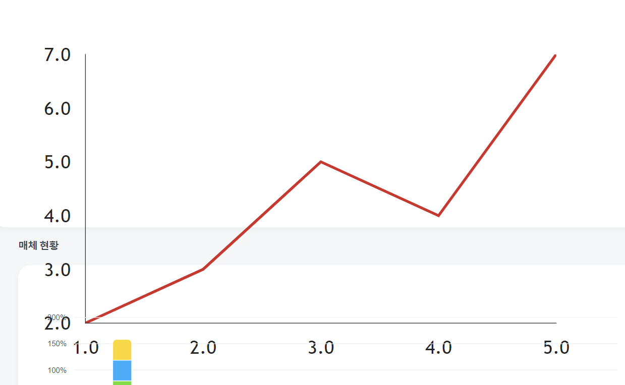
data={[
{ x: 1, y: 2 },
{ x: 2, y: 3 },
{ x: 3, y: 5 },
{ x: 4, y: 4 },
{ x: 5, y: 7 },
]}
/>
</VictoryChart>
</div>
);
};
export default Victory;
VictoryChart > VictoryAxis + VictoryLine
VictoryAxis 태그 다음에 VictoryLine가 와야 css적으로 위쪽에 표현됨. 반대로 하면 아래쪽.
import { VictoryAxis, VictoryChart, VictoryLabel, VictoryLine, VictoryTheme } from 'victory'
VictoryChart
-
width, height
width={1200} height={500} 으로 차트의 크기 결정
-
domain
domain={{ y: [0, 1] } 값의 범위를 지정
그래프는 기본적으로 일정한 간격의 공통된 x축,y축에 따라 달라진 y축 값을 표현한 것.
x축은 동일하니 y축의 범위를 공통되게 잡아줘야 같은 차트 상에 표시할 수 있음. -
theme
theme={VictoryTheme.material} 테마설정_ y축 간격별로 점선 표시, 폰트 바뀜
VictoryAxis
key
key={fisrtTarget} 라인그래프 태그와 연결dependentAxis
y축을 뜻함. y축 값을 따로 지정해 그릴 수 있게 해줌offsetX
offsetX={50} x축으로 얼마만큼 떨어져 있을지tickValues
tickValues={[0.2, 0.4, 0.6, 0.8, 1]} domian에서 정한 범위에 따른 y축의 간격을 결정.tickFormat
tickFormat={(t) => (t * firstMax).toLocaleString() } thickValue에서 정한 간격에 따라 표시할 값을 콜백함수의 리턴값으로 표현. tickValues의 정한 간격에 sampleData.y의 최댓값을 곱함tickLabelComponent
tickLabelComponent={} y축 라벨의 위치를 조정가능.style
style={{axis: { stroke: 'transparent' },tickLabels: { fill: '#94A2AD' },
grid: {
fill: '#94a2ad',
stroke: 'red',
pointerEvents: 'painted',
strokeWidth: 0.2,
},
}}
VictoryLine
key, name
key={fisrtTarget}
name='click' 라인그래프 태그와 연결data
data={sampleData}
[{x: string | number, y: number},...] 로 이루어진 값 넘겨주기
값을 넘겨받아 라인을 그려줌.y
y={(datum) => datum.y / sampleData.y} 콜백함수의 파라미터로 위에 넣어준 데이터 객체를 받음. 이 때 데이터는 도메인 범위 내에 표현돼야하므로, sampleData.y의 최댓값으로 나눠줌.style
style={{ data: { stroke: 'red' }, parent: { border: '1px solid #ccc' }, }}animate
animate={{ duration: 2000, onLoad: { duration: 1000 }, }}
가로축 설정
 <VictoryAxis
      tickCount={testValue}
      tickFormat={(x) => dayjs(x).format('MM월 DD일')}
      style={{ axis: { stroke: '#94A2AD' }, tickLabels: { fill: '#94A2AD' } }}
    />
VictoryAxis를하면 세로축으로 되면 가로축이 사라짐. 하나 더넣어줘야함.
tickCount는 근사최대갯수인데 만약 8로 했는데 10으로하면 10개씩 보여주는게 더 잘 맞아떨어지니 10개의 데이터를 보여줌
import styles from './victory.module.scss';
import { VictoryAxis, VictoryChart, VictoryLine } from 'victory';

const sampleData = [
  { x: '11월 11일', y: 0 },
  { x: '11월 12일', y: 500 },
  { x: '11월 13일', y: 1000 },
  { x: '11월 14일', y: 1500 },
  { x: '11월 15일', y: 2000 },
  { x: '11월 16일', y: 2500 },
  { x: '11월 17일', y: 3000 },
];

const sampleData2 = [
  { x: '11월 11일', y: 0 },
  { x: '11월 12일', y: 500 },
  { x: '11월 13일', y: 250 },
  { x: '11월 14일', y: 400 },
  { x: '11월 15일', y: 700 },
  { x: '11월 16일', y: 500 },
  { x: '11월 17일', y: 1000 },
];

const Victory = () => {
  return (
    <div>
      <VictoryChart width={1200} height={400} domain={{ y: [0, 1] }}>
        <VictoryAxis
          style={{
            axis: { stroke: 'transparent' },
            tickLabels: { fill: '#94A2AD' },
          }}
        />
        <VictoryAxis
          name='click'
          dependentAxis
          tickValues={[0, 0.25, 0.5, 0.75, 1]}
          tickFormat={(y) => (y * 3000).toLocaleString()}
          style={{
            axis: { stroke: 'transparent' },
            tickLabels: { fill: '#94A2AD' },
            grid: {
              fill: '#94a2ad',
              stroke: 'red',
              pointerEvents: 'painted',
              strokeWidth: 0.2,
            },
          }}
          offsetX={1200}
        />
        <VictoryLine
          name='click'
          data={sampleData}
          y={(datum) => datum.y / 3000}
          style={{
            data: { stroke: 'red' },
          }}
        />
        <VictoryAxis
          name='name'
          dependentAxis
          tickValues={[0, 0.25, 0.5, 0.75, 1]}
          tickFormat={(y) => (y * 1000).toLocaleString()}
          style={{
            axis: { stroke: 'transparent' },
            tickLabels: { fill: '#94A2AD' },
            grid: {
              fill: '#94a2ad',
              stroke: 'red',
              pointerEvents: 'painted',
              strokeWidth: 0.2,
            },
          }}
        />
        <VictoryLine
          name='name'
          data={sampleData2}
          y={(datum) => datum.y / 1000}
          style={{
            data: { stroke: 'red' },
          }}
        />
      </VictoryChart>
    </div>
  );
};

export default Victory;
data-set 데이터셋
| data-set코드 | 브라우저 표시 |
|---|---|
 |  |
css not선택자
| css not선택자 | 코드 |
|---|---|
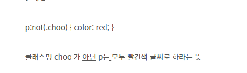 | 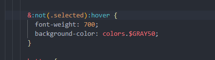 |
not뒤에 hover가 와야 원하는대로 작동함.
데이터 단위환산 unit
| 데이터단위환산 | 코드 | 내코드 if문 |
|---|---|---|
 | 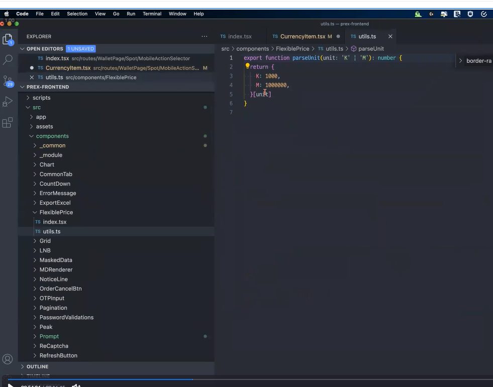 | 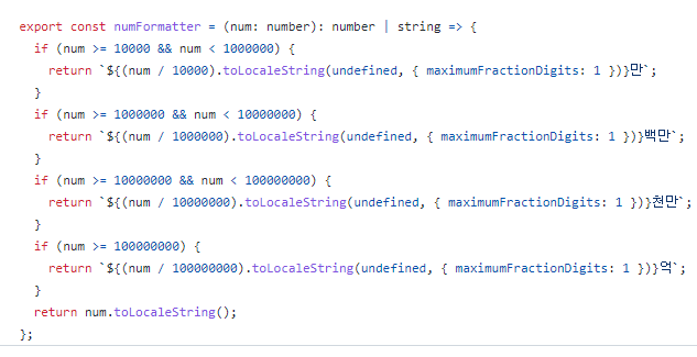 |
다 같이 새벽 5시까지 작업~!! 조금 자고 9시에 다시 만나기로...

잘하고싶다...