
📌 배운 점
생각보다 구간을 상세히 나눠야 한다.
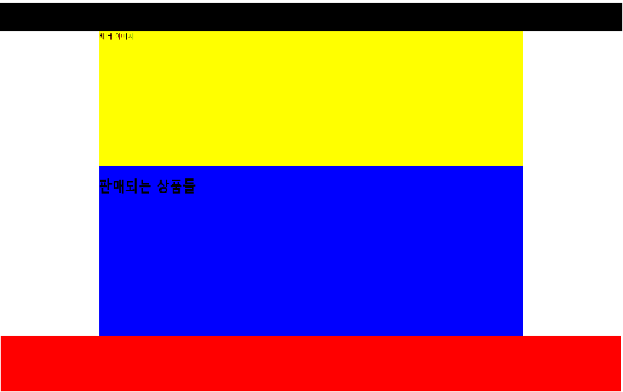
1. 초기 설정 (구간 나누기)
네이버 홈 화면 처럼 그랩마켓 웹 화면을 구현할 것이다.
검정색: header
노란색: body-banner
파란색: body
빨간색: footer
1. html
<html>
<head>
<link href="index.css" type="text/css" rel="stylesheet" />
<title>그랩마켓</title>
</head>
<body>
<div id="header"></div>
<div id="body">
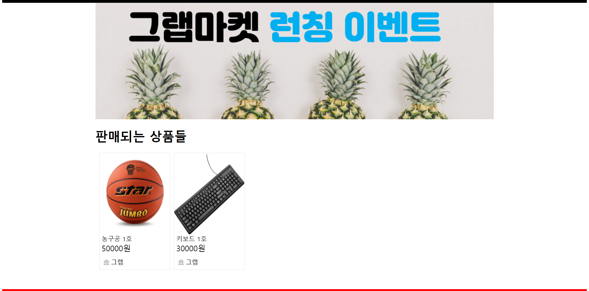
<div id="banner">배너 이미지</div>
<h1>판매되는 상품들</h1>
</div>
<div id="footer"></div>
</body>
</html>2. css
#header {
  height: 64px;
  background-color: black;
}

#body {
  height: 100%;
  background-color: blue;
  width: 1024px;
  margin: 0 auto;
}

#footer {
  height: 200px;
  background-color: red;
}

#banner {
  height: 300px;
  background-color: yellow;
}
2. product-list
1. html
<div id="body">
<div id="banner">
<img src="images/banners/banner1.png" />
</div>
<h1>판매되는 상품들</h1>
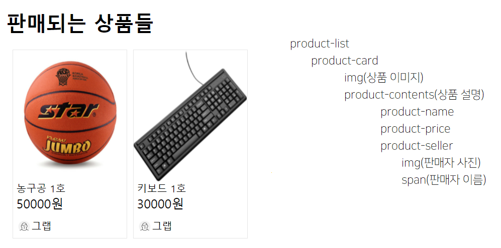
<div id="product-list">
<div class="product-card">
<div>
<img class="product-img" src="images/products/basketball1.jpeg" />
</div>
<div class="product-contents">
<span class="product-name">농구공 1호</span>
<span class="product-price">50000원</span>
<div class="product-seller">
<img class="avatar" src="images/icons/avatar.png" />
<span>그랩</span>
</div>
</div>
</div>2. css
#product-list {
 display: flex;
 flex-wrap: wrap;
}
.product-card {
 width: 180px;
 height: 300px;
 margin-left: 10px;
 border: 1px solid rgb(230, 230, 230);
}
.product-contents {
 display: flex;
 flex-direction: column;
 margin-left: 5px;
}
.product-img {
 width: 100%;
 height: 210px;
}
.product-price {
 font-size: 20px;
}

.product-seller {
 display: flex;
 margin-top: 12px;
}

.avatar {
 width: 24px;
}
다시태어나고싶어요