폼 요소 중 체크박스 커스텀에 대해 배운걸 정리했다.
- 토글 형 체크박스
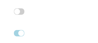
CSS로 토글형 체크박스 스타일링이 가능하다.
		<div class="toggle_box">
            <input type="checkbox" id="toggle1">
            <label for="toggle1">체크박스 1</label>
        </div>

        <div class="toggle_box">
            <input type="checkbox" id="toggle2">
            <label for="toggle2">체크박스 2</label>
        </div>
// 체크박스 모양 제거
.toggle_box input[type='checkbox']{
display: inline-block;
overflow: hidden;
width: 1px;
height: 1px;
margin: -1px;
opacity: 0;
}
// 토글 모양
.toggle_box input[type='checkbox'] + label{
display: inline-block;
overflow: hidden;
width: 36px;
height: 22px;
border-radius: 10px;
background-color: lightgray;
color: transparent;
position: relative;
}
// 토글 내에 동그란 버튼
.toggle_box input[type='checkbox'] + label::before{
content: "";
display: inline-block;
width: 20px;
height: 20px;
background-color: #fff;
border-radius: 50%;
position: absolute;
top: 1px;
left: 1px;
}
// 토글을 눌렀을때 색상 변경
.toggle_box input[type='checkbox']:checked +label{
background: lightblue;
}
// 토글을 눌렀을때 원 모양 이동
.toggle_box input[type='checkbox']:checked + label::before{
left: auto;
right: 1px;
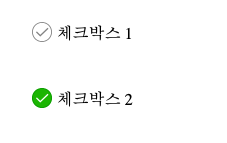
}- 이미지를 이용한 체크박스 커스텀
        <div class="check_box">
            <input type="checkbox" id="ch1">
            <label for="ch1">체크박스 1</label>
        </div>

        <div class="check_box">
            <input type="checkbox" id="ch2">
            <label for="ch2">체크박스 2</label>
        </div>
.check_box input[type='checkbox'] + label{
display: inline-block;
}
.check_box input[type='checkbox'] + label::before{
display: inline-block;
content: "";
width: 20px;
height: 20px;
background: url(./checkbox/checkbox.png) no-repeat;
background-size: 20px;
vertical-align: top;
margin: -4px 5px 0 0;
}
.check_box input[type='checkbox']:checked + label::before{
width: 20px;
height: 20px;
background: url(./checkbox/checkbox_on.png) no-repeat;
background-size: 20px;
}
.check_box input[type='checkbox']{
position: absolute;
overflow: hidden;
width: 1px;
height: 1px;
margin: -1px;
opacity: 0;
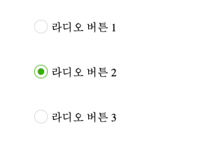
}- 이미지를 활용한 라디오 버튼 커스텀
        <div class="radio_box">
            <input type="radio" name="radio1" id="test1">
            <label for="test1">라디오 버튼 1</label>
        </div>

        <div class="radio_box">
            <input type="radio" name="radio1" id="test2">
            <label for="test2">라디오 버튼 2</label>
        </div>

        <div class="radio_box">
            <input type="radio" name="radio1" id="test3">
            <label for="test3">라디오 버튼 3</label>
</div>input[type='radio']{
position: absolute;
overflow: hidden;
width: 1px;
height: 1px;
margin: -1px;
opacity: 0;
}
input[type="radio"] + label{
display: inline-block;
}
input[type="radio"] + label::before{
display: inline-block;
content: "";
width: 20px;
height: 20px;
background: url(./radio/radio.png) no-repeat;
background-size: 20px;
vertical-align: top;
margin: -4px 5px 0 0;
}
input[type="radio"]:checked + label::before{
background: url(./radio/radio_on.png);
width: 20px;
height: 20px;
background-size: 20px;
}가상요소들을 이용해서 이미지를 추가하거나 임의의 도형을 만들어서 버튼 처럼 꾸민다. 그리고 :checked 를 이용해서 이미지를 바꾸거나 도형을 이동시켜서 사용자로부터 입력이 들어왔다는것을 시각적으로 보여준다.

유연한 개발자