float : 수평정렬 가능 (옛 문법)
-
float : left/right/none
-
float을 넣으면 자동으로 block으로 바뀜
-
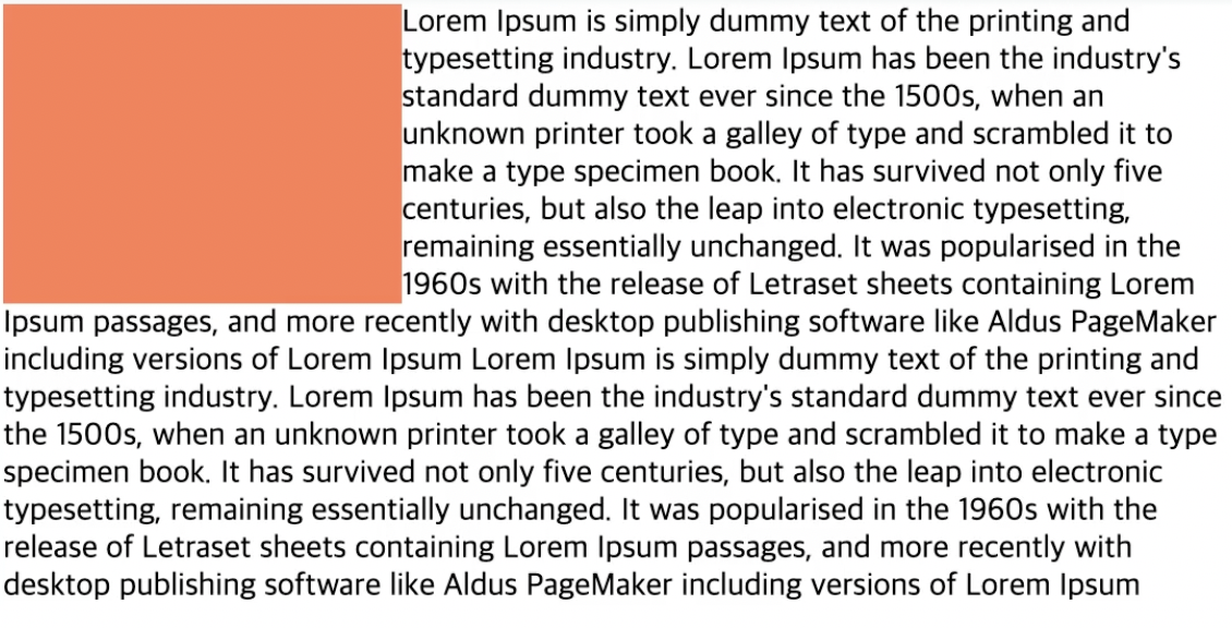
둥둥뜨기 때문에 글자사이에 들어갈 수 있음 (아래 사진 참고)
-
둥둥떠서 겹치기 때문에 부모태그 clearfix에 자식 태그(무조건 property에 display:float)있어야 하고 property로 clear:both를 항상 같이 써줘야함
html
<div class="clearfix">
  <div class="float-box"></div>
  <div class="float-box"></div>
  <div class="float-box"></div>
</div>
<div class="newbox"></div>

CSS
.clearfix::after {
  content:"";
  clear: both;
  display: block;
}
.float-box {
  float: left;
  background: orange;
  width: 100px;
  height: 50px;
  margin: 5px;
}
.newbox {
  background: red;
  width: 100px;
  height: 50px;
  margin: 5px;
}
position (*absolute를 사용시, 부모선택자에 position: relative 여부를 무조건 확인)
- position: relative (요소 자기자신 기준으로 배치)
- position: absolute (위치상 부모 요소(부모태그 && css postion있는 곳) 기준으로 배치)
- top: position 기준으로 거리 설정 (%,px,em,cm)- bottom: position 기준으로 거리 설정
- left: position 기준으로 거리 설정
- right: position 기준으로 거리 설정
HTML
 <div class="grand-parent">
   <div class="parent">
     <div class="child">1</div>
     <div class="child absolute">2</div>
     <div class="child">3</div>
   </div>
 </div>
CSS
.grand-parent {
  width: 400px;
  height: 300px;
  padding: 30px 100px 100px 30px;
  border: 4px dashed lightgray;
}
.parent {
  width: 400px;
  height: 300px;
  border: 4px dashed gray;
  position: relative;
}
.child {
  width: 120px;
  hegith: 80px;
  background: tomato;
  border-radius: 10px;
  font-size: 30px;
  display: flex;
  justify-content: center;
  align-items: center;
}
.absolute {
  position: absolute;
  top: 50px;
  left: 10px;
}- position: sticky(스크롤영역 기준 배치)
- position: fixed(브라우저 기준으로 배치)
align-items:center -> 박스안 글자 pading에 맞게 정렬
background : 색상 이미지경로 반복 위치 스크롤특성;
- 단축속성으로 background-color:로 지정가능
-background-image: url ("")요소의 배경에 하나 이상 가능.
flex (최신문법)
Container에는 display, flex-flow, justify-content 등의 속성을 사용할 수 있으며,
Items에는 order, flex, align-self 등의 속성을 사용할 수 있습니다.
- display:flex; -> block 요소랑 비슷하다. 수평으로 쌓인다
- display:inline-flex -> 인라인처럼 한줄에서 계속 쌓인다
- container ? display:flex; 지정된 요소이다.
- items? container 안의 자식들이다.
flex-direction:row -> 가로로 정렬
flex-direction:column ->위에서 아래로 정렬
container {flex-wrap:wrap: wrap;} -> 여러줄의 아이템이 줄바꿈된다
부모 (display:flex된)에서 justify-content:
- 글자 정렬
- flex-end; 오른쪽
- center; 중앙
- space-between items 사이사이 여백
- space-around: 맨처음 마지막 포함 여백
align-content: ( 부모요소)
- item이 여백이 있고 여러줄일때 사용가능 (부모가 flex-wrap:wrap일때)
- 1줄이면 align-items 사용하기
order
- html의 순서 건드리지 않고 css로 순서 설정가능하다
- 기본값은 0으로 되어 있음, 음수 가능함
flex-grow
- 가로 비율
- Item의 증가 너비 비율을 설정합니다.
flex-basis
-넓이의 기본값을 입력할 수 있다.
align-self
- 특정 item의 위치정렬을 바꿀 수 있다.
- reference from https://heropy.blog/2018/11/24/css-flexible-box/
Why not?