Material Components
Compose에는 앱을 만드는 데 상요할 수 있는 Material Component Composable이 제공된다. 가장 High-Level Composable은 Scaffold이다.
Scaffold
Scaffold를 사용하면 기본 머티리얼 디자인 레이아웃 구조로 UI를 구현할 수 있다. TopAppBar, BottomAppBar, FloatingActionButton과 Drawer와 같은 가장 일반적인 최상위 머티리얼 컴포넌트에 대한 슬롯을 제공한다. Scaffold를 사용하면 이런 컴포넌트가 올바르게 배치되고 작동하는지 확인할 수 있다.
생성된 Android Studio 기본 Compose 템플릿을 기반으로 Scaffold를 사용해볼 것이다. "Hi there!"을 출력하는 LayoutsCodelab Composable을 새로 만든다.
Scaffold API의 모든 매개변수는 @Composable(InnerPadding) -> Unit 유형의 본문 내용을 제외한 선택사항이다. 람다는 패딩을 매개변수로 받는다. 이는 화면의 item을 적절히 제한하기 위해 Composable 컨텐츠 루트에 적용해야 하는 padding이다. 일단 Scaffold만 추가해 보면,
@Composable
fun LayoutsCodelab() {
    Scaffold { innerPadding ->
        Text(text = "Hi there!", modifier = Modifier.padding(innerPadding))
    }
}
화면에 메인 컨텐츠가 있는 Column을 만드려면, Column에 수정자가 필요하다.
@Composable
fun LayoutsCodelab() {
    Scaffold { innerPadding ->
        Column(modifier = Modifier.padding(innerPadding)) {
            Text(text = "Hi there!")
            Text(text = "Thanks for going through the layouts codelab")
        }
    }
}.png)
코드를 좀 더 재사용/테스트가 가능하게 만들려면 더 작게 구조화해야 한다. 다른 기능을 추가하면서 수정해보겠다.
@Composable
fun LayoutsCodelab() {
    Scaffold { innerPadding ->
        BodyContent()
    }
}

@Composable
fun BodyContent(modifier: Modifier = Modifier) {
    Column(modifier = modifier) {
        Text(text = "Hi there!")
        Text(text = "Thanks for going through the layouts codelab")
    }
}
현재 화면, navigation과 action에 대한 정보가 있는 Android 앱의 최상위 AppBar를 보는 것이 일반적이다.
TopAppBar
Scaffold에는 @Composable () -> Unit 유형의 topBar 매개변수가 있는 상단 AppBar용 슬롯이 있다. 즉, 원하는 Composable로 슬롯을 채울 수 있다. 예를 들어, h3 스타일 텍스트만 포함하려면 아래처럼 하면 된다.
@Composable
fun LayoutsCodelab() {
    Scaffold(
        topBar = {
            Text(
                text = "LayoutsCodelab",
                style = MaterialTheme.typography.h3
            )
        }
    ) { innerPadding ->
        BodyContent(Modifier.padding(innerPadding))
    }
}
// BodyContent Composable은 수정없음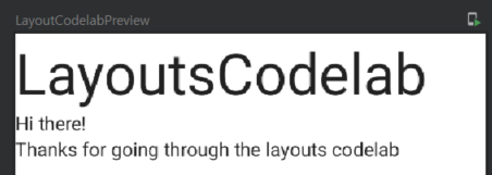
그러나 대부분의 머티리얼 컴포넌트와 마찬가지로 title, navigation icon과 action을 위한 슬롯이 있는 TopAppBar Composable이 함께 제공된다. 또한, 각 컴포넌트에 사용할 색상과 같이 머티리얼 스펙에서 권장하는 부분에 맞게 조정되는 일부 기본값이 함께 제공된다.
Slot API 패턴에 따라 TopAppBar의 title 슬롯에 화면 제목이 있는 Text가 포함되게 하려면,
@Composable
fun LayoutsCodelab() {
    Scaffold(
        topBar = {
            TopAppBar(
                title = {
                    Text(text = "LayoutsCodelab")
                }
            )
        }
    ) { innerPadding ->
        BodyContent(Modifier.padding(innerPadding))
    }
}
// BodyContent Composable은 수정없음.png)
TopAppBar에는 몇 가지 action items이 있다. 그 예로 즐겨찾기 버튼을 만들어 볼 것이다. Compose에는 여러 Material icons가 있기 때문에 참고해 사용하면 된다.
TopAppBar의 action items 슬롯은 내부적으로 Row를 사용하는 actions 매개변수이므로 여러 action이 가로로 배치된다.
@Composable
fun LayoutsCodelab() {
    Scaffold(
        topBar = {
            TopAppBar(
                title = {
                    Text(text = "LayoutsCodelab")
                },
                actions = {
                    // 미리 정의된 아이콘 중 하나를 사용하기 위해 내부에 Icon이 있는 IconButton Composable 사용
                    IconButton(onClick = {}) {
                        Icon(Icons.Filled.Favorite, contentDescription = null)
                    }
                }
            )
        }
    ) { innerPadding ->
        BodyContent(Modifier.padding(innerPadding))
    }
}
Placing modifiers 수정자 배치
새로운 컴포저블을 생성할 때마다 기본적으로 Modifier인 modifier 매개변수를 갖는 것은 컴포저블을 재사용 가능하게 만드는 좋은 방법이다. BodyContent 컴포저블은 이미 modifier를 매개변수로 사용한다. BodyContent에 extra padding을 추가하려면 padding 수정자를 배치하는 2가지 방법이 있다.
1. BodyContent에 대한 모든 호출이 extra padding을 적용하도록 수정자를 컴포저블 내부의 유일한 직계 자식에 적용
@Composable
fun BodyContent(modifier: Modifier = Modifier) {
	Column(modifier = modifier.pading(8.dp)) {
    	Text(text = "Hi there!")
        Text(text = "Thanks for going through the Layouts codelab")
    }
}- 필요할 때만 extra padding을 추가하는 컴포저블을 호출할 때 수정자를 적용
@Composable
fun LayoutsCodelab() {
    Scaffold(...) { innerPadding ->
        BodyContent(Modifier.padding(innerPadding).padding(8.dp))
    }
}
어디에서 수행할지 결정하는 것은 컴포저블 유형과 use case에 달렸다.
1. 수정자가 컴포저블에 고유한 경우 내부에 배치
2. 그렇지 않은 경우 외부에 배치
여기서는 BodyContent를 호출할 때마다 항상 강제 적용되지 않을 수 있는 2번째를 사용한다.
수정자는 이전 수정자에서 각 연속 수정자 함수를 호출하여 연결될 수 있다. 사용 가능한 연결 방법이 없으면 .then()을 사용할 수 있다. 여기서는 modifier(대문자가 아닌 소문자)로 시작한다. 즉, 매개변수로 전달된 체인 위에 체인이 빌드된다.
더 많은 아이콘
이전에 나열한 아이콘 외에도 프로젝트에 새 dependency를 추가해 전체 머티리얼 아이콘을 사용할 수 있다.
dependencies {
  ...
  implementation "androidx.compose.material:material-icons-extended:$compose_version"
}
앞으로...
Scaffold와 TopAppBar는 Material looking application을 갖는 데 사용할 수 있는 컴포저블일 뿐이다. BottomNavigation이나 BottomDrawer와 같은 머티리얼 컴포넌트에 대해서도 동일한 작업을 수행할 수 있다.
Working with lists
item 리스트를 표시하는 것은 앱에서 흔한 패턴이다. Jetpack Compose는 Column과 Row 컴포저블을 사용하여 이 패턴을 쉽게 구현할 수 있도록 하지만 현재 보이는 item만 구성하고 배치하는 lazy 리스트도 제공한다.
fun SimpleList() {
	// item 100개를 가지는 리스트
	Column {
    	repeat(100) {
        	Text("Item $it")
        }
    }
}Column은 기본적으로 스크롤을 처리하지 않기 때문에 화면 밖의 item들은 보이지 않는다. 따라서, verticalScroll 수정자를 추가하여 Column 내에서 스크롤을 활성화해야 한다.
@Composable
fun SimpleList() {
    // 리스트를 프로그래밍 방식으로 스크롤하는 데 사용 가능한 state로 스크롤 위치를 저장
    val scrollState = rememberScrollState()

    // item 100개를 가지는 리스트
    Column(Modifier.verticalScroll(scrollState)) {
        repeat(100) {
            Text(text = "Item $it")
        }
    }
}
Lazy list 지연 리스트
Column은 화면에 표시되지 않는 item을 포함하여 모든 리스트 item을 렌더링하므로 크기가 커질 때 성능 문제가 발생한다. 이를 개선하기 위해 화면에 보이는 item만 렌더링하는 LazyColumn을 사용해 성능을 높이고 scroll 수정자를 사용할 필요 없게 한다.
앞서 말했듯 Jetpack Compose의
LazyColumn은 Android View의RecyclerView와 동등하다.
LazyColumn에는 리스트 컨텐츠을 설명하는 DSL이 있다. 리스트 크기로 숫자를 사용할 수 있는 items를 사용한다. 또, 배열과 리스트를 지원한다.
@Composable
fun LazyList() {
    // 리스트를 프로그래밍 방식으로 스크롤하는 데 사용 가능한 state로 스크롤 위치를 저장
    val scrollState = rememberLazyListState()

    LazyColumn(state = scrollState) {
        items(100) {
            Text("Item #$it")
        }
    }
}
예시 이미지가 너무 커 따로 첨부하지 않는다.
이미지 표시
지난 포스트에서 만들었던 PhotographCard에서 봤듯이 Image는 Bitmap이나 백터 이미지를 표시하는데 사용할 수 있는 컴포저블이다. 이미지를 원격으로 가져오는 경우 앱에서 asset을 다운로드하고, 비트맵으로 디코딩하고, 이미지 내에서 렌더링해야 하는 과정이 필요하다.
이를 단순화하기 위해 Coil이라는 라이브러리를 사용한다.
Coil dependency 추가와 매니페스트 파일에서 INTERNET 권한 추가가 필요하다.
implementation 'io.coil-kt:coil-compose:1.3.0'
...
<uses-permission android:name="android.permission.INTERNET" />
이미지가 표시되는 list를 만들어보겠다.
@Composable
fun ImageListItem(index: Int) {
    Row(verticalAlignment = Alignment.CenterVertically) {

        Image(
            painter = rememberImagePainter(
                data = "https://developer.android.com/images/brand/Android_Robot.png"
            ),
            contentDescription = "Android Logo",
            modifier = Modifier.size(50.dp)
        )
        Spacer(Modifier.width(10.dp))
        Text("Item #$index", style = MaterialTheme.typography.subtitle1)
    }
}
다음으로 리스트의 Text 컴포저블을 ImageListItem에 넣는다.
@Composable
fun ImageList() {
    // We save the scrolling position with this state
    val scrollState = rememberLazyListState()

    LazyColumn(state = scrollState) {
        items(100) {
            ImageListItem(it)
        }
    }
}
리스트 스크롤
리스트의 스크롤 위치를 수동으로 제어해볼 것이다. 리스트의 상/하단으로 부드럽게 스크롤하는 2개의 버튼을 추가할 것이다. 스크롤하는 동안 리스트 렌더링을 차단하는 것을 방지하기 위한 스크롤 API는 suspend 기능이다. 따라서, Coroutine에서 호출해야 한다.
이를 위해, 버튼 이벤트 핸들러에서 Coroutine을 생성하기 위해 rememberCoroutineScope 함수를 사용하여 CoroutineScope를 생성할 수 있다. 이 CoroutineScope는 호출 사이트의 수명 주기를 따른다. 컴포저블 수명 주기, Coroutine과 부작용에 대한 정보는 여기서 확인할 수 있다.
커스텀 레이아웃
Compose는 Column, Row, Box와 같은 기본 제공 컴포저블을 결합하여 커스텀 레이아웃에 컴포저블의 재사용성을 높여준다.
그러나 수동으로 자식을 배치해야 하는 우리의 앱에서 유니크한 무언가를 빌드해야 할 수도 있다. 이를 위해, Layout 컴포저블을 사용할 수 있다. 실제로 Column과 Row와 같은 모든 상위 레벨 레이아웃은 앞에서 말한 것대로 빌드된다.
View 시스템에서 커스텀 레이아웃을 생성하려면
ViewGroup을 확장하고 measure와 레이아웃 함수를 구현해야 한다. Compose에서는Layout컴포저블을 사용하여 함수를 만들면 된다.
커스텀 레이아웃을 만들기 전 Compose의 레이아웃 원칙에 대해 먼저 알아보자.
Compose 레이아웃 원칙
-
일부 Composable 함수는 호출될 때 화면에 렌더링될 UI 트리에 추가되는 UI 조각을 방출된다.
각 방출(또는 요소)에는 하나의 부모와 잠재적으로 많은 자식을 가지고 부모의 위치(x, y)와 크기(width와height)를 가진다. -
요소는 만족되어야 하는 제약조건으로 스스로를 measure해야 한다.
제약 조건은 요소의 최소/최대width와height를 제한한다. 만약 요소에 자식 요소가 있는 경우 자체 크기를 결정하는 데 도움이 될 수 있도록 각 요소를 measure할 수 있다. 요소가 자신의 크기를 보고하면 자식 요소를 자신과 관련해 배치할 수 있다. -
Compose UI는 다중 패스 measurement를 허용하지 않는다.
레이아웃 요소가 다른 measurement configuration을 시도하기 위해 자식을 두 번 이상 measure하지 않을 수 있음을 의미한다. 단일 패스 measurement는 성능이 좋으며, Compose가 deep UI 트리를 효율적으로 처리할 수 있다.
레이아웃 수정자 사용
layout 수정자를 사용하여 요소를 측정하고 배치하는 방법을 수동으로 제어한다. 일반적으로 커스텀 layout 수정자는 아래의 형태이다.
fun Modifier.customLayoutModifier(...) = Modifier.layout { measurable, constraints ->
...
})
layout 수정자를 사용할 때 2개의 람다 매개변수를 얻는다.
measurable: measured와 배치될 자식constraints: 자식의 너비와 높이의 최소/최대
화면에 Text를 표시하고 텍스트의 첫 번째 줄 상단에서 기준선까지 거리를 제어하려고 한다. 그러기 위해서는 layout 수정자를 사용해 화면에 컴포저블을 수동으로 배치해야 한다.
(상단에서 첫 번째 기준선까지의 거리가 24.dp인 아래 그림을 참조)

먼저 firstBaselineToTop 수정자를 사용
fun Modifier.firstBaselineToTop(
  firstBaselineToTop: Dp
) = this.then(
    layout { measurable, constraints ->
        ...
    }
)
컴포저블을 measure해야 한다. Compose 레이아웃 원칙에서 말했듯이 자식은 한 번만 measure할 수 있다.
measurable.measure(constraints)를 호출하여 컴포저블을 measure한다. measure(constraints)를 호출할 때 constraints 람다 매개변수에서 사용 가능한 컴포저블의 주어진 제약 조건을 전달하거나 직접 생성할 수 있다. Measurable에 대한 measure()호출의 결과는 placeRelative(x, y)를 호출하여 위치를 지정할 수 있는 Placeable이다.
아래 코드의 경우 measurement를 더이상 제약하지 말고 주어진 대로 사용한다.
fun Modifier.firstBaselineToTop(
    firstBaselineToTop: Dp
) = this.then(
    layout { measurable, constraints ->
        val placeable = measurable.measure(constraints)

        ...
    }
)
이제 컴포저블이 measure되었으므로 콘텐츠를 배치하는데 사용되는 람다도 허용하는 layout(width, height) 메서드를 호출하여 크기를 계산하고 지정해야 한다.
아래의 경우,
- 컴포저블의 너비 = measured된 컴포저블의
width - 컴포저블의 높이 = 원하는 top-to-baseline 높이 - first baseline을 뺀 컴포저블의
width
fun Modifier.firstBaselineToTop(
    firstBaselineToTop: Dp
) = this.then(
    layout { measurable, constraints ->
        val placeable = measurable.measure(constraints)

        // 컴포저블에 첫번째 기준선이 있는지 확인
        check(placeable[FirstBaseline] != AlignmentLine.Unspecified)
        val firstBaseline = placeable[FirstBaseline]

        // 패딩이 있는 컴포저블 높이 - 첫번째 기준선
        val placeableY = firstBaselineToTop.roundToPx() - firstBaseline
        val height = placeable.height + placeableY
        layout(placeable.width, height) {
            ...
        }
    }
)
이제 placeable.placeRelative(x, y)를 호출하여 컴포저블을 화면에 배치할 수 있다. placeRelative를 호출하지 않으면 컴포저블이 표시되지 않는다. placeRelative는 현재 layoutDirection을 기반으로 배치 가능한 위치를 자동으로 조정한다.
아래의 경우 텍스트의 y 위치 = 위쪽 패딩 - 첫 번째 기준선의 위치
fun Modifier.firstBaselineToTop(
    firstBaselineToTop: Dp
) = this.then(
    layout { measurable, constraints ->
        ...

        // 패딩이 있는 컴포저블 높이 - 첫 번째 기준선
        val placeableY = firstBaselineToTop.roundToPx() - firstBaseline
        val height = placeable.height + placeableY
        layout(placeable.width, height) {
            // 컴포저블이 배치되는 위치
            placeable.placeRelative(0, placeableY)
        }
    }
)
예상대로 작동하는지 확인하기 위해 위 그림에서 본 것처럼 Text에 수정자를 적용시킬 것이다.
@Preview
@Composable
fun TextWithPaddingToBaselinePreview() {
    LayoutComposeCodelabTheme {
        Text("Hi there!", Modifier.firstBaselineToTop(32.dp))
    }
}

@Preview
@Composable
fun TextWithNormalPaddingPreview() {
    LayoutComposeCodelabTheme {
        Text("Hi there!", Modifier.padding(top = 32.dp))
    }
}
레이아웃 컴포저블 사용
단일 컴포저블이 measured되고 화면에 배치되는 방식을 제어하는 대신, 컴포저블 그룹에 대해 동일한 필요성이 존재할 수 있다. 이를 위해, Layout 컴포저블을 사용해 레이아웃의 자식을 measure하고 배치하는 방법을 수동으로 제어할 수 있다. 일반적으로 Layout을 사용하는 컴포저블의 일반적인 구조는 아래와 같다.
@Composable
fun CustomLayout(
    modifier: Modifier = Modifier,
    // 커스텀 레이아웃 속성
    content: @Composable () -> Unit
) {
    Layout(
        modifier = modifier,
        content = content
    ) { measurables, constraints ->
        // 이 부분에 constraints 로직이 주어진 자식을 measure하고 배치
    }
}CustomLayout에 필요한 최소 매개변수는 modifier와 content이다. 이런 매개변수가 Layout으로 전달된다. L ayout(MeasurePolicy 유형)의 후행 람다에서 layout 수정자를 사용해 얻은 것과 동일한 람다 매개변수를 얻는다.
Layout이 작동하는 모습을 보여주기 위해 API를 이해하기 위해 Layout을 사용하여 기본적인 Column을 구현해 볼 것이다.
기본 Column 구현
Column의 커스텀 구현은 항목을 세로로 배치한다. 또한, 단순성을 위해 레이아웃은 부모에서 가능한 많은 공간을 차지한다.
MyOwnColumn이라는 새 컴포저블을 만들고 Layout 컴포저블의 공통 구조를 추가한다.
@Composable
fun MyOwnColumn(
    modifier: Modifier = Modifier,
    content: @Composable () -> Unit
) {
    Layout(
        modifier = modifier,
        content = content
    ) { measurables, constraints ->
        // 이 부분에 constraints 로직이 주어진 자식을 measure하고 배치
    }
}
이전과 마찬가지로 가장 먼저 해야할 일은 한 번 밖에 measure할 수 없는 자식들을 measure하는 것이다. 레이아웃 수정자가 작동하는 방식과 유사하게 measurables 람다 매개변수에서 measurable.measure(constraints)를 호출하여 measure할 수 있는 모든 content를 얻는다.
이 경우, 자식 view를 더이상 제한하지 않는다. 자식들을 measure할 때 나중에 화면에 자식들을 올바르게 배치할 수 있도록 각 행의 width와 최대 height도 추적해야 한다.
@Composable
fun MyOwnColumn(
    modifier: Modifier = Modifier,
    content: @Composable () -> Unit
) {
    Layout(
        modifier = modifier,
        content = content
    ) { measurables, constraints ->

        // 자식 view를 더이상 제한하지 말고 주어진 제약조건으로 measure
        // measured된 자식들의 리스트
        val placeables = measurables.map { measurable ->
            // 각 자식들을 measure
            measurable.measure(constraints)
        }
    }
}
이제 로직에 measure된 자식 리스트가 있으므로 화면에 배치하기 전에 Column 버전의 크기를 계산해야 한다. 부모 크기만큼 만들 때 크기는 부모가 전달해야 할 제약 조건이다. layout(width, height) 메서드를 호출하여 자체 열의 크기를 지정한다. layout(width, height)는 자식 배치에 사용되는 람다도 제공한다.
@Composable
fun MyOwnColumn(
    modifier: Modifier = Modifier,
    content: @Composable () -> Unit
) {
    Layout(
        modifier = modifier,
        content = content
    ) { measurables, constraints ->
        // 자식 measure - 위 코드 부분
        ...

        // 레이아웃의 크기를 최대한 크게 설정
        layout(constraints.maxWidth, constraints.maxHeight) {
            // 자식 배치
        }
    }
}
마지막으로 placeable.placeRelative(x, y)를 호출하여 화면에 자식들을 배치한다. 자식들을 수직으로 배치하기 위해 우리는 자식들을 배치한 y 좌표를 추적한다. MyOwnColumn의 최종 코드는 아래에 있다.
@Composable
fun MyOwnColumn(
    modifier: Modifier = Modifier,
    content: @Composable () -> Unit
) {
    Layout(
        modifier = modifier,
        content = content
    ) { measurables, constraints ->
        // 자식 view를 더이상 제한하지 말고 주어진 제약조건으로 measure
        // measured된 자식들의 리스트
        val placeables = measurables.map { measurable ->
            // 각 자식들을 measure
            measurable.measure(constraints)
        }

        // 배치된 자식들의 y좌표
        var yPosition = 0

        // 레이아웃의 크기를 최대한 크게 설정
        layout(constraints.maxWidth, constraints.maxHeight) {
            // 부모 레이아웃에 자식 배치
            placeables.forEach { placeable ->
                // 화면에서 아이템 위치 지정
                placeable.placeRelative(x = 0, y = yPosition)

                // 배치된 y좌표 기록
                yPosition += placeable.height
            }
        }
    }
}