as
리액트에서 스타일드 컴포넌트로 css를 입힐때 사용할 수 있는 테크니션(?)같은거라고 생각하면 되겠다.
냅다 코드부터 들여다봐보자
import React from 'react';
import styled from 'styled-components';
// 태그는 div 태그임
const Father = styled.div`
display: flex;
`;
// 태그는 button임
const Btn = styled.button`
color: white;
background-color: tomato;
border: 0;
border-radius: 15px;
`;
const App = () => {
return (
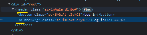
// 하지만 as='header' 이렇게 해주면
// Father 스타일은 그대로 가져가고, header 태그로바뀜
// 아래 사진 참고
<Father as='header'>
<Btn>Log in</Btn>
// 마찬가지로 as='a' 해주면
// Btn 스타일은 그대로가져가고, a 태그로바뀜
<Btn as='a' href='/'>
Log in
</Btn>
</Father>
);
};
export default App;
이런식으로 바뀐다.
Attrs
태그의 속성을 설정할 수 있다.
만약 수많은 input 태그가 있는데, 모든 input에 required:true 설정을 주고 싶은 경우 어떻게해주는게 베스트일까?
이렇게?
<Input required />
<Input required />
<Input required />
<Input required />
styled-components의 attrs를 사용하면 이렇게 해주면 손 쉽게 적용 가능하다.
const Input = styled.input.attrs({ required: true })`
  background-color: tomato;
`;

const App = () => {
  return (
      <Input />
      <Input />
      <Input />
      <Input />
      <Input />
  );
};
이런식으로도 응용이 가능하겠다.
const Input = styled.input.attrs({ required: true ,minLength:10})`
  background-color: tomato;
`;

const App = () => {
  return (
      <Input />
      <Input />
      <Input />
      <Input />
      <Input />
  );
};
내 가치를 찾아서