1. StackView
AutoLayout을 적용시킬 때, StackView를 사용하면 편하다. 개념은 조금 다를 수 있지만, Figma나 일러스트레이터에서 요소들을 그룹화 하는것과 비슷하다. 즉, 여러개의 요소들을 하나의 Stack으로 묶어서 배치하는 것이다.
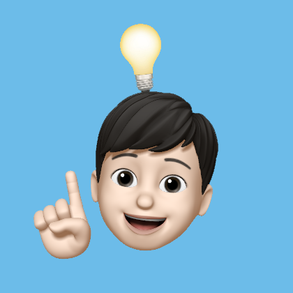
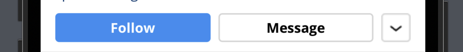
아래의 사진을 만들어보자.
1-1. StackView 만들어주기
우선 StackView를 만들어주자.
// middleBar 스택뷰
private let middleBarStackView: UIStackView = {
    let stackView = UIStackView()
    stackView.axis = .horizontal
    stackView.alignment = .fill
    stackView.distribution = .fillProportionally
    stackView.spacing = 8
    return stackView
}()
axis는 가로, 세로 방향을 정할 수 있다. alignment는 정렬이다. distribution은 하위 뷰의 크기를 결정하는 설정값이다. 각각에 다양한 속성들이 있는데, 아래의 글을 참고하면 좋을 것 같다.
1-2. StackView에 들어갈 요소 만들어주기
이제 StackView에 들어갈 요소들을 만들어 주자. 구현하고자 하는 StackView에는 3개의 버튼이 들어가 있다.
// Follow 버튼
private let followButton: UIButton = {
    let button = UIButton()
    button.setTitle("Follow", for: .normal)
    button.setTitleColor(UIColor.white, for: .normal)
    button.titleLabel?.font = UIFont.bold14
    button.titleLabel?.textAlignment = .center
    button.backgroundColor = UIColor(red: 0.22, green: 0.596, blue: 0.953, alpha: 1)
    button.layer.cornerRadius = 4
    return button
}()

// Message 버튼
private let messageButton: UIButton = {
    let button = UIButton()
    button.setTitle("Message", for: .normal)
    button.setTitleColor(UIColor.black, for: .normal)
    button.titleLabel?.font = UIFont.bold14
    button.titleLabel?.textAlignment = .center
    button.backgroundColor = UIColor.white
    button.layer.cornerRadius = 4
    button.layer.borderWidth = 1.5
    button.layer.borderColor = UIColor(red: 0.855, green: 0.855, blue: 0.855, alpha: 1).cgColor
    return button
}()

// More 버튼
private let moreButton: UIButton = {
    let button = UIButton()
    button.setImage(UIImage(named: "More"), for: .normal)
    button.snp.makeConstraints { make in
        make.width.equalTo(30)
    }
    return button
}()
1-3. 추가 조건 적용하기
Follow 버튼과 Message 버튼의 넓이가 같아야 한다. 추가적으로 넓이에 대한 설정을 추가해주면 된다.
followButton.snp.makeConstraints { make in
    make.width.equalTo(messageButton.snp.width)
}
2. SnapKit
AutoLayout을 정하기 위해서 SnapKit을 자주 사용한다. 그런데 사용되는 요소들에 대해 좀 더 알아봐야 할 필요성을 느껴서 정리해보고자 한다.
2-1. snp는 무엇인가?
snp는 SnapKit 라이브러리의 네임스페이스 (Namespace) 단축표현이다.
DSL은 특정 도메인 (이 경우, Auto Layout)에 대한 특화된 언어로, 해당 도메인의 작업을 보다 쉽게 표현하고 이해할 수 있도록 만들어진다. SnapKit은 Auto Layout에 관한 작업을 단순화하고 가독성을 높이기 위해 DSL을 제공하며, snp는 이 DSL을 사용할 때 SnapKit의 네임스페이스에 접근하는 단축 표현이다.
따라서 snp를 사용하여 SnapKit의 메서드와 프로퍼티에 접근할 수 있으며, Auto Layout 제약 조건을 설정하는 코드를 보다 간결하게 작성할 수 있다. snp는 SnapKit의 특별한 컨텍스트 안에서만 사용되므로 다른 네임스페이스와 충돌하지 않도록 보장한다.
2-2. leading, trailing VS left, right
우선 아래 표처럼 스냅킷의 ViewAttribute는 NSLayoutAttribute와 매칭된다.
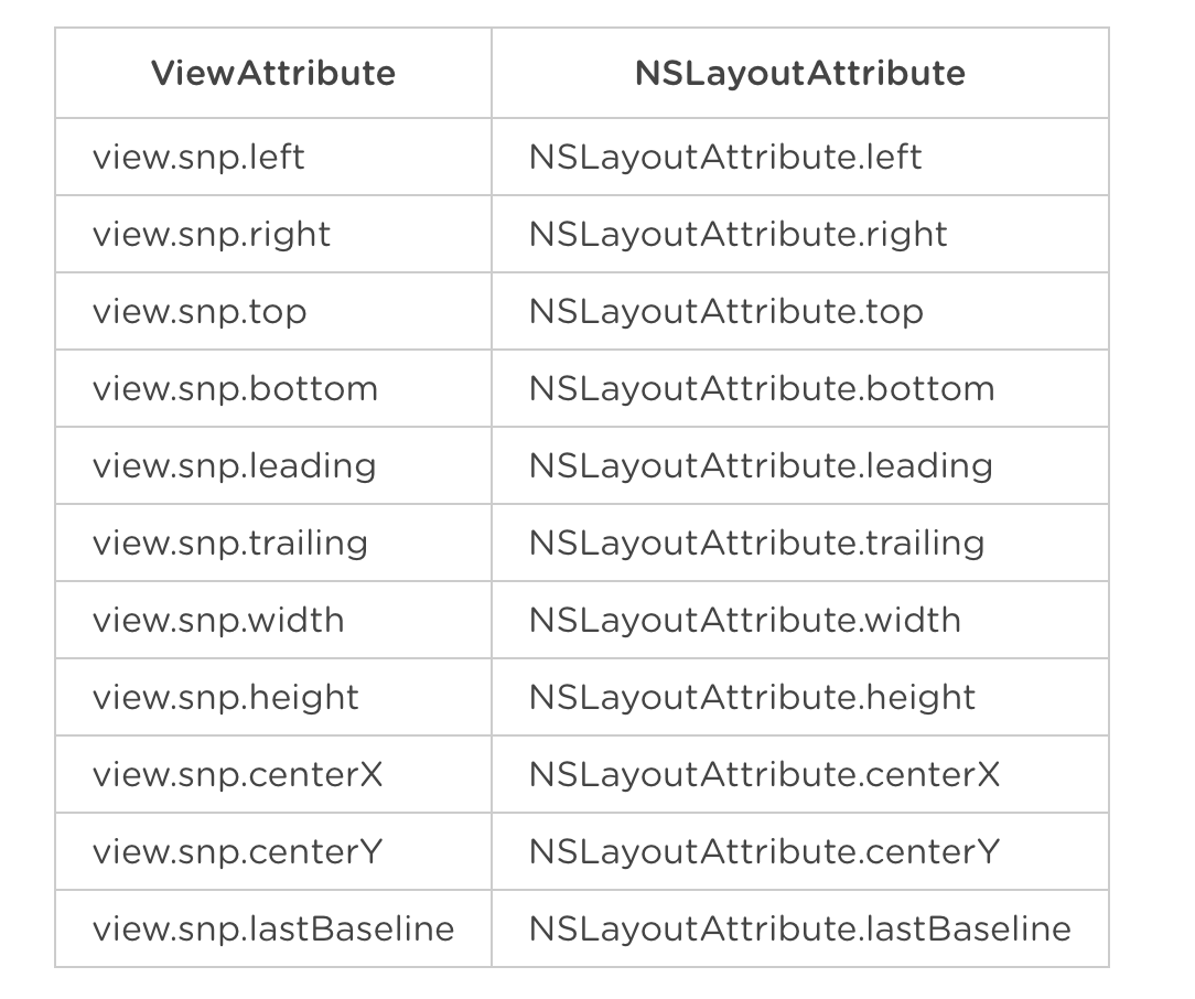
leading, trailing으로 설정하면 right-to-left 순서로 읽는 지역에서 화면이 거꾸로(flip되어서) 표시된다.
하지만 left, right로 설정하면 이런 현상을 방지할 수 있다.