viewport
뷰포트(Viewport)는 웹 브라우저에서 웹페이지가 표시되는 화면 영역을 의미
<meta name="viewport" content="width=device-width, initial-scale=1" />
content 속성값
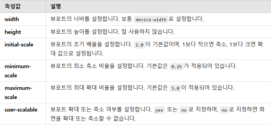
user-scalable=no 를 사용하면 저시력과 같은 시각 장애를 가진 사용자의 접근성 문제가 발생할 수 있다.
media query 기본 구문
@media media-type and (media-feature-rule) {
  /* CSS rules go here */
}
media-type
- all: 모든 출력 장치(스크린, 프린터, 음성 등)에 적용, 많이 쓰인다.
- print: 인쇄(프린터) 환경에서 적용
- screen: 모니터, 태블릿, 스마트폰 등의 화면 장치에서 적용, all과 비슷하게 많이 쓰인다.
- speech: 음성 합성 장치(screen reader 등)에서 적용되는 스타일이다.
시각 장애인을 위한 스크린 리더(Screen Reader) 프로그램에서 읽을 내용을 조정할 때 사용
media-feature-rule
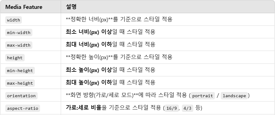
많이 사용되는 미디어 기능들
@media screen and (max-width: 600px) {
  body {
    color: blue;
  }
}
/*뷰포트가 600px 이하인 경우 적용이 된다.*/
@media screen and (min-width: 600px) {
  body {
    color: red;
  }
}
/*뷰포트가 600px 이상인 경우 적용이 된다.*/
미디어 쿼리로 ‘가로모드’라는 모바일/태블릿의 기능을 선택하는 것이 아니라 뷰포트의 너비와 높이를 비교하여 가로모드/세로모드를 구분한다.
즉 데스크톱 모니터도 대부분 가로(width)가 세로(height)보다 크기 때문에, landscape 모드로 인식된다.
@media (orientation: portrait) { /* (너비 <= 높이)인 화면에서 적용 (세로모드) */ }
@media (orientation: landscape) { /* (너비 > 높이)인 화면에서 적용 (가로모드) */ }
@media (orientation: portrait) {
body {
color: blue;
}
}
@media (orientation: landscape) {
body {
color: red;
}
}논리곱과 논리합
and와 ,(콤마)를 사용해 미디어 기능을 결합할 수 있다.
@media screen and (min-width: 600px) and (orientation: landscape) {
  body {
    color: blue;
  }
}
/*여기서 텍스트가 파란색이 되는 유일한 경우는
뷰포트의 너비가 최소 600픽셀 이상이고 장치가 가로 모드인 경우에만 해당*/
@media screen and (min-width: 600px), screen and (orientation: landscape) {
  body {
    color: blue;
  }
}
/*여기서 텍스트가 파란색이 되는 경우는
뷰포트의 너비가 최소 600픽셀 이상 또는 장치가 가로 모드인 경우에 해당*/
출처
https://developer.mozilla.org/ko/docs/Learn_web_development/Core/CSS_layout/Media_queries
https://www.youtube.com/watch?v=RyHyLcYC7Ow&list=PL-eeIUD86IjTH1qT8qdHXDm-FfOnm7a_U&index=26

unleash the beast