Matplotlib : 시각화 라이브러리
import matplotlib.pyplot as plt
# %matplotlib inline
get_ipython().run_line_magic("matplotlib", "inline")
# black 권고 : 아마 정식 코드로 호출해서 사용하라는 의미
plt.figure(figsize=(x, y)) #그래프 크기
plt.plot([x1, x2, --- xn], [y1, y2 --- yn]) #그래프 값
plt.show #그래프 표시
삼각함수
import numpy as np
t = np.arange(0, 12, 0.01) #a부터 b까지의 s의 간격
y = np.sin(t) #sin함수
ex)
import numpy as np
t = np.arange(0, 12, 0.01) #a부터 b까지의 s의 간격
y = np.sin(t) #sin함수

def drawGraph():
	plt.figure(figsize=(10, 6))
    plt.plot(t, np.sin(t), label="sin")
    plt.plot(t, np.cos(t), label="cos")
    plt.grid() #격자
    plt.legend() #범례
    plt.xlabel("time") #X축 제목
    plt.ylabel("Amplitutde") #Y축 제목
    plt.title("Example of sinewave") #차트제목
    plt.show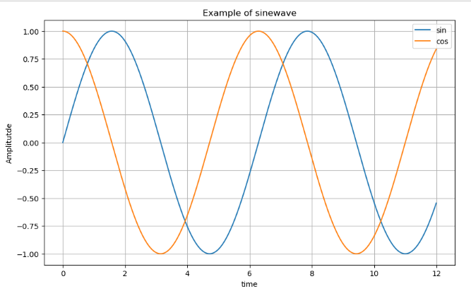
t = np.arange(0, 5, 0.5)

def drawGraph():
    plt.figure(figsize=(10, 6))
    plt.plot(t, t, "r--") #빨간 ---
    plt.plot(t, t ** 2, "bs") #파란색 □
    plt.plot(t, t ** 3, "g^") #초록색 △
    plt.show()

drawGraph()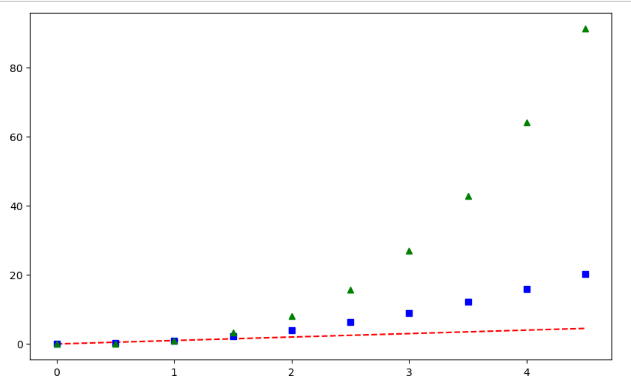
t = [0, 1, 2, 3, 4, 5, 6]
y = [1, 4, 5, 8, 9, 5, 3]

#다양한 스타일 지정 가능
def drawGraph():
    plt.figure(figsize=(10, 6))
    plt.plot(
        t,
        y,
        color="green",
        linestyle="dashed",
        marker="o",
        markerfacecolor="blue",
        markersize=12,
    )

    plt.xlim([-0.5, 6.5]) #축 최소, 최대값
    plt.ylim([0.5, 9.5]) #축 취소, 최대값
    plt.show()

drawGraph()
t = np.array([0, 1, 2, 3, 4, 5, 6, 7, 8, 9])
y = np.array([9, 8, 7, 6, 5, 4, 3, 2, 1, 0])

def drawGraph():
    plt.figure(figsize=(10, 6))
    plt.scatter(t, y)
    plt.show()

drawGraph()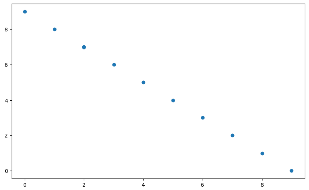
t = np.array([0, 1, 2, 3, 4, 5, 6, 7, 8, 9])
y = np.array([9, 8, 7, 6, 5, 4, 3, 2, 1, 0])
colormap = t

def drawGraph():
    plt.figure(figsize=(10, 6))
    plt.scatter(t, y, s=50, c=colormap, marker=">")
    plt.colorbar()
    plt.show()

drawGraph()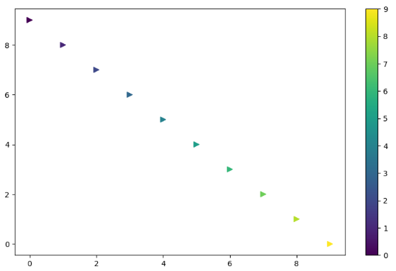

HR Anaylist!