최근 사이드 프로젝트를 하나 진행 중인데
프론트엔드를 맡게 되었다.
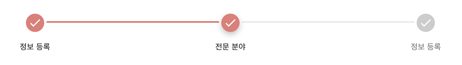
회원 가입 기능 중 작업 흐름을 시각화해 진행 상태를 눈으로 확인할 수 있게 해야한다는 요구사항을 아래와 같은 UI 로 구현해야했다.
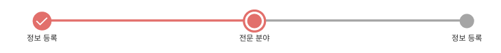
즉 Stepper 로 만들어 달라는 얘기이다.
Material UI 에서 Stepper를 지원하기 때문에
mui 예제를 응용하기로 했다.
어디보자, 비슷한게...
옳지 이거다!
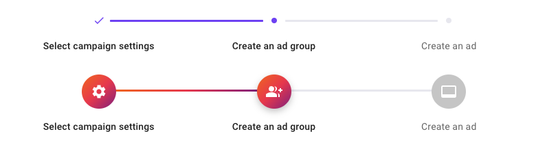
해당 코드의 예제 코드를 가져오고...
import * as React from 'react';
import { styled } from '@mui/material/styles';
import Stack from '@mui/material/Stack';
import Stepper from '@mui/material/Stepper';
import Step from '@mui/material/Step';
import StepLabel from '@mui/material/StepLabel';
import Check from '@mui/icons-material/Check';
import SettingsIcon from '@mui/icons-material/Settings';
import GroupAddIcon from '@mui/icons-material/GroupAdd';
import VideoLabelIcon from '@mui/icons-material/VideoLabel';
import StepConnector, { stepConnectorClasses } from '@mui/material/StepConnector';
import { StepIconProps } from '@mui/material/StepIcon';
const QontoConnector = styled(StepConnector)(({ theme }) => ({
[`&.${stepConnectorClasses.alternativeLabel}`]: {
top: 10,
left: 'calc(-50% + 16px)',
right: 'calc(50% + 16px)',
},
[`&.${stepConnectorClasses.active}`]: {
[`& .${stepConnectorClasses.line}`]: {
borderColor: '#784af4',
},
},
[`&.${stepConnectorClasses.completed}`]: {
[`& .${stepConnectorClasses.line}`]: {
borderColor: '#784af4',
},
},
[`& .${stepConnectorClasses.line}`]: {
borderColor: theme.palette.mode === 'dark' ? theme.palette.grey[800] : '#eaeaf0',
borderTopWidth: 3,
borderRadius: 1,
},
}));
const QontoStepIconRoot = styled('div')<{ ownerState: { active?: boolean } }>(
({ theme, ownerState }) => ({
color: theme.palette.mode === 'dark' ? theme.palette.grey[700] : '#eaeaf0',
display: 'flex',
height: 22,
alignItems: 'center',
...(ownerState.active && {
color: '#784af4',
}),
'& .QontoStepIcon-completedIcon': {
color: '#784af4',
zIndex: 1,
fontSize: 18,
},
'& .QontoStepIcon-circle': {
width: 8,
height: 8,
borderRadius: '50%',
backgroundColor: 'currentColor',
},
}),
);
function QontoStepIcon(props: StepIconProps) {
const { active, completed, className } = props;
return (
<QontoStepIconRoot ownerState={{ active }} className={className}>
{completed ? (
<Check className="QontoStepIcon-completedIcon" />
) : (
<div className="QontoStepIcon-circle" />
)}
</QontoStepIconRoot>
);
}
const ColorlibConnector = styled(StepConnector)(({ theme }) => ({
[`&.${stepConnectorClasses.alternativeLabel}`]: {
top: 22,
},
[`&.${stepConnectorClasses.active}`]: {
[`& .${stepConnectorClasses.line}`]: {
backgroundImage:
'linear-gradient( 95deg,rgb(242,113,33) 0%,rgb(233,64,87) 50%,rgb(138,35,135) 100%)',
},
},
[`&.${stepConnectorClasses.completed}`]: {
[`& .${stepConnectorClasses.line}`]: {
backgroundImage:
'linear-gradient( 95deg,rgb(242,113,33) 0%,rgb(233,64,87) 50%,rgb(138,35,135) 100%)',
},
},
[`& .${stepConnectorClasses.line}`]: {
height: 3,
border: 0,
backgroundColor:
theme.palette.mode === 'dark' ? theme.palette.grey[800] : '#eaeaf0',
borderRadius: 1,
},
}));
const ColorlibStepIconRoot = styled('div')<{
ownerState: { completed?: boolean; active?: boolean };
}>(({ theme, ownerState }) => ({
backgroundColor: theme.palette.mode === 'dark' ? theme.palette.grey[700] : '#ccc',
zIndex: 1,
color: '#fff',
width: 50,
height: 50,
display: 'flex',
borderRadius: '50%',
justifyContent: 'center',
alignItems: 'center',
...(ownerState.active && {
backgroundImage:
'linear-gradient( 136deg, rgb(242,113,33) 0%, rgb(233,64,87) 50%, rgb(138,35,135) 100%)',
boxShadow: '0 4px 10px 0 rgba(0,0,0,.25)',
}),
...(ownerState.completed && {
backgroundImage:
'linear-gradient( 136deg, rgb(242,113,33) 0%, rgb(233,64,87) 50%, rgb(138,35,135) 100%)',
}),
}));
function ColorlibStepIcon(props: StepIconProps) {
const { active, completed, className } = props;
const icons: { [index: string]: React.ReactElement } = {
1: <SettingsIcon />,
2: <GroupAddIcon />,
3: <VideoLabelIcon />,
};
return (
<ColorlibStepIconRoot ownerState={{ completed, active }} className={className}>
{icons[String(props.icon)]}
</ColorlibStepIconRoot>
);
}
const steps = ['Select campaign settings', 'Create an ad group', 'Create an ad'];
export default function CustomizedSteppers() {
return (
<Stack sx={{ width: '100%' }} spacing={4}>
<Stepper alternativeLabel activeStep={1} connector={<QontoConnector />}>
{steps.map((label) => (
<Step key={label}>
<StepLabel StepIconComponent={QontoStepIcon}>{label}</StepLabel>
</Step>
))}
</Stepper>
<Stepper alternativeLabel activeStep={1} connector={<ColorlibConnector />}>
{steps.map((label) => (
<Step key={label}>
<StepLabel StepIconComponent={ColorlibStepIcon}>{label}</StepLabel>
</Step>
))}
</Stepper>
</Stack>
);
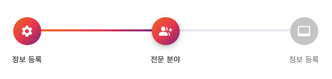
}다듬기
비슷하게 생긴 예제는 아래의 예제이기 때문에
불필요한 첫 번째 예제는 삭제한다. 그리고 각 단계에 사용할 텍스트도 바꿔준 후
저장하고 브라우저에서 결과를 확인한다.
불필요한 컴포넌트 삭제 및 문자열 값 변경
- QonotoConnector 삭제
- QontoStepIconRoot 삭제
- CustomizedSteppers > Stack > 위에 있는 Stepper 컴포넌트 삭제
변경
// before
const steps = ['Select campaign settings', 'Create an ad group', 'Create an ad'];
// after
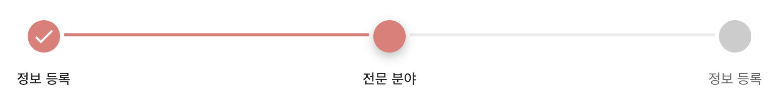
const steps = ['정보 등록', '전문 분야', '정보 등록'];중간 렌더링 결과
본격적으로 수정하기
아래 디자인과 비슷하게 바꾸려면 몇 가지 고칠 부분이 있다.
색상 및 사이즈
예제에는 그라디언트가 적용되었으나 구현해야 할 디자인은 단색이고 색도 다르다. 각 단계를 연결해주는 직선의 색상 역시 바꿔야 한다.
before
const ColorlibConnector = styled(StepConnector)(({ theme }) => ({
  [`&.${stepConnectorClasses.alternativeLabel}`]: {
    top: 22,
  },
  [`&.${stepConnectorClasses.active}`]: {
    [`& .${stepConnectorClasses.line}`]: {
-     backgroundImage:
-        'linear-gradient( 95deg,rgb(242,113,33) 0%,rgb(233,64,87) 50%,rgb(138,35,135) 100%)',
    },
  },
  [`&.${stepConnectorClasses.completed}`]: {
    [`& .${stepConnectorClasses.line}`]: {
-     backgroundImage:
-       'linear-gradient( 95deg,rgb(242,113,33) 0%,rgb(233,64,87) 50%,rgb(138,35,135) 100%)',
    },
  },
  [`& .${stepConnectorClasses.line}`]: {
    height: 3,
    border: 0,
    backgroundColor:
      theme.palette.mode === 'dark' ? theme.palette.grey[800] : '#eaeaf0',
    borderRadius: 1,
  },
}));

const ColorlibStepIconRoot = styled('div')<{
  ownerState: { completed?: boolean; active?: boolean };
}>(({ theme, ownerState }) => ({
  backgroundColor: theme.palette.mode === 'dark' ? theme.palette.grey[700] : '#ccc',
  zIndex: 1,
  color: '#fff',
  width: 50,
  height: 50,
  display: 'flex',
  borderRadius: '50%',
  justifyContent: 'center',
  alignItems: 'center',
  ...(ownerState.active && {
-   backgroundImage:
-     'linear-gradient( 136deg, rgb(242,113,33) 0%, rgb(233,64,87) 50%, rgb(138,35,135) 100%)',
    boxShadow: '0 4px 10px 0 rgba(0,0,0,.25)',
  }),
  ...(ownerState.completed && {
-   backgroundImage:
-     'linear-gradient( 136deg, rgb(242,113,33) 0%, rgb(233,64,87) 50%, rgb(138,35,135) 100%)',
  }),
}));
after
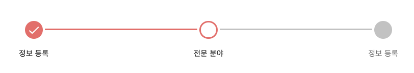
ColorlibConnector 는 각 아이콘의 사이를 선으로 연결해주는 UI 이고, ColorlibStepIconRoot 는 각 단계별 아이콘이다.
두 함수 안의 backgroundImage 속성을 backgroundColor 로 변경 후 원하는 색상을 지정해 UI 색상을 변경한다.
추가로 ColorlibStepIconRoot 내 width 와 height 값은 32로 바꿔 원의 크기를 줄였다.
ColorlibConnector 내의 top 과 height 두 값은 원의 반지름은 16 (13+3)으로 조절한다. 모두 수정했으니 저장 후 브라우저에서 렌더링되는 결과를 확인한다.
const ColorlibConnector = styled(StepConnector)(({ theme }) => ({
  [`&.${stepConnectorClasses.alternativeLabel}`]: {
+   top: 13,
  },
  [`&.${stepConnectorClasses.active}`]: {
    [`& .${stepConnectorClasses.line}`]: {
+     backgroundColor: theme.palette.primary.main,
    },
  },
  [`&.${stepConnectorClasses.completed}`]: {
    [`& .${stepConnectorClasses.line}`]: {
+     backgroundColor: theme.palette.primary.main,
    },
  },
  [`& .${stepConnectorClasses.line}`]: {
    height: 3,
    border: 0,
    backgroundColor:
      theme.palette.mode === "dark" ? theme.palette.grey[800] : "#eaeaf0",
    borderRadius: 1,
  },
}));

const ColorlibStepIconRoot = styled("div")<{
  ownerState: { completed?: boolean; active?: boolean };
}>(({ theme, ownerState }) => ({
  backgroundColor:
    theme.palette.mode === "dark" ? theme.palette.grey[700] : "#ccc",
  zIndex: 1,
  color: "#fff",
  width: 32,
  height: 32,
  display: "flex",
  borderRadius: "50%",
  justifyContent: "center",
  alignItems: "center",
  ...(ownerState.active && {
    backgroundColor: theme.palette.primary.main,
    boxShadow: "0 4px 10px 0 rgba(0,0,0,.25)",
  }),
  ...(ownerState.completed && {
    backgroundColor: theme.palette.primary.main,
  }),
}));

function ColorlibStepIcon(props: StepIconProps) {
  const { active, completed, className } = props;

  const icons: { [index: string]: React.ReactElement } = {
    1: <SettingsIcon />,
    2: <GroupAddIcon />,
    3: <VideoLabelIcon />,
  };

  return (
    <ColorlibStepIconRoot
      ownerState={{ completed, active }}
      className={className}
    >
      {icons[String(props.icon)]}
    </ColorlibStepIconRoot>
  );
}
렌더링 결과
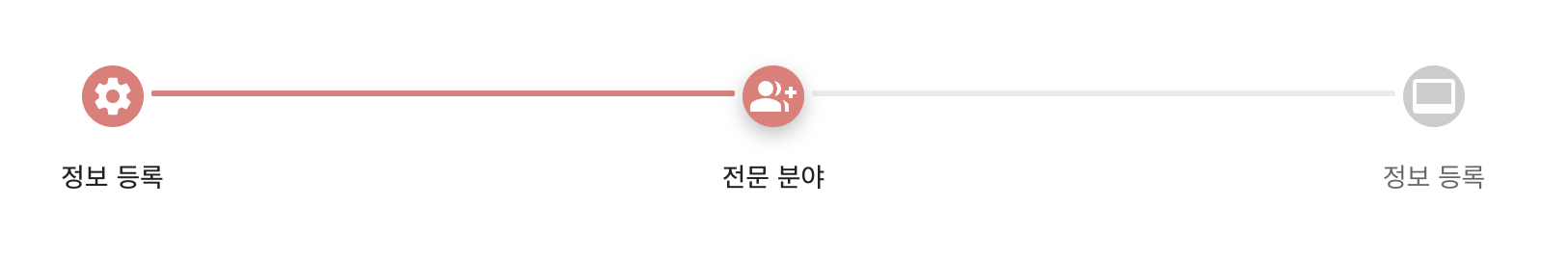
아이콘 변경
ColorlibStepIcon 함수에서 기존 아이콘을 체크 아이콘으로 대체 한다.
before
function ColorlibStepIcon(props: StepIconProps) {
  const { active, completed, className } = props;

- const icons: { [index: string]: React.ReactElement } = {
-   1: <SettingsIcon />,
-   2: <GroupAddIcon />,
-   3: <VideoLabelIcon />,
- };

  return (
    <ColorlibStepIconRoot
      ownerState={{ completed, active }}
      className={className}
    >
-      {icons[String(props.icon)]}
    </ColorlibStepIconRoot>
  );
}
after
+ import { Check } from "@mui/icons-material";

function ColorlibStepIcon(props: StepIconProps) {
  const { active, completed, className } = props;

  return (
    <ColorlibStepIconRoot
      ownerState={{ completed, active }}
      className={className}
    >
  +   <Check />
    </ColorlibStepIconRoot>
  );
}
저장 후 브라우저에서 렌더링 결과를 확인해보면 다음과 같다.
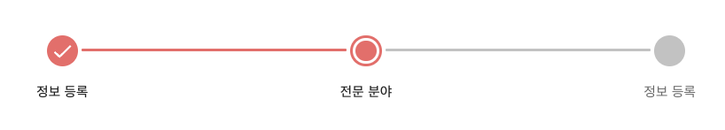
체크 아이콘 조건부 렌더링
체크 아이콘은 이미 완료된 단계에 해당하는 아이콘에서만 보여야 한다.
컴포넌트에서 넘어오는 props 중 completed 를 이용해 코드를 다음과 같이 수정하고 브라우저에서 결과를 확인한다.
import { Check } from "@mui/icons-material";

function ColorlibStepIcon(props: StepIconProps) {
  const { active, completed, className } = props;

  return (
    <ColorlibStepIconRoot
      ownerState={{ completed, active }}
      className={className}
    >
 +    {completed && <Check />}
    </ColorlibStepIconRoot>
  );
}
현재 진행중인 단계에 띠 형태 UI 적용
원래 border: double 속성을 가지고 만드려고 했는데, 만들고 나서 보니 별로 깔끔하지 않은 느낌이 있었다.
또한 border: solid 속성을 가지고 만드는게 더 간단하고 깔끔해 보여서 solid 를 가지고 구현하는 것으로 방향을 틀었다.
before
const ColorlibStepIconRoot = styled("div")<{
  ownerState: { completed?: boolean; active?: boolean };
}>(({ theme, ownerState }) => ({
  backgroundColor:
    theme.palette.mode === "dark" ? theme.palette.grey[700] : "#ccc",
  zIndex: 1,
  color: "#fff",
  width: 32,
  height: 32,
  display: "flex",
  borderRadius: "50%",
  justifyContent: "center",
  alignItems: "center",
  ...(ownerState.active && {
-   backgroundColor: theme.palette.primary.main,
-   boxShadow: "0 4px 10px 0 rgba(0,0,0,.25)",
  }),
  ...(ownerState.completed && {
    backgroundColor: theme.palette.primary.main,
  }),
}));
after
const ColorlibStepIconRoot = styled("div")<{
  ownerState: { completed?: boolean; active?: boolean };
}>(({ theme, ownerState }) => ({
  backgroundColor:
    theme.palette.mode === "dark" ? theme.palette.grey[700] : "#ccc",
  zIndex: 1,
  color: "#fff",
  width: 32,
  height: 32,
  display: "flex",
  borderRadius: "50%",
  justifyContent: "center",
  alignItems: "center",
  ...(ownerState.active && {
 +  border: `3px solid ${theme.palette.primary.main}`,
 +  backgroundColor: "none",
  }),
  ...(ownerState.completed && {
    backgroundColor: theme.palette.primary.main,
  }),
}));
다 됐으면 저장 후 브라우저에서 결과를 확인한다.
이제 안쪽 원만 만들어주면 완성이다.
import theme from "../src/theme/theme";

function ColorlibStepIcon(props: StepIconProps) {
  const { active, completed, className } = props;

  return (
    <ColorlibStepIconRoot
      ownerState={{ completed, active }}
      className={className}
    >
      {completed && <Check />}
 +    {active && (
 +      <span
 +        style={{
 +          width: "83%",
 +          height: "83%",
 +          borderRadius: "50%",
 +          backgroundColor: theme.palette.primary.main,
 +        }}
 +      ></span>
 +    )}
      </ColorlibStepIconRoot>
  );
}
컴포넌트 props 중 active 를 이용해 스타일을 적용한 span 태그를 생성하면 안쪽 원까지 채워지게 된다.
이제 디자인과 비슷하게 생긴 Stepper 컴포넌트를 완성하였다!
최종 코드
import { Check } from "@mui/icons-material";
import Stack from "@mui/material/Stack";
import Step from "@mui/material/Step";
import StepConnector, {
  stepConnectorClasses,
} from "@mui/material/StepConnector";
import { StepIconProps } from "@mui/material/StepIcon";
import StepLabel from "@mui/material/StepLabel";
import Stepper from "@mui/material/Stepper";
import { styled } from "@mui/material/styles";
import * as React from "react";

import theme from "../src/theme/theme";

const ColorlibConnector = styled(StepConnector)(({ theme }) => ({
  [`&.${stepConnectorClasses.alternativeLabel}`]: {
    top: 13,
  },
  [`&.${stepConnectorClasses.active}`]: {
    [`& .${stepConnectorClasses.line}`]: {
      backgroundColor: theme.palette.primary.main,
    },
  },
  [`&.${stepConnectorClasses.completed}`]: {
    [`& .${stepConnectorClasses.line}`]: {
      backgroundColor: theme.palette.primary.main,
    },
  },
  [`& .${stepConnectorClasses.line}`]: {
    height: 3,
    border: 0,
    backgroundColor: theme.palette.grey[100],
    borderRadius: 1,
  },
}));

const ColorlibStepIconRoot = styled("div")<{
  ownerState: { completed?: boolean; active?: boolean };
}>(({ theme, ownerState }) => ({
  backgroundColor: theme.palette.grey[100],
  zIndex: 1,
  color: "#fff",
  width: 32,
  height: 32,
  display: "flex",
  borderRadius: "50%",
  justifyContent: "center",
  alignItems: "center",
  ...(ownerState.active && {
    border: `3px solid ${theme.palette.primary.main}`,
    backgroundColor: "none",
  }),
  ...(ownerState.completed && {
    backgroundColor: theme.palette.primary.main,
  }),
}));

function ColorlibStepIcon(props: StepIconProps) {
  const { active, completed, className } = props;

  return (
    <ColorlibStepIconRoot
      ownerState={{ completed, active }}
      className={className}
    >
      {completed && <Check />}
      {active && (
        <span
          style={{
            width: "83%,
            height: "83%,
            borderRadius: "50%",
            backgroundColor: theme.palette.primary.main,
          }}
        ></span>
      )}
    </ColorlibStepIconRoot>
  );
}

const steps = ["정보 등록", "전문 분야", "정보 등록"];

export default function CustomizedSteppers() {
  return (
    <Stack sx={{ width: "100%" }} spacing={4}>
      <Stepper
        alternativeLabel
        activeStep={1}
        connector={<ColorlibConnector />}
      >
        {steps.map((label) => (
          <Step key={label}>
            <StepLabel StepIconComponent={ColorlibStepIcon}>{label}</StepLabel>
          </Step>
        ))}
      </Stepper>
    </Stack>
  );
}
