intl
1000000 > 1,000,000 의 형태로 바꿔주는 패키지인데 인트엘이라고 읽는 것을 첨 알았음.
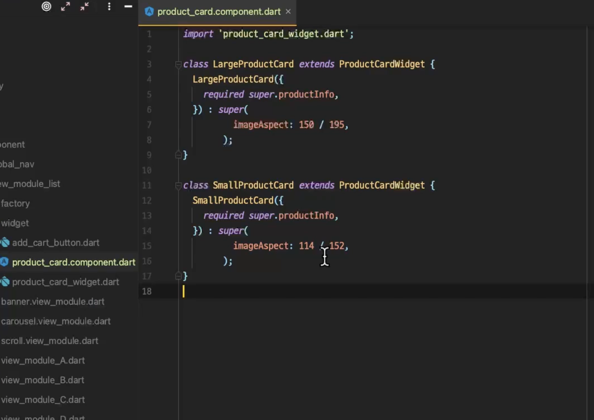
위젯의 상속
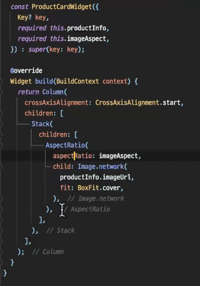
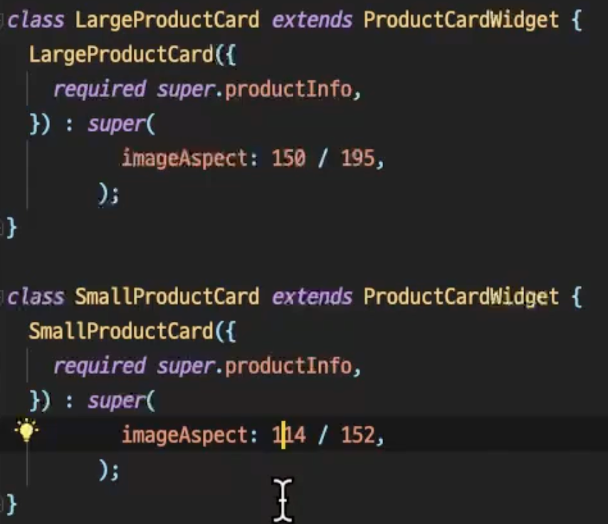
위 ProductCardWidget으로 만들어놓은 Widget을 extends로 받아와서 내부로 넘겨주는 값을 조정하여 새롭게 커스터마이징해서 새로 만들어줄 수 있는게 신기했음..
extension
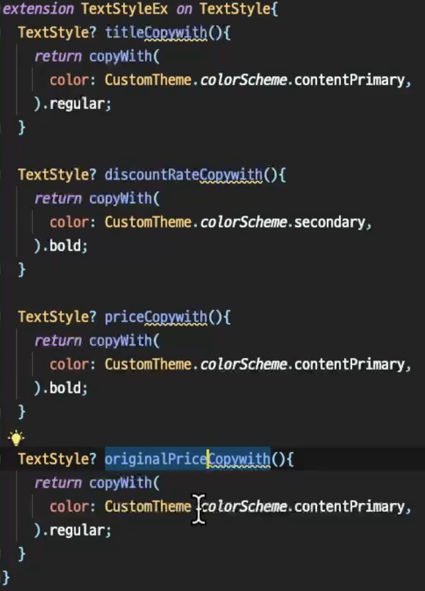
텍스트도 익스텐션을 활용해 미리 정의해두고 상수값처럼 쓰는게 깔끔해보임..
6월 3일 이후 정리
화면 별 사이즈 정리
화면을 그릴 때 다 하드코딩 박아버리면 여러 핸드폰에서 봤을 때 문제가 생길 것 같음.
MediaQuery
- 헤더, 바텀 네비게이션 등 화면 비율 기반 UI
- 이미지나 카드가 화면 크기에 맞춰 일정 비율을 유지해야 할 때
// 예: 상품 이미지가 화면 높이의 30%를 차지
Container(
  height: MediaQuery.of(context).size.height * 0.3,
  child: Image.network(productImage),
)

// 예: 화면 너비에 따른 그리드 컬럼 수 결정
GridView.builder(
  gridDelegate: SliverGridDelegateWithFixedCrossAxisCount(
    crossAxisCount: MediaQuery.of(context).size.width > 600 ? 4 : 2,
  ),
)
Flexible/Expanded
- 여러 위젯이 공간을 나눠 가져야 할 때
- 리스트와 버튼 영역을 분리할 때
// 예: 상품 목록과 하단 버튼 분리
Column(
  children: [
    Expanded(  // 남은 공간 모두 사용
      child: ListView.builder(...),
    ),
    Container(  // 고정 높이
      height: 60,
      child: ElevatedButton(...),
    ),
  ],
)

// 예: 가격과 할인율 공간 분배
Row(
  children: [
    Flexible(flex: 3, child: Text('원가: 50,000원')),
    Flexible(flex: 2, child: Text('20% 할인')),
  ],
)
IntrinsicHeight
- Row 안의 위젯들을 같은 높이로 정렬할 때
- 동적 콘텐츠의 크기를 예측하기 어려울 때
// 예: 상품명과 가격이 다른 길이여도 같은 높이
IntrinsicHeight(
  child: Row(
    children: [
      Expanded(
        child: Container(
          color: Colors.blue,
          child: Text('긴 상품명이 여러 줄로 표시될 수 있습니다'),
        ),
      ),
      Container(
        color: Colors.red,
        child: Text('가격'),
      ),
    ],
  ),
)
LayoutBuilder
- 화면 크기에 따라 완전히 다른 레이아웃이 필요할 때
- 태블릿/폰 구분해서 UI 구성할 때
- 부모 위젯의 제약에 따라 자식을 다르게 그려야 할 때
// 예: 화면 크기에 따른 상품 카드 레이아웃
LayoutBuilder(
  builder: (context, constraints) {
    if (constraints.maxWidth > 600) {
      // 태블릿: 가로 레이아웃
      return Row(
        children: [
          Image.network(productImage),
          Expanded(child: ProductInfo()),
        ],
      );
    } else {
      // 폰: 세로 레이아웃
      return Column(
        children: [
          Image.network(productImage),
          ProductInfo(),
        ],
      );
    }
  },
)
왜 굳이 나눴을까
imageAspect를 그냥 값으로 넘겨줄 수도 있었을 것 같은데, Large랑 Small의 사이즈를 정해서 나눠서 사용했었음.
어차피 상품카드는 어플 상에서 어느정도 사이즈가 정해져 있을 것이니, 아래처럼 나눈게 더 직관적으로 느껴짐.

나 원장이 아니다