CSS grid 레이아웃에 대해 알아보겠습니다. 이 포스트는 mdn과 css-tricks의 글들을 토대로 쓰여졌습니다.
grid VS flex
flex는 본질적으로 1차원안에서 요소들을 레이아웃하기 위해 쓰인다. 축이 한개이고, 중심축은 row(가로축) 아니면 column(세로축)이다. 반면 grid는 2차원 안에서 요소들을 레이아웃하기 위해서 쓰인다.
따라서 grid는 1차원 안에서 요소들을 레이아웃하기 어려울 때 쓴다.
Fixed and flexible track sizes
pixel등의 단위로 고정된 사이즈를 만들 수 있고, fr등의 단위로 유연한 사이즈를 만들 수도 있다.
밑의 경우처럼 섞어서 쓸 수도 있다. 그러면 화면 길이가 늘어남에 비례해서 늘어나는 element와, 고정된 element가 생긴다.
.wrapper {
  display : grid;
    grid-template-columns: 500px 1fr 2fr;
}
grid-template
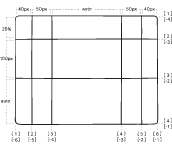
grid의 핵심은 grid-template이다.
grid-template-columns는 가로축안에서, grid-template-rows는 세로축 안에서 자식 요소들이 어떤 간격으로 레이아웃될지를 결정한다.
원하는 갯수만큼, 각각의 순서에 따라 요소가 얼마나 공간을 차지하는지를 선언하면 된다.
.container {
  grid-template-columns: 40px 50px auto 50px 40px;
  grid-template-rows: 25% 100px auto;
}
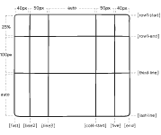
알아보기 쉽도록 각 라인의 이름을 정할 수도 있다.
.container {
  grid-template-columns: [first] 40px [line2] 50px [line3] auto [col4-start] 50px [five] 40px [end];
  grid-template-rows: [row1-start] 25% [row1-end] 100px [third-line] auto [last-line];
}
fr : grid의 상대 단위
grid만의 상대 단위가 있는데 그것은 fr이다. grid의 길이가 얼마나 늘어나든, fr단위를 가진 요소들은 grid의 전체 너비 혹은 높이에 비례해서 늘어난다.
repeat()
repeat은 말 그대로 같은 값이 반복될 때 쓰인다.
.wrapper {
  display : grid;
  grid-template-columns: repeat(3, 1fr);
}
grid-gap
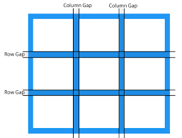
column-gap : grid의 각 column에 간격을 준다.
row-gap : grid의 column과 각 row에 간격을 준다.
gap : grid의 column과 row 모두에 간격을 준다.
minmax()
min-width, max-width로 어떤 요소의 최소 너비와 최대 너비를 결정하듯이, grid에서 요소의 최소 혹은 최대 크기를 정해주기 위해서 minmax를 사용한다.
grid-row & grid-column
grid의 자식들이 가질 위치 값들. 1부터 설정할 수 있고, grid system이 자동적으로 계산해준다.
grid-template-areas
grid-area에 이름을 선언한 자식들에 한해서, 각각의 grid-area 이름을 원하는 위치에 참조해줌으로써 grid-template을 짤 수 있다.
.item-a {
  grid-area: header;
}
.item-b {
  grid-area: main;
}
.item-c {
  grid-area: sidebar;
}
.item-d {
  grid-area: footer;
}

.container {
  display: grid;
  grid-template-columns: 50px 50px 50px 50px;
  grid-template-rows: auto;
  grid-template-areas:
    "header header header header"
    "main main . sidebar"
    "footer footer footer footer";
}
dnl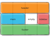
justify-content와 align-content
grid 전체를 합친 사이즈가 grid 부모요소의 사이즈보다 작을 경우에 쓴다. grid 부모 요소의 남는 공간에 대해서 자식 요소를 어떻게 배치할 것인지를 정한다.
기본적으로 flex에서의 justify-content와 align-content와 같다고 본다.
.container {
  justify-content: start | end | center | stretch | space-around | space-between | space-evenly;
}
.container {
justify-content: start;
}
flex와 달리 grid에서는 direction을 따로 결정할 수 없다. 가로축과 세로축이 고정적이다. 따라서 justify-content가 가로축 정렬을 맡고, align-content가 세로축 정렬을 맡는다.
justify-items align-items
grid 안의 각각의 content안에서 공간이 남을 경우에 사용된다.
.container {
  justify-items: start | end | center | stretch;
}
.container {
justify-items: start;
}