Chap 10-2 CSS 고급 선택자
CSS 고급 선택자
3. 가상 클래스
사용자 동작에 반응하는 가상 클래스 선택자
- :link - 방문하지 않은 링크에 스타일 적용
- :visited - 방문한 링크에 스타일 적용
- :active : 웹 요소를 활성화했을 때의 스타일 적용
- :hover - 웹 요소에 마우스 커서를 올려놓을 때의 스타일 적용
- :focus - 웹 요소에 초점이 맞추어졌을 때의 스타일 적용
📌 순서 중요❗❕❗❕ -
:link → :visited → :hover → :active
코드 예시와 결과 )
1. :link, :visited
- a태그 사용 시, 밑줄(underline)을 제거하고, 링크를 방문했을 시에도 밑줄을 제거하도록 설정
  ...
  .navi a:link, .navi a:visited{
    display:block;
    font-size:14px;
    color:#000;
    padding: 10px;
    text-decoration: none;  /* 밑줄 없앰 */
    text-align: center;
  }
  ...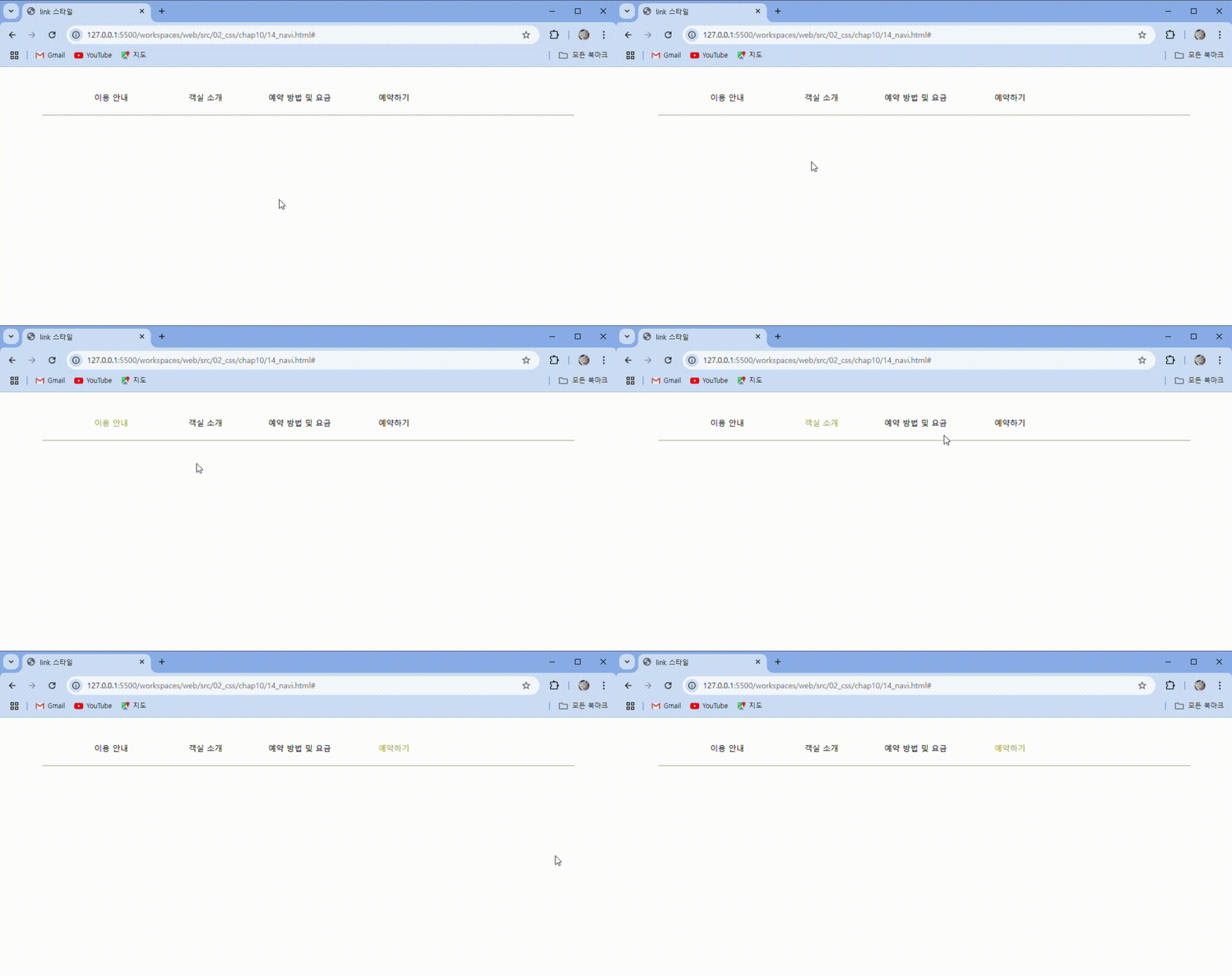
- 방문하지 않은 a태그와 방문했던 a태그의 밑줄을 제거함
2. :hover
- 마우스 커서를 올려놓았을 때, 배경색을 #222(검정색에 가까움), 글자색을 #fff(흰색)로 설정
  ...
 .navi a:hover{
    background-color:#222;  /* 배경 색 */
    color:#fff;  /* 글자 색 */
  }
  ...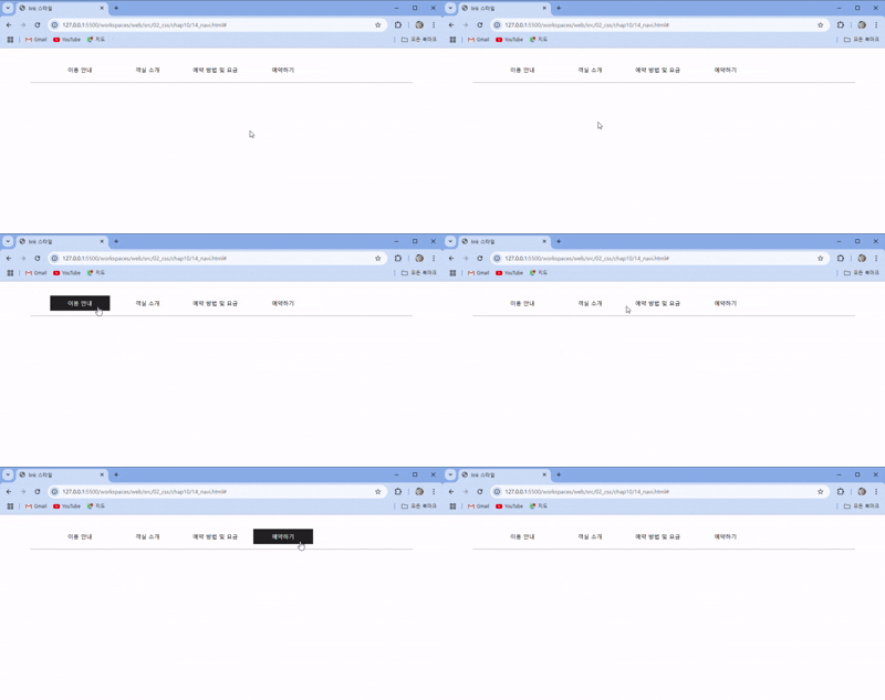
- 마우스 커서를 올렸을 때, 배경색과 글자색이 바뀜
3. :active
- 마우스로 클릭을 했을 시, 배경색을 #f00(빨강색)으로 설정하고, 글자색을 black으로 설정
  ...
  .navi a:active{
    background-color:#f00;  /* 배경 색 */
    color: black; /* 글자 색 */
  }
  ...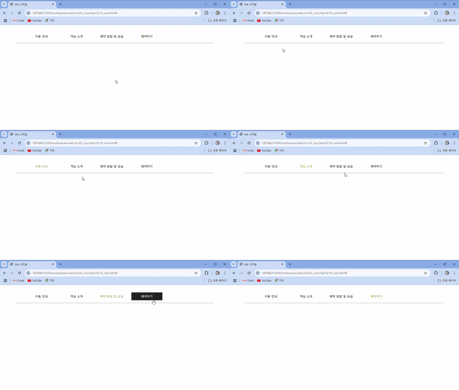
- 마우스로 클릭했을 시, 배경색은 빨강색, 글자색은 검정색으로 바뀜
4. :focus
- 마우스로 클릭하고 난 뒤, 초점이 맞추어졌을 때 글자색을 green으로 설정
  ...
  .navi a:focus{
    color: rgb(151, 151, 40);
  }
  ...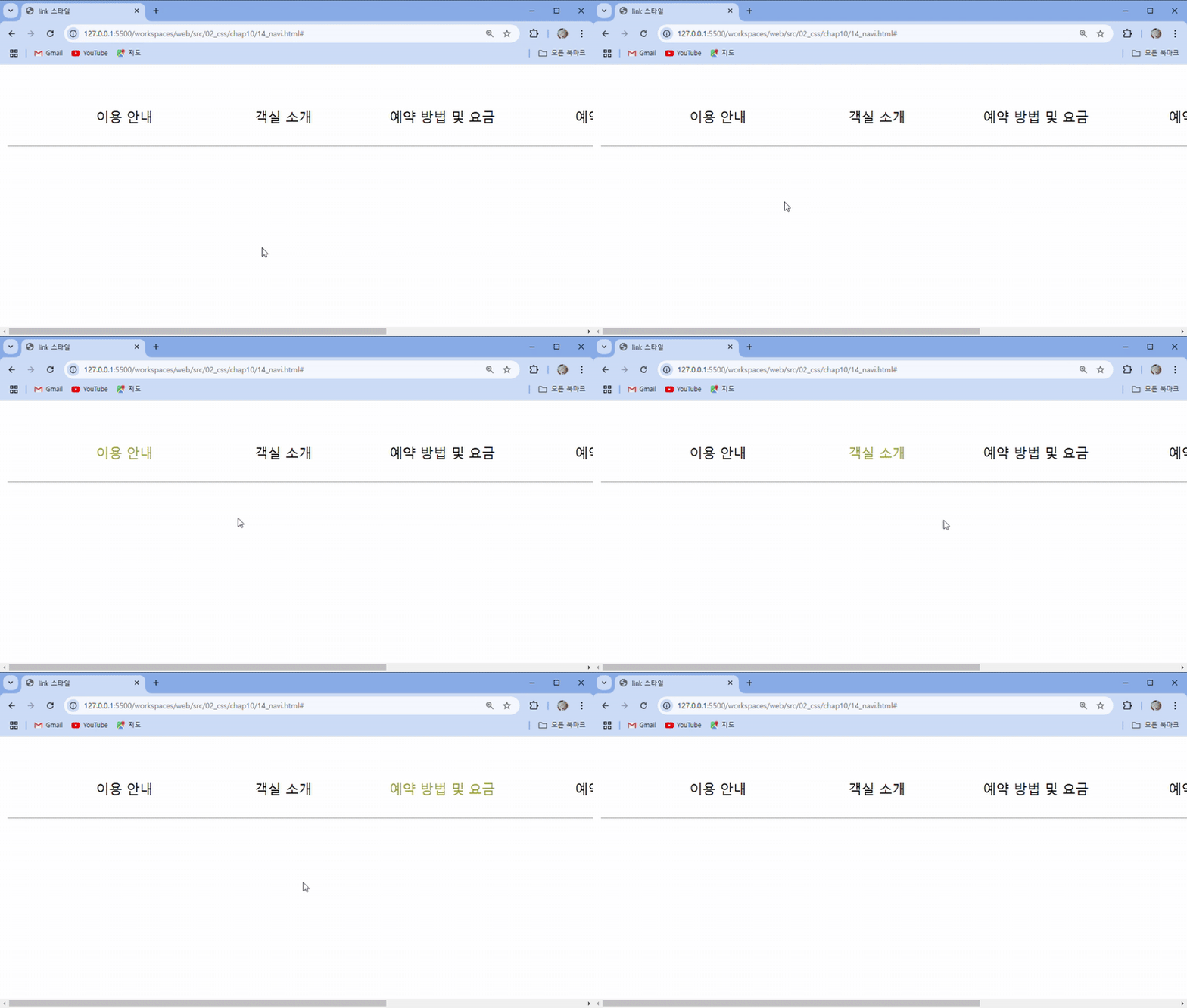
- 마우스로 클릭하고 난 뒤, 초점이 맞춰져 있을때 글자색을 초록색으로 설정
요소 상태에 따른 가상 클래스 선택자
- target - 앵커로 연결된 부분에 스타일 적용
- :enabled, :disabled - 요소의 사용 여부에 따라 스타일 적용
- :checked : 라디오 버튼이나 체크 박스에 체크했을 때 스타일 적용
코드 예시와 결과 )
- :checked를 사용했을때, 라디오 버튼 클릭 시, 글자색을 빨간색으로, 글꼴을 굵게 지정
...
    /* 라디오 버튼을 클릭했을 때 label 스타일 지정하기 */
    #signup input:checked + label{
      color:red;  /* 글자색 */
      font-weight:bold;  /* 글자 굵게 */
    }
  </style>
</head>
<body>
  <div class="container">
    <nav class="navi">
      <ul>
        <li><a href="ps-1.html#intro">이용 안내</a></li>
        <li><a href="ps-1.html#room">객실 소개</a></li>
        <li><a href="ps-1.html#reservation">예약 방법 및 요금</a></li>
        <li><a href="ps-2.html">예약하기</a></li>
      </ul>
    </nav>

    <form id="signup">
      <fieldset>
        <legend>개인 정보</legend>
        <ul>
          <li>
            <label for="fullname">이름</label>
            <input id="fullname" name="fullname" type="text" required>
          </li>
          <li>
            <label for="tel">연락처</label>
            <input id="tel" name="tel" type="tel">
          </li>
        </ul>
      </fieldset>
      <fieldset>
        <legend>객실 형태</legend>
        <ul>
          <li>
            <input type="radio" name="room" id="basic">
            <label for="basic">기본형(최대 2인)</label>
          <li>
          <li>
            <input type="radio" name="room" id="family">
            <label for="family">가족형(최대 8인)</label>
          </li>
        </ul>
      </fieldset>
      <button type="submit"> 제출 </button>
    </form>
  </div>
</body>
</html>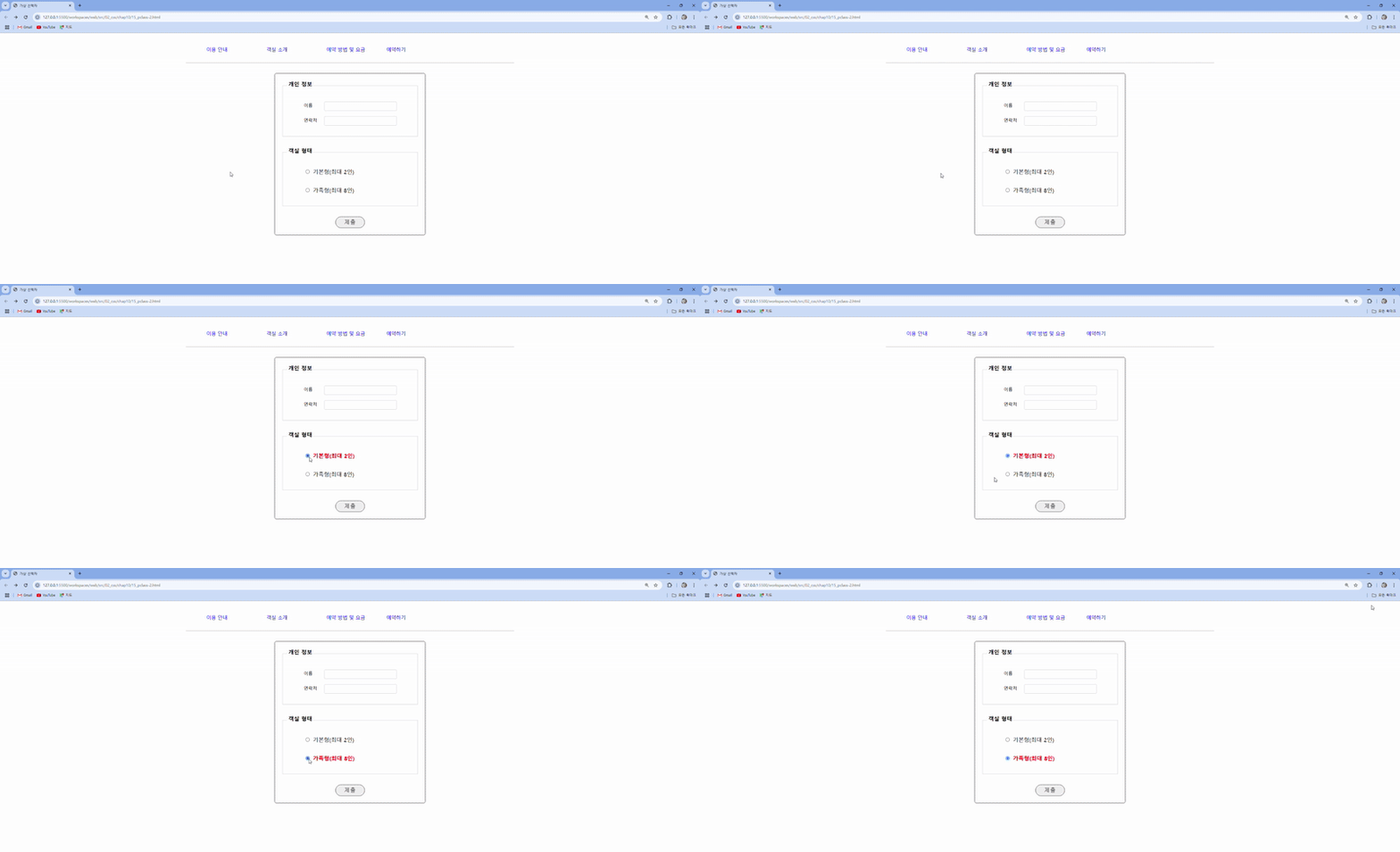
- radio 버튼 선택 시, 글자색을 빨강색으로 글꼴을 굵게 설정
요소 상태에 따른 가상 클래스 선택자
-
웹 문서의 구조를 기준으로 특정 위치에 있는 요소를 찾아 스타일 적용 -
위치가 계속 바뀐다면 an+b 처럼 수식을 사용할 수도 있음. (이 때 n값은 0부터)
선택자 설명 :first-child여러 요소 중에서 첫 번째 요소를 선택함. :last-child여러 요소 중에서 마지막 요소를 선택함. :only-child여러 요소 중에서 자식 요소가 하나일 때 선택함. :nth-child(숫자 또는 수식)지정한 위치의 자식 요소를 선택함. A:nth-of-type(숫자 또는 수식)A 요소를 기준으로 지정한 위치의 자식 요소를 선택함.
1. :first-child
첫 번째 자식 요소 선택- 코드 예시 )
...
  <title>가상 선택자</title>
  <style>
    body {
      display: flex;
      flex-direction: column;
      justify-content: center;
      align-items: center;
      height: 100vh;
      gap: 20px;
    }
    .container {
      width: 300px;
      padding: 20px;
      border: 1px solid #ccc;
      border-radius: 5px;
      text-align: center;
    }

    /* 가상 선택자를 사용해 항목 선택하기 */
    .container p:first-child{  /* 첫번째 자식 요소가 p일 때 선택 */
      background-color: #fc2;
    }
  </style>
</head>
<body>
  <div class="container">
    <p>첫 번째</p>
    <div>두 번째</div>
    <p>세 번째</p>
    <div>네 번째</div>
  </div>
  <div class="container">
    <div>혼자~</div>
  </div>
</body>
</html>
- 결과 )
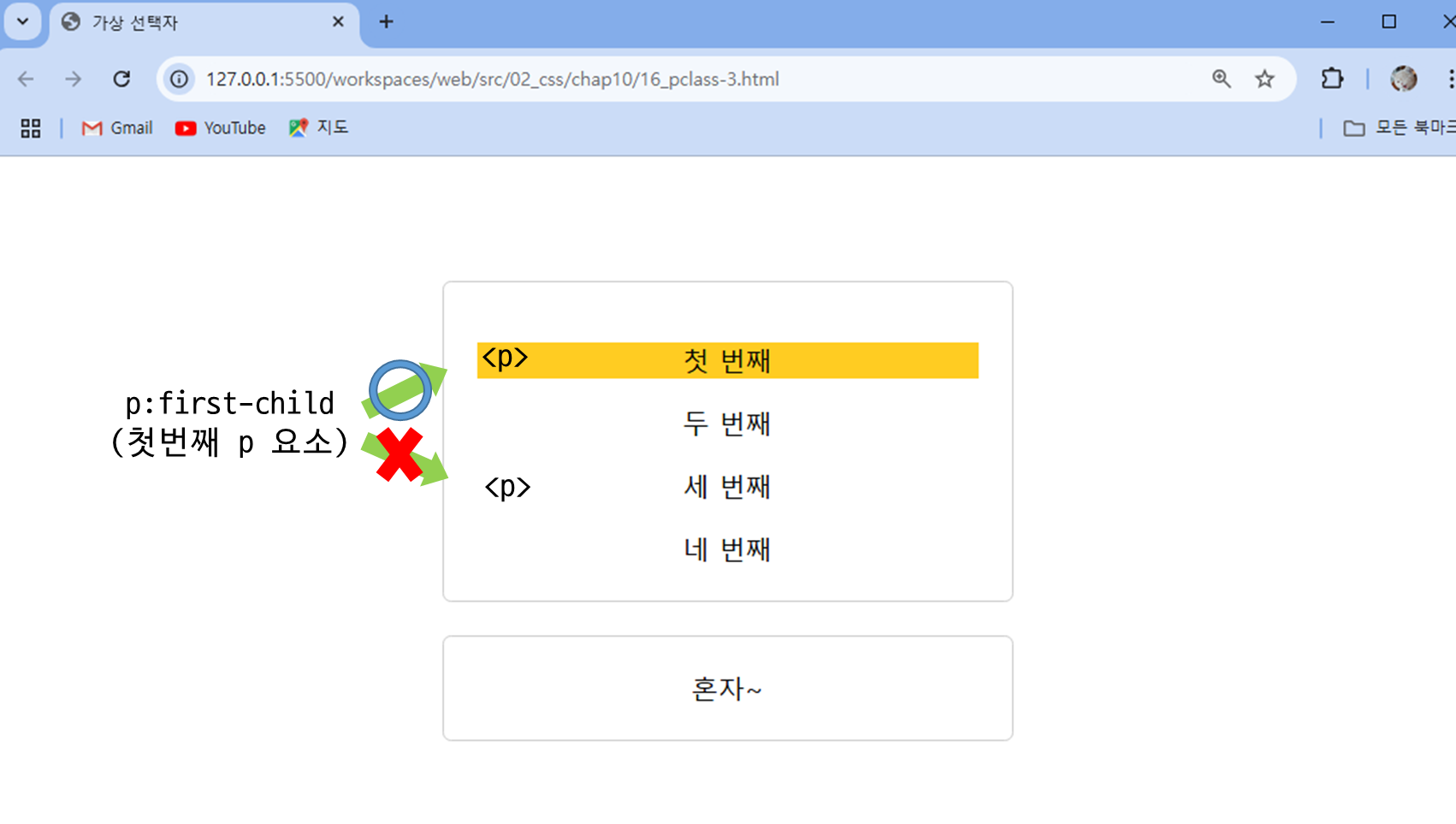
- ✅ .container p:first-child를 쓰면서
해당 코드의 첫 번째<div class="container"> <p>첫 번째</p> <div>두 번째</div> <p>세 번째</p> <div>네 번째</div> </div><p>태그에 스타일 적용
- ✅ .container p:first-child를 쓰면서
2. :last-child
마지막 자식 요소 선택- 코드 예시 )
...
<title>가상 선택자</title>
<style>
body {
display: flex;
flex-direction: column;
justify-content: ceer;
align-items: center;
height: 100vh;
gap: 20px;
}
.container {
width: 300px;
padding: 20px;
border: 1px solid #ccc;
border-radius: 5px;
text-align: center;
}
/* 가상 선택자를 사용해 항목 선택하기 */
/* 마지막 자식 요소 선택*/
.container div:last-child{
background-color: #2cf;
}
</style>
</head>
<body>
<div class="container">
  <p>첫 번째</p>
  <div>두 번째</div>
  <p>세 번째</p>
  <div>네 번째</div>
</div>
<div class="container">
<div>혼자~</div>
</div>
</body>
</html>- 결과 )
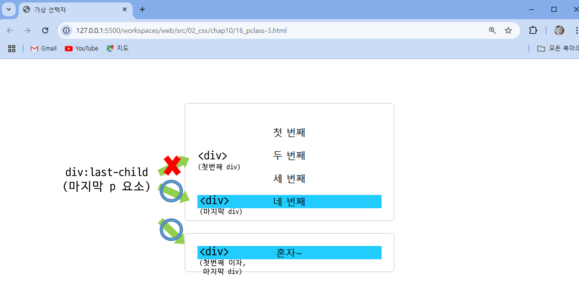
- ✅ .container div:last-child를 쓰면서
해당 코드의 마지막<div class="container"> <p>첫 번째</p> <div>두 번째</div> <p>세 번째</p> <div>네 번째</div> </div> <div class="container"> <div>혼자~</div> </div><div>태그에 스타일 적용
- ✅ .container div:last-child를 쓰면서
3. :only-child
자식요소가 하나일 때 선택- 코드 예시 )
...
<title>가상 선택자</title>
<style>
body {
display: flex;
flex-direction: column;
justify-content: center;
align-items: center;
height: 100vh;
gap: 20px;
}
.container {
width: 300px;
padding: 20px;
border: 1px solid #ccc;
border-radius: 5px;
text-align: center;
}
/* 가상 선택자를 사용해 항목 선택하기 */
/* 유일한 자식 요소가 div일 때 선택 */
.container div:only-child{
background-color: #f0c8fc;
}
</style>
</head>
<body>
<div class="container">
  <p>첫 번째</p>
  <div>두 번째</div>
  <p>세 번째</p>
  <div>네 번째</div>
</div>
<div class="container">
  <div>혼자~</div>
</div>
</body>
</html>- 결과 )
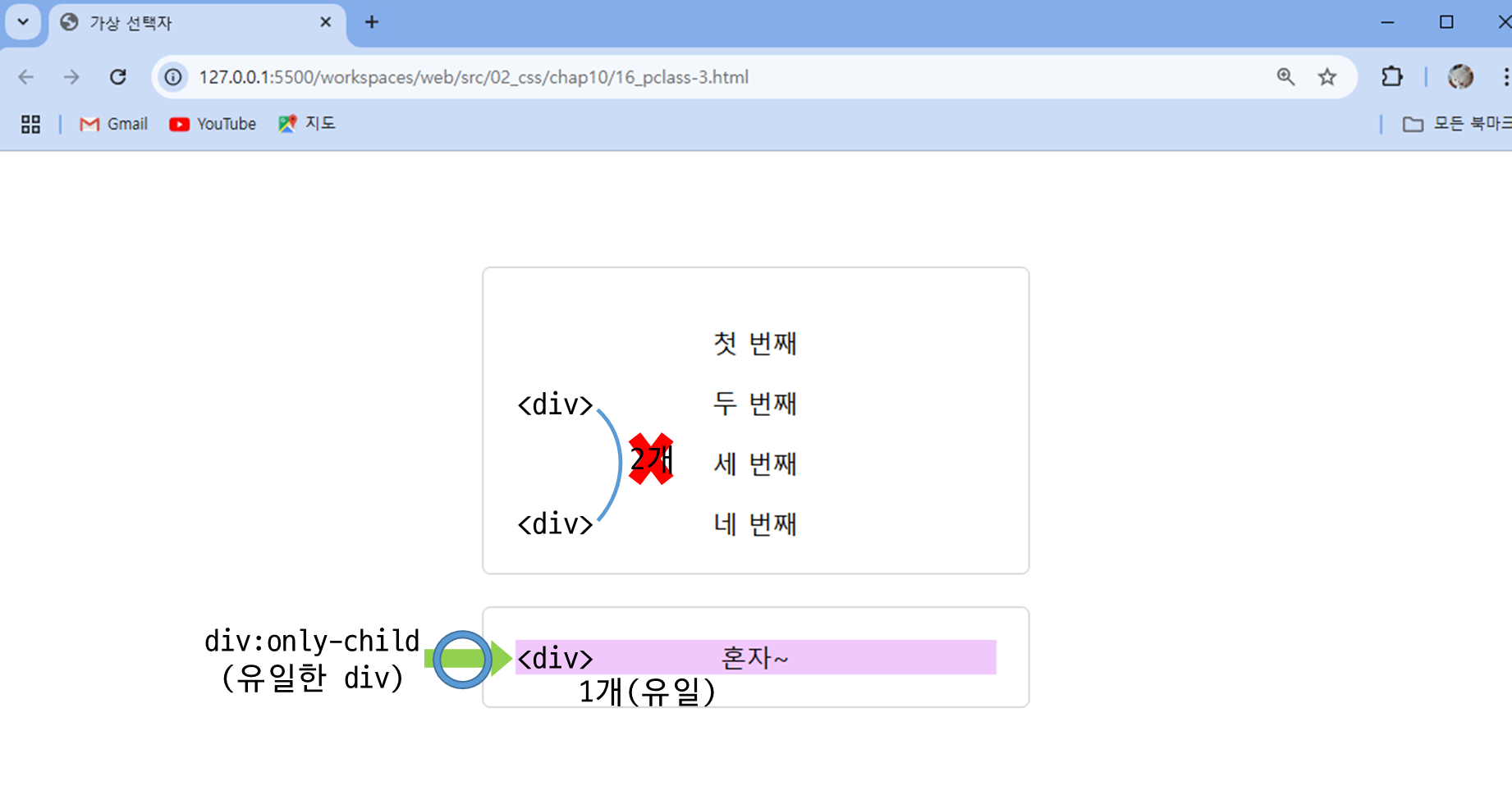
- ✅ .container div:only-child를 쓰면서
해당 코드에서 자식 요소가 하나 인, 밑에 있는 container class의 div를 선택해서 스타일 적용<div class="container"> <p>첫 번째</p> <div>두 번째</div> <p>세 번째</p> <div>네 번째</div> </div> <div class="container"> <div>혼자~</div> </div>
- ✅ .container div:only-child를 쓰면서
4. :nth-child()
지정한 위치의 자식 요소를 선택
4-1. 괄호 안의 위칫값을 숫자로 지정
- 예)
:nth-child(3)
- 코드 예시 1 ) - 위치값 지정
...
  <title>가상 선택자</title>
  <style>
    body {
      display: flex;
      justify-content: center;
      align-items: center;
      height: 100vh;
    }
    .container {
      width: 600px;
      display: flex;
      justify-content: space-between;
      align-items: center;
      gap: 5px;
    }
    .item {
      border: 1px solid #ccc;
      border-radius: 5px;
      padding: 20px;
    }

    /* 가상 선택자를 사용해 항목 선택하기 */
    /* 3번째 자식 요소 선택 */
    .container :nth-child(3) {
      background-color: #fc2;
    }
  </style>
</head>
<body>
  <div class="container">
    <div class="item">1</div>
    <div class="item">2</div>
    <div class="item">3</div>
    <div class="item">4</div>
    <div class="item">5</div>
    <div class="item">6</div>
    <div class="item">7</div>
    <div class="item">8</div>
  </div>
</body>
</html>-
결과 1)
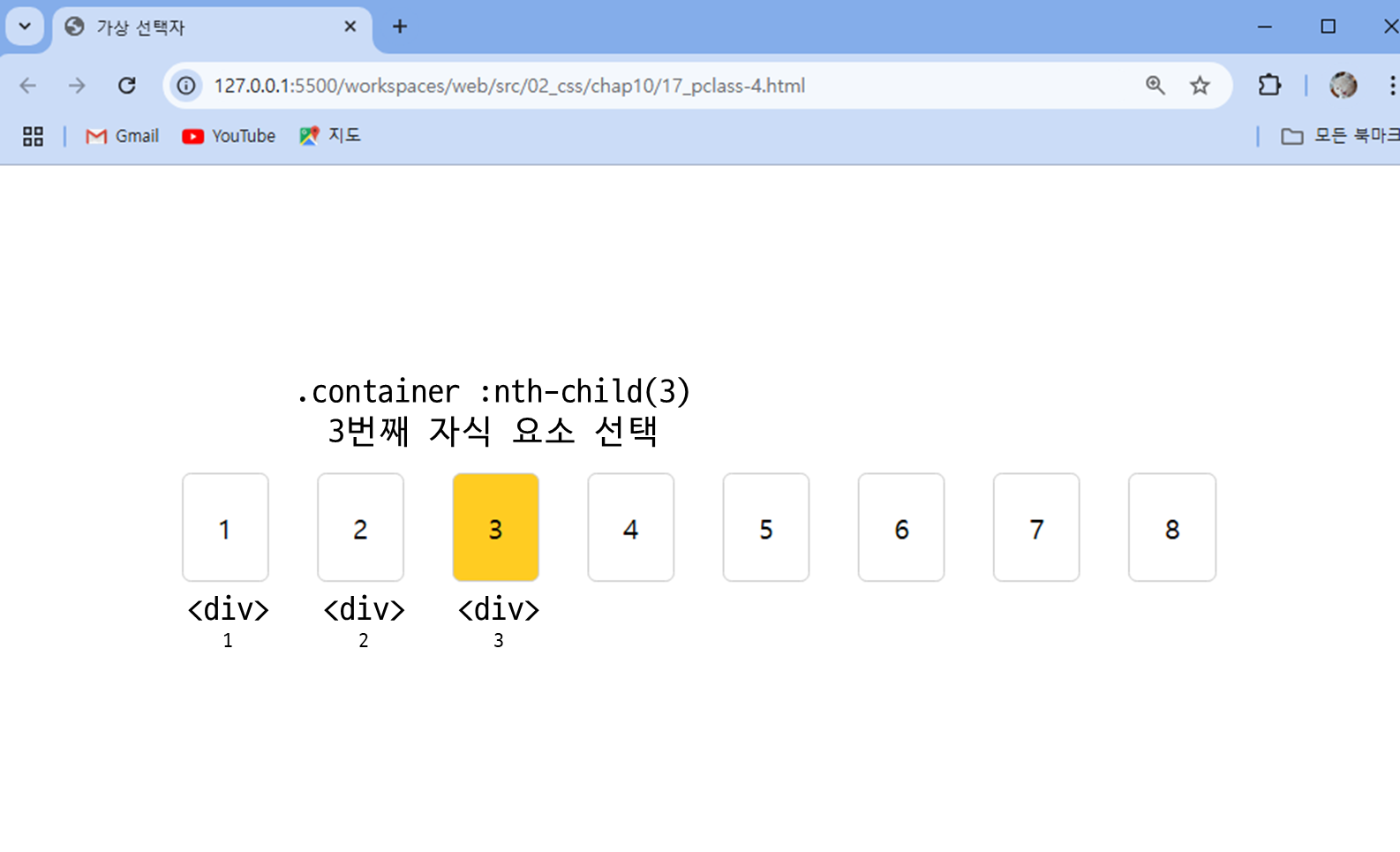
- ✅ .container :nth-child(3)를 쓰면서
container 클래스에 있는 자식 중, 3번째 자식에 스타일 적용... .container :nth-child(3) { background-color: #fc2; } ... <div class="container"> <div class="item">1</div> <div class="item">2</div> <div class="item">3</div> <div class="item">4</div> ...
- ✅ .container :nth-child(3)를 쓰면서
4-2. odd, even을 사용할 수도 있음 (짝,홀)
- 예)
:nth-child(even)
- 코드 예시 2 ) - odd, even
...
  <title>가상 선택자</title>
  <style>
    body {
      display: flex;
      justify-content: center;
      align-items: center;
      height: 100vh;
    }
    .container {
      width: 600px;
      display: flex;
      justify-content: space-between;
      align-items: center;
      gap: 5px;
    }
    .item {
      border: 1px solid #ccc;
      border-radius: 5px;
      padding: 20px;
    }

    /* 가상 선택자를 사용해 항목 선택하기 */

    /* 홀수번째 자식 요소 선택 */
    .container :nth-child(odd) {
      background-color: #fc2;
    }
  </style>
</head>
<body>
  <div class="container">
    <div class="item">1</div>
    <div class="item">2</div>
    <div class="item">3</div>
    <div class="item">4</div>
    <div class="item">5</div>
    <div class="item">6</div>
    <div class="item">7</div>
    <div class="item">8</div>
  </div>
</body>
</html>- 결과 2 )
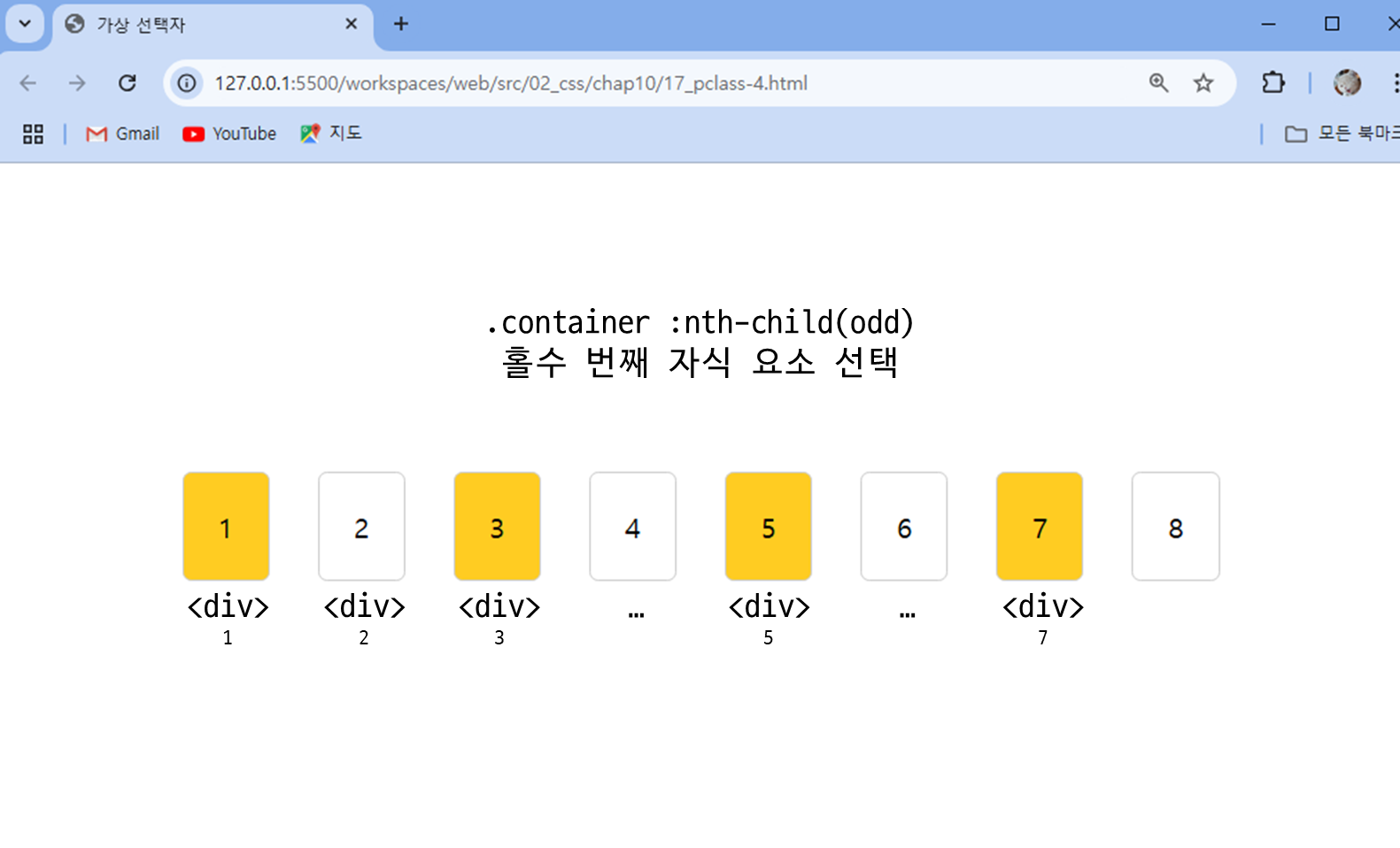
- ✅ .container :nth-child(odd)를 쓰면서
container 클래스에 있는 자식 중, 홀수 번째 자식에 스타일 적용... .container :nth-child(odd) { background-color: #fc2; } ... <div class="container"> <div class="item">1</div> <div class="item">2</div> <div class="item">3</div> <div class="item">4</div> ...
- ✅ .container :nth-child(odd)를 쓰면서
4-3. 패턴이 있을 경우, 식을 사용할 수 있음
- 예)
:nth-child(2n),:nth-child(2n + 1)
- 코드 예시 3 ) - 2n, 3n, 4n+1…
...
  <title>가상 선택자</title>
  <style>
    body {
      display: flex;
      justify-content: center;
      align-items: center;
      height: 100vh;
    }
    .container {
      width: 600px;
      display: flex;
      justify-content: space-between;
      align-items: center;
      gap: 5px;
    }
    .item {
      border: 1px solid #ccc;
      border-radius: 5px;
      padding: 20px;
    }

    /* 가상 선택자를 사용해 항목 선택하기 */

    /* 3의 배수번째 자식 요소 선택 */
    .container :nth-child(3n) {
      background-color: #fc2;
    }
  </style>
</head>
<body>
  <div class="container">
    <div class="item">1</div>
    <div class="item">2</div>
    <div class="item">3</div>
    <div class="item">4</div>
    <div class="item">5</div>
    <div class="item">6</div>
    <div class="item">7</div>
    <div class="item">8</div>
  </div>
</body>
</html>-
결과 3 )
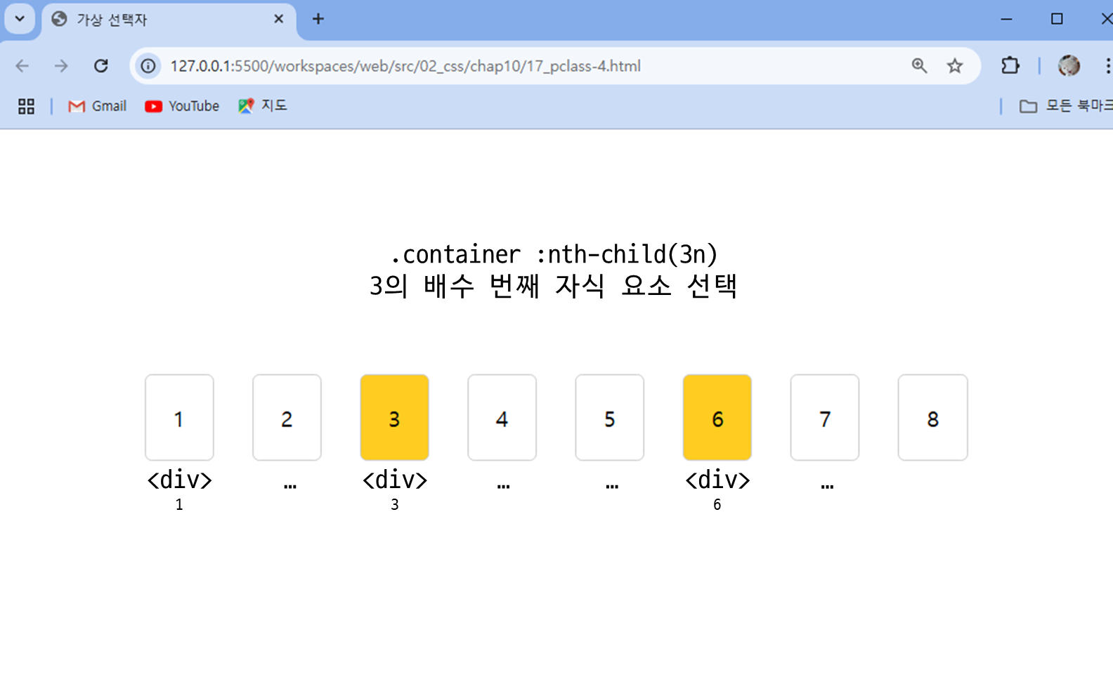
- ✅ .container :nth-child(3n)를 쓰면서
container 클래스에 있는 자식 중, 3의 배수 번째 자식에 스타일 적용... .container :nth-child(3n) { background-color: #fc2; } ... <div class="container"> <div class="item">1</div> <div class="item">2</div> <div class="item">3</div> <div class="item">4</div> ...
- ✅ .container :nth-child(3n)를 쓰면서
5. :nth-of-type()
같은 타입의 요소들 사이에서 순서를 지정하는 클래스- 예 ) .container 하위 요소 중 p 태그 요소 중에서 첫번째를 선택하려면
.container p:nth-of-type(1)
- 예 ) .container 하위 요소 중 p 태그 요소 중에서 첫번째를 선택하려면
- 코드 예시 )
...
  <title>가상 선택자</title>
  <style>
    body {
      display: flex;
      flex-direction: column;
      justify-content: center;
      align-items: center;
      height: 100vh;
      gap: 20px;
    }
    .container {
      width: 300px;
      padding: 20px;
      border: 1px solid #ccc;
      border-radius: 5px;
      text-align: center;
    }

    /* 가상 선택자를 사용해 항목 선택하기 */
    .container p:nth-of-type(1){  /* p 요소 중 첫번째 요소 선택 */
      background-color: #fc2;
    }
    .container div:nth-of-type(2){  /* div 요소 중 두번째 요소 선택*/
      background-color: #2cf;
    }
  </style>
</head>
<body>
  <div class="container">
    <p>첫 번째</p>
    <div>두 번째</div>
    <p>세 번째</p>
    <div>네 번째</div>
  </div>
</body>
</html>
- 결과 )
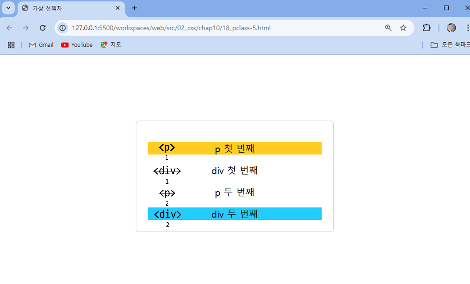
- ✅ .container p:nth-of-type(1)와 .container div:nth-of-type(2)를 쓰면서
해당 코드의 첫 번째 p 태그와 두 번째 div 태그에 스타일 적용<div class="container"> <p>첫 번째</p> <div>두 번째</div> <p>세 번째</p> <div>네 번째</div> </div>
- ✅ .container p:nth-of-type(1)와 .container div:nth-of-type(2)를 쓰면서
6. :not()
괄호 안에 있는 요소를 제외하고 선택- CSS 선택자 부분을 간결하게 표현할 수 있음.
- 코드 예시 )
...
  <title>가상 선택자</title>
  <style>
    .container {
      width: 960px;
      margin : 0 auto;
...
...
    #signup input:not([type=radio]) {
      border: 1px solid #ccc;
      border-radius: 3px;
      padding: 5px;
      width: 200px;
    }

    #signup button {
      border: 1px solid #222;
      border-radius: 20px;
      display: block;
      font: 16px 맑은고딕,굴림,돋움;
      letter-spacing: 1px;
      margin: auto;
      padding: 7px 25px;
    }

    #signup b {
      float: left;
      font-size: 13px;
      width: 110px;
    }
    ...
  </style>
</head>
<body>
  <div class="container">
    <nav class="navi">
      <ul>
        <li><a href="ps-1.html#intro">이용 안내</a></li>
        <li><a href="ps-1.html#room">객실 소개</a></li>
        <li><a href="ps-1.html#reservation">예약 방법 및 요금</a></li>
        <li><a href="ps-2.html">예약하기</a></li>
      </ul>
    </nav>

    <form id="signup">
      <fieldset>
        <legend>개인 정보</legend>
        <ul>
          <li>
            <label for="fullname">이름</label>
            <input id="fullname" name="fullname" type="text" required>
          </li>
          <li>
            <label for="tel">연락처</label>
            <input id="tel" name="tel" type="tel">
          </li>
        </ul>
      </fieldset>
      <fieldset>
        <legend>객실 형태</legend>
        <ul>
          <li>
            <input type="radio" name="room" id="basic">
            <label for="basic">기본형(최대 2인)</label>
          <li>
          <li>
            <input type="radio" name="room" id="family">
            <label for="family">가족형(최대 8인)</label>
          </li>
        </ul>
      </fieldset>
      <button type="submit"> 제출 </button>
    </form>
  </div>
</body>
</html>- 결과 )
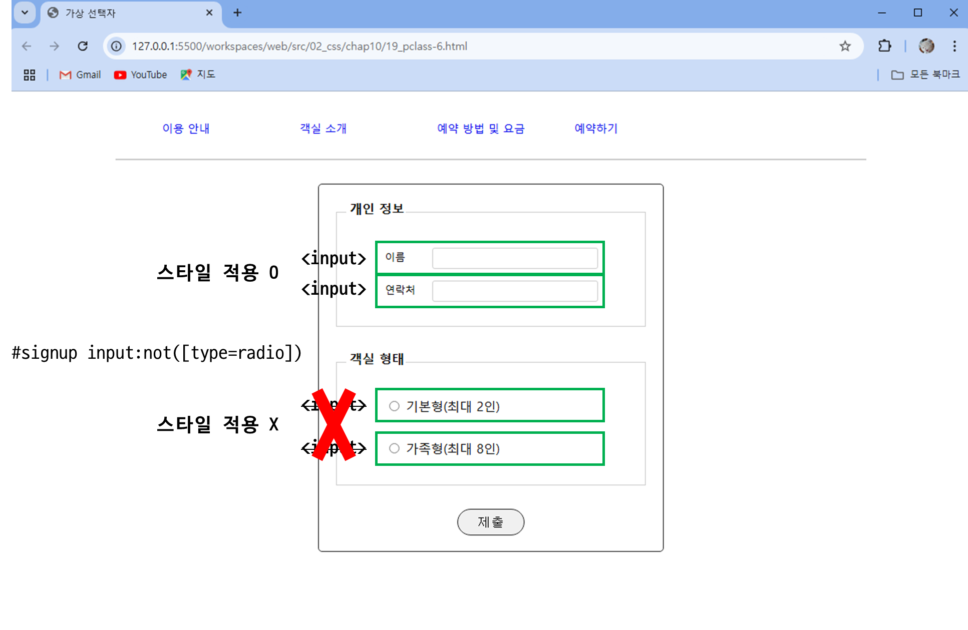
- ✅ #signup input:not([type=radio])를 쓰면서
id = signup 하위 요소 중, input 태그 내에 type=radio를 제외한 type에 스타일 적용<form id="signup"> <fieldset> <legend>개인 정보</legend> <ul> <li> <label for="fullname">이름</label> <input id="fullname" name="fullname" type="text" required> </li> <li> <label for="tel">연락처</label> <input id="tel" name="tel" type="tel"> </li> </ul> </fieldset> <fieldset> <legend>객실 형태</legend> <ul> <li> <input type="radio" name="room" id="basic"> <label for="basic">기본형(최대 2인)</label> <li> <li> <input type="radio" name="room" id="family"> <label for="family">가족형(최대 8인)</label> </li> </ul> </fieldset> <button type="submit"> 제출 </button> </form>
즉, type=text와 type=tel에 적용됨
- ✅ #signup input:not([type=radio])를 쓰면서
4. 가상 요소
- 화면 꾸미기용 요소를 웹 문서에 포함시키지 않기 위해 가상 요소 사용
::first-line, ::first-letter 요소
1. ::first-letter
특정 요소의 첫 번째 글자에 스타일 적용
- 코드 예시 )
<!DOCTYPE html>
<html lang="ko">
<head>
  <meta charset="UTF-8">
  <meta name="viewport" content="width=device-width, initial-scale=1.0">
  <title>가상 요소</title>
  <style>
    body {
      display: flex;
      justify-content: center;
      align-items: center;
      height: 100vh;
    }
    .container {
      width:800px;
      padding: 40px;
      border: 1px solid #ccc;
      border-radius: 5px;
      position: relative;
    }

    /* 단락의 첫번째 글자에 스타일 지정하기 */
    p::first-letter{
      font-size: 2em;
      font-weight: bold;
    }
  </style>
</head>
<body>
  <div class="container">
    <h1>CSS 가상 요소</h1>
    <p>가상 요소를 사용하면 CSS로 시각적 변화를 줄 수 있습니다. 이는 성능을 저하시키지 않으면서 웹 페이지를 꾸밀 수 있는 효율적인 방법입니다.</p>
  </div>
</body>
</html>-
결과 )
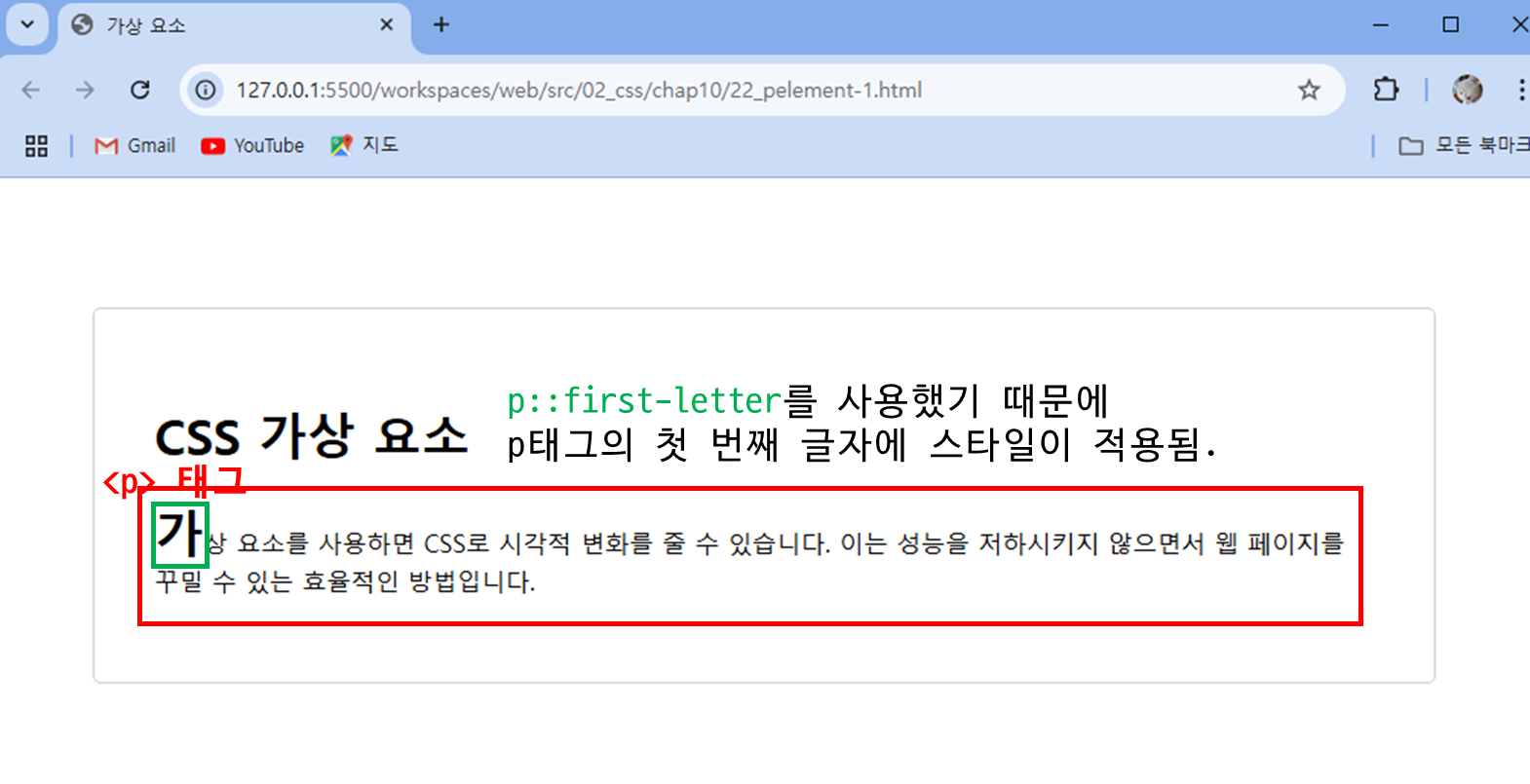
- ✅ p::first-letter{}를 쓰면서
... p::first-letter{ font-size: 2em; font-weight: bold; } ...<p>태그의 첫 번째 글자에 스타일이 적용됨
- ✅ p::first-letter{}를 쓰면서
2. ::first-line
특정 요소의 첫 번째 줄에 스타일 적용
- 코드 예시 )
<!DOCTYPE html>
<html lang="ko">
<head>
  <meta charset="UTF-8">
  <meta name="viewport" content="width=device-width, initial-scale=1.0">
  <title>가상 요소</title>
  <style>
    body {
      display: flex;
      justify-content: center;
      align-items: center;
      height: 100vh;
    }
    .container {
      width:800px;
      padding: 40px;
      border: 1px solid #ccc;
      border-radius: 5px;
      position: relative;
    }

    /* 단락의 첫번째 줄에 스타일 지정하기 */
    p::first-line{
      font-size: 2em;
      font-weight: bold;
    }
  </style>
</head>
<body>
  <div class="container">
    <h1>CSS 가상 요소</h1>
    <p>가상 요소를 사용하면 CSS로 시각적 변화를 줄 수 있습니다. 이는 성능을 저하시키지 않으면서 웹 페이지를 꾸밀 수 있는 효율적인 방법입니다.</p>
  </div>
</body>
</html>- 결과 )
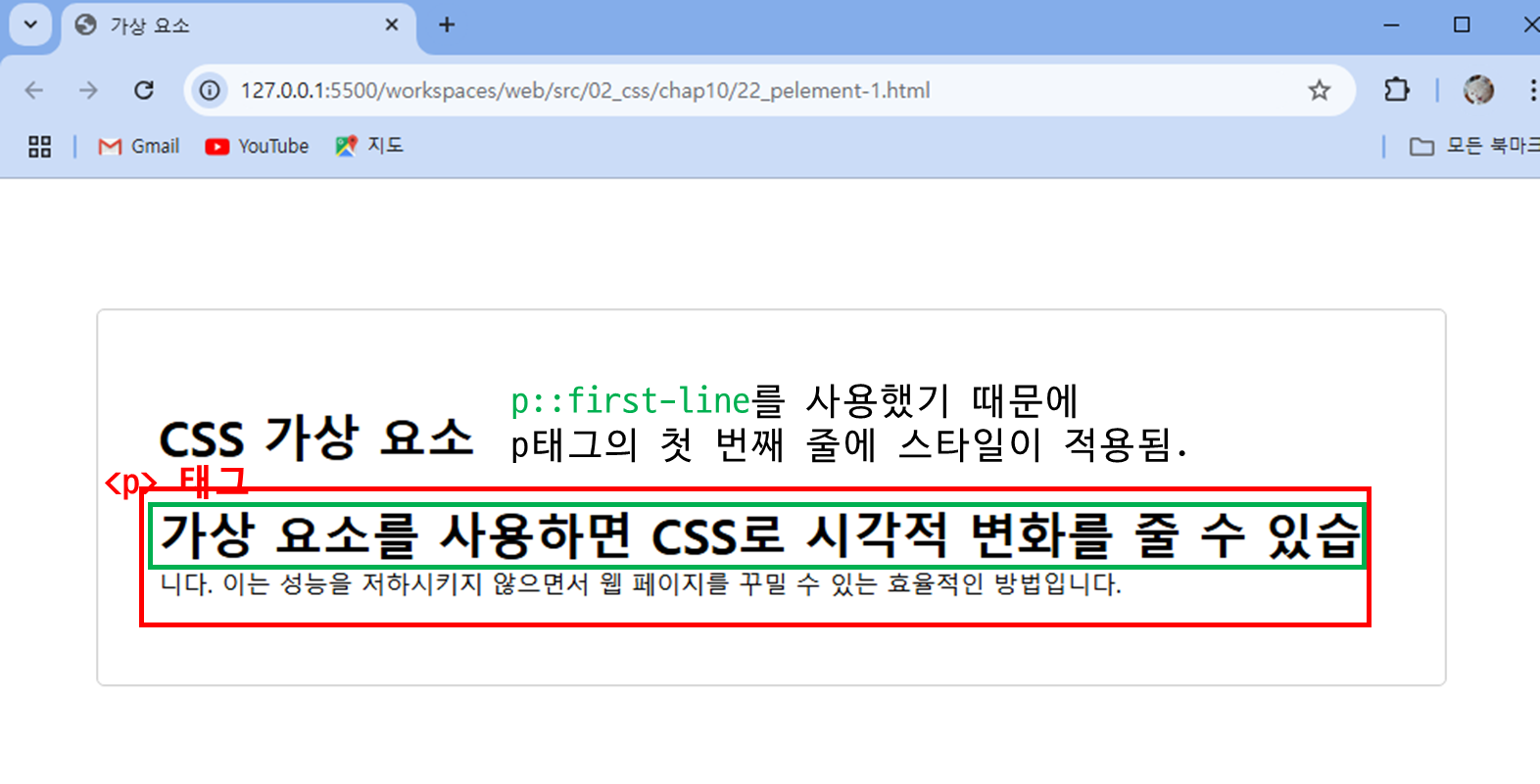
- ✅ p::first-line{}를 쓰면서
... p::first-line{ font-size: 2em; font-weight: bold; } ...<p>태그의 첫 번째 줄에 스타일이 적용됨
::before, ::after 요소
특웹 요소의 앞이나 뒤에 내용이나 스타일을 넣을 수 있다.- 항상 content 속성을 사용해야 한다. 내용 없이 스타일만 지정할 경우에는
content: “ “;
- 코드 예시 )
<!DOCTYPE html>
<html lang="ko">
<head>
  <meta charset="UTF-8">
  <meta name="viewport" content="width=device-width, initial-scale=1.0">
  <title>가상 요소</title>
  <style>
    body {
      display: flex;
      justify-content: center;
      align-items: center;
      height: 100vh;
    }
    .container {
      padding: 40px;
      text-align: center;
      border: 1px solid #ccc;
      border-radius: 5px;
      position: relative;
    }
    h1::before {
      content: "*";
      color: red;
      margin-right: 5px;
    }
    h1::after {
      content: "🎉";
      margin-left: 50px;
    }
  </style>
</head>
<body>
  <div class="container">
    <h1>CSS 가상 요소</h1>
    <p><span>가상 요소</span>를 사용하면 CSS로 시각적 변화를 줄 수 있습니다. </p>
  </div>
</body>
</html>- 결과 )
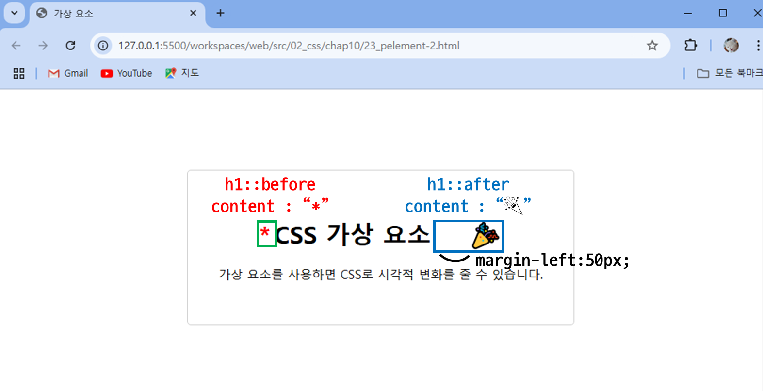
- ✅ h1::before과 h1::after를 쓰면서
h1 태그 앞에는 content *를 뒤에는 content 🎉 를 추가함... h1::before { content: "*"; color: red; margin-right: 5px; } h1::before { content: "🎉"; margin-left: 50px; } ...

Hi