React에서의 다양한 스타일 적용 방법

React를 사용하지 않고 HTML CSS JS 만으로 웹사이트를 만들 때, 스타일을 적용하는 여러가지 방법이 존재한다. 이 있다. 물론 나는 한가지 방법으로 밖에 안했지만 개발을 하는 입장에서 상황에 맞춰 여러가지 방법들을 사용할줄 아는게 작업의 속도와 효율성을 높이는 길이라 생각한다.
이번에는 React의 스타일 적용방법에 대해 알아보고 어떤 방법이 가장 좋을지에 대해 생각해 보아야 겠다.
React의 스타일 CSS 적용 방법
React JS의 스타일 css 적용 방법은 매우 많지만 이번 기회에는 크게 4가지만 알아볼 예정이다.
- inline style 사용
- css file을 통한 stylesheet 사용
- style.module.css file 사용
- styled component 사용
앞서 얘기했드시 모든 방법에는 각각의 장단점이 존재한다. 하지만 프로젝트 내에서 스타일 적용 방법을 통일하는게 협업이나 이후 유지보수 측면에서 좋을것이라 생각하기 때문에 나에게 잘 맞는 스타일 적용 방법을 알아보자.
Inline style 사용
첫번째 방법은 html element 부분에 inline으로 style 요소를 입력해주는 방법이다.
<div style={{display: "flex"}}>
  <div style={{backgroundColor: "orange", width: "200px", height: "200px", borderRadius: "100px"}}></div>
  <div style={{backgroundColor: "blue", width: "200px", height: "200px", borderRadius: "100px"}}></div>
</div>
이 방법의 가장 큰 장점은 작성하기 편한 것이다. 물론 코드의 양이 많지 않을 때 한정이긴 하지만 별도의 css 파일이나 다른 tool을 사용할 필요 없이 원하는 element에 style 문법을 작성해주면 style이 적용된다.
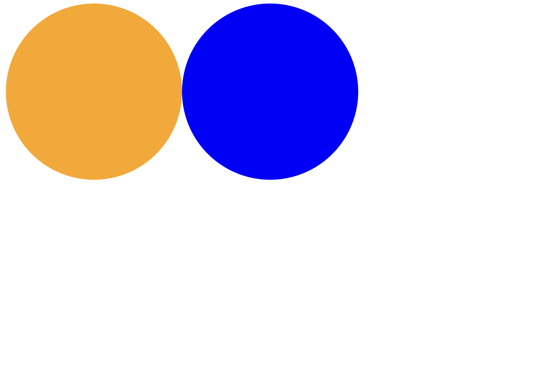
하지만 원하는 element에 모두 style을 적용해야 하기 때문에 코드 중복이 일어나고 코드의 양이 많아지면 작업량이 매우매우 많아진다는 단점이 있다. 당장 위의 코드만 보아도 background color만 다른 두가지 원을 만들었지만 나머지 style도 중복해서 작성해 주어야 한다는 것을 확인할 수 있다.
CSS 파일을 통한 stylesheet 사용
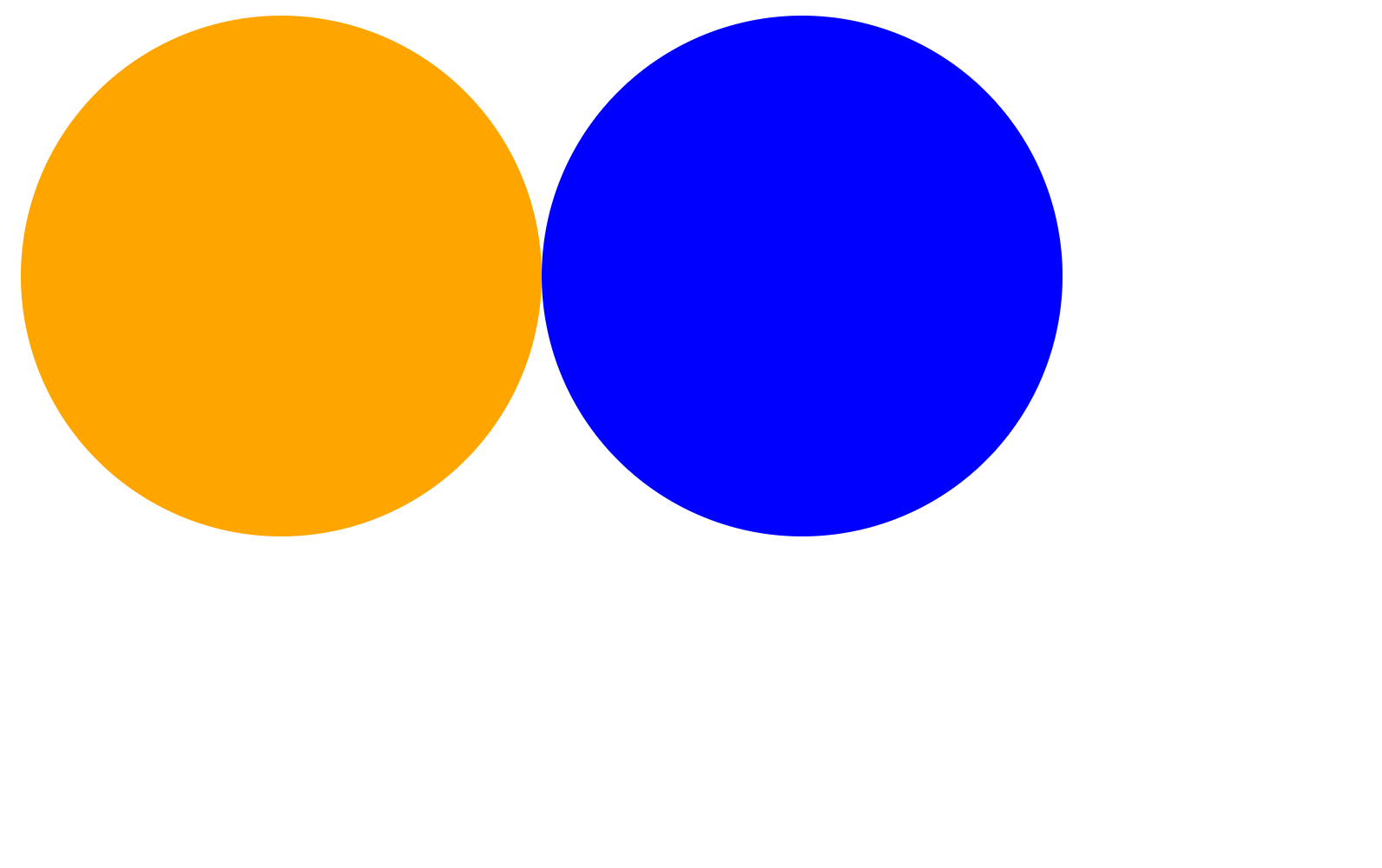
두번재는 vanilla JS를 통해 웹사이트를 만들 때 가장 많이 사용하는 방법인 stylesheet 사용이다. 원하는 element에 class 혹은 id를 지정해주고 stylesheet를 통해 이를 한번에 관리하는 방법이다. 이 방법을 사용하게 되면 class를 통해 원하는 style을 여러가지 element에 동시에 적용할 수 있고 style을 독립적으로 관리하기 때문에 유지보수가 쉽다는 장점이 존재한다.
<div className="main">
  <div className="circle circle__orange"></div>
  <div className="circle circle__blue"></div>
</div>
.circle {
width: 200px;
height: 200px;
border-radius: 200px;
}
.circle__orange {
background-color: orange;
}
.circle__blue {
background-color: blue;
}
.main {
display: flex;
}첫번째 방법인 inline style 과 비교해 보았을 때 가장 먼저 코드의 가독성이 좋아진 것을 느낄 수 있다. style에 대한 내용을 보지 않고 class를 통해 주황색 원과 파란색 원이 있다는 사실을 알 수 있다. 또한 코드의 중복이 줄어들었다. 똑같은 style을 적용하고 싶으면 같은 class를 지정해주면 된다. 만약 새로운 원을 만들고 싶으면 div element에 "circle" class만 추가해주면 된다.
하지만 React 특성 상 코드에 많은 수의 component가 존재하게 된다. component 별로 다른 스타일을 적용하고 싶을 때 위 방법을 이용하게 된다면 각각의 class 이름을 다르게 설정해 주어야 한다.
예를 들면서 이해해 보자.
A, B 의 두가지 component가 존재한다고 생각해보자. 두 component 모두 circle이 존재하지만 A의 circle은 크기가 작은 circle이 있어야 한다. 이 경우 A component에는
circle__small등의 className을 추가해 주어야 한다.
사실 처음에는 이 문제가 왜 불편한지 잘 몰랐다... 하지만 React 사용자들은 여러가지 component에 모두 같은 css 파일을 적용하여 className을 신경써줘야 한다는 것에 불편함을 느꼈고, component 별로 독립된 css 파일을 적용하는 것을 필요로 하였던 것 같다.
style.module.css file 사용
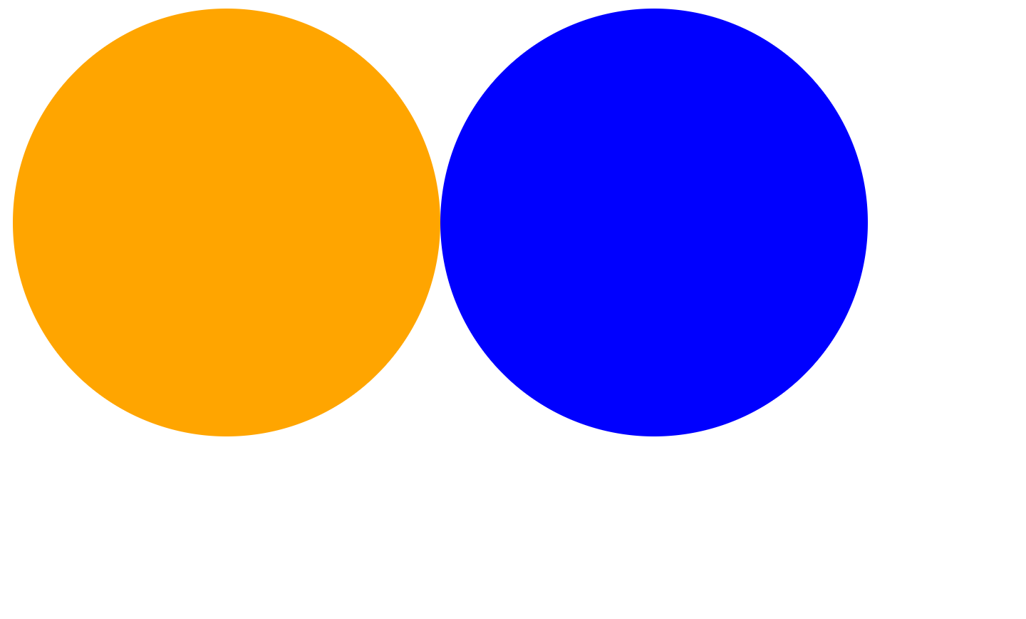
style.module.css 는 component 별로 별도의 css 파일을 통해 독립된 스타일을 적용해 주는 방법이다. 코드를 통해 이해하는것이 가장 쉬운 방법이라고 생각한다.
여러개의 component가 존재하는 상황을 만들기 위해 CircleOrange와 CircleBlue 두가지 component를 생성하고 App.js 에 import 하였다.
import CircleOrange from "./CircleOrange";
import CircleBlue from "./CircleBlue";

function App() {
  return (
    <div>
      <CircleOrange></CircleOrange>
      <CircleBlue></CircleBlue>
    </div>
  );
}

export default App;
이제 component별로 다른 style을 적용하여야 한다.
import styled from "./CircleOrange.module.css";

const CircleOrange = () => {
  return <div className={styled.circle}></div>;
};
export default CircleOrange;
/* CircleOrange.module.css */

.circle {
  width: 200px;
  height: 200px;
  border-radius: 100px;
  background-color: orange;
}
CircleOrange와 마찬가지로 CircleBlue 역시 만들어야 한다. 이 때 두 component에 같은 className을 줘야 한다.
import styled from "./CircleBlue.module.css";

const CircleBlue = () => {
  return <div className={styled.circle}></div>;
};
export default CircleBlue;
/* CircleBlue.module.css */

.circle {
  width: 200px;
  height: 200px;
  border-radius: 100px;
  background-color: blue;
}
결과창을 확인해보자.
circle이라는 같은 className을 주었지만 module 별로 다른 css 파일을 적용하였기 때문에 각각 다른 색의 원이 그려진 것을 확인할 수 있다.

하지만 또한 위와 같이 random으로 style.module.css 의 이름에 따른 class를 생성해주는 것을 확인할 수 있다. 이를 통해 같은 class를 지정해도 import하는 module에 따라 서로 다른 style을 적용하는 것이 가능해진다.
styled component 사용
마지막을 styled component를 사용하는 방법이다. 가장 직관적이고 작성하기 편한 방법이기 때문에 아마 가장 보편적으로 사용되는 방법이 아닐까 생각한다.
styled component를 사용하기 위해서는 module을 다운받아야 한다.
$ npm i styled-components이후 component 파일에 styled component를 만들어주어야 한다.
import styled from "styled-components";

const CircleOrange = styled.div`
  width: 200px;
  height: 200px;
  border-radius: 100px;
  background-color: orange;
`;

function App() {
  return (
    <div>
      <CircleOrange></CircleOrange>
    </div>
  );
}
코드를 보면 알 수 있드시 styled component란 component 파일에 style이 있는 element를 생성해주는 것이다. 이를 이용하면 css 파일을 따로 관리해줄 필요도 없고 style을 component에서 직접 관리하기 때문에 props 등을 이용해서 style을 적용하여 중복된 코드 역시 피할 수 있다. styled component를 이용해 파란색 원을 그려보자.
import styled from "styled-components";

const Main = styled.div`
  display: flex;
`;

const Circle = styled.div`
  width: 200px;
  height: 200px;
  border-radius: 100px;
  background-color: ${(props) => props.bgColor};
`;

function App() {
  return (
    <Main>
      <Circle bgColor={"orange"}></Circle>
      <Circle bgColor={"blue"}></Circle>
    </Main>
  );
}

export default App;
bgColor라는 props를 이용하여 style을 다르게 주었다. 이를 통해 코드의 중복을 제거할 수 있고 재사용성이 늘어났다.
다음은 styled component의 기능에 대해 몇가지 알아보자.
as 사용
만약 주황색 원을 link로 사용하고 싶다면 어떻게 해야할까? 파란색 원과 같은 styled component를 공유하고 있기 때문에 styled component를 건드리는 것은 좋은 방법이 아니다. 이 때 사용되는 것이 as 이다. as를 이용하면 styled component에서 스타일만 가져다 쓰면서 다른 tag를 사용하는 것이 가능하다.
function App() {
  return (
    <Main>
      <Circle as="a" href="#" bgColor={"orange"}></Circle>
      <Circle bgColor={"blue"}></Circle>
    </Main>
  );
}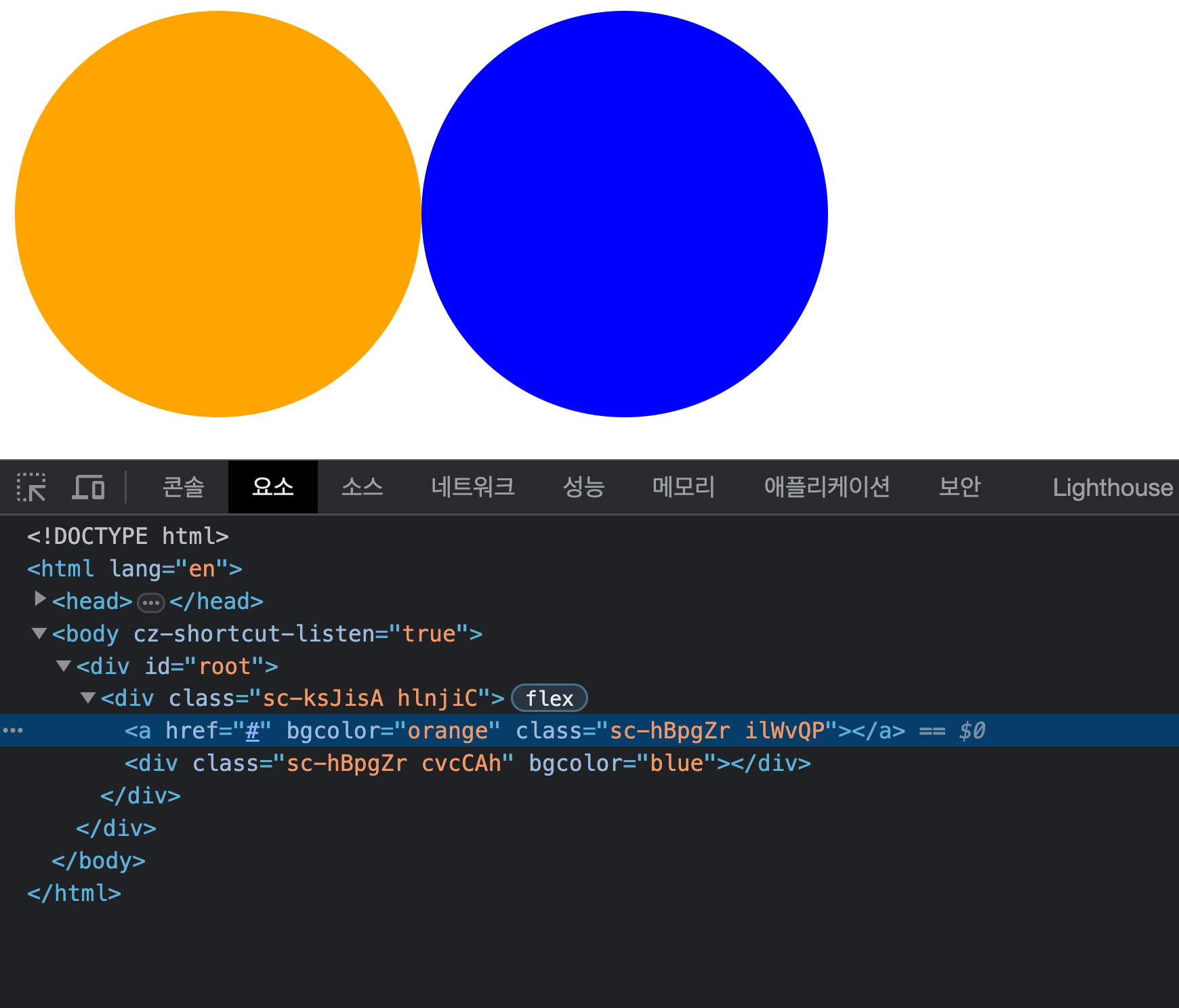
주황색 원이 div가 아닌 a로 변경된 것을 확인할 수 있다.
속성(attribute) 추가하기
styled component에서는 HTML 같이 element의 속성 역시 추가할 수 있다. <input>을 예로 들어보자.
const Input = styled.input.attrs({ placeholder: "add your name" })`
  height: 30px;
`;

function App() {
  return (
    <Main>
      <Input></Input>
    </Main>
  );
}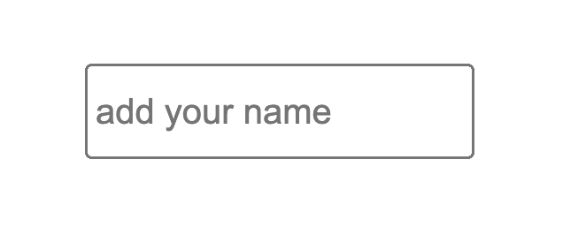
attrs method를 이용해 placholder 속성을 추가할 수 있다.
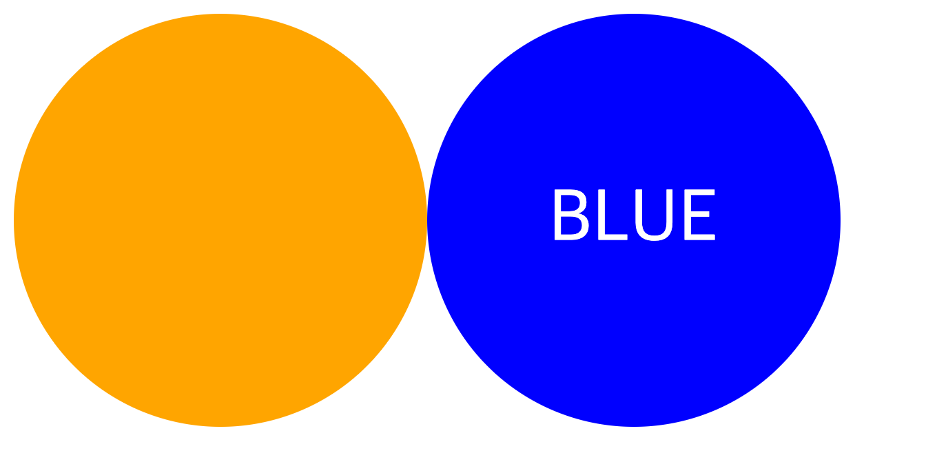
child element 선택
기존 css 파일에서는 child element를 선택하기 위해 > 등의 기호를 사용하였다.
.circle > span {
  font-size : 36px;
}
styled component에서는 보다 편한 방법으로 child element에게 스타일을 적용할 수 있다.
const Circle = styled.div`
  display: flex;
  justify-content: center;
  align-items: center;
  width: 200px;
  height: 200px;
  border-radius: 100px;
  background-color: ${(props) => props.bgColor};
  span {
    color: white;
    font-size: 36px;
  }
`;

function App() {
  return (
    <Main>
      <Circle as="a" href="#" bgColor={"orange"}></Circle>
      <Circle bgColor={"blue"}>
        <span>BLUE</span>
      </Circle>
    </Main>
  );
}
기존의 Circle 과 Circle > span 을 따로 작성해야 하는 방식과 다르게 styled component에서는 Circle 안에 span {} 을 추가하여 child element의 스타일 속성에 접근할 수 있다.
또한 &을 통해 hover, focus 등의 action에 따른 style을 관리할 수 있다.
const Circle = styled.div`
  display: flex;
  justify-content: center;
  align-items: center;
  width: 200px;
  height: 200px;
  border-radius: 100px;
  background-color: ${(props) => props.bgColor};
  span {
    color: white;
    font-size: 36px;
	&:hover {
		font-size: 100px;
	}
  }
`;
마치며
React에서의 style 적용 방법에 대해 알아봤다. module이나 styled component를 이용하는 방법의 장점이나 만들어진 이유에 대해서는 이해할 수 있었다. 솔직하게 CSS 파일로 스타일을 관리하는게 아직은 더 편하긴 하지만 새로운 방법들에 빠르게 익숙해지는것이 필요할 것 같다.
React를 시작하는 방법에서 부터 props, state, effect 등의 React가 가지고있는 특징, React에서 style을 적용하는 방법까지 공부하였다. 다음에는 여태까지 배웠던 것 복습도 할 겸 최대한 사용해보면서 간단한 게임 하나 만들어 봐야겠다.
