

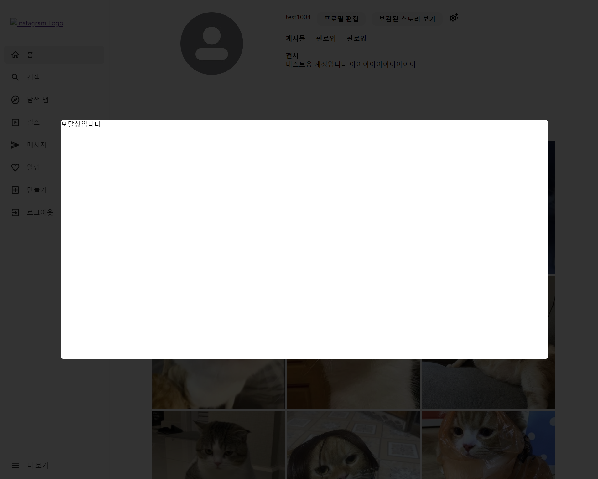
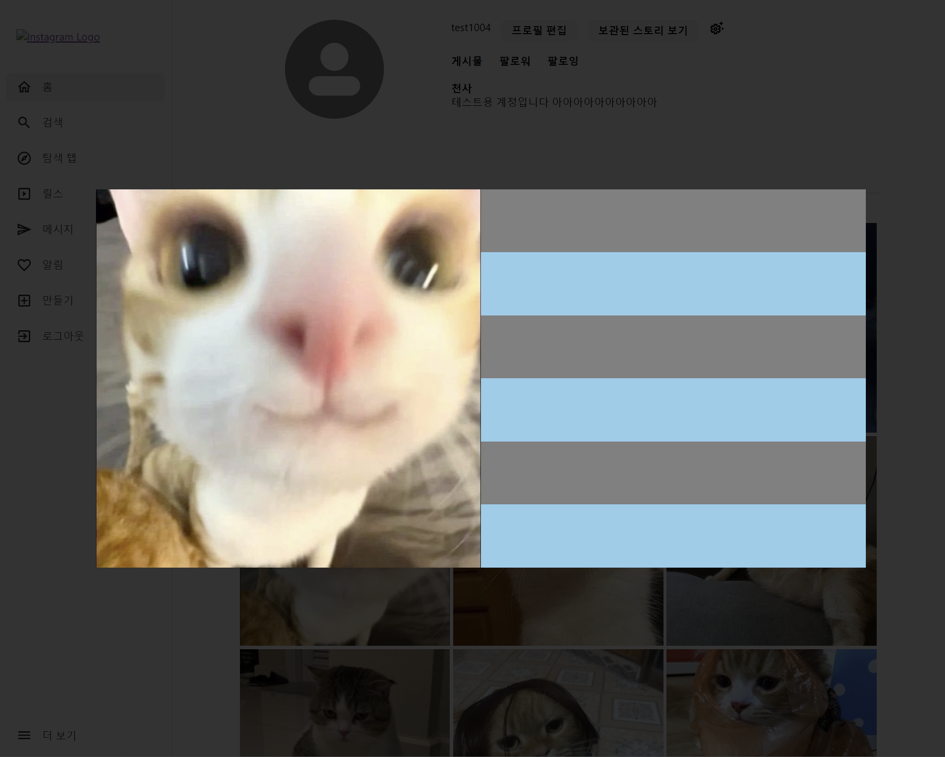
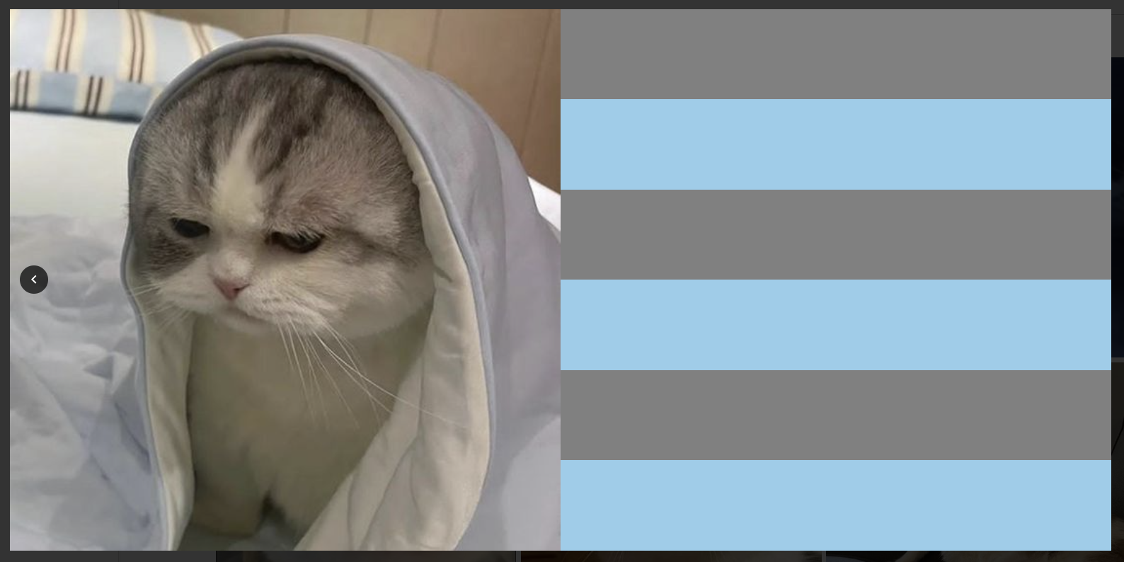
피드의 썸네일을 눌렀을 때, 출력되는 모달창이다.
어느 프로젝트든 모달창을 꼭 만드는 것 같은데, 만들 때마다 헷갈려서 정리해두기로 했다.
1. 기본 모달창
// css
.modalBackground {
z-index: 10000;
position: fixed;
top: 0;
left: 0;
width: 100vw;
height: 100vh;
background: rgb(0 0 0 / 80%);
display: flex;
align-items: center;
margin: auto;
}

.modalBox {
background-color: white;
border-radius: 8px;
margin: auto;
height: 50%;
}
```
이제 모달창 내부를 두 섹션으로 나눈다.
1. 이미지 출력부
2. 내용 및 댓글 출력부
2. 모달창 섹션 분리
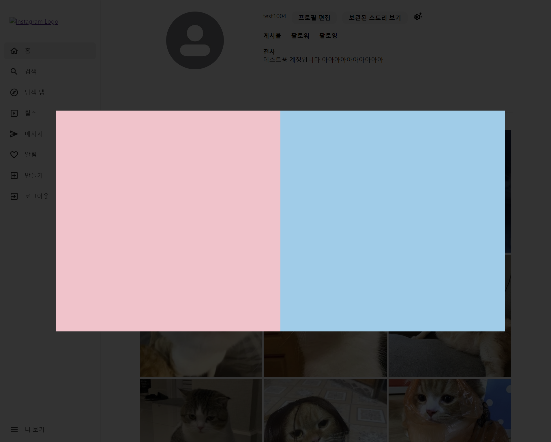
그리드 시스템을 사용하기 위해 부모 컨테이너에 display:grid를 적용했다.
```js
return (
  <div className={styles.modalBackground}>
    <div className={styles.modalBox}>
      {/* 이미지 출력 */}
      <div className={styles.sectionImg}>
      </div>
      {/* 내용 출력 */}
      <div className={styles.sectionContent}>
      </div>
    </div>
  </div>
);

// css
.modalBox {
  background-color: white;
  border-radius: 8px;
  margin: auto;
  height: 50%;
  display: grid;
  grid-template-columns: 1fr 1fr; /* 이미지와 콘텐츠가 각각 50%씩 차지 */
}

.sectionImg {
  background: pink;
  grid-row: 1;
  grid-column: 1;
}

.sectionContent {
  grid-row: 1;
  grid-column: 2;
  background: skyblue;
}

```
3. 이미지 넣기
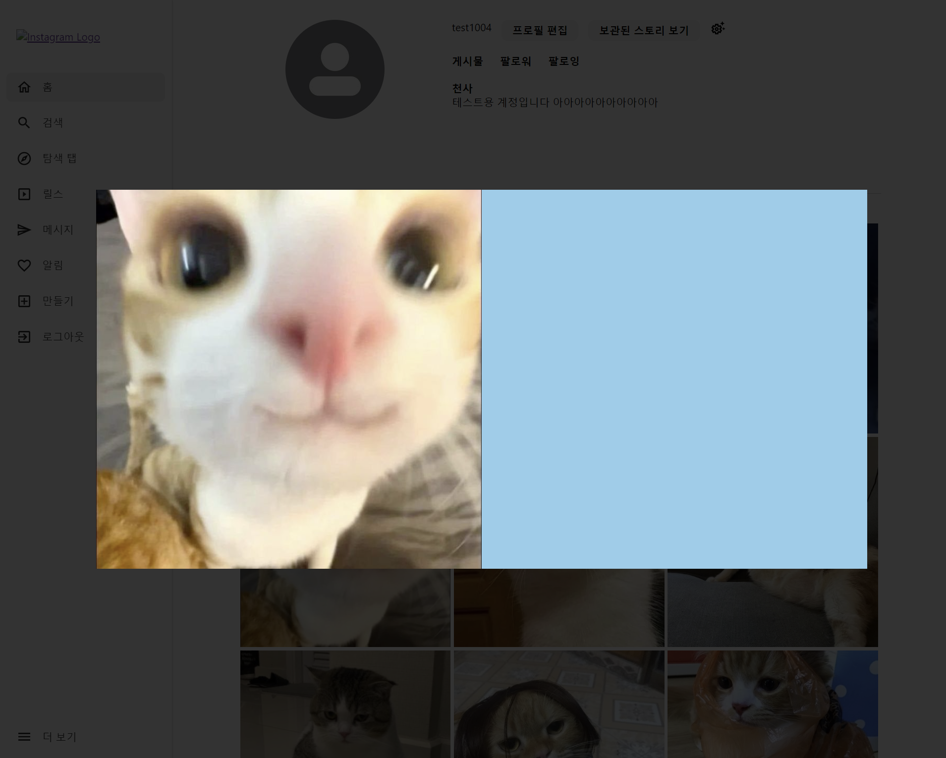
이미지는 임의로 넣었다.
sectionImg 안에 가득 차도록 구현했다.
return (
  <div className={styles.modalBackground}>
    <div className={styles.modalBox}>
      {/* 이미지 출력 */}
      <div className={styles.sectionImg}>
        <img src={이에로} />
      </div>
      {/* 내용 출력 */}
      <div className={styles.sectionContent}>
      </div>
    </div>
  </div>
);

// css
.sectionImg {
  grid-column: 1;
  height: 100%;
  aspect-ratio: 1/1;
  overflow: hidden;
  position: relative;
}

.sectionImg img {
  width: 100%;
  height: 100%;
  object-fit: cover;
}
4. 섹션 나누기
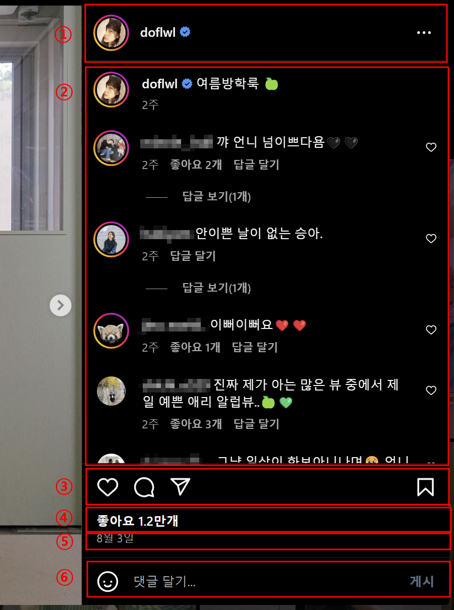
섹션은 6개로 나눴다.
1. 프로필
2. 내용 및 댓글
3. 좋아요/댓글/공유/북마크 버튼
4. 좋아요 개수
5. 작성일
6. 댓글 작성
마찬가지로 그리드 시스템을 사용하기 위해 부모 컨테이너에 display:grid를 적용했다.
return (
  <div className={styles.modalBackground}>
    <div className={styles.modalBox}>
      {/* 이미지 출력 */}
      <div className={styles.sectionImg}>
        <img src={이에로}  alt='이에로 고양이'/>
      </div>
      {/* 내용 출력 */}
      <div className={styles.sectionContent}>
        <div className={styles.sectionProfile}>
          {/* 프로필 */ }
        </div>
        <div className={styles.sectionComment}>
          {/* 내용 및 댓글 */}
        </div>
        <div className={styles.sectionButtons}>
          {/* 좋아요/댓글/공유/북마크 */}
        </div>
        <div className={styles.sectionLikes}>
          {/* 좋아요 개수 */}
        </div>
        <div className={styles.sectionDate}>
          {/* 작성일 */}
        </div>
        <div className={styles.addComment}>
          {/* 댓글 작성 */}
        </div>
      </div>
    </div>
  </div>
);

// css
.sectionContent {
  grid-column: 2;
  display: flex;
  flex-direction: column;
  padding: 16px;
}

.sectionProfile {
  display: flex;
  align-items: center;
  margin-bottom: 16px;
}
5. 모달창 닫기
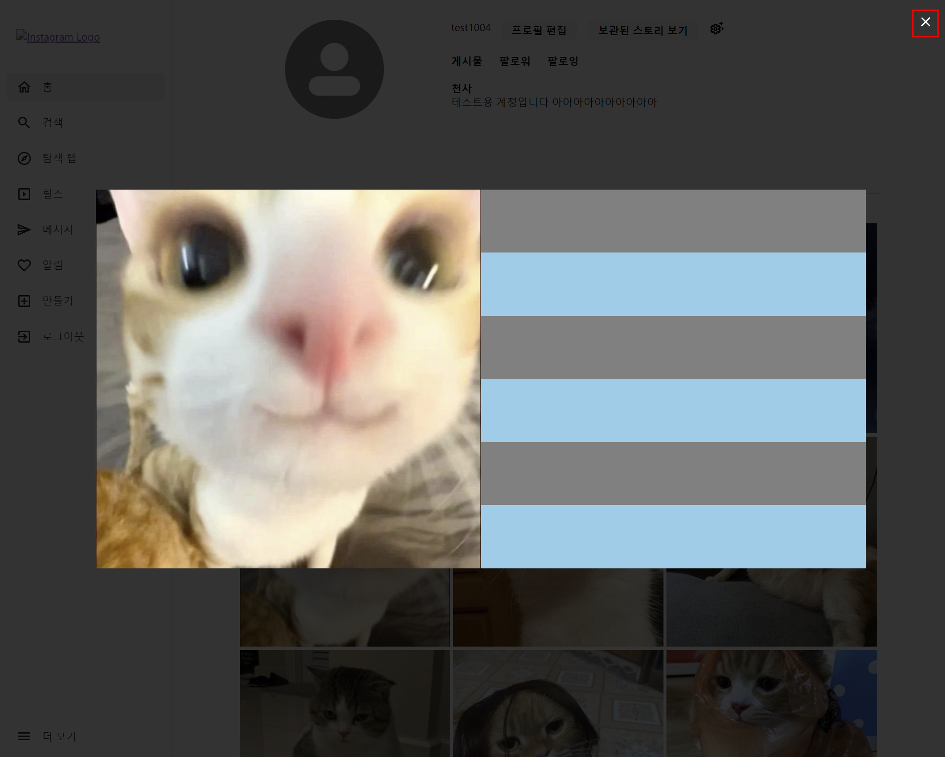
모달창을 열었으니, 닫기 위한 버튼이 필요하다.
모달창 닫기 버튼은 첨부한 사진처럼 배경의 우측 상단에 위치하게 했다.
또한, modalBox 바깥은 배경 부분을 클릭해도 모달창이 닫히게 구현하기 위해서
modalBackground 에도 onClick이벤트를 추가했다.
const closeModal = () => {
  handleCloseModal(); // 모달을 닫기 위해 handleCloseModal 호출
};

return (
  <div className={styles.modalBackground} onClick={closeModal}>
    <div className={styles.modalBox}>
      {/* 이미지 출력 */}
      <div className={styles.sectionImg}>
        ...
      </div>
      {/* 내용 출력 */}
      <div className={styles.sectionContent}>
        ...
      </div>
    </div>
    <button className={styles.closeBtn} onClick={closeModal}>
      <CloseIcon />
    </button>
  </div>
);
🚨하지만, 이렇게 구현하면 modalBox를 클릭해도 모달창이 닫히는 현상이 발생한다.
부모 컨테이너에 걸린 이벤트가 전파되기 때문이다.
🍀이걸 해결하기 위해선, 자식 컨테이너에 이벤트 전파를 막는 메서드를 추가해야한다.
const closeModal = () => {
handleCloseModal();
};
const stopPropagation = (e) => {
e.stopPropagation(); // 이벤트 전파 방지
};
return (
<div className={styles.modalBackground} onClick={closeModal}>
<div className={styles.modalBox} onClick={stopPropagation}>
{/* 이미지 출력 */}
<div className={styles.sectionImg}>
...
</div>
{/* 내용 출력 */}
<div className={styles.sectionContent}>
...
</div>
</div>
<button className={styles.closeBtn} onClick={closeModal}>
<CloseIcon />
</button>
</div>
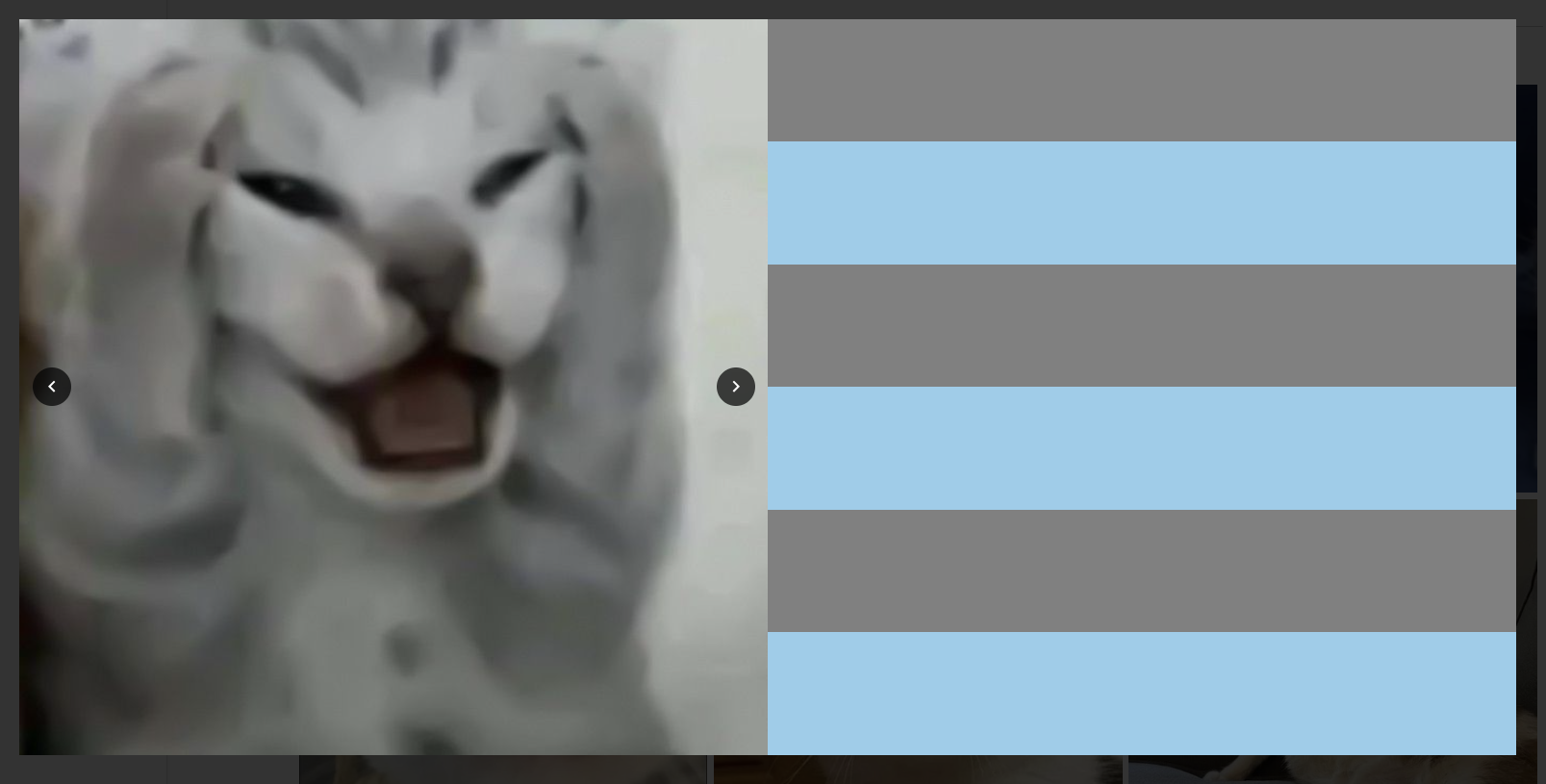
);여기서부터는 실제 데이터를 매핑해서 진행했다.
6. 이미지 슬라이더
인스타그램에 게시할 수 있는 이미지는 최대 10장이다.
그 말인즉슨, 모달창에서도 이미지 목록을 확인할 수 있어야 한다는 의미다.
구현해야할 기능은 다음과 같다.
1. 최대 10장의 이미지를 차례대로 넘겨볼 수 있어야한다.
2. 이전 이미지가 존재할 때에만 이전 버튼 출력
3. 다음 이미지가 존재할 때에만 다음 버튼 출력
(1) 이미지 슬라이더
const handleNext = () => {
  if (currentIndex < postModal.images.length - 1) {
    setCurrentIndex(currentIndex + 1);
  }
};

const handlePrev = () => {
  if (currentIndex > 0) {
    setCurrentIndex(currentIndex - 1);
  }
};

{/* 이미지 출력 */}
<div className={styles.sectionImg}>
  <img
    src={`http://localhost:8080${postModal.images[currentIndex].url}`}
    alt={postModal.images[currentIndex].alt || '게시물 이미지'}
  />
  {postModal.images.length > 1 && ( // 이미지가 한 장 이상일 때만 버튼이 출력되도록
    <>
      <button className={`${styles.Btn} ${styles.prevBtn}`} onClick={handlePrev}>
        <NavigateBeforeIcon />
      </button>
      <button className={`${styles.Btn} ${styles.nextBtn}`} onClick={handleNext}>
        <NavigateNextIcon />
      </button>
    </>
  )}
</div> .Btn {
position: absolute;
background-color: rgba(0, 0, 0, 0.7);
color: white;
border-radius: 50%;
border: none;
cursor: pointer;
transform: translateY(-50%);
width: 30px;
height: 30px;
display: flex;
align-items: center;
justify-content: center;
}
.Btn svg {
width: 100%;
height: 100%;
}
.prevBtn {
top: 50%;
left: 10px;
}
.nextBtn {
top: 50%;
right: 10px;
}(2) index로 버튼 출력 제어
(1)에서는 이전, 다음 이미지의 존재 여부 관계없이 버튼이 출력되었다.
이젠, currentIndex를 이용해 버튼 출력을 제어한다.
{postModal.images.length > 1 && (
  <>
    // 현재 index가 0보다 크다면(첫번째 이미지가 아니라면)
    {currentIndex > 0 && (
      <button className={`${styles.Btn} ${styles.prevBtn}`} onClick={handlePrev}>
        <NavigateBeforeIcon />
      </button>
    )}
	// 현재 index가 이미지의 개수 - 1 보다 작다면(마지막 이미지라면)
    {currentIndex < postModal.images.length - 1 && (
      <button className={`${styles.Btn} ${styles.nextBtn}`} onClick={handleNext}>
        <NavigateNextIcon />
      </button>
    )}
  </>
)}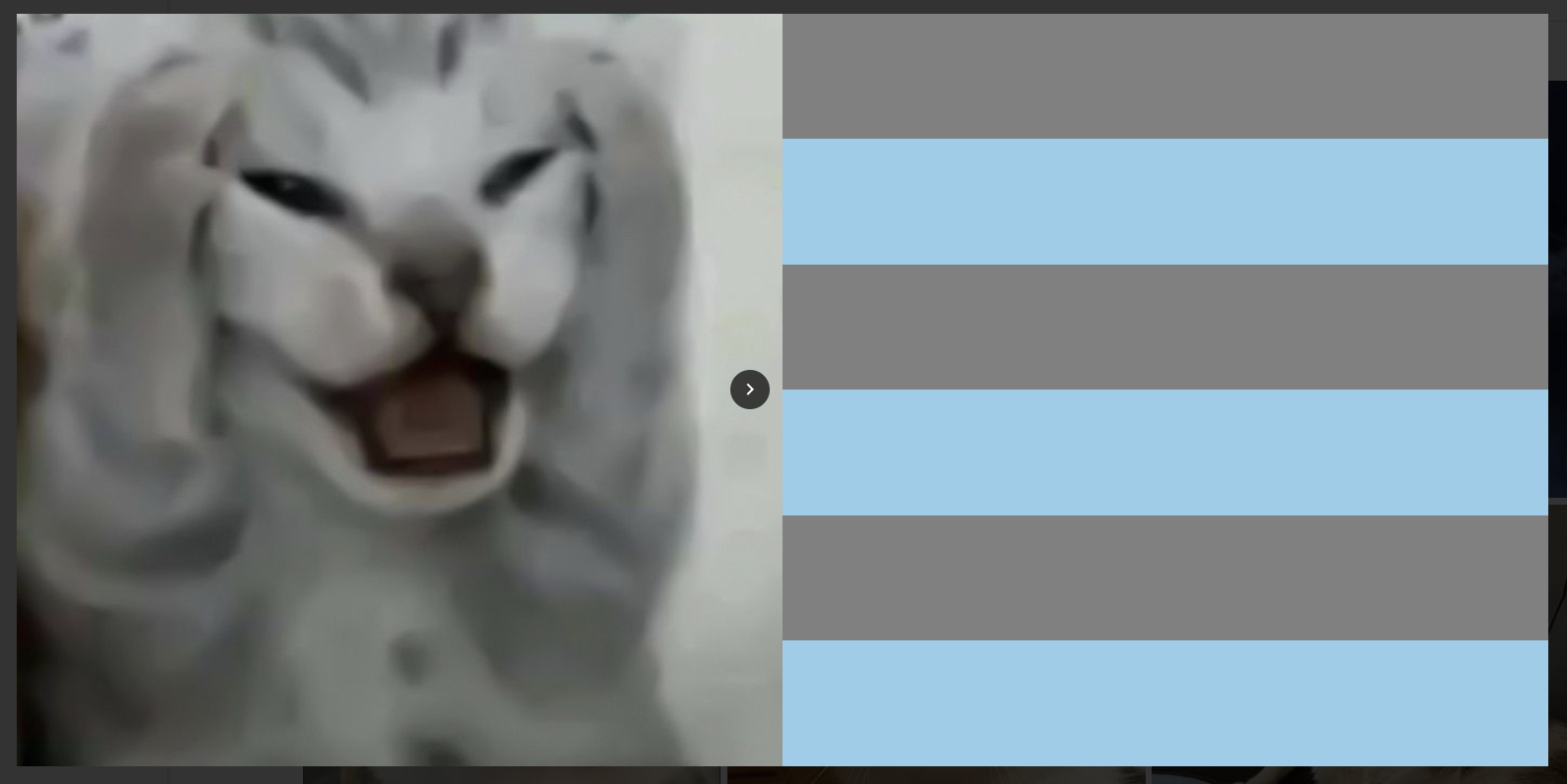
첫번째 이미지에서는 다음 버튼만, 마지막 이미지에서는 이전 버튼만 출력된다.
이제 content 부분만 매핑하면 모달은 끝이다👍

아직 진행 중~