streamlit_2 실습(사진)
import pandas as pd
import streamlit as st
# 사이드바 구성
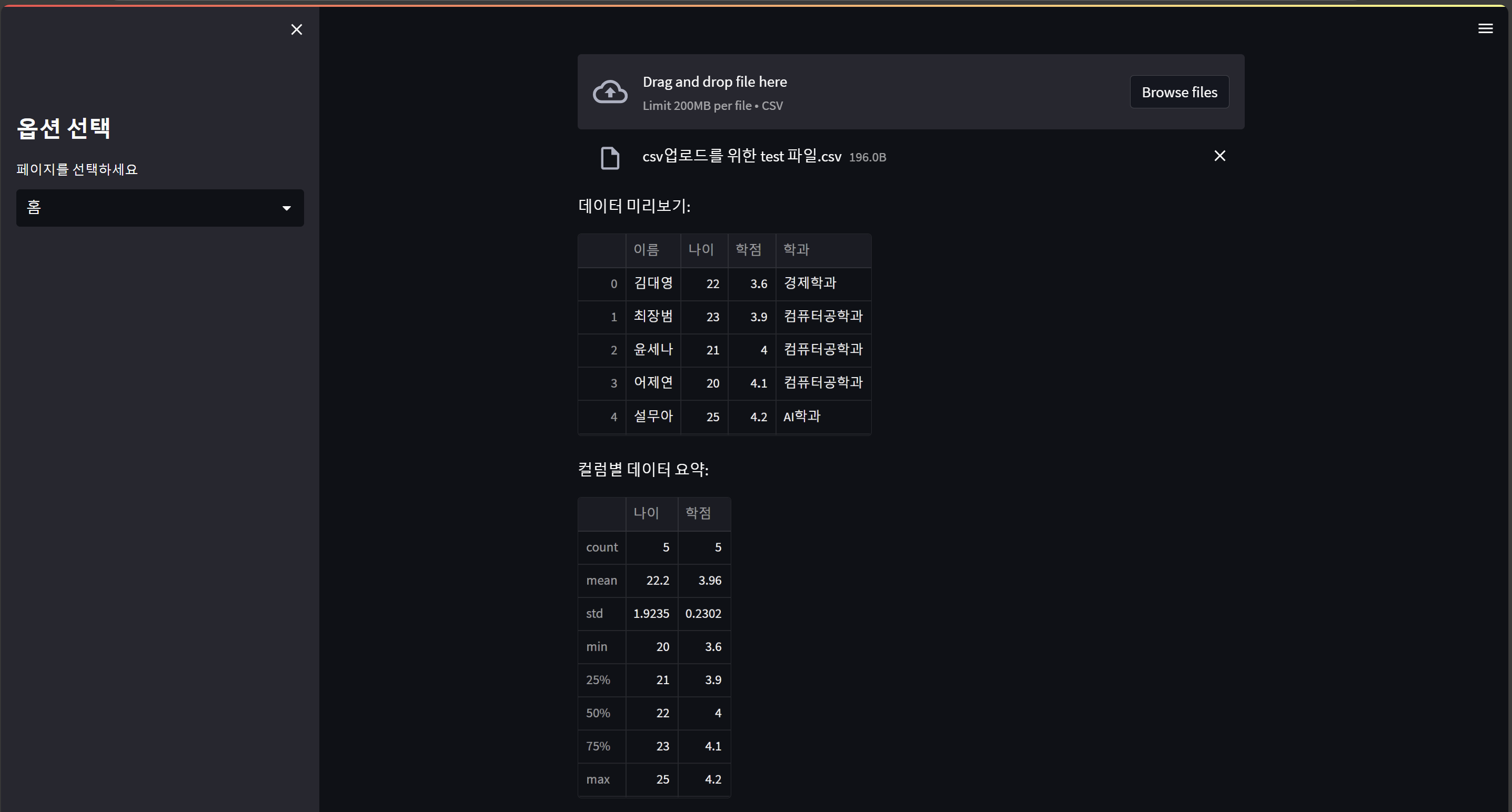
st.sidebar.title("옵션 선택")
page = st.sidebar.selectbox("페이지를 선택하세요", ["홈", "데이터", "시각화"])
st.write(f"현재 선택된 페이지: {page}")
# 컬럼 레이아웃
col1, col2 = st.columns(2)
#column = 열 st.colums(n) => n개로 열을 나눠라.
col1.write("왼쪽 컬럼")
col2.write("오른쪽 컬럼")

# 확장 가능 컨텐츠 = 자세히 보기 토글
# > 이거 누르면 내용 보인다.
with st.expander("자세히 보기"):
    st.write("여기에 숨겨진 내용을 작성합니다.")

# 파일 업로드
import pandas as pd

uploaded_file = st.file_uploader("CSV 파일 업로드", type="csv")
#(파일 업로드 제목, 타입 지정)

# 파일이 업로드 되었을 때
if uploaded_file:
    df = pd.read_csv(uploaded_file)
    st.write("데이터 미리보기:")
    st.dataframe(df)

# 데이터 처리 및 시각화
if uploaded_file:
    st.write("컬럼별 데이터 요약:")
    st.write(df.describe())
# 데이터 필터링
if uploaded_file:
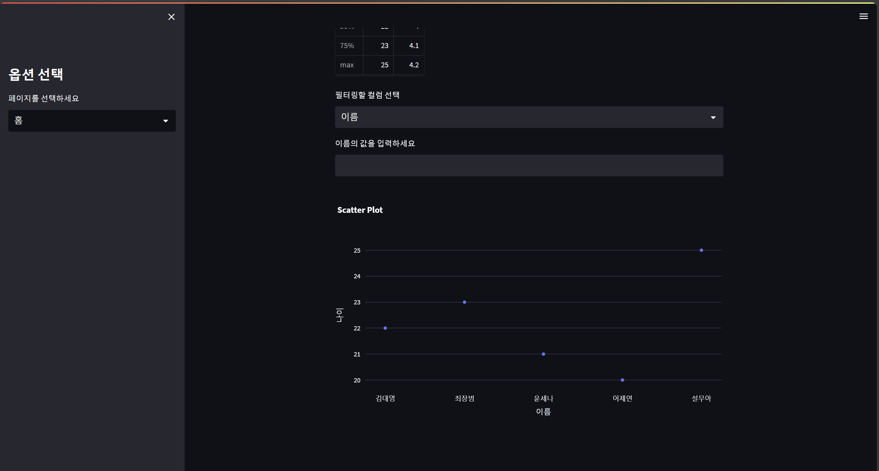
column = st.selectbox("필터링할 컬럼 선택", df.columns)
value = st.text_input(f"{column}의 값을 입력하세요")
if value:
filtered_df = df[df[column].astype(str).str.contains(value)]
# df라는 데이터프레임 안에서
# df[column](예를 들면, df["이름"], df["학점"], df["학과"])에서
# df[column] 값을 문자열(str)로 변경한 다음에
# 문자열에서 쓰이는 함수만 쓸거야.
# contains라는 함수를 쓸게.
# value가 포함된 값만 뽑아줘.
st.write("필터링된 데이터:")
st.dataframe(filtered_df)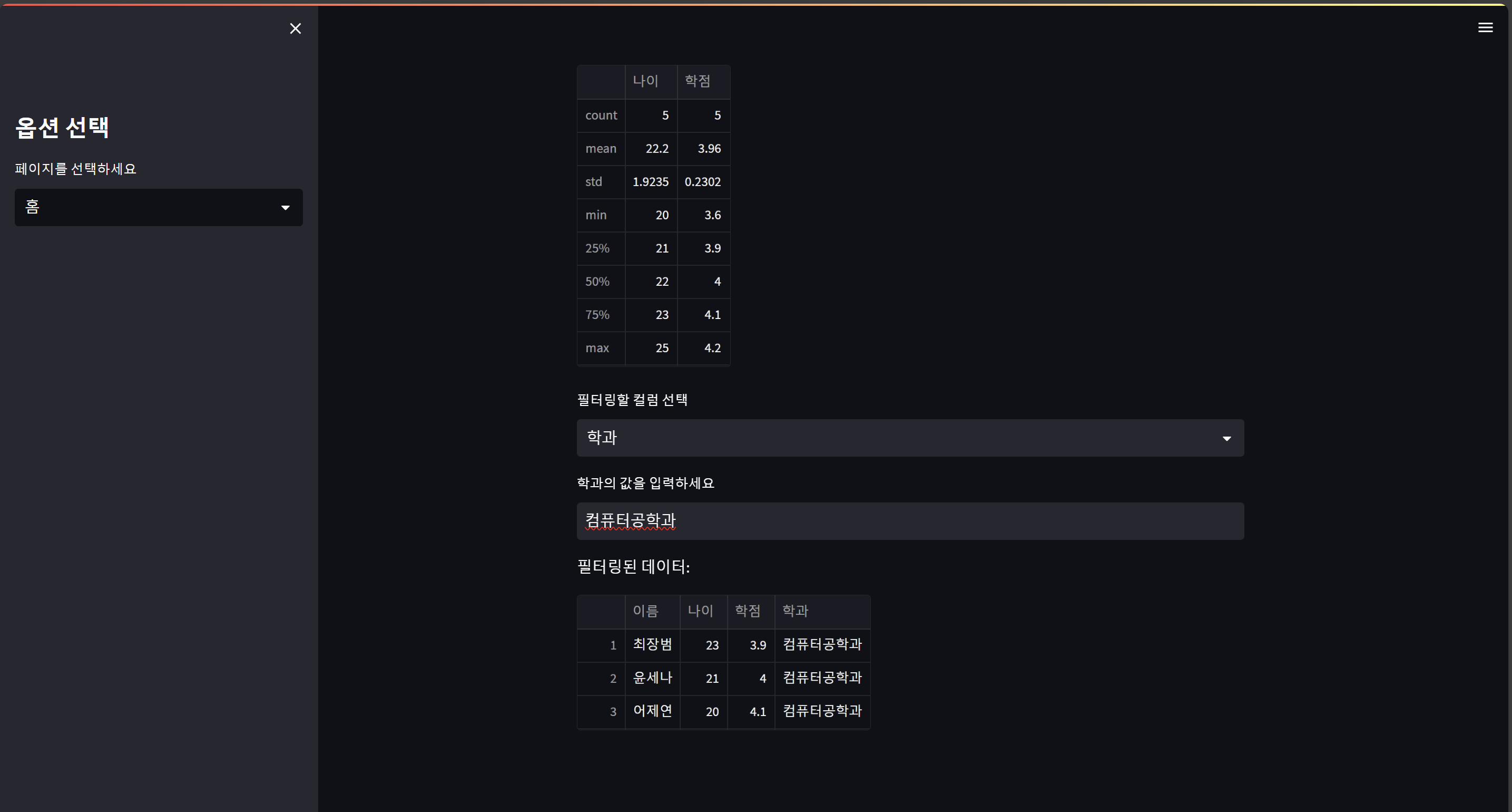
# 고급 시각화 차트 라이브러리들 설치, Plotly(동적 차트 생성) 및 Matplotlib 활용

import plotly.express as px
if uploaded_file:
    fig = px.scatter(df, x=df.columns[0], y=df.columns[1], title="Scatter Plot")
    st.plotly_chart(fig)
#막대그래프
import matplotlib.pyplot as plt
if uploaded_file:
    plt.figure(figsize=(10, 5))
    plt.hist(df[df.columns[3]], bins=20)  # hist = 히스토그램 = 분포를 나타내는 그림
    st.pyplot(plt)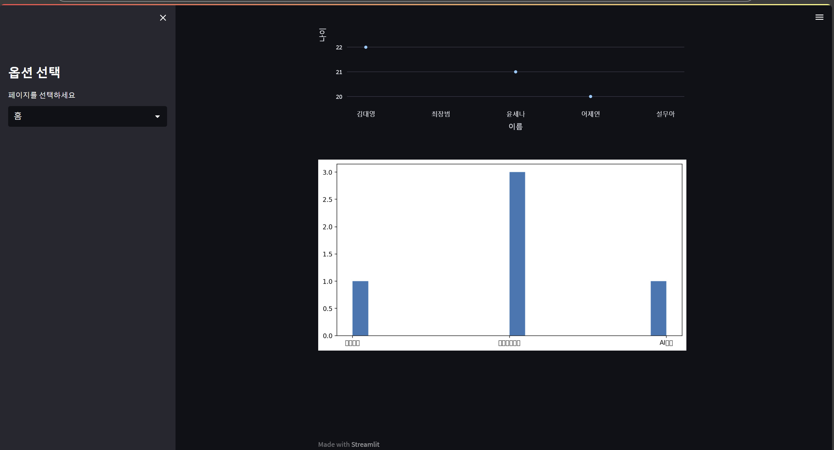
# Altair 및 Seaborn 활용
# Altair : 간결한 데이터 시각화
import altair as alt
if uploaded_file:
    chart = alt.Chart(df).mark_bar().encode(
        x=df.columns[0],
        y=df.columns[1]
    )
    # mark_bar() => 막대그래프 mark_line() => 꺾은선 그래프
    # encode => 알테어에 데이터를 입력해라
    st.altair_chart(chart, use_container_width=True)
    # use_container_width = 웹사이트 가로 길이랑 같아야 하니?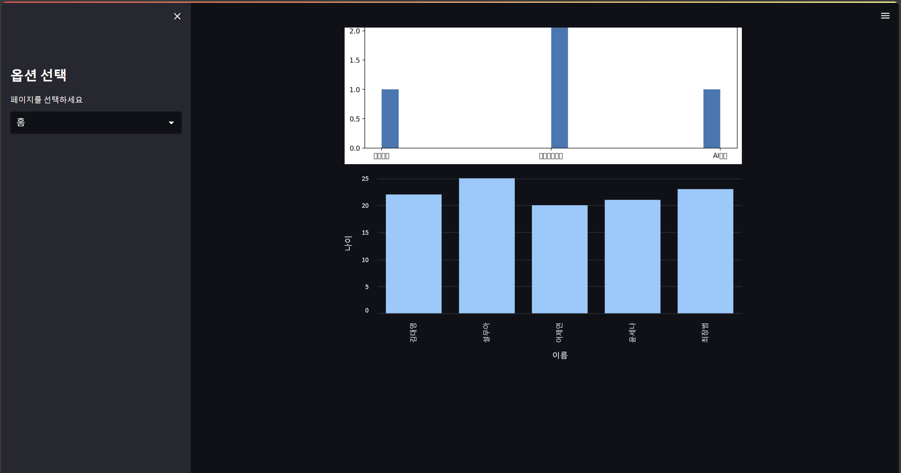
#seaborn
import seaborn as sns

if uploaded_file:
    sns.set_theme(style="whitegrid")  # 테마를 'whitegrid'로 설정해줘.
    fig, ax = plt.subplots()
    # matplotlib에서 subplot을 가져와 줘.
    # fig는 내가 직접 쓸 그림(figure)이고,
    # ax는 x랑 y의 축(axis) 값이야.
    sns.boxplot(data=df, ax=ax)
    # boxplot = 상자그림 = 최대값이랑 최소값이 표시된 막대그래프
    # data = 내가 쓸 데이터프레임
    # ax = matplotlib에서 가져온 축 값.
    st.pyplot(fig)  # fig를 그려줘.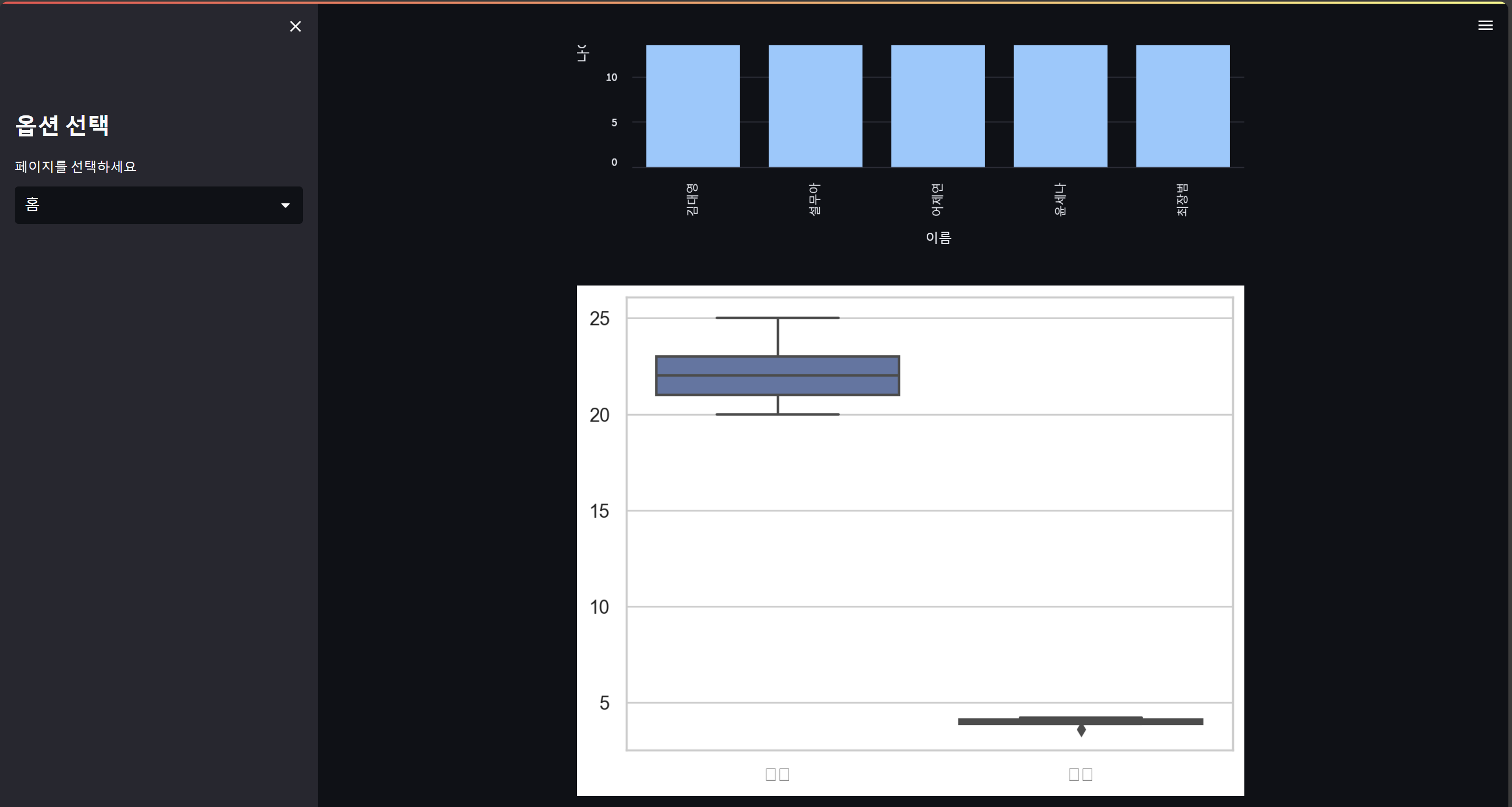

개발자로 한걸음씩!