6일차 요약
- z-index
- float
- flex
- 레이아웃에서 항상 염두에 둘 것
차원/축/태그간의 관계
학습 내용
실습 내용 / 결과물 출력 첨부
z-index
z축에 영향을 미치는 속성
- 3차원 포지션에서 유효(absolute/fixed)
- z-index의 속성값은 단위 없이 숫자
- 디폴트는 0
- 숫자가 높을수록 상위에 노출
z-index 활용
html
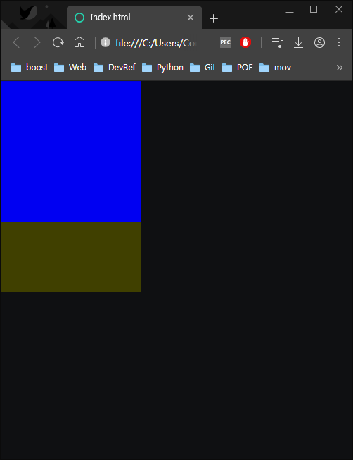
<body>
	<div class="z-one"></div>
	<div class="z-two"></div>
</body>
CSS
.z-one {
	position: absolute;
	width: 200px;
	height: 200px;
	background-color: yellow;
}
.z-two {
	position: absolute;
	width: 200px;
	height: 300px;
	background-color: blue;
}
결과출력
위와 같이 3차원 포지션의 두 영역을 출력했을 때는 겹쳐서 출력된다.
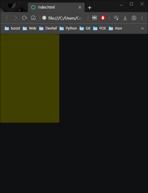
CSS : z-index를 적용
.z-one {
	position: absolute;
	width: 200px;
	height: 300px;
	background-color: yellow;
	z-index: 10;
}
.z-two {
	position: absolute;
	width: 200px;
	height: 200px;
	background-color: blue;
}
결과출력
z-one에 대한 z-index 값을 10으로 설정해준 결과 z-one영역이 상위에 출력됨
z-index 적용에 앞서 형제관계에서 레이아웃 겹침 현상에 대한 전반적 이해가 필요하다.
ex)형제관계에서 먼저 설정된 영역이 2차원인 경우 이후 작성된 영역이 3차원이더라도 영역이 겹치지 않는다.
float과 clear
float는 2차원 포지션에 3차원적 속성을 줌으로써 영역들을 x축으로 정렬하는데 사용된다.
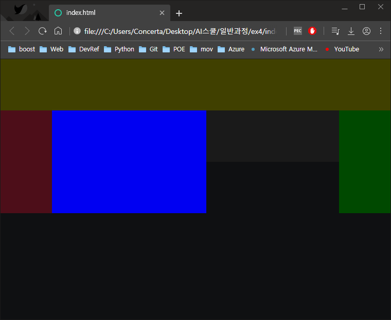
html
<body>
	<header></header>
	<div class="left"></div>
	<div class="center"></div>
	<div class="right"></div>
	<footer></footer>
</body>
CSS
header {
	width: 100%;
	height: 100px;
	background-color: yellow;
}
.left {
	float: left;
	width: 100px;
	height: 200px;
	background-color: pink;
}
.center {
	float: left;
	width: 300px;
	height: 200px;
	background-color: blue;
}
.right {
	float: right;
	width: 100px;
	height: 200px;
	background-color: green;
}
footer {
	width: 100%;
	height: 100px;
	background-color: gray;
}
결과출력
- 포지션을 따로 설정해주지 않은 영역들이 세로로 나열되지 않고 동일한 x축에서 정렬됨
- float를 적용시킨 세 개의 div태그들이 각각 3차원적 속성을 갖게 됨으로써 footer영역이 header 바로 아래로 붙은 모습
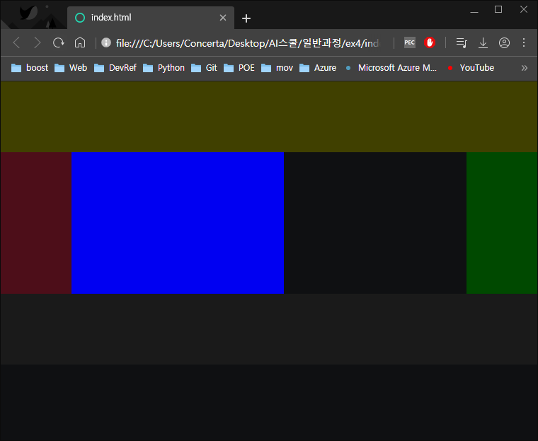
CSS : clear 적용
footer {
	clear: both;
	width: 100%;
	height: 100px;
	background-color: gray;
}
결과 출력(나머지는 위와 동일)
clear는 float를 마지막으로 사용한 영역 다음에 사용해서 float의 임시적 3차원적 속성을 더이상 적용하지 않게 한다.
** 실무에서 float와 clear를 사용할 떄 영역 구분을 명확하게 하기 위해서 class : "clearfix" 를 사용한다. 위 예제의 경우 footer태그에 clear를 적용하는 대신
<div class : "clearfix"></div>태그를 만들고
.clearfix {
	clear: both;}
를 CSS에 작성해주는 식으로 가독성을 좋게 만들어준다.
float 사용시 주의점
- float로 정렬되는 영역은 고정값을 가져야 한다. 그렇지 않으면 float속성을 가진 각각의 영역들보다 정렬 영역이 작아질 때 영역들이 아래로 내려가게 됨
- 당연하게도 float로 정렬되는 영역들의 상위 영역의 크기는 하위 영역의 합보다 크거나 같아야함
- float는 3차원적 속성을 갖게 하는 명령어로서, 이미 3차원인 포지션에서는 사용할 수 없음
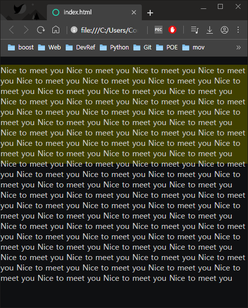
overflow
영역값을 벗어나는 정보에 대해 제어할 수 있다.
html
<div class="over-box">
	 	<p>Nice to meet you Nice to meet you Nice to meet you Nice to meet you Nice to meet you Nice to meet you Nice to meet you Nice to meet you Nice to meet you Nice to meet you Nice to ...
Nice to meet you Nice to meet you Nice to meet you Nice to meet you Nice to meet you Nice to meet you
  </p>
	 </div>
CSS
}
.over-box {
	widows: 200px;
	height: 200px;
	background-color: yellow;
}
출력결과
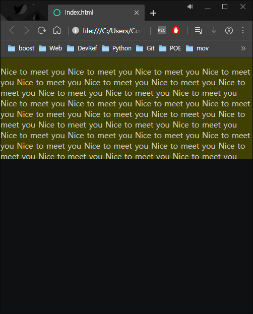
CSS - overflow: hidden;
.over-box {
	overflow: hidden;
	widows: 200px;
	height: 200px;
	background-color: yellow;
}
결과출력
위와 같이 영역을 벗어난 정보를 감추거나, 영역 안에서 스크롤을 만드는 등 제어 가능함
display: flex
- 부모영역에 display: flex를 설정해주면 자식 영역들이 그 안에서 정렬한다.
- flex-direction: row/column/row-reverse/column-reverse 를 통해 각각 좌에서 주 위에서 아래 그 반대로 설정 가능
- flex-warp: warp/nowarp를 통해 각각 부모영역의 크기를 자식 영역들의 합이 초과했을 때 정렬하는 방식을 행/열바꿈 또는 비율로 리사이징하는 것을 선택 가능
- flex-flow를 통해 direction과warp의 속성값을 한 번에 지정해 줄 수 있음
- justify-content 를 통해 다양헌 x축 정렬을 할 수 있음
- align-items를 통해 다양한 y축 정렬을 할 수 있음
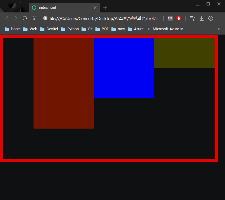
html
<body>
	<div class="container">
		<div class="item one"></div>
		<div class="item two"></div>
		<div class="item three"></div>
	</div>
</body>
CSS
.container {
	display: flex;
	flex-direction: row-reverse;
	width: 700px;
	height: 400px;
	border: solid 10px red;
}
.item {
	width: 200px;
}
.one {
	background-color: yellow;
	height: 100px;
}
.two {
	background-color: blue;
	height: 200px;
}
.three {
	background-color: orange;
	height: 300px;
}
결과출력
flex의 활용은 경우의 수가 다양하기 때문에 다 외우기 보다는 검색이나 보조 툴을 사용해 점차 익숙해지는 방식이 좋을 것
- flexbox.help 라는 사이트를 참조해보자
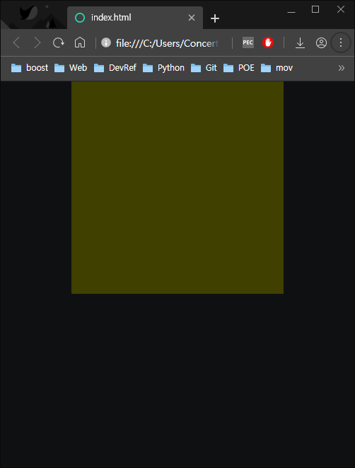
중앙정렬 하는 방법
html
<body>
	<div class="center-1"></div>
	<div class="center-2"></div>
</body>
(1) margin: 0 auto
CSS
.center-1 {
	width: 300px;
	height: 300px;
	background-color: yellow;
	margin: 0 auto;
결과출력
(2) position: relative;
CSS
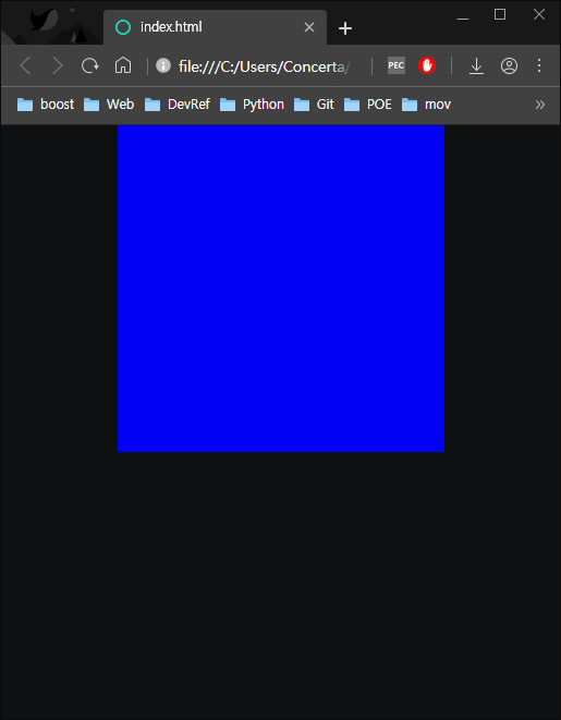
.center-2 {
	position: relative;
	width: 300px;
	height: 300px;
	background-color: blue;
	left: 50%;
	margin-left: -150px;
}
결과출력
이 경우 영역의 왼쪽을 기준으로 정렬한 다음 영역의 크기 절반 값만큼 다시 왼쪽으로 옮긴 것이기 때문에 영역의 크기가 수정되면 margin-left의 값도 수정해야한다는 단점이 있음.
추가 학습
미해결 - 솔루션
- overflow: hidden;을 사용해 float를 사용할 때 부모-자식간 높이값에 경향을 주지 않는 상황을 해결하는 실무팁이 이해되지 않았음
->
overflow: hidden;의 경우 영역밖의 내용들을 제어하는 것이 아니라 영역 안쪽의 내용만 작동하도록 만드는 것. 같은 원리로 float가 적용된 영역의 float가 영역 밖에서 영향을 끼치지 않도록 만들면 하위에 작성된 형제태그에 영향을 끼치지 않게 되어 clearfix태그를 작성한 것과 유사한 결과를 만들수 있다.
질문거리
x
복습
x
학습 소감
내용은 늘어나는데 체계가 잡히는 느낌이 들지 않는다... 추가적인 공부가 필요할 것 같다.