matplotlib
- 파이썬 대표 시각화 도구
- matplotlib은 plt로 많이 naming하여 사용
(pyplot :: matlab의 시각화 기능을 담아둔 것, 2d 그래프) - % matplotlib inline 옵션: 주피터 노트북에 matplotlib의 결과가 바로 나타나게 하는 설정 (실행했을 때 그래프 바로 뜰 수있게)
import matplotlib.pyplot as plt
get_ipython().run_line_magic("matplotlib","inline")
- <삼각함수 그리기>
- numpy의 sin함수를 가져오기
- np.arrange(a,b,s): a부터 b까지의 s의 간격
- np.sin(value)
- 그래프를 그릴땐 def()로 why? 나중에 별도의 셀에서 그림만 나타낼 수 있음
import numpy as np

t = np.arrange(0,12,0.01) #t = 1200개
y = np.sin(t)
def drawGrap():
plt.figure(figsize=(10,6))
plt.plot(t,np.sin(t), label="sin")
plt.plot(t,np.cos(t), label="cos")
plt.grid()
plt.legend()
plt.xlabel("time")
plt.ylabel("Amplitude")
plt.title("Example of sinewave")
plt.show()
- 다양한 방식으로 표를 꾸밀 수 있음.
[참고] matplotlib 공식사이트
:
https://matplotlib.org/stable/gallery/index
데이터 읽는 방법
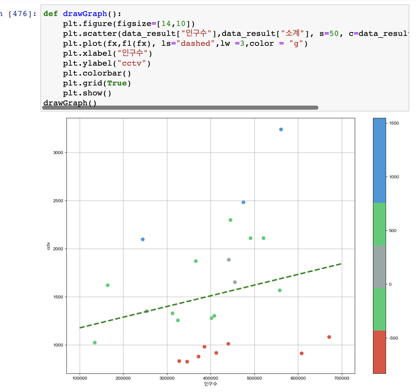
- <경향과 오차>
- 오차 : 실제값 - 예측값
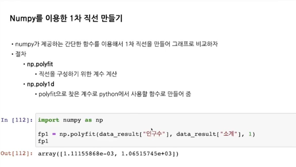
fp1 = np.polyfit(data_result["인구수"],data_result["소계"], 1)

f1 = np.poly1d(fp1) #예측값(경향선)
fx = np.linspace(10000,70000,100)

#오차 : 실제값 - 예측값
data_result["오차"] = data_result["소계"] - f1(data_result["인구수"])

#경향과 비교해서 데이터 오차가 너무 나는 데이터를 계산
df_sort_f = data_result.sort_values(by="오차", ascending=False) #오차가 가장많은구부터
df_sort_t = data_result.sort_values(by="오차", ascending=True)
Reference
- 이글은 제로베이스 데이터 취업 스쿨의 강의자료 일부를 발췌하여 작성되었음.

데이터와 이미지로 세상을 공부하는 중입니다 :)