-
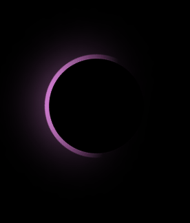
gradient loader를 구현하면서
filter그리고backdrop-filter속성을 알게 됐습니다.filter와backdrop-filter모두 graphical한 효과를 주기 위한 속성입니다. 차이점은backdrop-filter의 경우 content에 영향을 주지 않고 오직 background에만 영향을 줍니다. -
또한
filter: hue-rotate라는 속성을 이번에 사용하게 됐는데 hue는 색조를 의미합니다. transform과 animation속성을 활용하게 되면 매 순간 색이 변하는 효과를 구현할 수 있습니다.
코드
HTML
<!DOCTYPE html>
<html lang="en">
  <head>
    <meta charset="UTF-8" />
    <meta http-equiv="X-UA-Compatible" content="IE=edge" />
    <meta name="viewport" content="width=device-width, initial-scale=1.0" />
    <link rel="stylesheet" href="style.css" />
    <title>Gradient loader</title>
  </head>
  <body>
    <div class="loader"></div>
  </body>
</html>
CSS
* {
  margin: 0;
  padding: 0;
  box-sizing: border-box;
}

body {
  display: flex;
  flex-direction: column;
  justify-content: center;
  align-items: center;
  background: #000;
  min-height: 100vh;
}
.loader {
  position: relative;
  width: 150px;
  height: 150px;
  border-radius: 50%;
  background: linear-gradient(45deg, transparent, transparent 40%, #e5f403);
  animation: animate 1s linear infinite;
}

@keyframes animate {
  0% {
    transform: rotate(0);
    filter: hue-rotate(0deg);
  }
  100% {
    transform: rotate(360deg);
    filter: hue-rotate(360deg);
  }
}
.loader::before {
  content: "";
  position: absolute;
  top: 6px;
  right: 6px;
  bottom: 6px;
  left: 6px;
  border-radius: 50%;
  background: #000;
  z-index: 100;
}

.loader::after {
  content: "";
  position: absolute;
  top: 0px;
  right: 0px;
  bottom: 0px;
  left: 0px;
  background: linear-gradient(45deg, transparent, transparent 40%, #e5f403);
  border-radius: 50%;
  z-index: 1;
  filter: blur(30px);
}
세계 최고 수준을 향해 달려가는 개발자입니다.