viewport
화면 크기를 viewport 라고 함.
ex) 1200px x 920px 인 경우
10vw => 1200 x 0.1 = 120px
50vh => 920 x 0.5 = 460px
100vw => 1200 x 1 = 1200px
** 반응형에서 많이 사용하게 됨.
CSS 에서도 함수를 사용할 수 있을까?
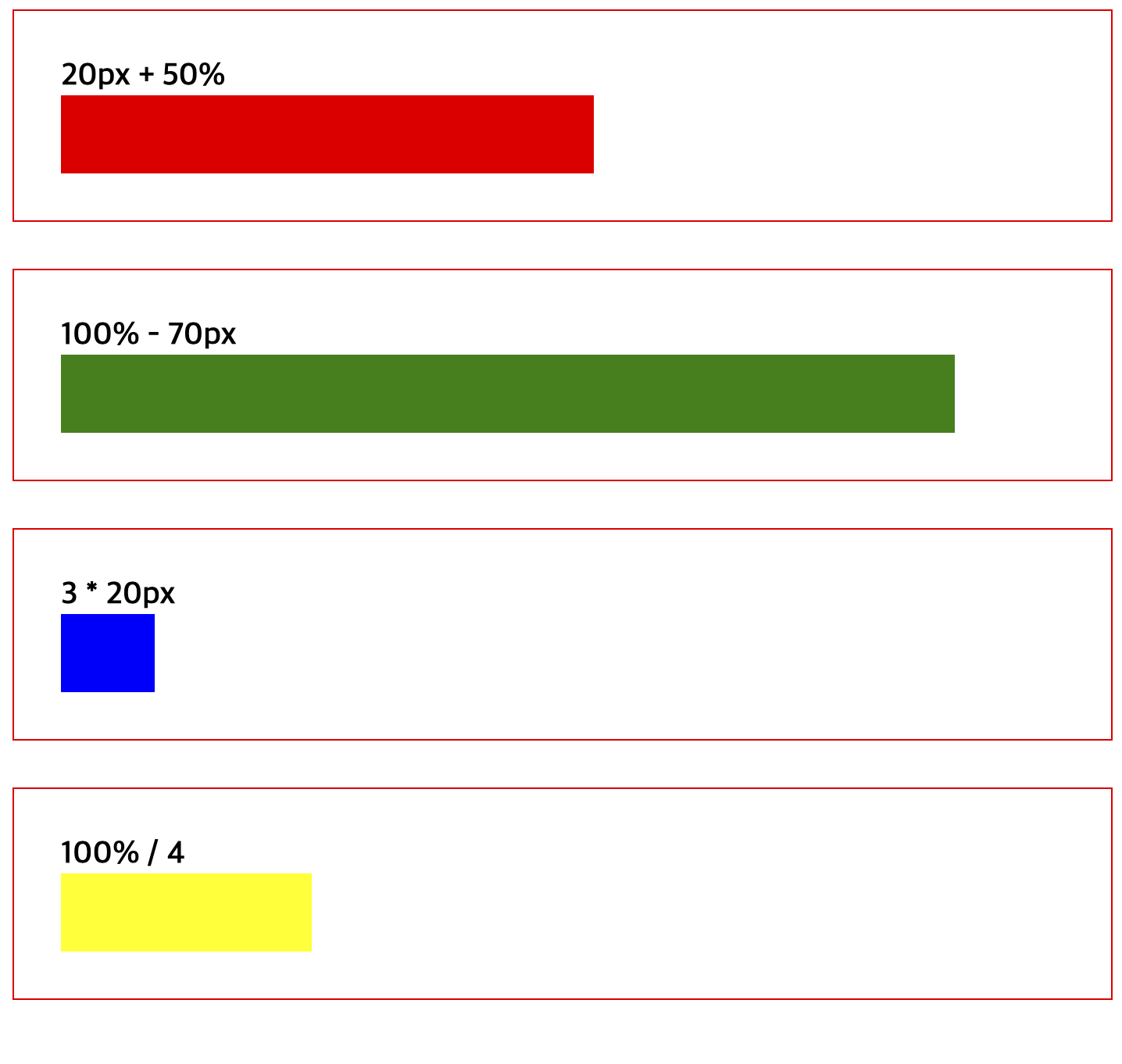
calc()
: 괄호 안의 사칙연산을 수행한 결과를 속성값으로 사용한다.
** +. - 의 경우 공백을 꼭 붙여야 한다.
<body>
    <div class="box">
        <span class="text">
            20px + 50%
        </span>
        <div class="item1"></div>
    </div>
    <div class="box">
        <span class="text">
            100% - 70px
        </span>
        <div class="item2"></div>
    </div>
    <div class="box">
        <span class="text">
            3 * 20px
        </span>
        <div class="item3"></div>
    </div>
    <div class="box">
        <span class="text">
            100% / 4
        </span>
        <div class="item4"></div>
    </div>
</body>
* {
box-sizing: border-box;
}
.box{
border: 1px solid red;
margin-bottom: 30px;
padding: 30px;
}
.text{
font-weight: 600;
font-size: 20px;
}
.item1{
background: red;
width: calc(20px + 50%);
height: 50px;
}
.item2 {
background: green;
width: calc(100% - 70px);
height: 50px;
}
.item3{
background: blue;
width: calc(3*20px);
height: 50px;
}
.item4{
background: yellow;
width: calc(100%/4);
height: 50px;
}[결과값]

absolutely love this part