.png)
Line plot
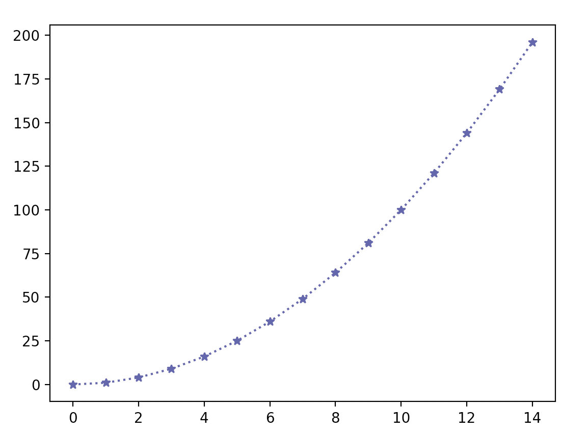
fig, ax = plt.subplots() #공백일 시 하나의 figure만 나타냄
x = np.arange(15)       # 0~14
y = x**2
ax.plot(
    x, y,
    linestyle = ":", # 그래프를 점으로 표시
    marker ="*",
    color = "#524FA1" #rgb 16진수
    )
Line style
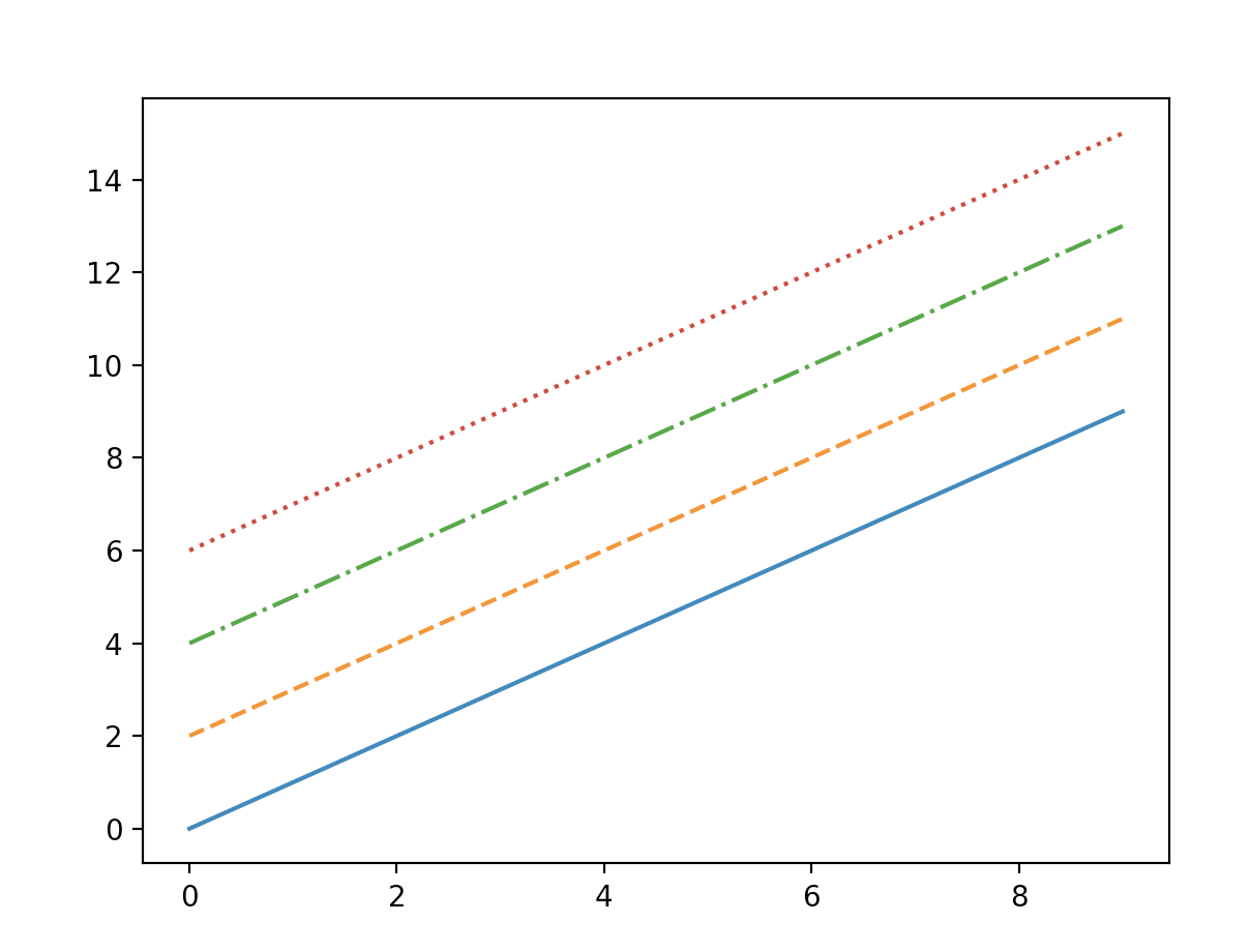
x = np.arange(10)
fig, ax = plt.subplots()
ax.plot(x, x, linestyle="-")  #ax.plot(x,y,linestyle)
#solid
ax.plot(x, x+2, linestyle="--")
#dashed
ax.plot(x, x+4, linestyle="-.")
#dashdot
ax.plot(x, x+6, linestyle=":")
#dotted
color
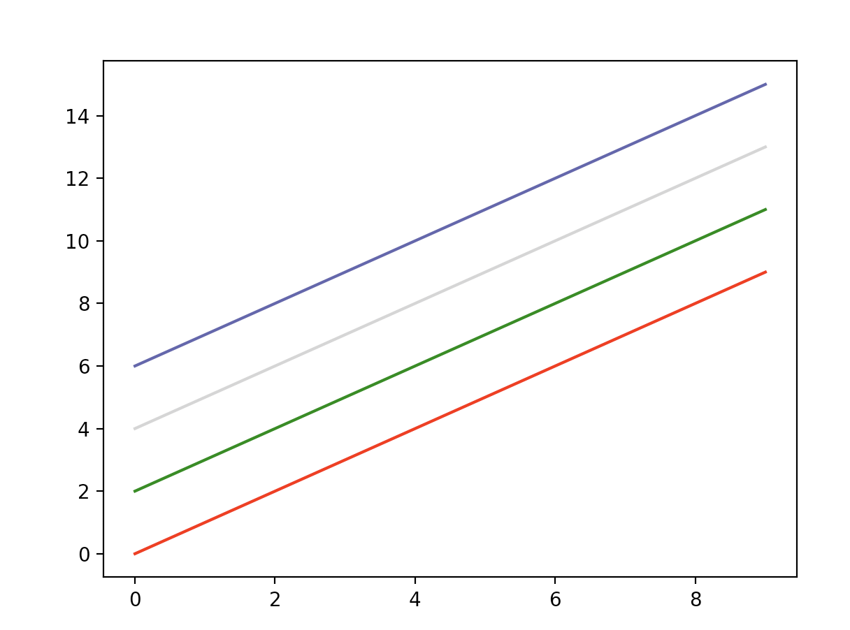
x = np.arange(10)
fig, ax = plt.subplots()
ax.plot(x, x, color="r")  #red
ax.plot(x, x+2, color="green")
ax.plot(x, x+4, color="0.8") #0~1 사이의 gray
ax.plot(x, x+6, color="#524FA1") #RGB값
marker
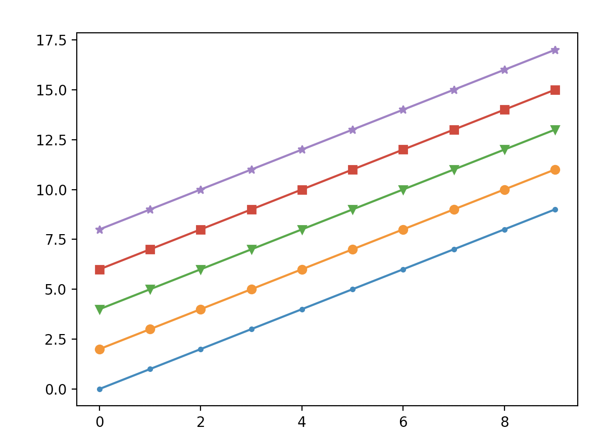
x = np.arange(10)
fig, ax = plt.subplots()
ax.plot(x, x, marker=".")
ax.plot(x, x+2, marker="o") #동그라미
ax.plot(x, x+4, marker="v") #화살표
ax.plot(x, x+6, marker="s") #네모
ax.plot(x, x+8, marker="*") #별표
축 경계 조정하기
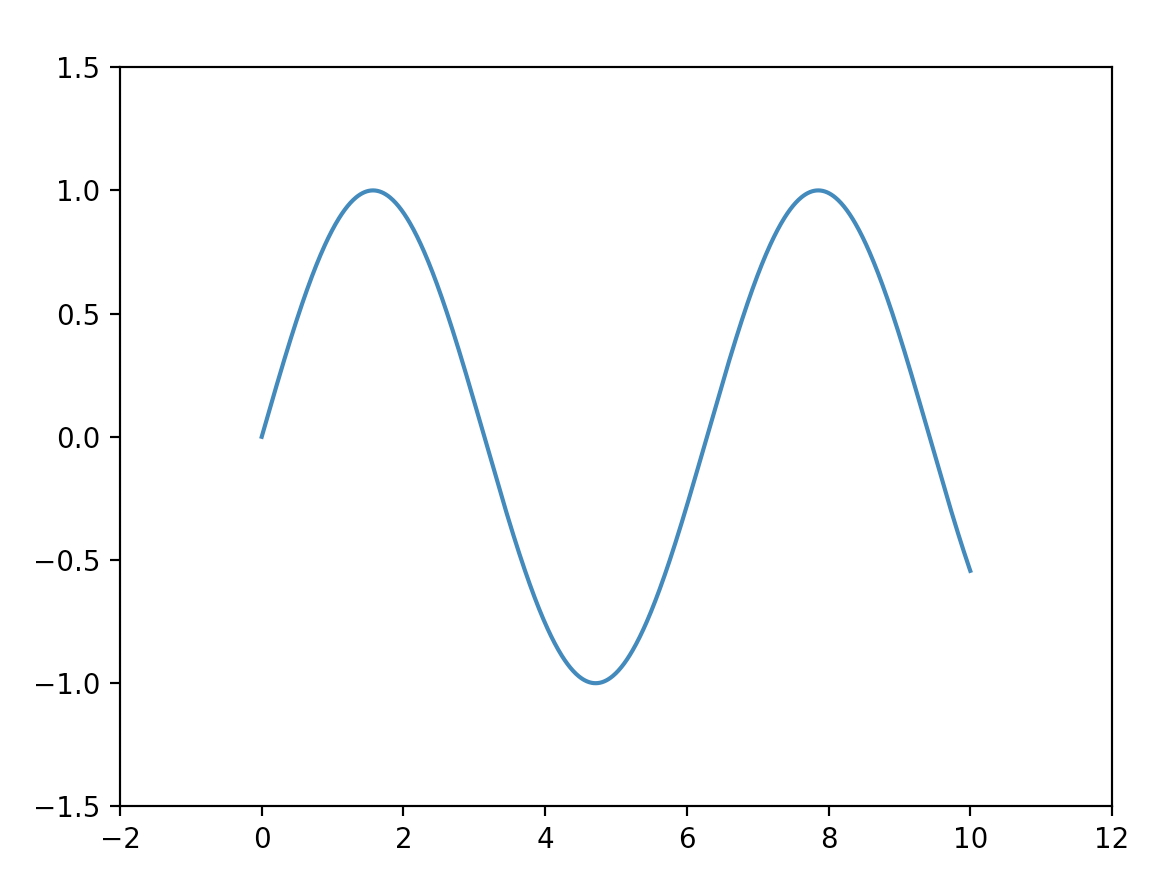
x = np.linspace(0, 10, 1000) #linspace(start, end, step)
fig, ax = plt.subplots()
ax.plot(x, np.sin(x))
ax.set_xlim(-2, 12) #x축 경계
ax.set_ylim(-1.5, 1.5) #y축 경계
범례
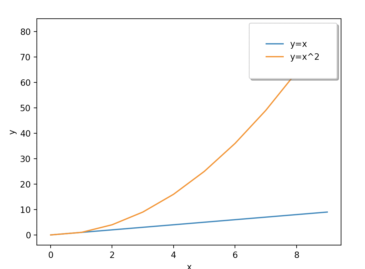
x = np.arange(10)
fig, ax = plt.subplots()
ax.plot(x, x, label='y=x')
ax.plot(x, x**2, label='y=x^2')
ax.set_xlabel("x")
ax.set_ylabel("y")
ax.legend(loc='upper right',
	shadow=True,
    	fancybox=True, # 모서리 둥글게
        borderpad=2) #범례의 위치와 속성(크기) 정의
Bar plot
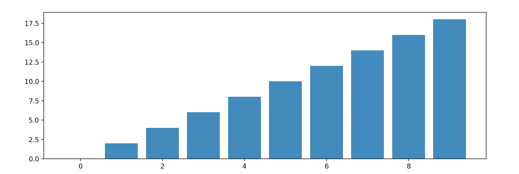
x = np.arange(10)
fig, ax = plt.subplots(figsize=(12, 4)) #가로, 세로
ax.bar(x, x*2)  #ax.bar(x, y)
누적해서 쌓아 올리기
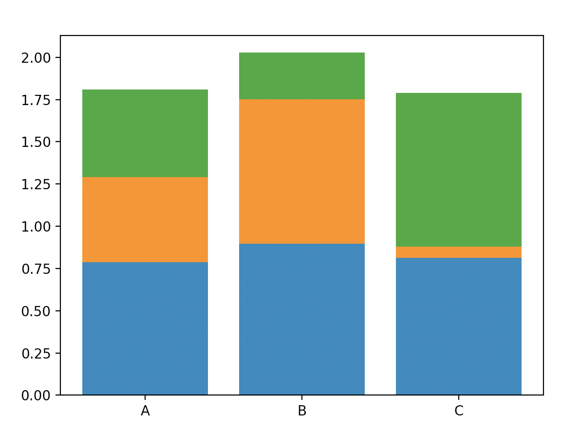
x = np.random.rand(3)
y = np.random.rand(3)
z = np.random.rand(3)
data = [x, y, z]
fig, ax = plt.subplots()
x_ax = np.arange(3)
for i in x_ax:
	ax.bar(x_ax, data[i],
    	bottom=np.sum(data[:i], axis=0)) # 쌓아올릴 부분의 시작점
ax.set_xticks(x_ax)
ax.set_xticklabels(["A", "B", "C"])
Histogram(도수분포표)
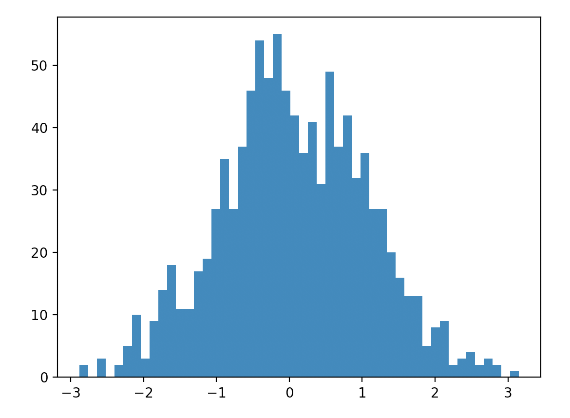
fig, ax = plt.subplots()
data = np.random.randn(1000)
ax.hist(data, bins=50) #bins: 막대의 수
Matplotlib with Pandas

재밌는 코딩 공부