1. Python Visualization Library
1) matplotlib
- Python 대표 시각화 라이브러리
- 기본적 그래프부터 통계, Image 처리까지
2) seaborn
- Matplotlib 기반의 Adds-on 성격의 라이브러리
- 간단한 메서드로 다양한 통계 그래픽
2. Matplotlib과 Seaborn을 활용한 시각화 - Heatmap
sns.heatmap(data
            , annot=True  # Heatmap에 숫자 표기
            , fmt='.1f'   # Annotation Formatting - 소수점 표기
            , linewidth=0.5   # Heatmap 사이 line 두께
            , cmap='Blues |YlGnBu | RdYlBu_r'   # 색상 Color map
            )
import matplotlib.pyplot as plt
import seaborn as sns

plt.figure(figsize=(15, 10))
sns.heatmap(cor_df.corr()
            , annot=True
            , fmt='.1f'
            , linewidth=0.5
            , cmap='YlGnBu'
            )
plt.show()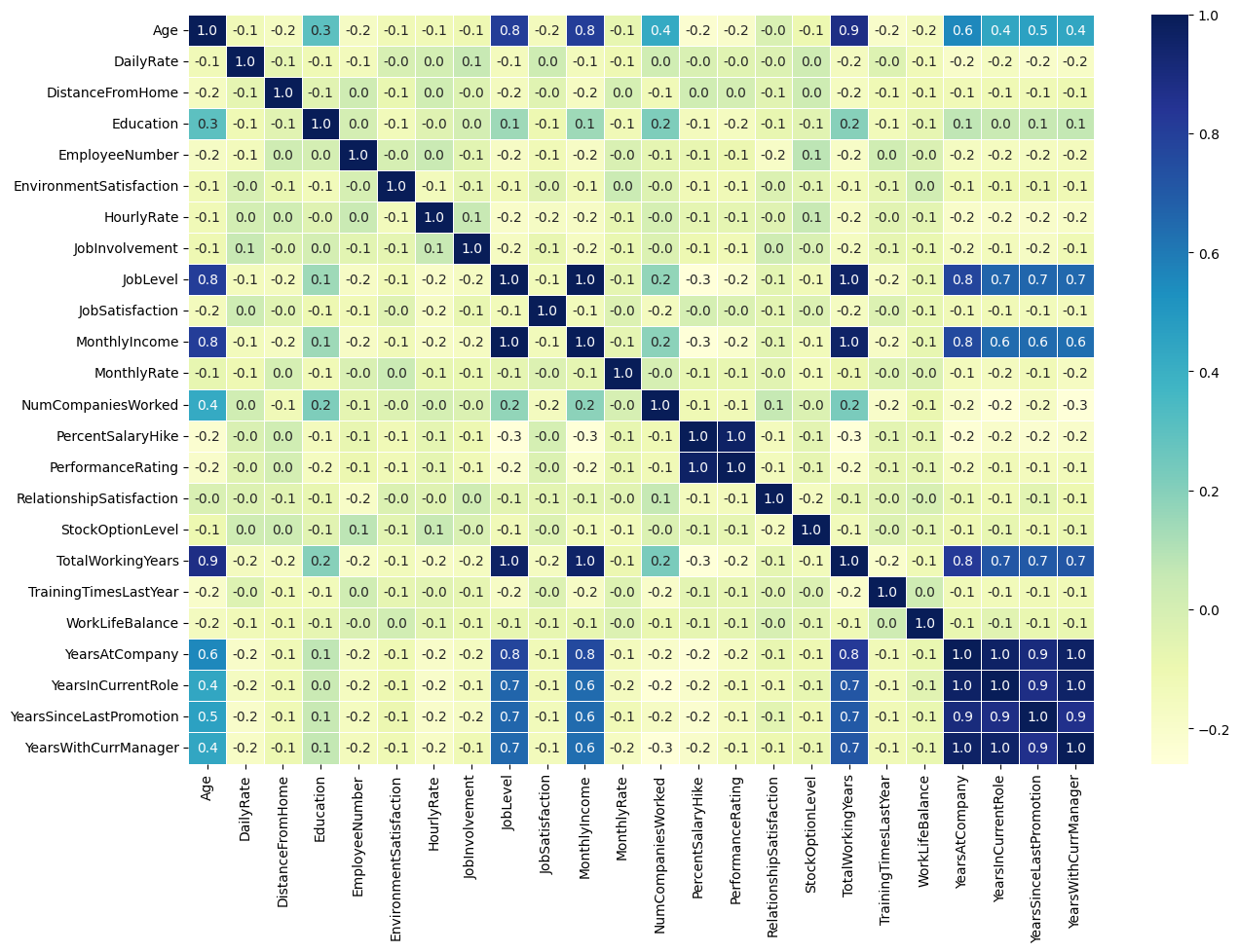
import matplotlib.pyplot as plt
import seaborn as sns

plt.figure(figsize=(15, 10))
sns.heatmap(cor_df.corr()
            , annot=True
            , fmt='.1f'
            , linewidth=0.5
            , cmap='YlGnBu'
            , vmin=-1
            , vmax=1)
plt.show()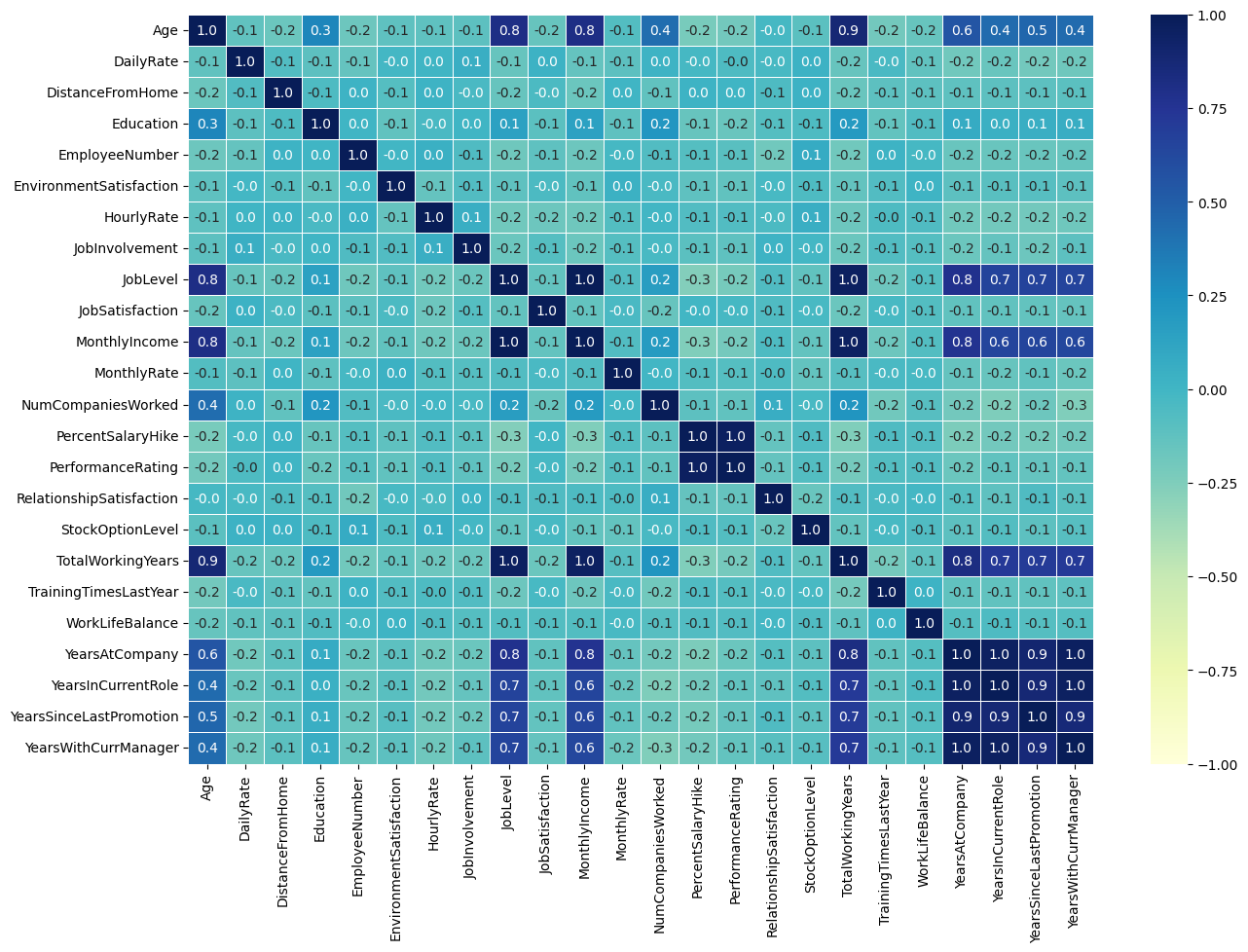
2.1 데이터 상관관계 한눈에 파악하기
df.select_dtypes(include='int64').corr().sum().sort_values(ascending=False)df.select_dtypes(include='int64').corr().sum().sort_values(ascending=False)[:8]top8_cols = df.select_dtypes(include='int64').corr().sum().sort_values(ascending=False)[:8].index.tolist()
top8_colscor_df2 = df[top8_cols].corr()
sns.heatmap(cor_df2, annot=True, fmt='.1f', cmap='Blues')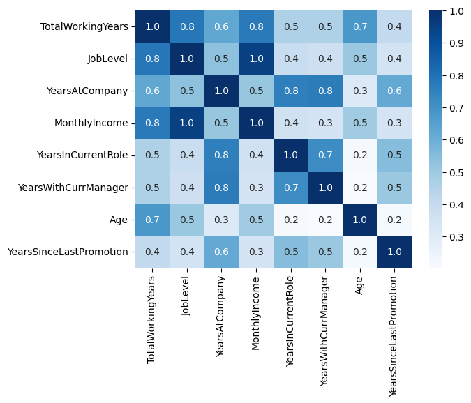
# 삼각형 Mask 씌워서 Heatmap 깔끔하게 그려보기
import numpy as np

mask = np.zeros_like(cor_df2, dtype=bool)
mask[np.triu_indices_from(mask)] = True
sns.heatmap(cor_df2, annot=True, fmt='.1f', cmap='Blues', mask=mask)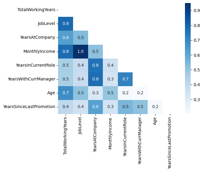

거북선통통통통