[CSS] Flexbox
 ## 잘못 사용하고 있던 float
float 은 본래 이미지+텍스트를 표현하기 위해 만들어졌다.
따라서 박스들의 위치를 변경하기 위해서 float을 사용하는 것은 잘못된 방법이였던 것!
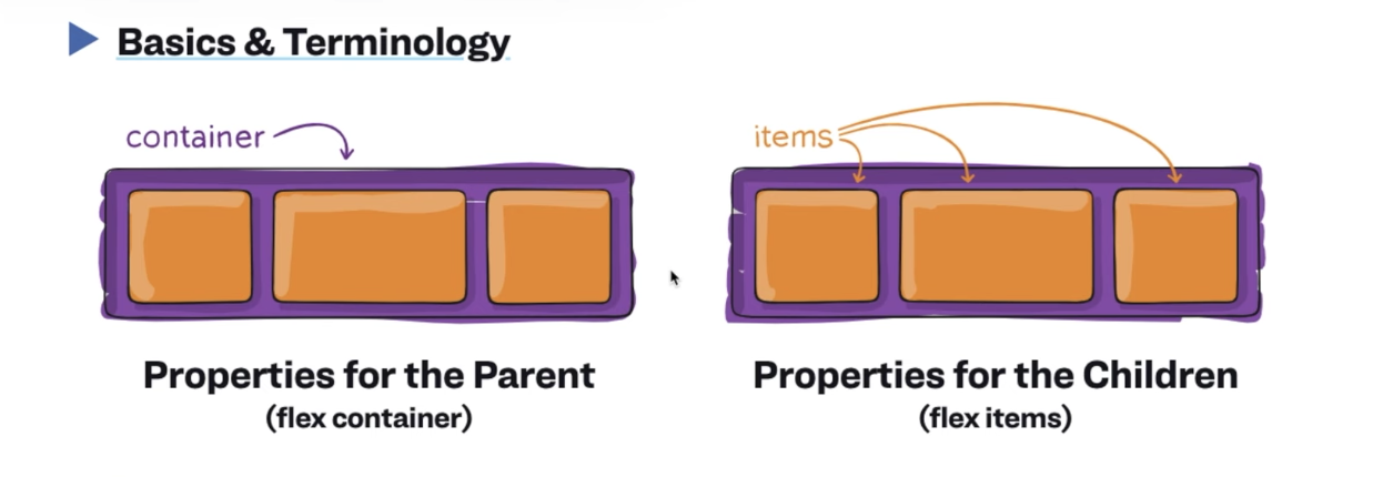
Flexbox
전체를 감싸는 box 역할을 하는 container
그 안에 여러 개의 box 인 item
축은 2개 (수직/수평)
.container {

	display: flex;
    flex-direction: row;
    flex-wrap : wrap
    /* flex-flow : row wrap */
    justify-
}

.item {
	/* order: 1 */
    flex-grow: 1;
}
flex-direction : row(default), column, row-reverse, column-reverse
flex-wrap: nowrap(default), wrap, wrap-reverse
flex-flow : flex-direction + flex-wrap
justify-content: flex-start(왼->오, 위 -> 아래), flex-end(오->왼, 아래->위)
space-around : container 내 item 사이 공간을 만들어주는 것
space-evenly : container 내 item 사이 동일한 공간을 만들어주는 것
space-between : 왼쪽.오른쪽은 화면에 붙이고 사이만 공간을 만들어주는 것
align-items : 중심축(row/column) 아이템 배치
align-content: 반대축(row/column) 아이템을 배치
flex-grow: 0 (default), 1(화면의 중심축을 꽉 채우려함) 아이템이 얼마나 늘어나야하는지
flex-shrink: 0(default), 아이템이 얼마나 줄어들어야하는지
flex-basis: flex-grow, flex-shrink 없는 경우 %로 지정 가능
align-self: item 하나만 배치하고 싶을 때 사용
참고사이트
https://css-tricks.com/snippets/css/a-guide-to-flexbox/
게임
https://flexboxfroggy.com/#ko
