원형 Progress
내배캠 개인 과제 주제가 TMDB를 활용한 영화 정보 사이트를 만드는 과제였다.
영화 평점을 표시하려고 별점을 만들었지만 굉장히 불만족스러워 하던중 주말에 토이프로젝트로 아날로그 시계를 만들게 되었는데 그 시계를 만들고나서 갑자기 어떻게 만들면 될지 머리속에서 번뜩 떠올랐다.
html
html에서는 div를 2개를 겹쳐 밑에 게이지를 표현할 부모 div와 평점을 출력할 자식 div를 생성한다.
<!DOCTYPE html>
<html lang="en">
  <head>
    <meta charset="UTF-8">
    <title>Title</title>

  </head>
  <body>
    <main>
      <div class="circle">
        <div class="inner-circle">
          <span>77%</span>
        </div>
      </div>

    </main>

  </body>
</html>
css
 body {
        display: flex;
        height: 100vh;
      }
      main{
        margin: auto;
      }

      .circle {
        font-size: 10px;
        width: 50px;
        height: 50px;
        display: flex;
        border-radius: 50%;
        border: 1px solid #353b48;
        position: relative;
      }
      .inner-circle {
        width: 90%;
        height: 90%;
        border-radius: inherit;
        background-color: #353b48;
        margin: auto;
        display: flex;
        color: white;
        justify-content: center;
      }

      .inner-circle span {
        display: flex;
        align-items: center;
      }
.circle에 display를 flex로 설정하고 하위 inner-circle을 margin:auto로 중앙정렬 시킨다.
하위 inner-circle은 부모요소의 크기 90%를 갖는다.
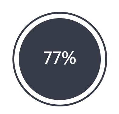
이런 모양이 예쁘게 그려진다.
여기까지는 순조롭게 코딩이 되었다.
하지만 부모요소를 어떻게하면 12시방향부터 게이지가 차는것처럼 보일까 하고 고민하던중
conic-gradient()를 찾았고 그걸 적용시켰다.
 body {
        display: flex;
        height: 100vh;
      }
      main{
        margin: auto;
      }

      .circle {
        font-size: 10px;
        width: 50px;
        height: 50px;
        display: flex;
        border-radius: 50%;
        border: 1px solid #353b48;
        position: relative;
        background: conic-gradient(yellowgreen 277deg, white 0deg);
      }
      .inner-circle {
        width: 90%;
        height: 90%;
        border-radius: inherit;
        background-color: #353b48;
        margin: auto;
        display: flex;
        color: white;
        justify-content: center;
      }

      .inner-circle span {
        display: flex;
        align-items: center;
      }
위와같이 .circle에 conic-gradient 속성을 주게되면 아래와 같이 아주 예쁜 원형 progress가 만들어진다.
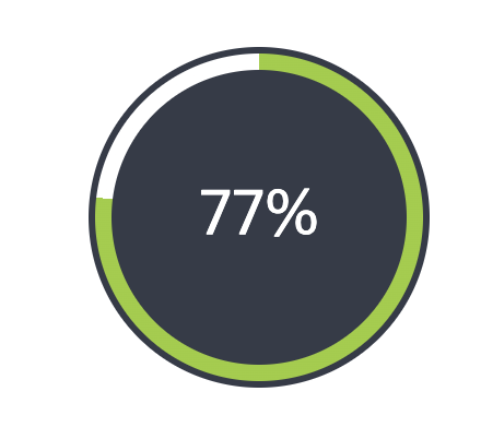
각도는 평점(10점 만점에 소수점 1자리를 갖는다) * 36을 하면 딱 나오기에 소수점은 반올림하고 javascript에서 입력만 해주면 되겠다.

흠..