지난 TIL에 이어서..
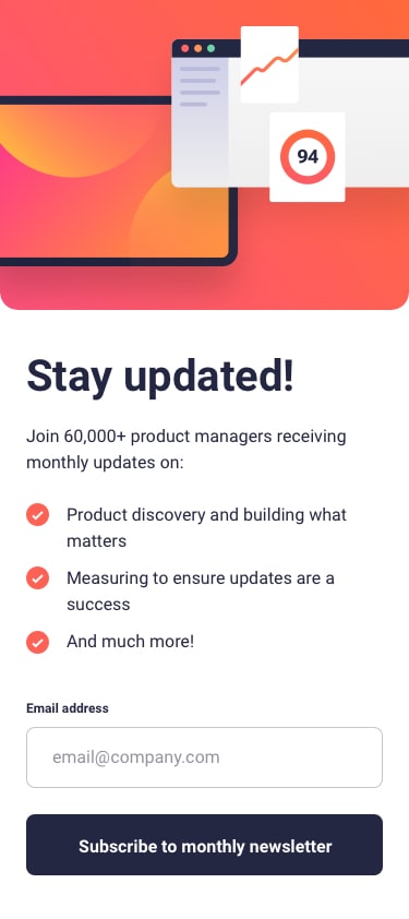
Newsletter sign-up form with success message
데스크탑에 이어 반응형으로 모바일까지 작성을 완료했다.
javascript는 추가된게 없고
html과 css만 추가되었다.
html:
<!doctype html>
<html lang="en">
<head>
<meta charset="UTF-8" />
<meta name="viewport" content="width=device-width, initial-scale=1.0" />
<!-- displays site properly based on user's device -->
<link
rel="icon"
type="image/png"
sizes="32x32"
href="./assets/images/favicon-32x32.png"
/>
<title>
Frontend Mentor | Newsletter sign-up form with success message
</title>
<!--fonts-->
<link rel="preconnect" href="https://fonts.googleapis.com" />
<link rel="preconnect" href="https://fonts.gstatic.com" crossorigin />
<link
href="https://fonts.googleapis.com/css2?family=Roboto:wght@400;700&display=swap"
rel="stylesheet"
/>
<!--fonts end-->
<link rel="stylesheet" href="./css/styles.css" />
<!-- Feel free to remove these styles or customise in your own stylesheet 👍 -->
<style>
/*.attribution { font-size: 11px; text-align: center; }*/
/*.attribution a { color: hsl(228, 45%, 44%); }*/
</style>
</head>
<body>
<!-- Sign-up form start -->
<section class="sign-up-section">
<div class="sign-up__contents">
<div>
<h1>Stay updated!</h1>
<p>Join 60,000+ product managers receiving monthly updates on:</p>
<div class="sign-up__check-box">
<div class="sign-up__check">
<img src="./assets/images/icon-list.svg" alt="" />
<span>Product discovery and building what matters</span>
</div>
<div class="sign-up__check">
<img src="./assets/images/icon-list.svg" alt="" />
<span>Measuring to ensure updates are a success</span>
</div>
<div class="sign-up__check">
<img src="./assets/images/icon-list.svg" alt="" />
<span>And much more!</span>
</div>
</div>
<form id="sign-up__form">
<div class="sign-up__btn">
<div class="sign-up__btn-text">
<span>Email address</span>
<span class="error-text hidden">Valid email required</span>
</div>
<input id="email" type="email" placeholder="email@company.com" />
<div class="sign-up__btn-div">
<a id="sign-up__btn-submit" href="#"
>Subscribe to monthly newsletter</a
>
</div>
</div>
</form>
</div>
</div>
<div class="sign-up__img">
<img src="" alt="" />
</div>
</section>
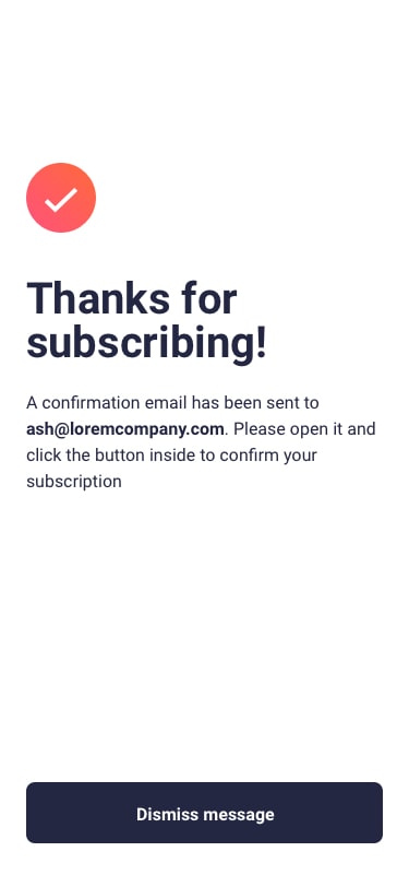
<section class="success-section hidden">
<div class="success__contents">
<div>
<img src="./assets/images/icon-success.svg" alt="" />
<h1>Thanks for subscribing!</h1>
<p>
A confirmation email has been sent to
<span>ash@loremcompany.com</span>. Please open it and click the
button inside to confirm your subscription.
</p>
</div>
<div class="success__btn-div">
<a id="" href="#">Dismiss message</a>
</div>
</div>
</section>
<!--<div class="attribution">
Challenge by
<a href="https://www.frontendmentor.io?ref=challenge" target="_blank"
>Frontend Mentor</a
>. Coded by <a href="#">yeols</a>.
</div>-->
<script src="./js/app.js"></script>
</body>
</html>html에서는 .sign-up__contents 하위에 div를 추가하였다.
모바일에서 텍스트와 버튼이 아래위로 찢어지는 디자인이여서 텍스트 그룹을 하나의 구역으로 묶고 img를 하나의 구역로 만들어 flex를 보다 편리하게 사용하기위해 추가했다.
css:
/* Reset */
body {
  margin: unset;
  padding: unset;
}

h1,
h2,
h3 {
  margin: unset;
  font-size: unset;
}

p,
span {
  margin: unset;
}

a {
  margin: unset;
  text-decoration: unset;
}
input {
  outline: unset;
}

/* Typography*/
:root {
  font-size: 10px;
}

body {
  font-family: 'Roboto', sans-serif;
  font-size: 1.6rem;
  line-height: 1.67;
}

/* Contents*/

body {
  height: 100vh;
  display: flex;
  padding: 40px 20px;
  box-sizing: border-box;
  background-color: #36384d;
  color: hsl(234, 29%, 20%);
}

.sign-up-section,
.success-section {
  position: absolute;
  inset: 0;
  max-width: 1000px;
  max-height: 700px;
  margin: auto;
  display: flex;
  justify-content: space-between;
  padding: 25px;
  box-sizing: border-box;
  background-color: #ffffff;
  border-radius: 33px;
}

.sign-up__contents {
  display: flex;
  flex-direction: column;
  height: 100%;
  width: 50%;
  font-size: 1.6rem;
  overflow: scroll;
}

.sign-up__contents > div {
  margin: auto;
  width: 80%;
}

h1 {
  font-size: 5.5rem;
  line-height: 1.2;
}

.sign-up__contents p {
  margin: 1.2rem 0;
}

.sign-up__check-box {
  margin: 20px 0;
}

.sign-up__contents .sign-up__check {
  display: flex;
  align-items: center;
}

.sign-up__contents .sign-up__check > img {
  margin-right: 10px;
}

.sign-up__contents .sign-up__btn {
  display: flex;
  flex-direction: column;
}

.sign-up__contents .sign-up__btn-text span {
  font-size: 1.2rem;
  font-weight: bold;
}

.sign-up__contents .sign-up__btn-text {
  display: flex;
  justify-content: space-between;
}

.sign-up__contents .sign-up__btn-text span:first-child {
  color: #545361;
}
.sign-up__contents .sign-up__btn-text span:last-child,
.sign-up__contents .sign-up__btn > input.error {
  color: #d97772;
}

.sign-up__contents .sign-up__btn > input.error {
  border: 0.1rem solid rgba(217, 119, 114, 0.4);
  background-color: #ffe8e6;
}

.sign-up__contents .sign-up__btn > input.error:focus {
  border: 0.1rem solid rgba(217, 119, 114, 1);
  outline: none;
}

.sign-up__contents .sign-up__btn > input,
.sign-up__contents .sign-up__btn > div,
.success__btn-div {
  border-radius: 9px;
}

.sign-up__contents .sign-up__btn > input {
  padding: 18px;
  margin-top: 5px;
  margin-bottom: 20px;
  border: 0.1rem solid rgba(0, 0, 0, 0.2);
  box-sizing: border-box;
}
.sign-up__contents .sign-up__btn > input:focus {
  border: 0.1rem solid rgba(0, 0, 0, 0.5);
}

.sign-up__contents .sign-up__btn > input::placeholder {
  color: rgba(0, 0, 0, 0.4);
  font-size: 1.6rem;
}

.sign-up__contents .sign-up__btn > .sign-up__btn-div,
.success__btn-div {
  text-align: center;
  background-color: #222641;
  position: relative;
  transition: opacity 0.5s;
}
.sign-up__contents .sign-up__btn > .sign-up__btn-div:after,
.success__btn-div:after {
  content: '';
  opacity: 0;
  position: absolute;
  z-index: 1;
  top: 0;
  left: 0;
  bottom: 0;
  right: 0;
  border-radius: inherit;
  transition: opacity 0.5s;
  background: linear-gradient(to left, #ff693b, #f3597c);
}
.sign-up__contents .sign-up__btn > .sign-up__btn-div:hover:after,
.success__btn-div:hover:after {
  opacity: 1;
}

.sign-up__contents .sign-up__btn > .sign-up__btn-div > a,
.success__btn-div > a {
  display: block;
  color: #ffffff;
  position: relative;
  padding: 15px 0;
  height: 100%;
  z-index: 2;
}

.sign-up__img {
  display: flex;
}
.sign-up__img img {
  content: url('../assets/images/illustration-sign-up-desktop.svg');
}

.hidden {
  display: none;
}

/* success */
.success-section {
  max-width: 500px;
  max-height: 500px;
  padding: 50px 65px;
  box-sizing: border-box;
}

.success__contents {
  margin: auto;
  height: 100%;
  overflow: scroll;
}
.success__contents > div:first-child img {
  width: 60px;
  height: 60px;
}

.success__contents > div:first-child > h1 {
  margin-top: 10px;
}
.success__contents > div:first-child > p {
  margin-top: 20px;
  margin-bottom: 30px;
  font-size: 1.6rem;
}
.success__contents > div:first-child > p > span {
  font-weight: bold;
}

/*mobile*/
@media (max-width: 375px) {
  body {
    height: auto;
    display: block;
    padding: unset;
  }
  .sign-up-section {
    flex-direction: column-reverse;
    border-radius: unset;
    padding: 0 0 30px 0;
    height: auto;
    max-height: unset;
    position: relative;
  }
  .sign-up__img img {
    content: url('../assets/images/illustration-sign-up-mobile.svg');
    width: 100%;
    height: 100%;
  }
  .sign-up__contents {
    width: 100%;
    height: auto;
    overflow: unset;
  }
  h1 {
    font-size: 4rem;
  }
  .sign-up__contents h1 {
    margin: 30px 0;
  }

  /*  success page */
  .success-section {
    border-radius: unset;
    height: 100vh;
    max-height: 100vh;
    position: relative;
    padding: 50px 30px;
  }
  .success__contents {
    display: flex;
    flex-direction: column;
    overflow: unset;
  }
  .success__contents > div:first-child {
    flex-grow: 1;
  }
}
mobile은 요구사항이 375px 이하 일때여서 @media (max-width: 375px)를 주었고 특이 사항으로는 success페이지 예제가 아래위 여백이 많은데 화면 height에 맞게 조절되게 작성했다.
완성은 했지만 아직 css에서 변수 활용을 못하는거같다. 잘 모르기도하고..
더욱 좋은 코드를 작성할 수 있게 변수 공부를 해야겠다....
github
흠..