TailwindCSS v4의 다크 모드 기능 (feat. shadcn/ui)
- TailwindCSS의 다크 모드는 어떻게 사용하는가?
- 다크 모드 테마를 구성하는 방법은 여러 가지 있다. 그중, shadcn/ui의 CSS 세팅을 기반으로 살펴 보자.
@import 'tailwindcss';

@plugin 'tailwindcss-animate';

@custom-variant dark (&:is(.dark *));

:root {

	... ...

  --background: oklch(1 0 0);
  --foreground: oklch(0.145 0 0);
  --card: oklch(1 0 0);
  --card-foreground: oklch(0.145 0 0);
  --popover: oklch(1 0 0);
  --popover-foreground: oklch(0.145 0 0);
  --primary: oklch(0.205 0 0);
  --primary-foreground: oklch(0.985 0 0);
  --secondary: oklch(0.97 0 0);
  --secondary-foreground: oklch(0.205 0 0);

  ... ...

  }

.dark {
  --background: oklch(0.145 0 0);
  --foreground: oklch(0.985 0 0);
  --card: oklch(0.145 0 0);
  --card-foreground: oklch(0.985 0 0);
  --popover: oklch(0.145 0 0);
  --popover-foreground: oklch(0.985 0 0);
  --primary: oklch(0.985 0 0);
  --primary-foreground: oklch(0.205 0 0);
  --secondary: oklch(0.269 0 0);
  --secondary-foreground: oklch(0.985 0 0);

  ... ...

  }

@theme inline {
  --color-background: var(--background);
  --color-foreground: var(--foreground);
  --color-card: var(--card);
  --color-card-foreground: var(--card-foreground);
  --color-popover: var(--popover);
  --color-popover-foreground: var(--popover-foreground);
  --color-primary: var(--primary);
  --color-primary-foreground: var(--primary-foreground);
  --color-secondary: var(--secondary);
  --color-secondary-foreground: var(--secondary-foreground);

  ... ...

  }
코드를 보면, 앞서 1편에서 간단하게 @theme에 컬러를 직접 넣은 것과 다르게, :root와 .dark에 컬러를 지정하고 스위칭하는 방식이다.
@custom-variant dark (&:is(.dark *));
이 부분이 상당히 중요한데, dark 모드를 시스템 제어가 아닌, 애플리케이션 내부에서 제어하는 수동 다크 모드 방식을 뜻한다.
시스템 제어 다크 모드 방식
@import 'tailwindcss';
:root {
--color-mint-500: oklch(0.72 0.11 178);
--color-banana: oklch(0.95 0.05 100);
}
/* 다크 모드 기준, 바나나와 민트의 컬러가 반대다. */
.dark {
--color-mint-500: oklch(0.95 0.05 100);
--color-banana: oklch(0.72 0.11 178);
}
@theme {
--color-mint-500: var(--color-mint-500);
--color-banana: var(--color-banana);
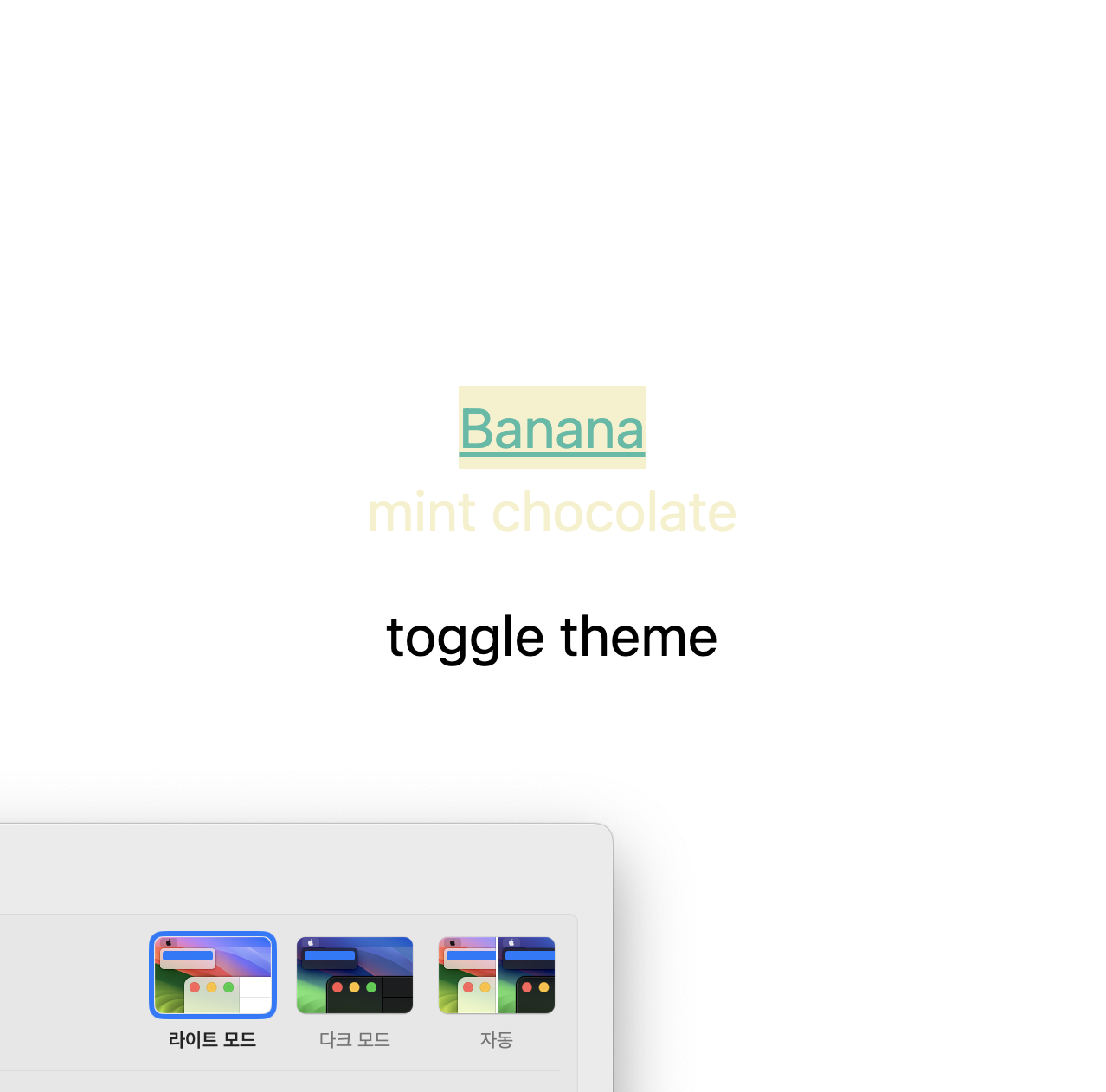
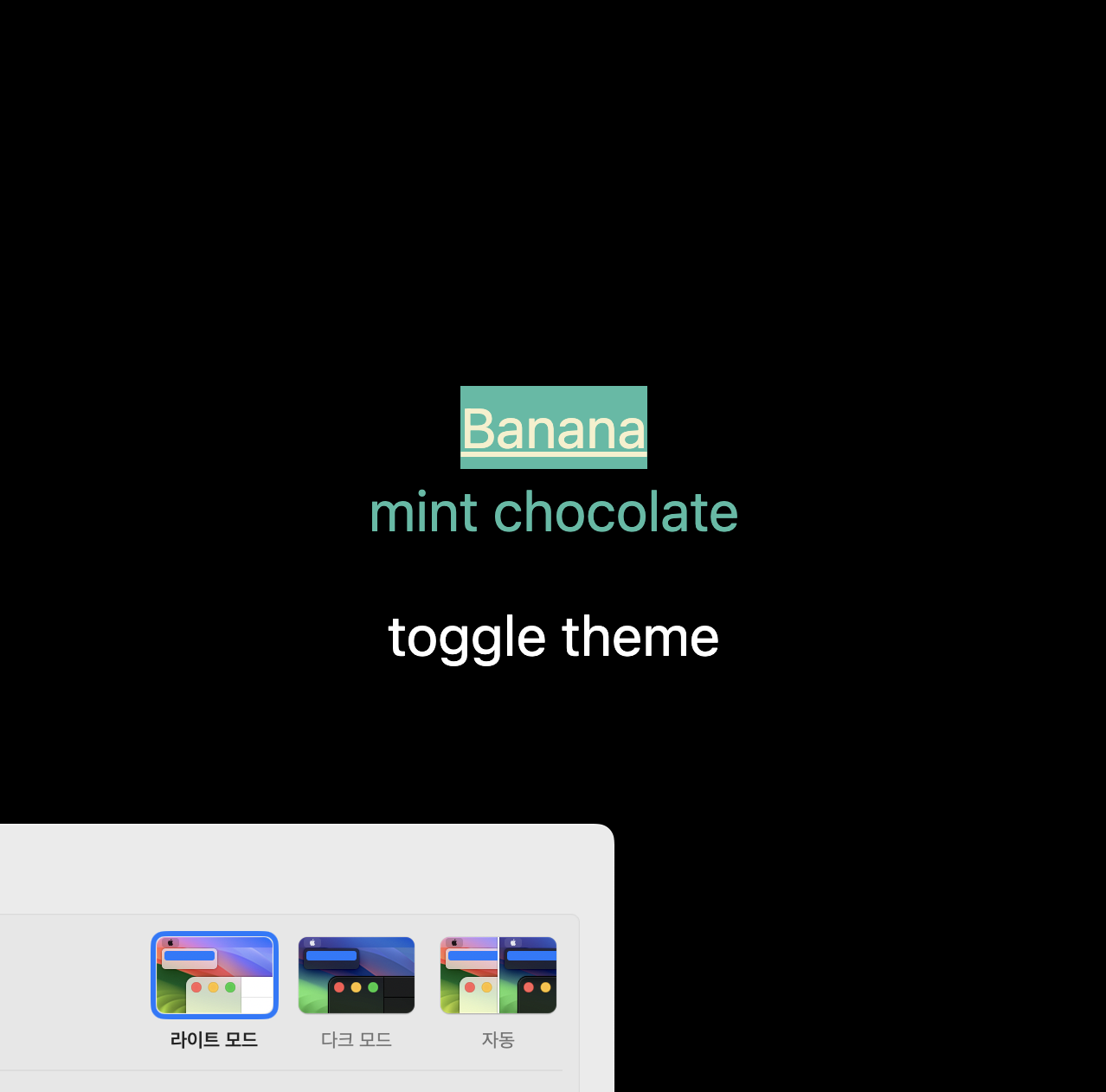
}function App() {
return (
<main className='flex flex-col items-center justify-center w-screen h-screen dark:bg-white bg-black'>
<h1 className='underline text-banana bg-mint-500 text-title-01'>Banana</h1>
<p className='text-mint-500'>mint chocolate</p>
<button className='text-title-01 dark:bg-white dark:text-black bg-black text-white h-12 w-full'>
theme
</button>
</main>
);
}
export default App;JSX 구문의 className을 보면, dark:text-black과같이 dark:*의 className을 볼 수 있다.
이 부분이 시스템이 다크 모드일 시, 적용된다.
면밀한 비교를 위해 라이트 모드일 시 검은 배경, 다크 모드일 시 흰 배경을 적용했다.
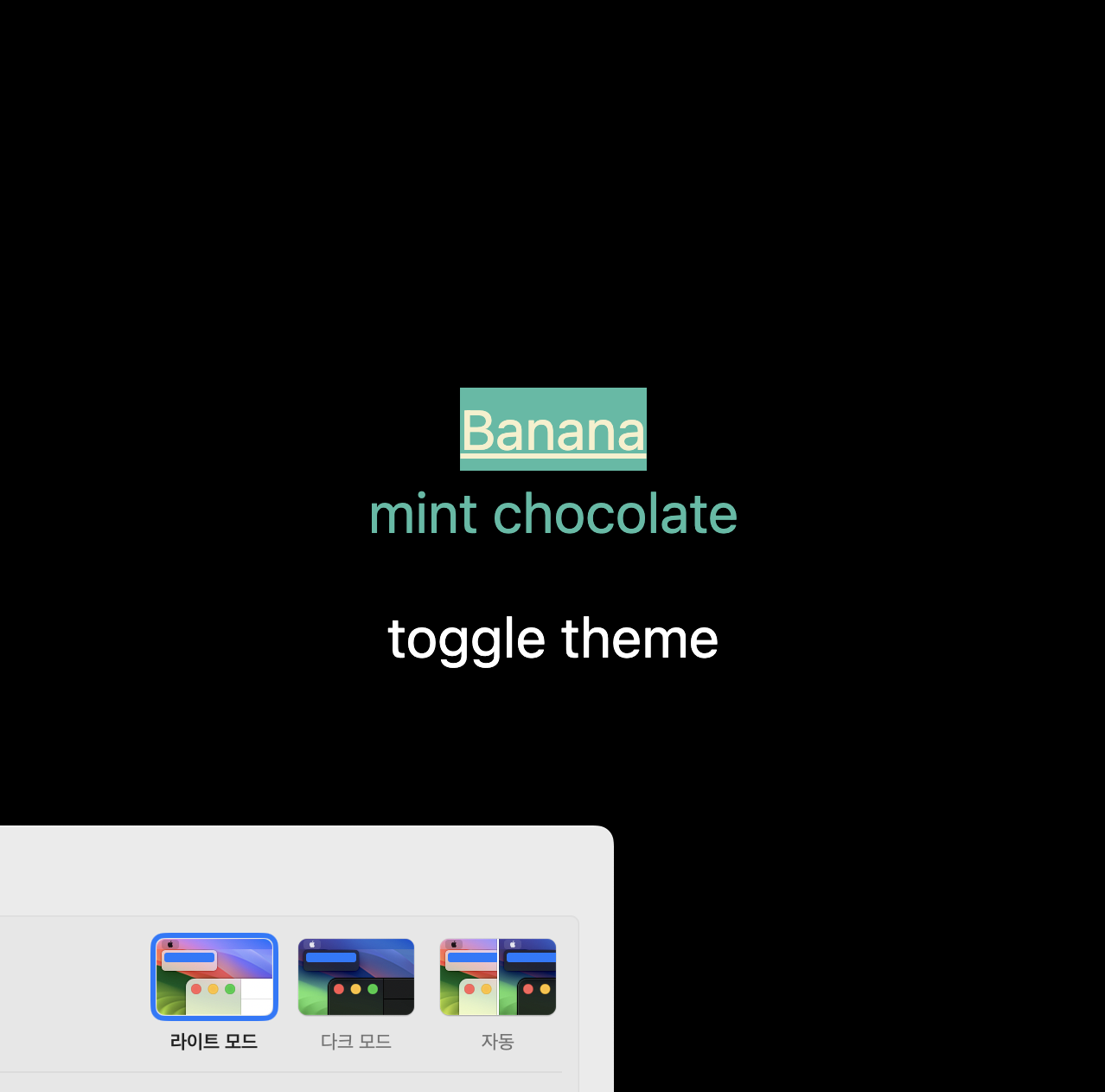
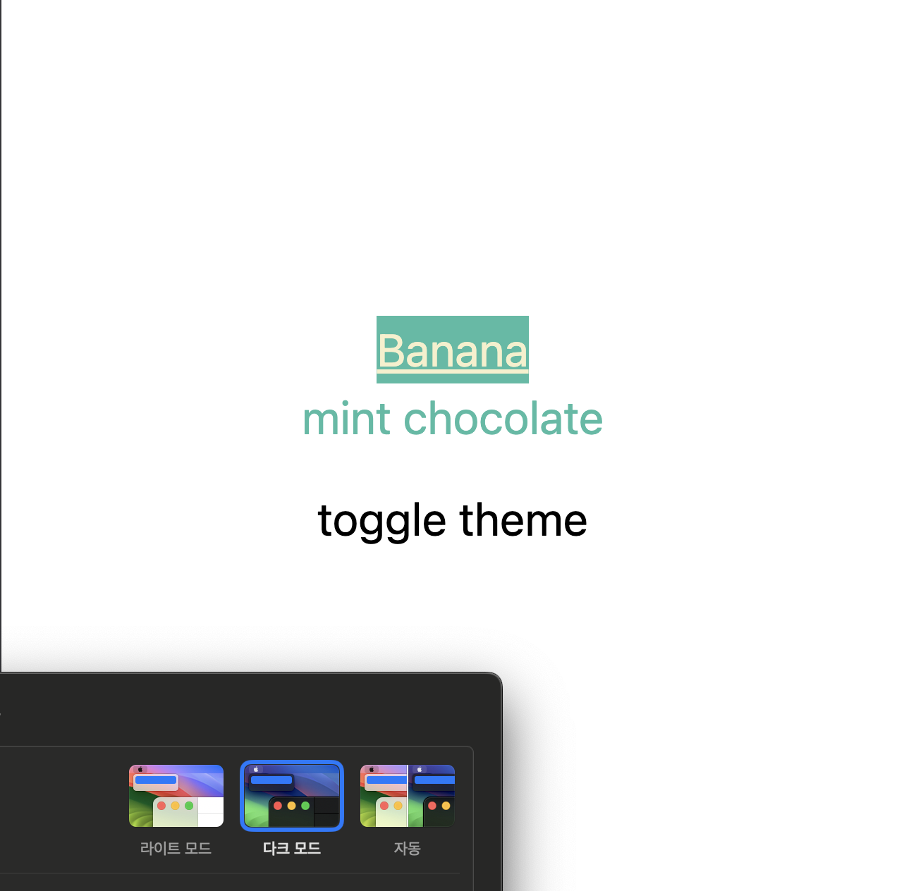
dark라는 className을 따로 쓴 것은 아니기에, CSS에 설정한 .dark의 컬러 변수가 지원되진 않는다. (설정은 하였지만, 변경되지 않는 상태이다)
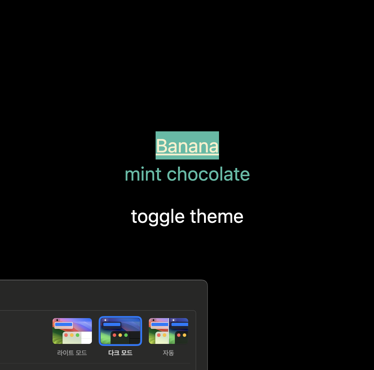
.dark의 컬러 변수를 제어하는 방법
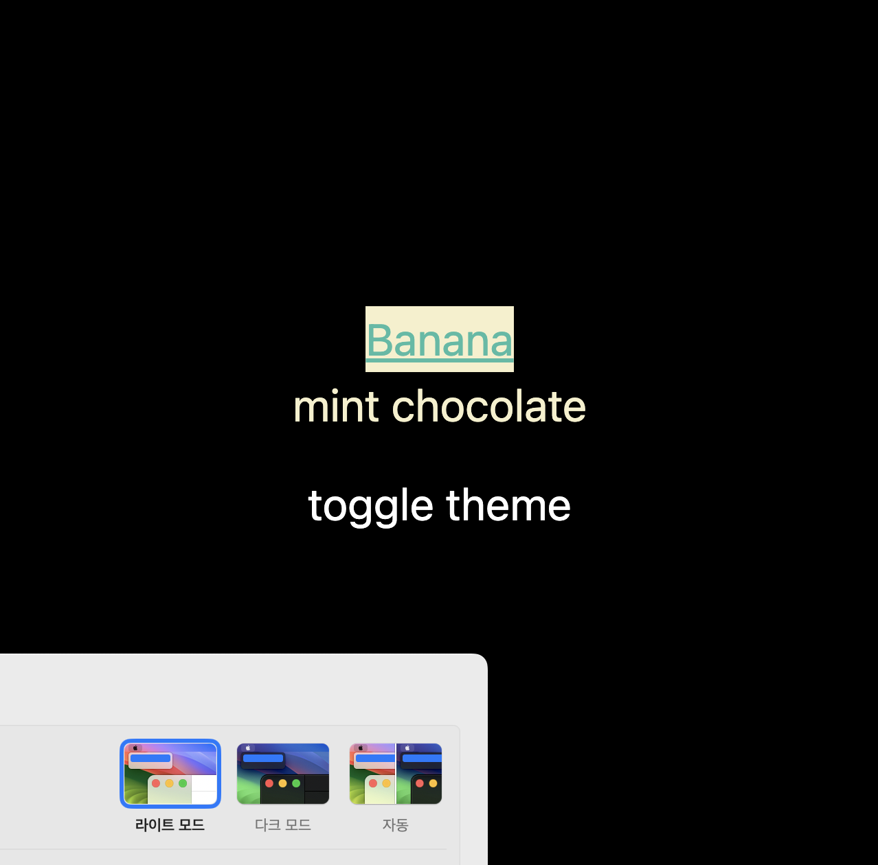
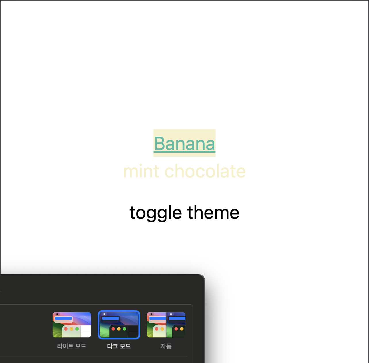
import { useState } from 'react';

function App() {
	// 현재 기준으로 'light'는 명시적으로 표현하기 위함이지, 기능을 보유하진 않는다.
  const [theme, setTheme] = useState<'light' | 'dark'>('light');

  const handleTheme = () => {
    if (theme === 'light') {
      setTheme('dark');
    } else {
      setTheme('light');
    }
  };

  return (
    <main className={`${theme} flex flex-col items-center justify-center w-screen h-screen dark:bg-white bg-black`}>
      <h1 className='underline text-banana bg-mint-500 text-title-01'>Banana</h1>
      <p className='text-mint-500'>mint chocolate</p>
      <button
        className='text-title-01 dark:bg-white dark:text-black bg-black text-white h-12 w-full'
        onClick={handleTheme}
      >
        toggle theme
      </button>
    </main>
  );
}

export default App;
공식 문서에서는 html 태그에 class=’dark’를 넣으라고 되어 있다. (localStorage 등을 활용하는 것을 권장한다)
우리는 리액트를 사용하기에, html 태그까지 갈 필요 없이, root Element에 사용하면 될 것이다.


마](https://velog.velcdn.com/images/yeon0731/post/778b1864-ddd2-42ee-8ffa-fbfd402df508/image.png)
다만, dark:*는 여전히 시스템 다크 모드 제어에 의존하고, dark라는 class에 의해 변동하지 않는다.
완전 수동 제어 방법
앞서 언급한 @custom-variant dark (&:is(.dark *));를 추가하면, 완전 제어가 가능하다.
@import 'tailwindcss';

@custom-variant dark (&:is(.dark *));

:root {
  --color-mint-500: oklch(0.72 0.11 178);
  --color-banana: oklch(0.95 0.05 100);
}

/* 다크 모드 기준, 바나나와 민트의 컬러가 반대다. */
.dark {
  --color-mint-500: oklch(0.95 0.05 100);
  --color-banana: oklch(0.72 0.11 178);
}

@theme {
  --color-mint-500: var(--color-mint-500);
  --color-banana: var(--color-banana);
}
이외 코드는 이전과 동일하다.

컬러 변수를 세팅하는 것이, 매번 dark:*를 달지 않아도 되기에,
최대한 컬러 변수를 활용하고 필요한 부분만 dark:*로 채워 넣는 것이 좋다고 생각한다.
TailwindCSS v4의 text-size(font-size) 설정
Theme variable namespaces 를 참고하면,
—text-*를 확인할 수 있다.
아래는 Default theme variable reference 이다.
@theme {

	... ...

  --text-xs: 0.75rem;
  --text-xs--line-height: calc(1 / 0.75);
  --text-sm: 0.875rem;
  --text-sm--line-height: calc(1.25 / 0.875);
  --text-base: 1rem;
  --text-base--line-height: calc(1.5 / 1);
  --text-lg: 1.125rem;
  --text-lg--line-height: calc(1.75 / 1.125);
  --text-xl: 1.25rem;
  --text-xl--line-height: calc(1.75 / 1.25);
  --text-2xl: 1.5rem;
  --text-2xl--line-height: calc(2 / 1.5);
  --text-3xl: 1.875rem;
  --text-3xl--line-height: calc(2.25 / 1.875);
  --text-4xl: 2.25rem;
  --text-4xl--line-height: calc(2.5 / 2.25);
  --text-5xl: 3rem;
  --text-5xl--line-height: 1;

  ... ...

  }
line-height의 경우도, 이처럼 부가적인 하위 선언을 통해 할당해 준다.
다음은 실제 코드에 적용해 본 예시이다.
@import 'tailwindcss';

:root {
  --color-mint-500: oklch(0.72 0.11 178);
  --color-banana: oklch(0.95 0.05 100);

  --text-title-01: 3.75rem;
  --text-title-01--line-height: calc(0.98 / 1);
  --text-title-02: 2rem;
  --text-title-02--line-height: calc(0.98 / 1);
  --text-title-03: 1rem;
  --text-title-03--line-height: calc(0.98 / 1);
}

@theme {
  --color-mint-500: var(--color-mint-500);
  --color-banana: var(--color-banana);

  --text-title-01: var(--text-title-01);
  --text-title-01--line-height: var(--text-title-01--line-height);
  --text-title-02: var(--text-title-02);
  --text-title-02--line-height: var(--text-title-02--line-height);
  --text-title-03: var(--text-title-03);
  --text-title-03--line-height: var(--text-title-03--line-height);
}
function App() {
return (
<main className='flex flex-col items-center justify-center w-screen h-screen bg-black'>
<h1 className='underline text-banana bg-mint-500 text-title-01'>Banana</h1>
<p className='text-mint-500'>mint chocolate</p>
</main>
);
}
export default App;
이외에도 다음과같이 text-size 관련해서 추가할 수 있는 하위 속성들이 있다.
@theme {
  --text-tiny: 0.625rem;
  --text-tiny--line-height: 1.5rem;
  --text-tiny--letter-spacing: 0.125rem;
  --text-tiny--font-weight: 500;
}
TailwindCSS 유틸로 cn 등(clsx, twMerge, cva)을 사용하는 경우 (shadcn/ui 등)
shadcn/ui를 사용하는 경우, cn 함수를 주로 사용할 것이다. (매우 유용하다)
유틸의 내용은 우선 넘어가고, cn 함수를 많이 사용하는 편인데, 이때 text-size(font-size) theme variables를 설정해주면 꼭 해줘야 하는 세팅이 있다.
import { type ClassValue, clsx } from 'clsx'
import { extendTailwindMerge } from 'tailwind-merge'

const ctwMerge = extendTailwindMerge({
  extend: {
    theme: {
      text: ['title-01', 'title-02', 'title-03'],
    },
  },
})

export function cn(...inputs: ClassValue[]) {
  return ctwMerge(clsx(inputs))
}
ctwMerge를 이렇게 세팅해줘야, cn함수를 사용할 때도 text-size 부분이 정상적으로 적용된다.
TailwindCSS v4의 input 태그 placeholder 문제 (chrome 브라우저)
현재 chrome에서, TailwindCSS placeholder 스타일이 일부 적용이 안 되는 문제가 있다.
(chrome, safari, brave, arc, whale, edge에서 테스트를 진행했고, chrome만이 적용되지 않는다)
placeholder (font-size, color) 부분이 적용되지 않는다.
동일한 환경에서, 왼쪽은 크롬, 오른쪽은 브레이브 브라우저이다.


관련 discussion을 올려 뒀는데, issue로 전환할까 고민 중이다.
어쨌든 이를 대체할 수 있는 반창고로, CSS를 선택하여 사용했다.
예시 코드는 실제 회사에서 내가 작성한 코드 중 일부이다.
/* 플레이스홀더 스타일 추가 */
/* Chrome 브라우저에서 플레이스홀더 스타일 적용 방법 */
.input-with-placeholder::placeholder {
  color: var(--color-gray-05);
  font-size: var(--text-body-01);
  line-height: var(--text-body-01--line-height);
  letter-spacing: var(--text-body-01--letter-spacing);
}
import { Input as InputComponent } from '@ui/common/components/input'
import { cn } from '@ui/common/lib/utils'
import React from 'react'
export function Input(props: React.ComponentProps<'input'>) {
const { className, ...rest } = props
return (
<InputComponent
className={cn(
'h-12 rounded-md border border-gray-07 p-3 text-body-01',
'xl:text-body-01 sm:text-body-01 md:text-body-01 lg:text-body-01',
'dark:aria-invalid:ring-none aria-invalid:ring-none aria-invalid:border-gray-07',
// 원인을 모르겠으나, Chrome 브라우저에서 placeholder에 텍스트 사이즈와 색상이 적용되지 않음 (tailwindcss discussion 생성)
// 이외 브라우저에서는 적용됨 - 사파리, 아크, 웨일, 브레이브에서 정상 적용 확인 완료
// https://github.com/tailwindlabs/tailwindcss/discussions/17239
// 'placeholder:text-title-01 placeholder:text-gray-05',
// chrome 브라우저 대응 가능한 플레이스홀더 스타일 적용 방법
'input-with-placeholder',
className
)}
{...rest}
/>
)
}이와 관련해서 간단하게 고민해봤는데, 크로미움 브라우저는 정상 적용이 되는데, 크롬은 적용되지 않는다는 것이 의아하다.
의아함에도 불구하고 이를 알지 못 한다는 점에서, 브라우저나 깊은 부분에 대해 부족함을 느낀다.
이런 부분까지 알 수 있는 개발자가 되면 좋겠다.
작성된 내용이, TailwindCSS v4를 세팅하거나 사용하는 분들께 조금이나마 시간을 효율적으로 쓰게끔 도움을 드린다면 좋겠다.


같은 Chromium 기반 브라우저인데 Chrome만 안된다는게 신기하네요. Tailwind 적용할때 참고하겠습니다!