- react 컴포넌트의 장점에 대해 설명할 수 있습니다.
- 답변)
- 의도:
- 지원자가 React 컴포넌트의 장점을 이해하고 있는지 평가.
- 팁:
- React 컴포넌트의 재사용성, 컴포지션, 유지보수성 등의 장점을 설명하세요.
- React 컴포넌트를 사용하는 예제를 떠올려 보세요.
- 모범답안:
- React 컴포넌트는 재사용이 가능하며, 하나의 컴포넌트를 여러 곳에서 사용할 수 있습니다.
- 컴포지션을 통해 복잡한 UI를 간단한 컴포넌트로 구성할 수 있습니다.
- 컴포넌트 단위로 개발하면 유지보수성과 확장성이 높아집니다.
- 의도:
- 답변)
React 컴포넌트 장점
1. 재사용성 (Reusability)
- 한 번 작성한 컴포넌트를 여러 곳에서 재사용 가능. 예를 들어, Button 컴포넌트를 만들면 애플리케이션 전체에서 일관된 스타일과 동작을 가진 버튼을 사용할 수 있다.
- Props를 통해 동일한 컴포넌트를 다양한 상황에 맞게 커스터마이징 가능.
🖥️ jsx

// 재사용 가능한 Button 컴포넌트
const Button = ({ variant, children, onClick }) => {
  return (
    <button
      className={`button ${variant}`}
      onClick={onClick}
    >
      {children}
    </button>
  );
};
props로 컴포넌트로 커스터마이징 예시 코드
🖥️ import React from 'react';
import { AlertCircle, CheckCircle, Info } from 'lucide-react';

// 1. 기본적인 버튼 컴포넌트
const Button = ({
  variant = 'primary',  // primary, secondary, danger
  size = 'medium',      // small, medium, large
  disabled = false,
  children,
  onClick
}) => {
  // variant에 따른 스타일 매핑
  const variantStyles = {
    primary: 'bg-blue-500 hover:bg-blue-600 text-white',
    secondary: 'bg-gray-500 hover:bg-gray-600 text-white',
    danger: 'bg-red-500 hover:bg-red-600 text-white'
  };

  // size에 따른 스타일 매핑
  const sizeStyles = {
    small: 'px-2 py-1 text-sm',
    medium: 'px-4 py-2',
    large: 'px-6 py-3 text-lg'
  };

  return (
    <button
      className={`rounded-md ${variantStyles[variant]} ${sizeStyles[size]}
        ${disabled ? 'opacity-50 cursor-not-allowed' : ''}`}
      onClick={onClick}
      disabled={disabled}
    >
      {children}
    </button>
  );
};

// 2. 알림 메시지 컴포넌트
const Alert = ({
  type = 'info',      // info, success, error
  message,
  showIcon = true,
  className = ''
}) => {
  const alertStyles = {
    info: {
      bg: 'bg-blue-100 border-blue-500',
      text: 'text-blue-900',
      icon: <Info className="w-5 h-5" />
    },
    success: {
      bg: 'bg-green-100 border-green-500',
      text: 'text-green-900',
      icon: <CheckCircle className="w-5 h-5" />
    },
    error: {
      bg: 'bg-red-100 border-red-500',
      text: 'text-red-900',
      icon: <AlertCircle className="w-5 h-5" />
    }
  };

  const style = alertStyles[type];

  return (
    <div className={`p-4 rounded-lg border-l-4 ${style.bg} ${className}`}>
      <div className="flex items-center gap-2">
        {showIcon && style.icon}
        <span className={style.text}>{message}</span>
      </div>
    </div>
  );
};

// 3. 입력 필드 컴포넌트
const Input = ({
  type = 'text',
  label,
  placeholder,
  error,
  size = 'medium',
  onChange,
  required = false
}) => {
  const sizeStyles = {
    small: 'px-2 py-1 text-sm',
    medium: 'px-3 py-2',
    large: 'px-4 py-3 text-lg'
  };

  return (
    <div className="flex flex-col gap-1">
      {label && (
        <label className="text-gray-700">
          {label}
          {required && <span className="text-red-500 ml-1">*</span>}
        </label>
      )}
      <input
        type={type}
        className={`border rounded-md ${sizeStyles[size]}
          ${error ? 'border-red-500' : 'border-gray-300'}
          focus:ring-2 focus:ring-blue-500 focus:border-transparent`}
        placeholder={placeholder}
        onChange={onChange}
      />
      {error && (
        <span className="text-red-500 text-sm">{error}</span>
      )}
    </div>
  );
};

// 사용 예시를 보여주는 컴포넌트
const Demo = () => {
  return (
    <div className="space-y-8 p-6">
      <div className="space-y-2">
        <h2 className="text-lg font-semibold">버튼 예시</h2>
        <div className="flex gap-2">
          <Button>기본 버튼</Button>
          <Button variant="secondary" size="small">작은 버튼</Button>
          <Button variant="danger" size="large" disabled>비활성화된 버튼</Button>
        </div>
      </div>

      <div className="space-y-2">
        <h2 className="text-lg font-semibold">알림 예시</h2>
        <Alert type="info" message="정보 메시지입니다." />
        <Alert type="success" message="성공적으로 저장되었습니다." />
        <Alert type="error" message="오류가 발생했습니다." showIcon={false} />
      </div>

      <div className="space-y-2">
        <h2 className="text-lg font-semibold">입력 필드 예시</h2>
        <Input
          label="이메일"
          type="email"
          placeholder="이메일을 입력하세요"
          required
        />
        <Input
          label="비밀번호"
          type="password"
          error="비밀번호는 8자 이상이어야 합니다."
          size="large"
        />
      </div>
    </div>
  );
};

export default Demo;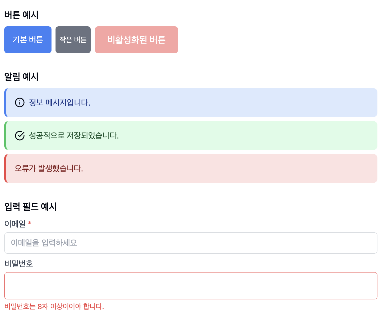
2. 컴포지션 (Composition)
- 작은 단위의 컴포넌트들을 조합하여 복잡한 UI를 구축할 수 있다.
- 예시 : Form 컴포넌트는 Input, Button, Label 등의 작은 컴포넌트들로 구성될 수 있다.
- 이러한 계층 구조는 코드의 가독성을 높이고 로직을 분리하기 좋다.
🖥️ jsx

// 컴포지션을 통한 Form 컴포넌트 구현
const LoginForm = () => {
  return (
    <form>
      <Input label="이메일" type="email" />
      <Input label="비밀번호" type="password" />
      <Button variant="primary">로그인</Button>
      <Button variant="secondary">취소</Button>
    </form>
  );
};
3. 유지보수성 (Maintainability)
-
관심사의 분리
- UI, 로직, 상태 관리 등을 개별 컴포넌트로 분리
- 각 컴포넌트가 독립적인 책임을 가짐
-
캡슐화
- 컴포넌트 내부 구현을 외부로부터 숨김
- 컴포넌트 간 인터페이스(props)를 통한 명확한 상호작용
각 컴포넌트가 독립적 단위로 작동하므로, 특정 기능을 수정할 때 다른 부분에 영향 주지 않는다.
컴포넌트별 책임이 명확하게 분리되어 있어 버그 수정이 용이.
테스트도 컴포넌트 단위로 진행할 수 있어 품질 관리가 쉽다.
4. 선언적 UI (Declarative UI)
- React의 선언적 방식으로 UI를 구현하면 코드의 예측성이 높아진다.
- 상태(state)에 따른 UI 변화를 명확하게 정의할 수 있다.
➡️ 대규모 애플리케이션 개발에 특히 적합
- 팀 단위 개발에서 컴포넌트 단위 작업 분배 가능
- 디자인 시스템을 구축하고 일관된 UI 유지 용이
- 코드의 재사용성이 높아져 개발 생산성 향상
아무튼, 개발자