코드를 정말 가볍게 찍먹하려고 읽는 중인데
toast와 radix가 다른 부분에서 사용된 것을 발견했고,
둘 사이에 어떤 차이가 있으며 어떤 이유에서 다르게 사용됐는지 궁금해졌다.
Toast UI
사용자에게 일시적인 알림을 보여줄 때 사용한다.
특징
- 화면 상단이나 하단에 잠깐 나타났다가 자동으로 사라짐
- 사용자의 작업을 방해하지 않음
- 주로 작업 완료, 오류 발생, 새 메시지 도착 등을 알릴 때 사용
사용
- "변경사항이 저장되었습니다"
- "새로운 메시지가 도착했습니다"
- "네트워크 연결이 끊겼습니다"
Radix UI
복잡한 상호작용이 필요한 UI 컴포넌트를 구현할 때 사용한다.
특징
- 접근성(키보드 네비게이션, 스크린 리더 지원)이 우수
- 커스터마이징이 자유로움
- 모달, 드롭다운, 툴팁 등 다양한 컴포넌트 제공
사용
- 설정 메뉴
- 드롭다운 선택
- 모달 다이얼로그
- 폼 컨트롤
코드 차이점
Toast UI 관련 코드
🖥️ javascript

showToast, setShowToast
notification, alert
setTimeout (자동으로 사라지는 타이밍 설정)
Radix UI 관련 코드
🖥️ javascript

Dialog, Modal
Dropdown, Select
Popover
Toast UI 예시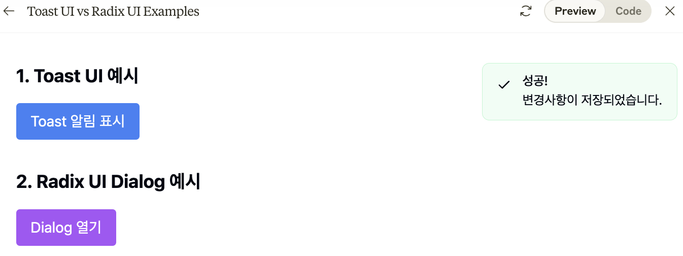
Radix UI 예시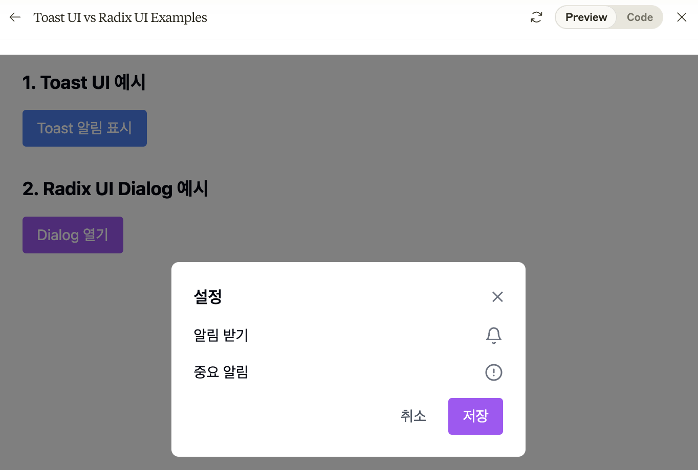
코드
🖥️ import React, { useState } from 'react';
import { AlertCircle, Bell, Check } from 'lucide-react';
import { Alert, AlertDescription, AlertTitle } from '@/components/ui/alert';

const UIExamples = () => {
  const [showToast, setShowToast] = useState(false);
  const [showDialog, setShowDialog] = useState(false);

  // Toast 알림 표시
  const triggerToast = () => {
    setShowToast(true);
    setTimeout(() => setShowToast(false), 3000);
  };

  return (
    <div className="p-8 space-y-8">
      {/* Toast UI 예시 */}
      <div className="space-y-4">
        <h2 className="text-xl font-bold">1. Toast UI 예시</h2>
        <button
          onClick={triggerToast}
          className="px-4 py-2 bg-blue-500 text-white rounded hover:bg-blue-600"
        >
          Toast 알림 표시
        </button>

        {showToast && (
          <div className="fixed top-4 right-4 animate-fade-in">
            <Alert className="w-72 bg-green-50 border-green-200">
              <Check className="w-4 h-4 text-green-500" />
              <AlertTitle>성공!</AlertTitle>
              <AlertDescription>
                변경사항이 저장되었습니다.
              </AlertDescription>
            </Alert>
          </div>
        )}
      </div>

      {/* Radix UI Dialog 예시 */}
      <div className="space-y-4">
        <h2 className="text-xl font-bold">2. Radix UI Dialog 예시</h2>
        <button
          onClick={() => setShowDialog(true)}
          className="px-4 py-2 bg-purple-500 text-white rounded hover:bg-purple-600"
        >
          Dialog 열기
        </button>

        {showDialog && (
          <div className="fixed inset-0 bg-black bg-opacity-50 flex items-center justify-center">
            <div className="bg-white p-6 rounded-lg w-96 space-y-4">
              <div className="flex justify-between items-center">
                <h3 className="text-lg font-semibold">설정</h3>
                <button
                  onClick={() => setShowDialog(false)}
                  className="text-gray-500 hover:text-gray-700"
                >
                  ✕
                </button>
              </div>
              <div className="space-y-4">
                <div className="flex items-center justify-between">
                  <span>알림 받기</span>
                  <Bell className="w-5 h-5 text-gray-500" />
                </div>
                <div className="flex items-center justify-between">
                  <span>중요 알림</span>
                  <AlertCircle className="w-5 h-5 text-gray-500" />
                </div>
              </div>
              <div className="flex justify-end space-x-2">
                <button
                  onClick={() => setShowDialog(false)}
                  className="px-4 py-2 text-gray-600 hover:bg-gray-100 rounded"
                >
                  취소
                </button>
                <button
                  onClick={() => setShowDialog(false)}
                  className="px-4 py-2 bg-purple-500 text-white rounded hover:bg-purple-600"
                >
                  저장
                </button>
              </div>
            </div>
          </div>
        )}
      </div>
    </div>
  );
};

export default UIExamples;
아무튼, 개발자