[DAY15] Optimizations and Deployment
간단한 Javascript 연습
// <h1 class="heading-primary">
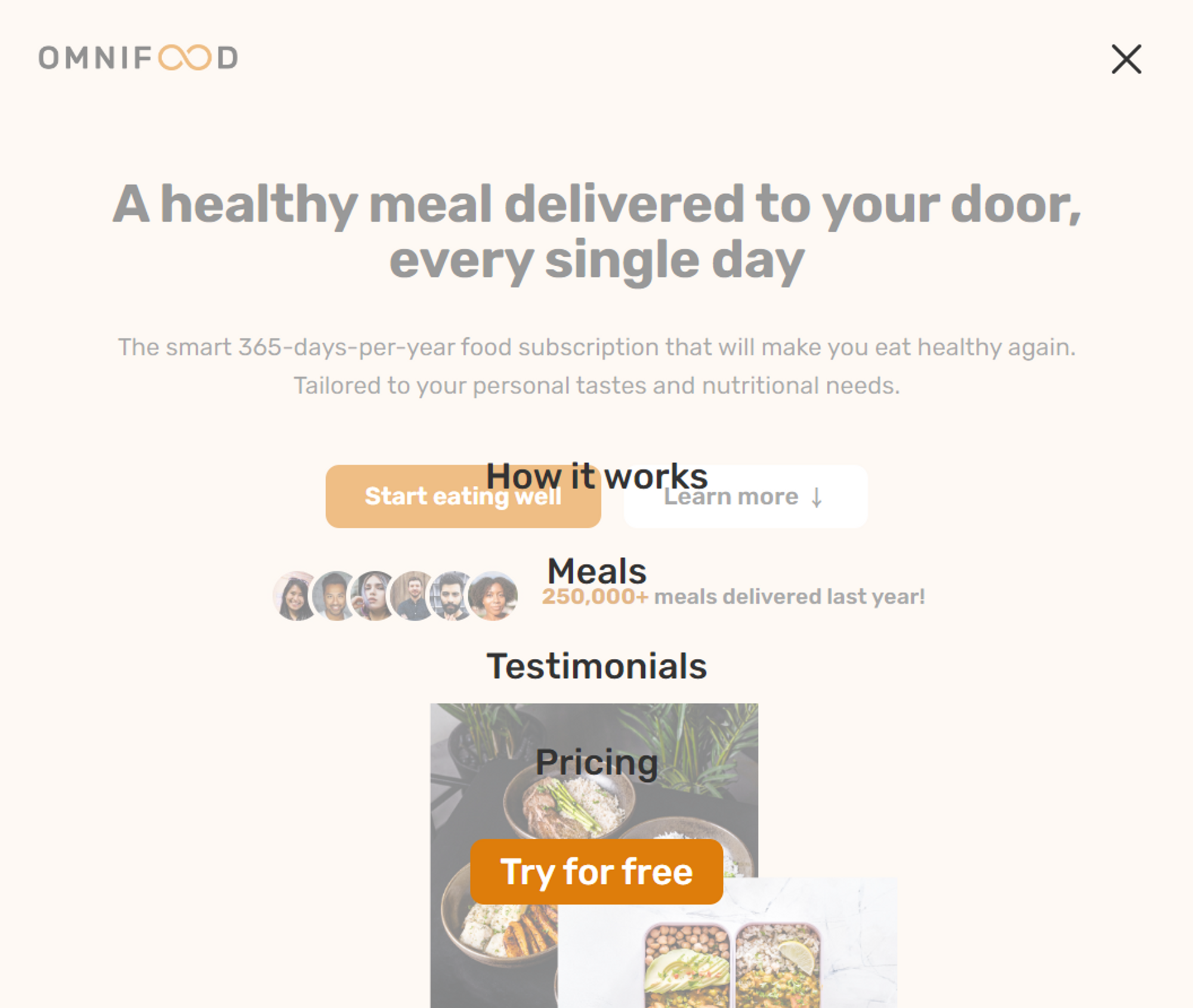
// A healthy meal delivered to your door, every single day
// </h1>
const myName = "Jonas Schmedtmann";
const h1 = document.querySelector(".heading-primary");
console.log(myName);
console.log(h1);
// html 조작
h1.textContent = myName;
// css 조작
// h1.style.backgroundColor = "red";
// h1.style.padding = "5rem";
h1.addEventListener("click", function () {
h1.style.backgroundColor = "red";
h1.style.padding = "5rem";
});
///////////////////////////////////////////////////////////
// Set current year
// <p class="copyright">
// Copyright © <span class="year">2027</span> by Omnifood, Inc. All rights reserved.
// </p>
const yearElement = document.querySelector(".year");
const currentYear = new Date().getFullYear() + " ";
yearElement.textContent = currentYear;모바일 용 Navigatoin bar 만들기
///////////////////////////////////////////////////////////
// Make mobile navigation work

// <button class="btn-mobile-nav">
//   <ion-icon class="icon-mobile-nav" name="menu-outline"></ion-icon>
//   <ion-icon class="icon-mobile-nav" name="close-outline"></ion-icon>
// </button>
const btnNavEl = document.querySelector(".btn-mobile-nav");
const headerEl = document.querySelector(".header"); // header가 btn-mobile-nav의 parent

btnNavEl.addEventListener("click", function () {
  headerEl.classList.toggle("nav-open");
});
/* MOBILE NAVIGATION */
.btn-mobile-nav {
display: block;
z-index: 1000; /* 메뉴 펼치는 버튼이 맨 위에 있도록 */
}Smooth Scrolling 만들기
- 스크롤 효과를 애니메이션으로 만들기 전에 HTML에서 먼저 스크롤을 구현해야 한다.

- Nav bar의 버튼들을 누르면
href="#"로 페이지 상단으로 이동한다. - 우리는 각 버튼을 누르면 해당하는 section으로 이동하고 싶다.
버튼에 해당하는 섹션과 버튼 연결하기
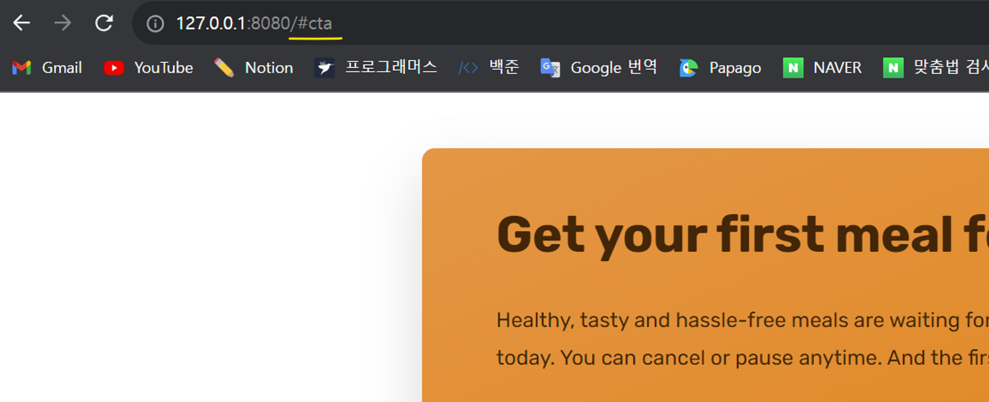
Start eating well 버튼
- 이동하고 싶은 곳에
id를 부여한다.
<section class="section-cta" id="cta">
	...
</secition>- Start eating well 버튼의
href="#"를href="#cta"로 수정한다.
<main>
  <section class="section-hero">
    <div class="hero">
      <div class="hero-text-box">
        <a href="#cta" class="btn btn--full margin-right-sm">Start eating well</a>
..- 버튼을 누르면 해당 섹션으로 이동하고, url을 확인하면 끝이
/#cta가 된다.
How it works 버튼
<section class="section-how" id="how">
	...
</secition>
Meals 버튼
<section class="section-meals" id="meals">
	...
</section>
Testimonials 버튼
<section class="section-testimonials" id="testimonials">
	...
</secition>
Pricing 버튼
<section class="section-pricing" id="pricing">
	...
</section>
버튼 별 연결된 섹션
<nav class="main-nav">
	<ul class="main-nav-list">
	  <li><a class="main-nav-link" href="#how">How it works</a></li>
	  <li><a class="main-nav-link" href="#meals">Meals</a></li>
	  <li><a class="main-nav-link" href="#testimonials">Testimonials</a></li>
	  <li><a class="main-nav-link" href="#pricing">Pricing</a></li>
	  <li><a class="main-nav-link nav-cta" href="#cta">Try for free</a></li>
	</ul>
</nav><a href="#how" class="btn btn--outline">Learn more ↓</a>CSS로 스크롤 동작에 애니메이션 주기
html에scroll-behavior: smooth속성을 준다. (강의 당시 사파리 브라우저와 모든 iOS에는 적용되지 않았으나 현재는 잘 )
/* general.css */

html {
  ...
  scroll-behavior: smooth;
}
JS로 스크롤 애니메이션 동작 주기
scrollTo
- 강의 당시 사파리와 iOS에서 scroll behavior가 지원되지 않았으므로, js로 해당 애니메이션을 구현해본다.
const allLinks = document.querySelectorAll("a:link");
console.log(allLinks);- cosnole.log로 보면 NodeList가 출력된다.
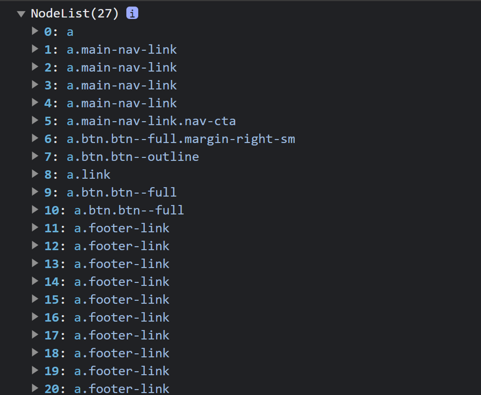
- 받아온 allLinks는 여러 개이므로,
forEach()를 사용한다.
const allLinks = document.querySelectorAll("a:link");
// console.log(allLinks);
allLinks.forEach(function (link) {
link.addEventListener("click", function (e) {
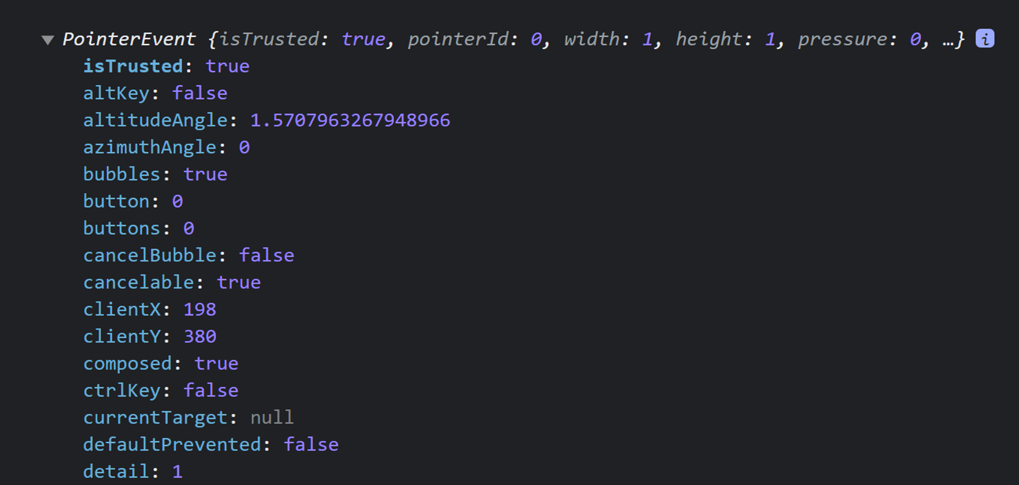
console.log(e);
});
});- 버튼을 누르면 pointerEvent가 발생한다.
.preventDefault()로 기본 동작을 끄고href에 설정된 값을 읽어온다.
const allLinks = document.querySelectorAll("a:link");
// console.log(allLinks);
allLinks.forEach(function (link) {
  link.addEventListener("click", function (e) {
    e.preventDefault();
    // href에 설정된 값 읽기
    const href = link.getAttribute("href");
    // console.log(href);

    // Scroll back to top
    if (href == "#")
      window.scrollTo({
        top: 0, // top에서 0px 떨어진 위치로 이동
        behavior: "smooth",
      });
  });
});
ScrollIntoView
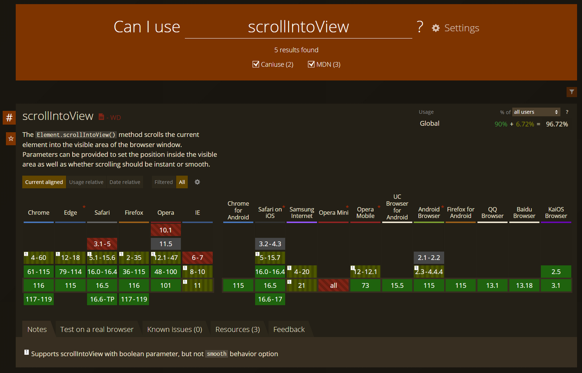
-
강의 당시 scrollTo의 속성 역시 사파리에서 지원하지 않았기 때문에 아래처럼
html에 polyfill을 넣어야 했다.<script defer src="https://unpkg.com/smoothscroll-polyfill@0.4.4/dist/smoothscroll.min.js"></script>-
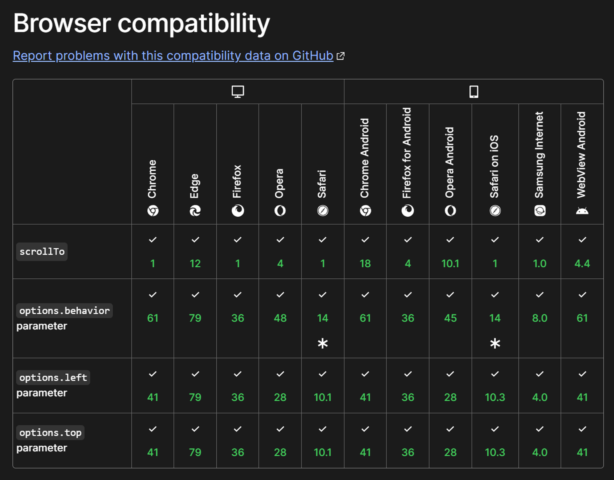
현재의 compatibility
-
scrollTo 대신 ScrollIntoView 사용하는 방법
const allLinks = document.querySelectorAll("a:link");
// console.log(allLinks);
allLinks.forEach(function (link) {
  link.addEventListener("click", function (e) {
    e.preventDefault();
    // href에 설정된 값 읽기
    const href = link.getAttribute("href");
    // console.log(href);

    // Scroll back to top
    if (href == "#")
      window.scrollTo({
        top: 0, // top에서 0px 떨어진 위치로 이동
        behavior: "smooth",
      });
    if (href !== "#" && href.startsWith("#")) {
      // console.log(href);
      const sectionEl = document.querySelector(href);
      console.log(sectionEl);
      sectionEl.scrollIntoView({ behavior: "smooth" });
    }
  });
});
-
모바일 용 Nav bar에 있는 버튼을 누르면 bar가 닫히도록 만들기
///////////////////////////////////////////////////////////
// Smooth scrolling animation

const allLinks = document.querySelectorAll("a:link");
// console.log(allLinks);
allLinks.forEach(function (link) {
  link.addEventListener("click", function (e) {
    e.preventDefault();
    // href에 설정된 값 읽기
    const href = link.getAttribute("href");
    // console.log(href);

    // Scroll back to top
    if (href == "#")
      window.scrollTo({
        top: 0, // top에서 0px 떨어진 위치로 이동
        behavior: "smooth",
      });

    // Scroll to other links
    if (href !== "#" && href.startsWith("#")) {
      // console.log(href);
      const sectionEl = document.querySelector(href);
      console.log(sectionEl);
      sectionEl.scrollIntoView({ behavior: "smooth" });
    }

    // Close mobile navigation
    if (link.classList.contains("main-nav-link"))
      headerEl.classList.toggle("nav-open");
  });
});
Sticky Navigation Bar 만들기
- 상단에 붙어있는 navigation bar를 만드는 것이 목표다.
<header class="header sticky">
	...
</header>
.sticky {
position: fixed;
top: 0;
bottom: 0;
width: 100%;
height: 8rem;
padding-top: 0;
padding-bottom: 0;
background-color: rgba(255, 255, 255, 0.97);
z-index: 9999;
box-shadow: 0 1.2rem 3.2rem rgba(0, 0, 0, 0.03);
}hero section이 안 보일 때 sticky하게 만들어주기
- 절대 위치 때문에 헤더에 가려지는 부분도 복구해야 한다. (손실된 높이 복구하기)
- 코드가 까다로울 수 있으므로 이해가 안돼도 그냥 보기
///////////////////////////////////////////////////////////
// Sticky navigation

const sectionHeroEl = document.querySelector(".section-hero");

const observer = new IntersectionObserver(
  function (entries) {
    const ent = entries[0];
    // console.log(ent);
    // intersectionRatio, isIntersecting 주목
    if (!ent.isIntersecting) {
      // document.querySelector(".header").classList.add("sticky");
      document.body.classList.add("sticky");
    }
    if (ent.isIntersecting) {
      document.body.classList.remove("sticky");
    }
  },
  {
    // In the viewport
    root: null,
    threshold: 0,
    // 섹션이 뷰포트를 완전히 벗어나자마자 이벤트가 발생하게 한 것.
    rootMargin: "-80px",
  }
);
observer.observe(sectionHeroEl);
// 관찰하고자 하는 섹션: hero.
// 위 섹션이 뷰포트에서 나오자마자 네비게이션이 sticky하길 원한다.
/* STICKY NAVIGATION */
.sticky .header {
position: fixed;
top: 0;
bottom: 0;
width: 100%;
height: 8rem;
padding-top: 0;
padding-bottom: 0;
background-color: rgba(255, 255, 255, 0.97);
z-index: 9999;
box-shadow: 0 1.2rem 3.2rem rgba(0, 0, 0, 0.03);
}
.sticky .section-hero {
margin-top: 9.6rem;
}브라우저 지원
-
10년도 더 전에는 중요한 주제였다.
-
browser support란 웹 브라우저마다 다른 CSS 속성을 지원한다는 뜻이다.
-
우리가 만든 웹사이트가 브라우저마다 다르게 보였다.
-
아래 사이트에서 다양한 브라우저 지원을 볼 수 있다.
Can I use... Support tables for HTML5, CSS3, etc
- 오른쪽 위 상단의 %를 보면 전체 브라우저 중 몇 %가 해당 기능을 지원하는지 볼 수 있다.
prefix란?
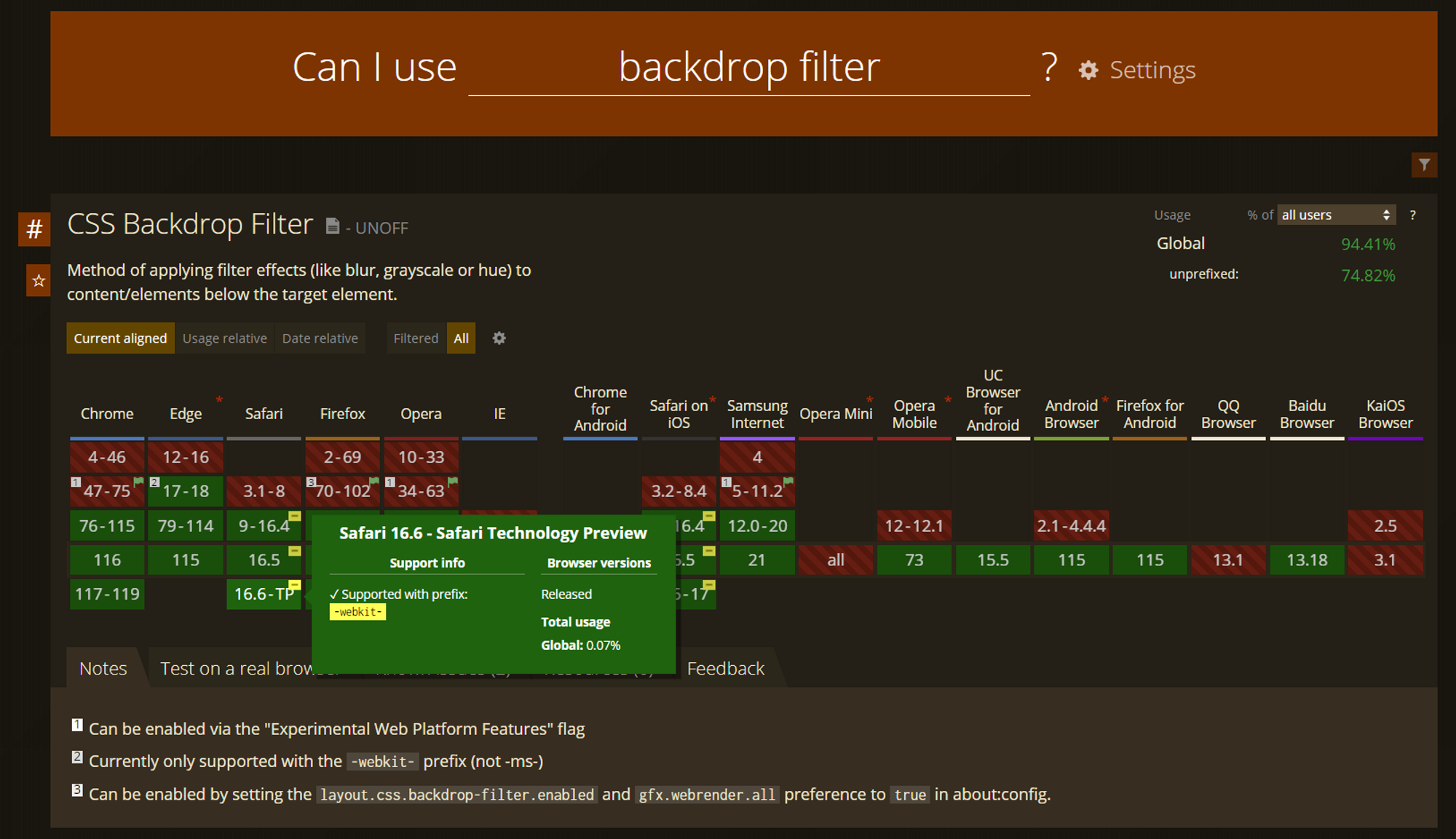
- 현대적인 CSS 속성인
backdrop-filter에 대해 알아보면 몇몇 브라우저에서supported with prefix: -webkit-을 볼 수 있다. - 이 속성은 웹킷 접두사로만 지원된다는 뜻이다.
- (크롬) 사용 예시
.main-nav {
    background-color: rgba(255, 255, 255, 0.5);
	...
}
.main-nav {
    background-color: rgba(255, 255, 255, 0.5);
    backdrop-filter: blur(10px);
	...
}- (사파리) 사용 예시
.main-nav {
    background-color: rgba(255, 255, 255, 0.5);
    -webkit-backdrop-filter: blur(10px);
	...
}오래된 Safari에서 flexbox gap 수정해주기
- 오래된 Safari에서는 flexbox를 지원하지 않았다. (강의일 기준이고 현재는 전부 지원)
///////////////////////////////////////////////////////////
// Fixing flexbox gap property missing in some Safari versions
function checkFlexGap() {
var flex = document.createElement("div");
flex.style.display = "flex";
flex.style.flexDirection = "column";
flex.style.rowGap = "1px";
flex.appendChild(document.createElement("div"));
flex.appendChild(document.createElement("div"));
document.body.appendChild(flex);
var isSupported = flex.scrollHeight === 1;
flex.parentNode.removeChild(flex);
console.log(isSupported);
if (!isSupported) document.body.classList.add("no-flexbox-gap");
}
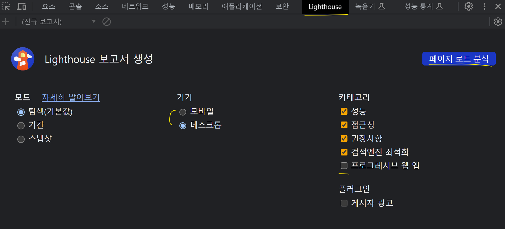
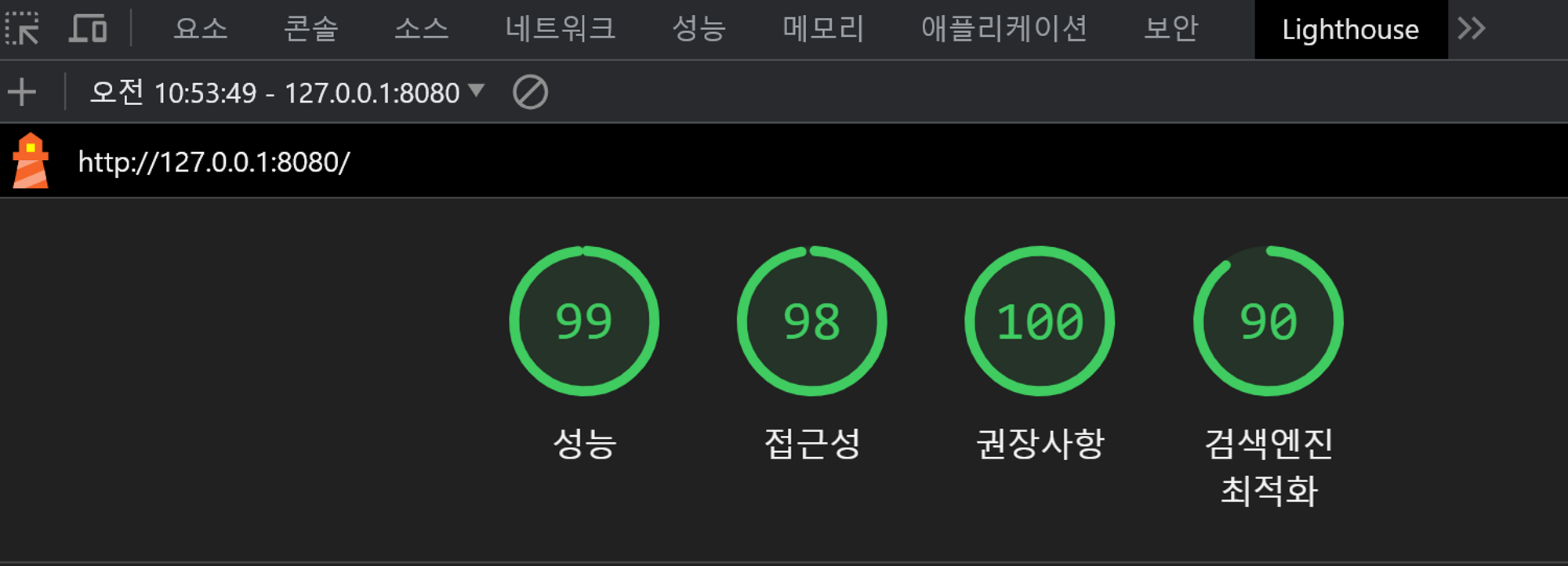
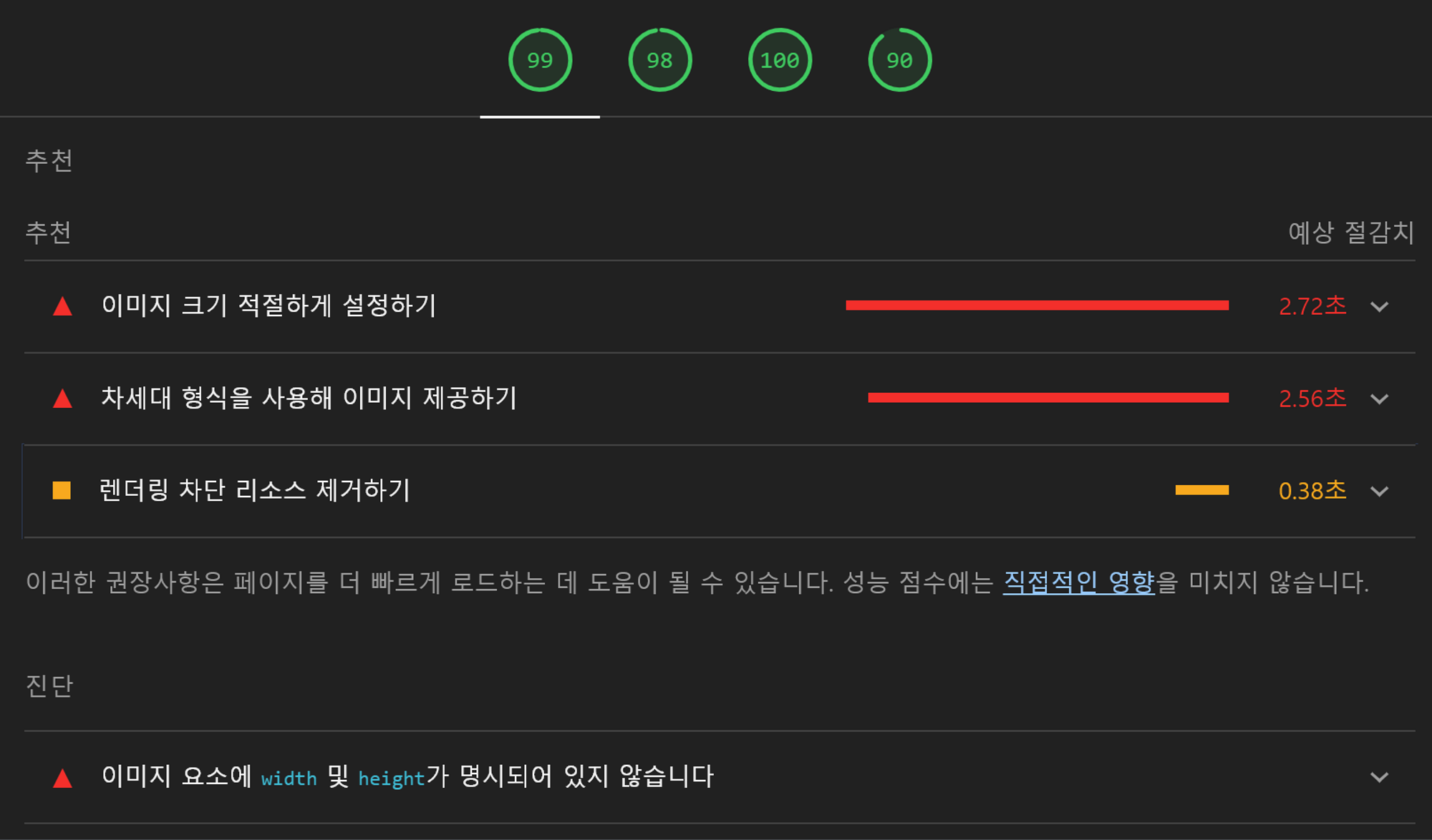
checkFlexGap();Testing Performance With Lighthouse
- Lighthouse:기본적으로 자동화된 툴로 페이지의 품질을 향상시키는데 사용된다.
- google이 개발한 도구로 개발자 도구에서 쓸 수 있다.
Meta description 추가 & Favicon 넣기
Meta description이란?
- 웹사이트에 대한 짧은 설명
- 구글과 다른 검색 엔진에서 각각의 검색 결과에 대한 텍스트이기도 하다.
- 사용 예시
<meta
      name="decription"
      content="Omnifood is an AI-powered food subscription that will make you eat healthy again, 365 per year. It's tailored to your personal tastes and nutritional needs."
    />
Favicon
- 큰 로고 이미지를 하나 준비한다 → 다양한 사이즈로 줄여서 사용하기 위함
- 홈페이지 상단: 64x64로 바꾸고
<link *rel*="icon" *href*="img/favicon.png" />
- 애플: 180x180로 바꾸고
<link *rel*="apple-touch-icon" *href*="img/apple-touch-icon.png" /> - 안드로이드: 192x192와 512x512를 준비하고
<link *rel*="manifest" *href*="manifest.webmanifest" />
// 일종의 확장 파일.
// 기본적으로 다른 파비콘을 인식하기 위해 Android를 위해 사용된다.

// index.html과 같은 위치 manifest.webmanifest 파일을 만들고 아래처럼 작성한다.

{
  "icons": [
    { "src": "img/favicon-192.png", "type": "image/png", "sizes": "192x192" },
    { "src": "img/favicon-512.png", "type": "image/png", "sizes": "512x512" }
  ]
}
Image Optimizations
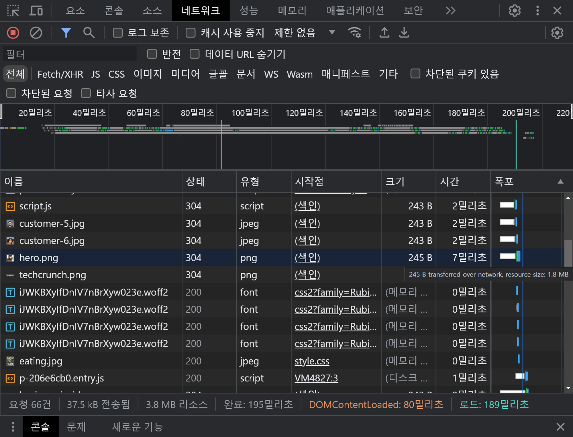
💡 REMIND: 초고해상도 모니터를 고려하여, 현재 표시되는 이미지의 2배 큰 이미지를 준비해야한다.- 개발자 도구에서 이미지의 원본 크기와 현재 렌더링된 크기를 볼 수 있다.
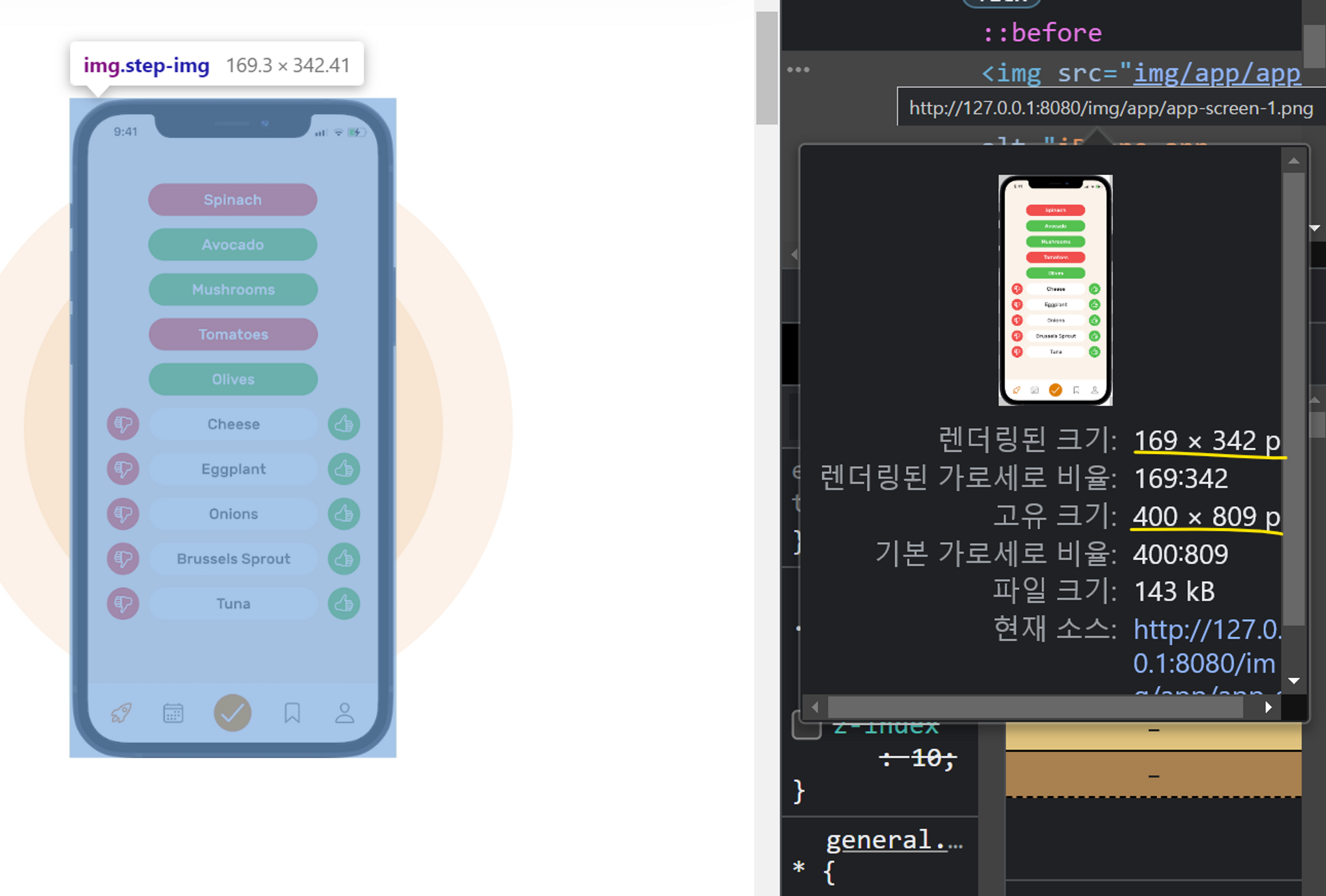
- 강의에서는 렌더링된 이미지가 가장 클 때를 기준으로 고유 크기를 미리 설정해준 것이다.
직접 해보기 : hero image

- (이미지가 가장 클 때 렌더링된 크기)x2 보다 (고유 크기)가 훨씬 크다.
-
크기를 조절해준다. (강의에서는 렌더링된 크기의 가로가 500px 후반대로, 고유 크기를 600px 기준 2배인 1200px로 해주었다.)
- 개발자도구의 네트워크 탭을 확인해보자.
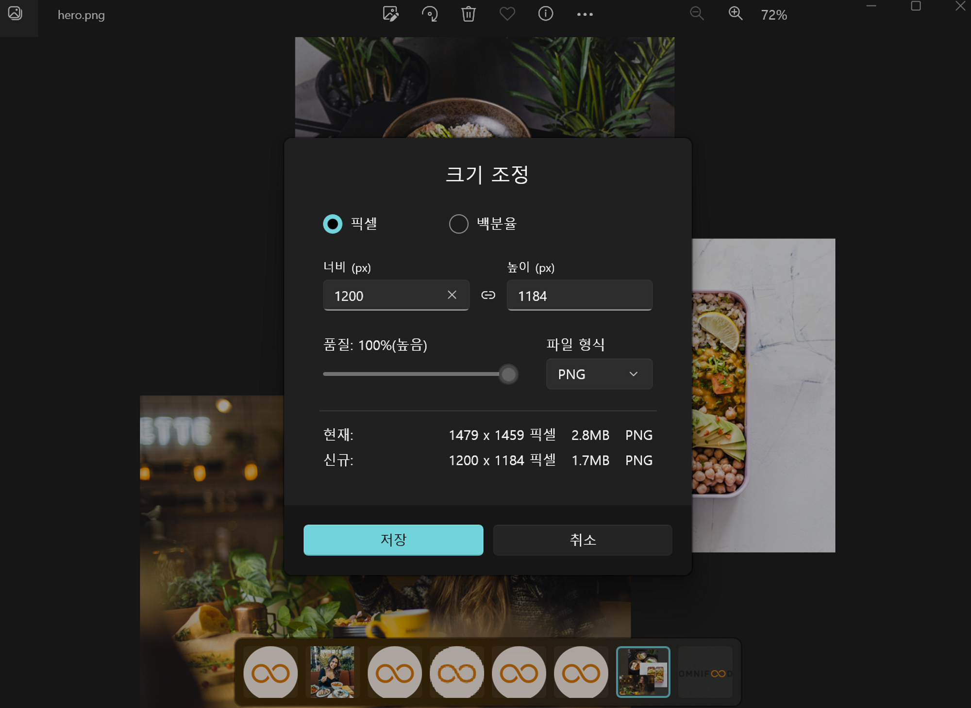
- 이미지를 압축해 파일 크기를 줄인다. squoosh 사이트 이용하기
- jpeg는 투명한 배경이 사라지고 검은 배경으로 바뀌기 때문에 png로 바꿔야 한다.
- 현대에는 png보다 더 좋은 화질을 유지하는 WebP를 사용하는 걸 추천한다.
<img
  src="img/hero.webp"
  class="hero-img"
  alt="Woman enjoying food, meals in storage container, and food bowls on a table"
/>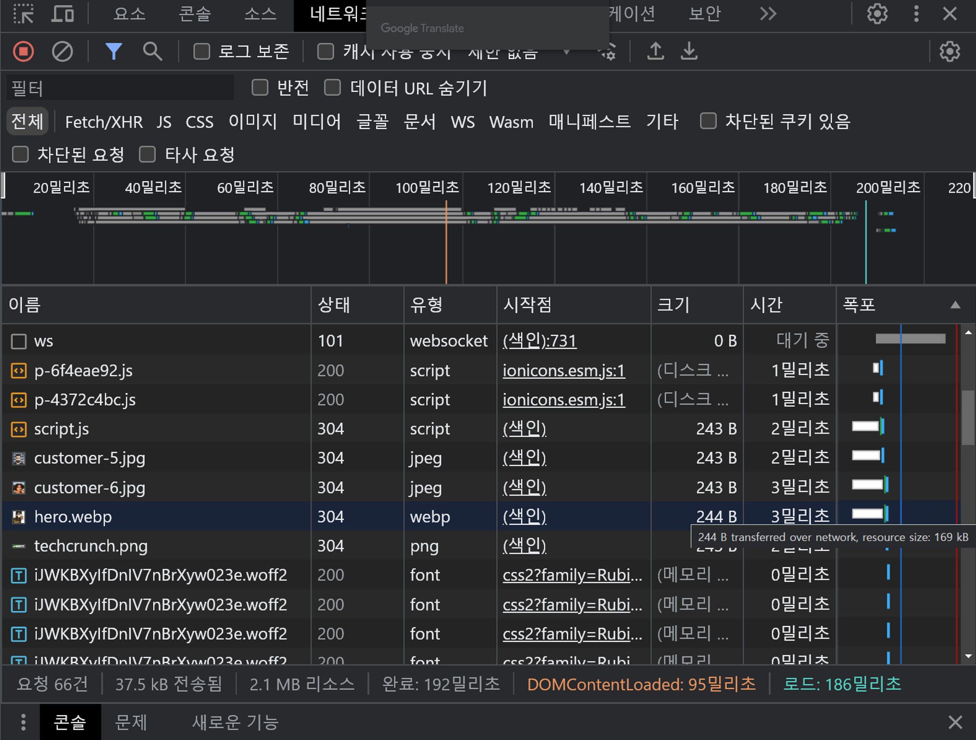
- caniuse.com에서 webp 검색
- 강의 당시 webp를 지원하지 않는 브라우저 버전들이 있었다.
- 현재는 아래와 같이 대부분의 브라우저에 지원한다.
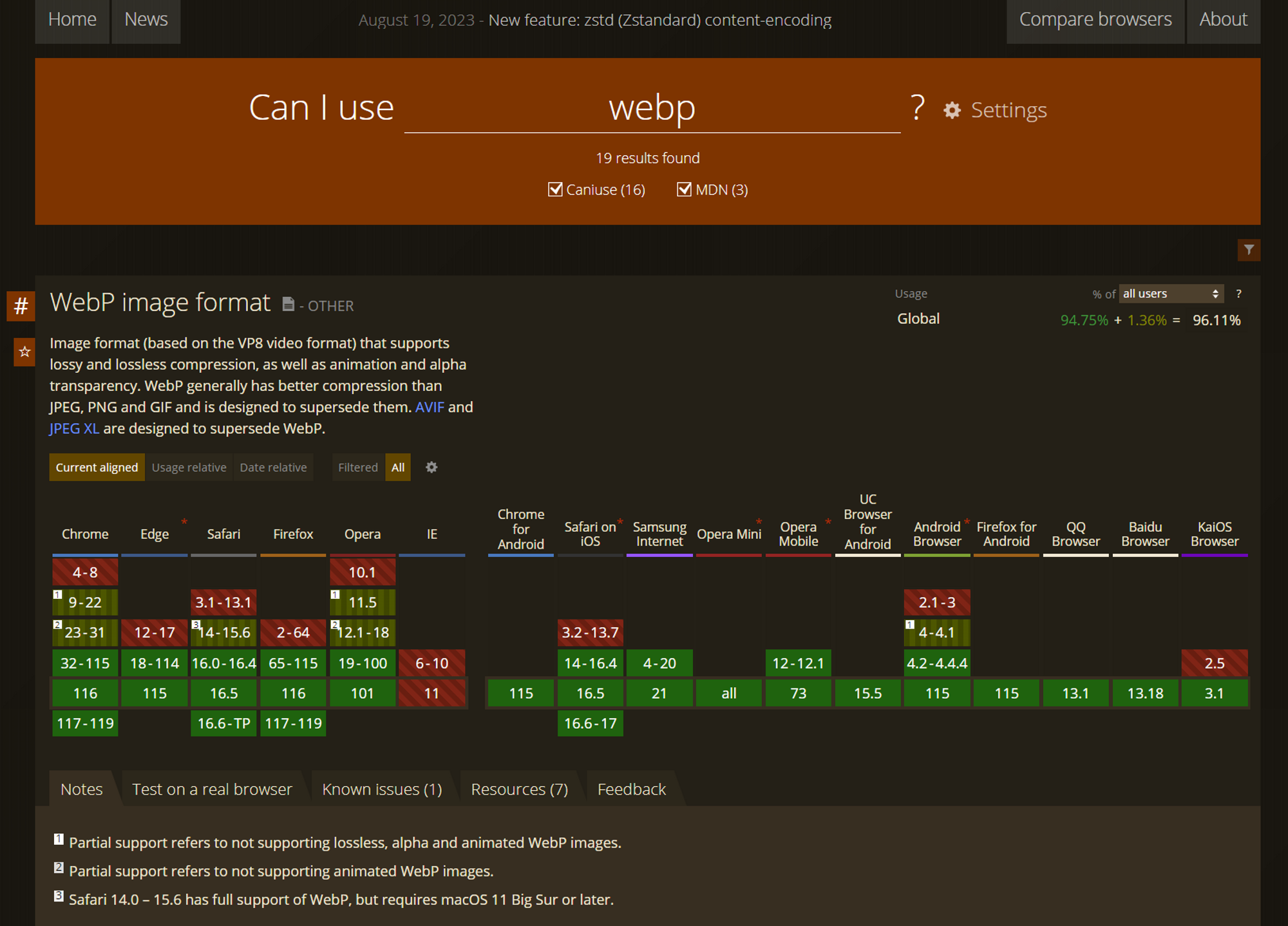
- webp를 지원하지 않는 브라우저에 대한 해결법?
→ 이제 브라우저가 두 어미지 중 디스플레이 할 수 있는 것 중 좋은 것을 선택한다.<picture> <source srcset="img/hero.webp" type="image/webp"/> <source srcset="img/hero-min.png" type="image/png"/> <img src="img/hero.webp" class="hero-img" alt="Woman enjoying food, meals in storage container, and food bowls on a table" /> </picture>
Netlify에 배포하기
- c패널이란? → cPanel은 일반 사용자를 염두에 두고 만들었으며 그래픽 인터페이스 및 마우스 클릭 기반 플랫폼입니다. 어려운 기술 장벽을 없앴기에 경험이나 지식 수준과 관계없이 모든 사용자가 쉽게 이용할 수 있습니다.
- 폴더를 drop 해서 간단히 배포할 수 있다.
- 도메인 바꾸기
 Omnifood — Never cook again
- omnifood의 sub-domain이 아닌 도메인을 쓰고 싶다면? 도메인을 구매하고 지정해야 한다. Godaddy나 Hover라는 웹사이트를 이용한다.
- https 우리는 기본값으로 HTTP C 인증서를 받는데 Netlify가 두어 달마다 업데이트 해 사이트가 계속 안전하다.
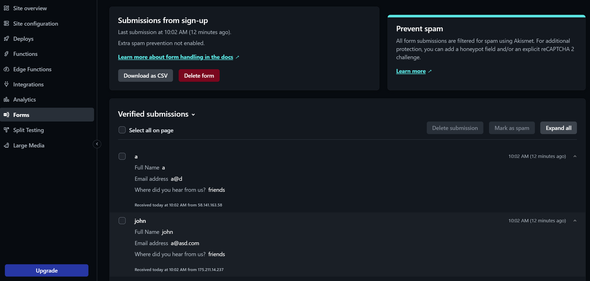
Netlify form 기능 사용하기
- 서버나 js 없이 form을 관리할 수 있다.
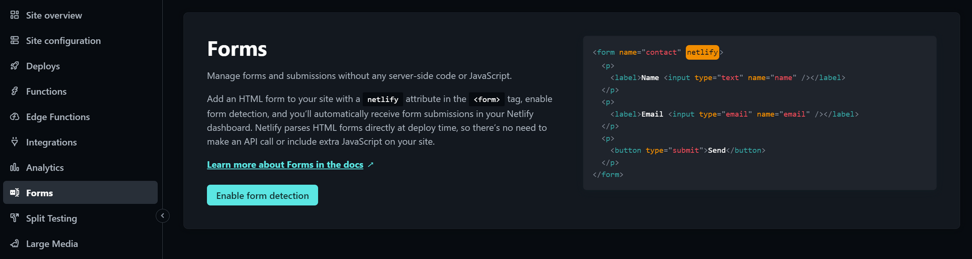
<form name="contact" netlify> <p> <label>Name <input type="text" name="name" /></label> </p> <p> <label>Email <input type="email" name="email" /></label> </p> <p> <button type="submit">Send</button> </p> </form>-
코드에서 아래와 같이 변경해주고 다시 배포해야 한다.
<form class="cta-form" name="sign-up" netlify>
  <div>
    <label for="full-name">Full Name</label>
    <input
      id="full-name"
      type="text"
      placeholder="John Smith"
      name="full-name"
      required
    />
  </div>

  <div>
    <label for="email">Email address</label>
    <input
      id="email"
      type="email"
      placeholder="me@example.com"
      name="email"
      required
    />
  </div>

  <div>
    <label for="select-where">Where did you hear from us?</label>
    <select id="select-where" name="select-where" required>
      <option value="">Please choose one option:</option>
      <option value="friends">Friends and family</option>
      <option value="youtube">YouTube video</option>
      <option value="podcast">Podcast</option>
      <option value="ad">Facebook ad</option>
      <option value="others">Others</option>
    </select>
  </div>
	<button class="btn btn--form">Sign up now</button>

  <!-- <input type="checkbox" />
  <input type="number" /> -->
</form>
-
- netlify에서 아래와 같이 자동으로 `method="post"`를 추가해준 것을 알 수 있다.
- form 탭에서 form 기능을 켜놓아야 하는 것에 주의