SCSS란?
: css의 상위 집한 언어로서, 기본 css를 확장하여 스타일 시트 작성을 더 편리하고 유지보수가 용이하도록 해주는 스타일링 언어
→ 브라우저는 scss의 고급기능을 이해하지 못하기 때문에 컴파일링 해서 css로 변환시켜줘야 화면에 정상적으로 출력된다.
"Dart Sass"로 전환..(node-sass 서비스 종료 )
: Sass스크립트를 컴파일하여 css로 변환해주는 도구
(순수 Dart로 작성되었기 때문에 Node.js가 없는 환경에서도 사용 가능)
npm i sass설치
1. 중첩기능
body {
  h1 {
    color: crimson;
    &:hover {
      color: royalblue;
    }
  }
}
2. 가상요소 선택자
  .btn {
    display: block;
    text-align: center;
    line-height: 50px;
    color: #fff;
    text-transform: uppercase;

    width: 300px;
    height: 50px;
    &:hover {
      background-color: blue;
    }
    &::before,
    &::after {
      content: "";
      position: absolute;
      top: 0;
      left: 0;
      width: inherit;
      height: inherit;
      border: 1px solid #fff;
      transition: 0.3s;
}<div class="frame">
<div>#01</div>
<div>#02</div>
<div>#03</div>
</div>.frame {
display: flex;
gap: 20px;
div {
flex: 1;
height: 150px;
box-shadow: 0 0 10px rgba(0, 0, 0, 0.3);
display: flex;
justify-content: center;
align-items: center;
transition: 0.3s;
&:nth-child(1) {
background-color: crimson;
}
&:nth-child(2) {
background-color: royalblue;
}
&:nth-child(3) {
background-color: plum;
}
}
}
3. 부모선택자 참조(&)
<section>
      <h1 class="font-large">this is h1</h1>
      <h2 class="font-medium">this is h2</h2>
      <h3 class="font-small">this is h3</h3>
 </section>
.font {
&-large {
font-size: 60px;
color: crimson;
text-transform: uppercase;
}
&-medium {
font-size: 40px;
color: yellowgreen;
text-transform: uppercase;
}
&-small {
font-size: 20px;
color: royalblue;
text-transform: uppercase;
}
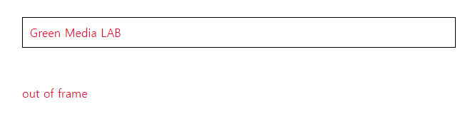
}4. 부모 선택자 나가기 @at-root
: 부모 선택자와 상관없이 같은 클래스 값에 설정
 <div class="frame">
      <h1 class="heading">Green Media LAB</h1>
    </div>
    <h1 class="heading">out of frame</h1>
.frame {
border: 1px solid #000;
padding: 20px;
text-align: center;
@at-root.heading {
color: crimson;
font-weight: normal;
}
}
+) 접두어 활용, 선택자 생성
.frame {
  border: 1px solid #000;
  padding: 20px;

  @at-root.heading {
    color: crimson;
    font-weight: normal;
    text: {
      align: center;
      transform: uppercase;
      overflow: hidden;
    }
  }
}
text-align, text-transform, text-overflow를 나타냄
5. 가상 클래스 is
:is(header, section, footer) h1 {
  font : {
    size: 30px;
    weight: normal;
  }
}
=> <header>, <section>, <footer>요소 안에 있는 h1에서 스타일 지정
6. 그룹 재사용(@mixin/@include)
@mixin : 스타일을 스타일을 재사용할 수 있게 정의하는 기능
@include : @mixin으로 정의된 스타일을 적용시키는 기능
 <h1 class="heading">greenmedia <span>frontend</span> class</h1>
<h1 class="news_headline">news <span>headline</span> broadcast</h1>
@mixin headline {
text-align: center;
font-size: 36px;
text-transform: capitalize;
position: relative;
padding-bottom: 20px;
span {
color: royalblue;
}
&::before {
content: "";
position: absolute;
width: 100px;
height: 4px;
background-color: crimson;
bottom: 0;
left: 50%;
transform: translateX(-50%);
}
}
.heading {
@include headline();
}
.news_headline {
@include headline();
}⇒ @mixin으로 'headline'이라는 스타일을 정의
⇒ @include로 .heading과 .news_headline에 headline 스타일을 적용시킴
+) 스타일 재사용 + 매개변수
@mixin border-style($width, $style, $color) {
  border: $width $style $color;
}

@mixin button-padding($updown, $leftright) {
  padding: $updown $leftright;
}

.btns {
  button {
    padding: 7px;
    background-color: lavender;
    outline: none;
    font-size: 18px;
    @include button-padding(20px, 150px);
    &.approval {
      @include border-style(2px, solid, blue);
    }
    &.refuse {
      @include border-style(2px, solid, red);
    }
  }
}
7. 선택자속성 가져오기(@extend)
 <button class="order">Order</button>
 <button class="add">Add Item</button>
 <button class="checkout">Checkout</button>
.btn {
width: 200px;
padding: 7px;
background-color: #fff;
font-size: 18px;
text-transform: capitalize;
border-radius: 5px;
color: #333;
}
.order {
@extend .btn; //.btn의 값 가져오기ㅓ
}
.add {
@extend .btn;
}
.checkout {
@extend .btn;
}
8. 변수
/*변수*/
$primary: crimson;
$secondary: royalblue;

body {
  h1 {
    color: $primary;
    &:hover {
      color: $secondary;
    }
  }
}
9. map-get : 여러개의 값을 하나의 변수로 묶어서 사용
-> 코드를 더 간결하고 유지보수가 용이
$color: (
  font-primary: #2d3436,
  font-secondary: #636e72,
  font-focus: #d63031,
  bgc-primary: #dfe6e9,
  bgc-secondary: #b2bec3,
);
$headline-font: (
  large: 45px,
  medium: 32px,
  small: 24px,
);
$font-family: (
  eng: "Noto Sans Nag Mundari",
  sans-serif,
  kor: "Noto Sans KR",
);
body {
  background-color: map-get($color, bgc-primary);
  font-family: map-get($font-family, eng);
}
.frame {
  h1 {
    font-size: map-get($headline-font, large);
  }
  h2 {
    font-size: map-get($headline-font, medium);
  }
  h3 {
    font-size: map-get($headline-font, small);
  }
}
10. if/else/for/each 제어문
*if-else
.item {
  width: $width;
  @if ($width >= 300) {
    background-color: crimson;
  } @else if($width < 300) {
    background-color: royalblue;
  }
}
*for
.frame div {
  border: 3px solid #000;
  margin: 5px;
  padding: 5px;
}
@for $i from 1 through 9 {
  .frame div:nth-child(#{$i}) {
    width: 50px * $i;
  }
}
*each
@each $size in $size {
  .logo-#{$size} {
    width: $size;
    height: $size;
  }
}
이런 유용한 정보를 나눠주셔서 감사합니다.