html,css 연습문제
html
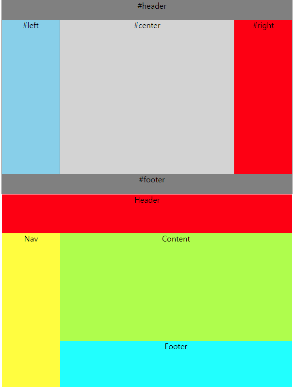
<!DOCTYPE html>
<html lang="en">
<head>
    <meta charset="UTF-8">
    <meta name="viewport" content="width=device-width, initial-scale=1.0">
    <title>10_연습문제</title>
    <link rel="stylesheet" href="css/flex00.css">
</head>
<body>
    <div class="container">
        <header class="header">#header</header>
        <section class="content">
            <div class="box left">#left</div>
            <div class="box center">#center</div>
            <div class="box right">#right</div>
        </section>
        <footer class="footer">#footer</footer>
    </div>


    <div class="container2">
        <div class="Header">Header</div>
        <div class="main">
            <div class="Nav">Nav</div>
            <div class="Content">
                <div class="Content2">Content</div>
                <div class="Footer">Footer</div>
            </div>
        </div>
    </div>
</body>
</html>
css
*{
    box-sizing: border-box;
    text-align: center;
}

.container{
    display: flex;
    flex-direction: column;
    border: 1px solid gray;
    width: 600px;
    height: 400px;
}

.header{
    background-color: gray;
    height: 10%;
    padding-left: 20px;
    text-align: center;
}

.footer{
    background-color: gray;
    height: 10%;
    padding-left: 20px;
    text-align: center;
}

.content{
    display: flex;
    height: 80%;
}

.left{
    width: 20%;
    background-color: skyblue;
    border-right: 1px solid gray;
    text-align: center;
}

.center{
    width: 60%;
    background-color: lightgray;
    text-align: center;
}

.right{
    width: 20%;
    background-color: red;
    border-left: 1px solid gray;
    text-align: center;
}

.container2{
    display: flex;
    flex-direction: column;
    border: 1px solid white;
    width: 600px;
    height: 400px;
}

.Header{
    height: 20%;
    border: 2px solid whi;
    background-color: red;
    text-align: center;
}

.main{
    display: flex;
    height: 80%;
}

.Nav{
    background-color: yellow;
    width: 20%;
    text-align: center;
}

.Content{
    width: 80%;
}

.Content2{
    background-color: greenyellow;
    height: 70%;
    text-align: center;
}

.Footer{
    background-color: aqua;
    height: 30%;
    text-align: center;
}
결과값

.