
1. gap 과 margin 의 차이는?
gap은 요소와 요소사이의 간격이고 margin은 외부여백입니다.
2. 아래의 단위에 대하여 설명하시오.
- %: 창이 중심이 아닌, %를 쓰고 있는 요소의 부모 요소의 길이에 맞게 반환합니다.
- vh: 열려있는 화면 전체의 상대길이이기 때문에 스크롤바를 포함한 길이를 반환하는것으로 vewpoint height 이라고합니다.
- vw: 열려있는 화면 전체의 상대길이이기 때문에 스크롤바를 포함한 길이를 반환하는것으로 vewpoint width 라고합니다.
3. 아래를 구현하시오.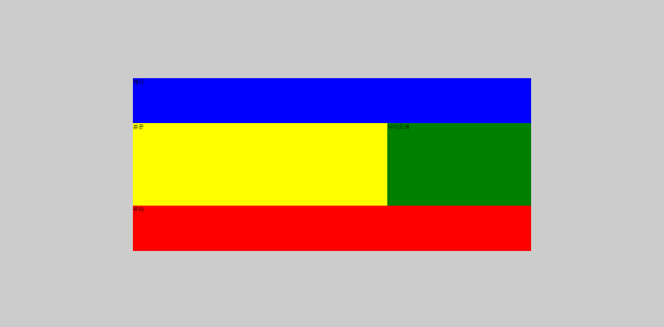
<!DOCTYPE html>
<html lang="en">
<head>
   <meta charset="UTF-8">
   <meta name="viewport" content="width=device-width, initial-scale=1.0">
   <title>Document</title>
   <style>
      body{
         /* width: 100vw; */
         margin: 0;
         height: 100vh;
         display: flex;
         justify-content: center;
         align-items: center;

      }
      #wrap{
         display: flex;
         flex-direction: column;
         width: 60%;
         margin: 0 auto;
         height: 500px;
      }
      header{
         /* height: 100px; */
         background-color: blue;
         flex-grow: 1;
      }
      section{
         /* height: 200px; */
         flex-grow: 2;
         display: flex
      }
      nav{
         background-color: yellow;
         flex-grow: 2;
      }
      aside{
         background-color: green;
         flex-grow: 1;
      }
      footer{
         background-color: red;
         /* height: 100px; */
         flex-grow: 1;
      }
   </style>
</head>
<body>
   <div id="wrap">
   <header>헤더</header>
   <section>
      <nav>본문</nav>
      <aside>사이드바</aside>
   </section>
   <footer>푸터</footer>
</div>
</body>
</html>
4. 요안도라를 완성하시오
<!DOCTYPE html>
<html lang="en">

<head>
    <meta charset="UTF-8">
    <meta name="viewport" content="width=device-width, initial-scale=1.0">
    <title>Document</title>
    <style>
        body {
            font: 14px "맑은 고딕";
            background: linear-gradient(to bottom, skyblue, white 50%);
            background: -webkit-linear-gradient(top, skyblue, white 50%);
            background: -moz-linear-gradient(top, skyblue, white 50%);
            background-attachment: fixed;
        }

        #wrap {
            width: 60%;
            margin: 0 auto;
        }

        #footer {
            padding: 10px 0;
            background-color: #061f1f;
            color: #fff;
            text-align: center;
        }

        #mainHeader {
            height: 280px;
            margin-top: 0;
            background-image: url('image/bg.png');
            background-repeat: no-repeat;
            background-position: left top;
            background-size: cover;
            position: relative;
        }

        .header1 {
            position: absolute;
            margin-top: 35px;
            margin-left: 20px;
            font-family: Arial;
            font-size: 5em;
            color: #ff0;
        }

        #mainNav {
            background: #060;
            margin-top: -15px;
            height: 60px;
        }

        #mainNav ul {
            list-style: none;
            height: 40px;
            padding-top: 10px;
            padding-bottom: 5px;
            display: flex;
            justify-content: space-around;

        }

        #mainNav a,
        #mainNav a:visited {
            text-decoration: none;
            color: #fff;
            padding: 10px 5px 5px 35px;
            display: block;

        }

        @media screen and (min-width:1024px) {

            #main {
                display: flex;
                /* justify-content: flex-end; */
            }

            #sidebar {
                display: flex;
                flex-direction: column;
                padding: 10px;
                background-color: #dfd;
                gap: 10px;

            }

            #sidebar img {
                min-width: 75%;
                min-height: 30%;
                border: 1px solid #ccc;
                text-align: center;
            }
        }

        @media screen and (min-width:560px) and (max-width:1023px) {
            #main {
                display: flex;
                flex-direction: column;
            }

            #sidebar {
                display: flex;
                padding: 10px;
                background-color: #dfd;
                gap: 10px;
            }
            #sidebar img {
                min-width: 25%;
                min-height: 100%;
                border: 1px solid #ccc;

            }
        }
        @media screen and (min-width:0px) and (max-width:559px) {
            #wrap{
                width: 320px;
                display: flex;
                flex-direction: column;
            }
            #mainHeader{
                height: 100px;
                background-color: black;
                background-image: none;
                position: relative;
            }
            .header1{
                position: absolute;
                top: -10px;
                font-size: 3em;
            }
            #mainNav{
                height: 210px;
            }
            #mainNav ul{
            display: flex;
            flex-direction: column;
            background-color: white;
            height: 190px;
            text-align: center;
            padding-left: 0;
            }
            #mainNav ul a, #mainNav a:visited{
                color: blue;
                text-decoration: none;
                border: 1px solid #ccc;
                border-radius: 50px ;


            }
            #mainNav ul li{
                width: 80%;
                margin-left: 10%;
            }
            #content{
                height: 531px;
                background-color: white;
                padding: 5px;
            }
            #sidebar img {
                width: 90%;
                display: flex;
                border: 1px solid #ccc;

            }
            #sidebar{
                background-color: white;
                margin-top: -5px;
                display: flex;
                flex-direction: column;
                align-items: center;
                gap: 5px;
            }
        }
    </style>
</head>

<body>
    <div id="wrap">
        <header id="mainHeader">
            <h1 class="header1">Joandora</h1>
        </header>
        <nav id="mainNav">
            <ul>
                <li><a href="#">이용 안내</a></li>
                <li><a href="#">객실 소개</a></li>
                <li><a href="#">예약 방법</a></li>
                <li><a href="#">예약 하기</a></li>
            </ul>
        </nav>
        <main id="main">
            <section id="content">
                <h2>요안도라 소개</h2>
                <article>
                    <h3>¤ 요안도라는 게스트 하우스(Guest House) 형식의 농어촌 민박입니다</h3>
                    <p>성산의 날씨는 다음주 내내 높은 구름에 햇살 가득이라고 합니다. 목요일이면 섭씨 27도까지 오른다고 하지만, 늘 부는 바람이 쾌적한 균형을 잡아 마당에 마당에 나가 앉아 있는
                        시간이
                        많아질듯 합니다.</p>
                    <p>오늘은 사진에 보이는 긴 돌담을 따라 들어오는 요안도레 올레 입구에 특곤색의 대문을 달았습니다.</p>
                    <p>내일은 두달 여동안 밖거리에 만든 게스트 하우스에 연백색의 황토 페인트를 칠할 예정입니다. <br>
                        그리고 이것저것 사소한 정리를 마치고 나면, 나이 드시고 젊고 한 미지의 새식구들을 설렘으로 만나고 함께하고, 도시의 바쁜 생활로 소원해진 오래된 친구와의 우정을 이
                        제주에서
                        새롭게 열어나가기 위해 요안도라를 세상에 알리려고 합니다.</p>
                    <p>그럼 이 홈페이지를 공식적으로 체계적으로 갖추면서, 그동안 공사로 어수선해 올려드리지 못한 집 안팎 사진들을 상세하게 올리고 당신을 만날 채비를 마치겠습니다.</p>
            </section>
            <aside id="sidebar">
                <img src="image/1.jpg" alt="">
                <img src="image/4.jpg" alt="">
                <img src="image/2.jpg" alt="">
            </aside>
        </main>
        <footer id="footer">
            <p>제주특별자치도 남제주군 성산읍 수산리 000 번지</p>
            <address>
                Copyright ⓒ. All rights reserved.
            </address>
        </footer>
    </div>
</body>

</html>