1. 아래의 의미는?
-
max-width:100%
max-width는 이 안에 지정한 속성들이 max-width 로 지정해놓은 최대 넓이보다 커진다면 적용되는 것이다. 100%면 지정된 길이까지만 길어진다는 뜻이다. -
min-width:100%
min-width 는 브라우저 기준으로, min-width 로 지정해놓은 사이즈보다 커진다면 적용될 사이즈다. 100%면 지정된 길이까지만 줄어진다는 뜻이다. -
vh-100(부트스트랩에서)
body에 height는 지정이 안되어있기때문에 직접 최대높이를 지정해주는 것이다.
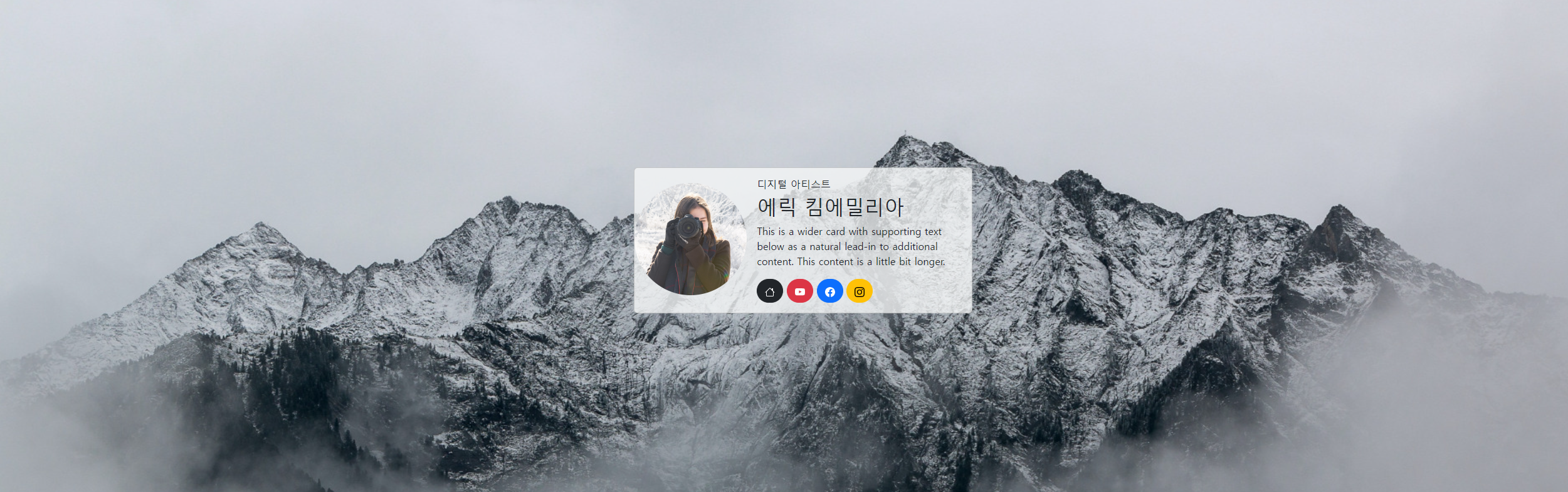
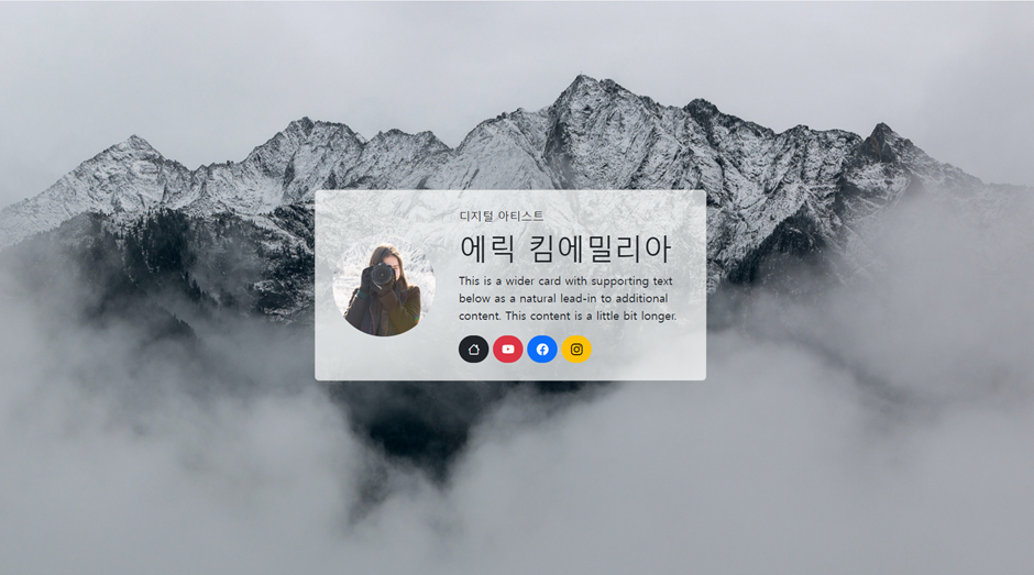
2. 아래를 구현하시오.
<!doctype html>
<html lang="en">

<head>
    <title>Title</title>
    <!-- Required meta tags -->
    <meta charset="utf-8" />
    <meta name="viewport" content="width=device-width, initial-scale=1, shrink-to-fit=no" />

    <!-- Bootstrap CSS v5.2.1 -->
    <link href="https://cdn.jsdelivr.net/npm/bootstrap@5.3.2/dist/css/bootstrap.min.css" rel="stylesheet"
        integrity="sha384-T3c6CoIi6uLrA9TneNEoa7RxnatzjcDSCmG1MXxSR1GAsXEV/Dwwykc2MPK8M2HN" crossorigin="anonymous" />
</head>

<body style="background-image: url(/부트스트랩/실습예제/이미지/bg-img.jpg);">
    <header>
        <!-- place navbar here -->
    </header>
    <main>
        <div class="container">
            <div class="d-flex justify-content-center align-items-center vh-100">
                <div class="card mb-3 bg-light bg-opacity-75" style="max-width: 540px;">
                    <div class="row g-0">
                        <div class="col-md-4 my-4 ">
                            <img src="/부트스트랩/실습예제/이미지/10.jpg" class="img-fluid rounded-pill" alt="Card title" />
                        </div>
                        <div class="col-md-8">
                            <div class="card-body">
                                <h6>디지털 아티스트</h6>
                                <h2 class="card-title">에릭 킴에밀리아</h2>

                                <p class="card-text">
                                    This is a wider card with supporting text below as a
                                    natural lead-in to additional content. This content is a
                                    little bit longer.
                                </p>
                                <a name="" id="" class="btn btn-dark rounded-pill" href="#" role="button"><svg
                                        xmlns="http://www.w3.org/2000/svg" width="16" height="16" fill="currentColor"
                                        class="bi bi-house" viewBox="0 0 16 16">
                                        <path
                                            d="M8.707 1.5a1 1 0 0 0-1.414 0L.646 8.146a.5.5 0 0 0 .708.708L2 8.207V13.5A1.5 1.5 0 0 0 3.5 15h9a1.5 1.5 0 0 0 1.5-1.5V8.207l.646.647a.5.5 0 0 0 .708-.708L13 5.793V2.5a.5.5 0 0 0-.5-.5h-1a.5.5 0 0 0-.5.5v1.293zM13 7.207V13.5a.5.5 0 0 1-.5.5h-9a.5.5 0 0 1-.5-.5V7.207l5-5z" />
                                    </svg></a>
                                <a href="#" class="btn btn-danger rounded-pill" role="button"><svg
                                        xmlns="http://www.w3.org/2000/svg" width="16" height="16" fill="currentColor"
                                        class="bi bi-youtube" viewBox="0 0 16 16">
                                        <path
                                            d="M8.051 1.999h.089c.822.003 4.987.033 6.11.335a2.01 2.01 0 0 1 1.415 1.42c.101.38.172.883.22 1.402l.01.104.022.26.008.104c.065.914.073 1.77.074 1.957v.075c-.001.194-.01 1.108-.082 2.06l-.008.105-.009.104c-.05.572-.124 1.14-.235 1.558a2.01 2.01 0 0 1-1.415 1.42c-1.16.312-5.569.334-6.18.335h-.142c-.309 0-1.587-.006-2.927-.052l-.17-.006-.087-.004-.171-.007-.171-.007c-1.11-.049-2.167-.128-2.654-.26a2.01 2.01 0 0 1-1.415-1.419c-.111-.417-.185-.986-.235-1.558L.09 9.82l-.008-.104A31 31 0 0 1 0 7.68v-.123c.002-.215.01-.958.064-1.778l.007-.103.003-.052.008-.104.022-.26.01-.104c.048-.519.119-1.023.22-1.402a2.01 2.01 0 0 1 1.415-1.42c.487-.13 1.544-.21 2.654-.26l.17-.007.172-.006.086-.003.171-.007A100 100 0 0 1 7.858 2zM6.4 5.209v4.818l4.157-2.408z" />
                                    </svg></a>
                                <a name="" id="" class="btn btn-primary rounded-pill " href="#" role="button"><svg
                                        xmlns="http://www.w3.org/2000/svg" width="16" height="16" fill="currentColor"
                                        class="bi bi-facebook" viewBox="0 0 16 16">
                                        <path
                                            d="M16 8.049c0-4.446-3.582-8.05-8-8.05C3.58 0-.002 3.603-.002 8.05c0 4.017 2.926 7.347 6.75 7.951v-5.625h-2.03V8.05H6.75V6.275c0-2.017 1.195-3.131 3.022-3.131.876 0 1.791.157 1.791.157v1.98h-1.009c-.993 0-1.303.621-1.303 1.258v1.51h2.218l-.354 2.326H9.25V16c3.824-.604 6.75-3.934 6.75-7.951" />
                                    </svg></a>
                                <a name="" id="" class="btn btn-warning rounded-pill " href="#" role="button"><svg
                                        xmlns="http://www.w3.org/2000/svg" width="16" height="16" fill="currentColor"
                                        class="bi bi-instagram" viewBox="0 0 16 16">
                                        <path
                                            d="M8 0C5.829 0 5.556.01 4.703.048 3.85.088 3.269.222 2.76.42a3.9 3.9 0 0 0-1.417.923A3.9 3.9 0 0 0 .42 2.76C.222 3.268.087 3.85.048 4.7.01 5.555 0 5.827 0 8.001c0 2.172.01 2.444.048 3.297.04.852.174 1.433.372 1.942.205.526.478.972.923 1.417.444.445.89.719 1.416.923.51.198 1.09.333 1.942.372C5.555 15.99 5.827 16 8 16s2.444-.01 3.298-.048c.851-.04 1.434-.174 1.943-.372a3.9 3.9 0 0 0 1.416-.923c.445-.445.718-.891.923-1.417.197-.509.332-1.09.372-1.942C15.99 10.445 16 10.173 16 8s-.01-2.445-.048-3.299c-.04-.851-.175-1.433-.372-1.941a3.9 3.9 0 0 0-.923-1.417A3.9 3.9 0 0 0 13.24.42c-.51-.198-1.092-.333-1.943-.372C10.443.01 10.172 0 7.998 0zm-.717 1.442h.718c2.136 0 2.389.007 3.232.046.78.035 1.204.166 1.486.275.373.145.64.319.92.599s.453.546.598.92c.11.281.24.705.275 1.485.039.843.047 1.096.047 3.231s-.008 2.389-.047 3.232c-.035.78-.166 1.203-.275 1.485a2.5 2.5 0 0 1-.599.919c-.28.28-.546.453-.92.598-.28.11-.704.24-1.485.276-.843.038-1.096.047-3.232.047s-2.39-.009-3.233-.047c-.78-.036-1.203-.166-1.485-.276a2.5 2.5 0 0 1-.92-.598 2.5 2.5 0 0 1-.6-.92c-.109-.281-.24-.705-.275-1.485-.038-.843-.046-1.096-.046-3.233s.008-2.388.046-3.231c.036-.78.166-1.204.276-1.486.145-.373.319-.64.599-.92s.546-.453.92-.598c.282-.11.705-.24 1.485-.276.738-.034 1.024-.044 2.515-.045zm4.988 1.328a.96.96 0 1 0 0 1.92.96.96 0 0 0 0-1.92m-4.27 1.122a4.109 4.109 0 1 0 0 8.217 4.109 4.109 0 0 0 0-8.217m0 1.441a2.667 2.667 0 1 1 0 5.334 2.667 2.667 0 0 1 0-5.334" />
                                    </svg></a>


                            </div>
                        </div>
                    </div>
                </div>
            </div>
        </div>

    </main>
    <footer>
        <!-- place footer here -->
    </footer>
    <!-- Bootstrap JavaScript Libraries -->
    <script src="https://cdn.jsdelivr.net/npm/@popperjs/core@2.11.8/dist/umd/popper.min.js"
        integrity="sha384-I7E8VVD/ismYTF4hNIPjVp/Zjvgyol6VFvRkX/vR+Vc4jQkC+hVqc2pM8ODewa9r"
        crossorigin="anonymous"></script>

    <script src="https://cdn.jsdelivr.net/npm/bootstrap@5.3.2/dist/js/bootstrap.min.js"
        integrity="sha384-BBtl+eGJRgqQAUMxJ7pMwbEyER4l1g+O15P+16Ep7Q9Q+zqX6gSbd85u4mG4QzX+"
        crossorigin="anonymous"></script>
</body>

</html>
3. 아래를 구현하시오.
<!doctype html>
<html lang="en">
<head>
<!-- Required meta tags -->
<meta charset="utf-8">
<meta name="viewport" content="width=device-width, initial-scale=1">
<!-- Bootstrap CSS-->
<link href="https://cdn.jsdelivr.net/npm/bootstrap@5.3.3/dist/css/bootstrap.min.css" rel="stylesheet">
<script src="https://cdn.jsdelivr.net/npm/bootstrap@5.3.3/dist/js/bootstrap.bundle.min.js"></script>
<title>Hello, world!</title>
</head>
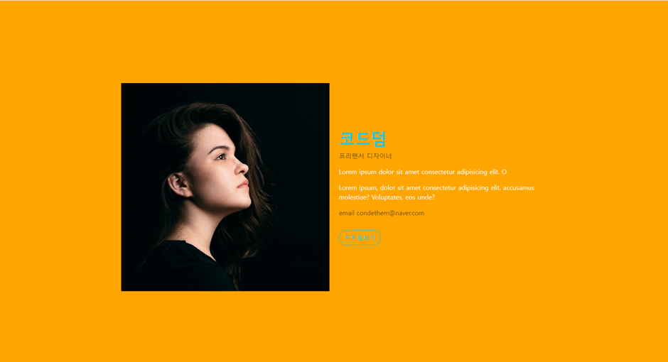
<body style="background-color: black;">
<section class="container text-white ">
<div class="row vh-100 justify-content-center align-items-center g-5">
<div class="col-md-6"><img src="이미지/image.png" alt="" class="img-fluid"></div>
<div class="col">
<h1 class="fw-bold text-info">코드덤</h1>
<p class="text-muted">프리랜서 디자이너</p>
<p style="color: orange;">Lorem ipsum dolor sit amet consectetur adipisicing elit. O</p>
<p style="color: orange;">Lorem ipsum, dolor sit amet consectetur adipisicing elit. accusamus molestiae? Voluptates, eos unde?</p>
<p class="text-muted">email condethem@naver.com</p>
<a href="#" class="btn btn-outline-info mt-3 rounded-pill">프로필보기</a>
</div>
</div>
</section>
</body>
</html>4. 아래 사이트를 클론 코딩하시오.
https://getbootstrap.kr/docs/5.3/examples/album/
<!DOCTYPE html>
<html lang="en">
<head>
<meta charset="UTF-8">
<meta name="viewport" content="width=device-width, initial-scale=1.0">
<link href="https://cdn.jsdelivr.net/npm/bootstrap@5.3.3/dist/css/bootstrap.min.css" rel="stylesheet">
<script src="https://cdn.jsdelivr.net/npm/bootstrap@5.3.3/dist/js/bootstrap.bundle.min.js"></script>
<title>Document</title>
</head>
<body>
<svg xmlns="http://www.w3.org/2000/svg" class="d-none">
<symbol id="check2" viewBox="0 0 16 16">
<path
d="M13.854 3.646a.5.5 0 0 1 0 .708l-7 7a.5.5 0 0 1-.708 0l-3.5-3.5a.5.5 0 1 1 .708-.708L6.5 10.293l6.646-6.647a.5.5 0 0 1 .708 0z">
</path>
</symbol>
<symbol id="circle-half" viewBox="0 0 16 16">
<path d="M8 15A7 7 0 1 0 8 1v14zm0 1A8 8 0 1 1 8 0a8 8 0 0 1 0 16z"></path>
</symbol>
<symbol id="moon-stars-fill" viewBox="0 0 16 16">
<path
d="M6 .278a.768.768 0 0 1 .08.858 7.208 7.208 0 0 0-.878 3.46c0 4.021 3.278 7.277 7.318 7.277.527 0 1.04-.055 1.533-.16a.787.787 0 0 1 .81.316.733.733 0 0 1-.031.893A8.349 8.349 0 0 1 8.344 16C3.734 16 0 12.286 0 7.71 0 4.266 2.114 1.312 5.124.06A.752.752 0 0 1 6 .278z">
</path>
<path
d="M10.794 3.148a.217.217 0 0 1 .412 0l.387 1.162c.173.518.579.924 1.097 1.097l1.162.387a.217.217 0 0 1 0 .412l-1.162.387a1.734 1.734 0 0 0-1.097 1.097l-.387 1.162a.217.217 0 0 1-.412 0l-.387-1.162A1.734 1.734 0 0 0 9.31 6.593l-1.162-.387a.217.217 0 0 1 0-.412l1.162-.387a1.734 1.734 0 0 0 1.097-1.097l.387-1.162zM13.863.099a.145.145 0 0 1 .274 0l.258.774c.115.346.386.617.732.732l.774.258a.145.145 0 0 1 0 .274l-.774.258a1.156 1.156 0 0 0-.732.732l-.258.774a.145.145 0 0 1-.274 0l-.258-.774a1.156 1.156 0 0 0-.732-.732l-.774-.258a.145.145 0 0 1 0-.274l.774-.258c.346-.115.617-.386.732-.732L13.863.1z">
</path>
</symbol>
<symbol id="sun-fill" viewBox="0 0 16 16">
<path
d="M8 12a4 4 0 1 0 0-8 4 4 0 0 0 0 8zM8 0a.5.5 0 0 1 .5.5v2a.5.5 0 0 1-1 0v-2A.5.5 0 0 1 8 0zm0 13a.5.5 0 0 1 .5.5v2a.5.5 0 0 1-1 0v-2A.5.5 0 0 1 8 13zm8-5a.5.5 0 0 1-.5.5h-2a.5.5 0 0 1 0-1h2a.5.5 0 0 1 .5.5zM3 8a.5.5 0 0 1-.5.5h-2a.5.5 0 0 1 0-1h2A.5.5 0 0 1 3 8zm10.657-5.657a.5.5 0 0 1 0 .707l-1.414 1.415a.5.5 0 1 1-.707-.708l1.414-1.414a.5.5 0 0 1 .707 0zm-9.193 9.193a.5.5 0 0 1 0 .707L3.05 13.657a.5.5 0 0 1-.707-.707l1.414-1.414a.5.5 0 0 1 .707 0zm9.193 2.121a.5.5 0 0 1-.707 0l-1.414-1.414a.5.5 0 0 1 .707-.707l1.414 1.414a.5.5 0 0 1 0 .707zM4.464 4.465a.5.5 0 0 1-.707 0L2.343 3.05a.5.5 0 1 1 .707-.707l1.414 1.414a.5.5 0 0 1 0 .708z">
</path>
</symbol>
</svg>
<div class="dropdown position-fixed bottom-0 end-0 mb-3 me-3 bd-mode-toggle">
<button class="btn btn-bd-primary py-2 dropdown-toggle d-flex align-items-center" id="bd-theme" type="button"
aria-expanded="false" data-bs-toggle="dropdown" aria-label="Toggle theme (light)">
<svg class="bi my-1 theme-icon-active" width="1em" height="1em">
<use href="#sun-fill"></use>
</svg>
<span class="visually-hidden" id="bd-theme-text">Toggle theme</span>
</button>
<ul class="dropdown-menu dropdown-menu-end shadow" aria-labelledby="bd-theme-text" style="">
<li>
<button type="button" class="dropdown-item d-flex align-items-center active" data-bs-theme-value="light"
aria-pressed="true">
<svg class="bi me-2 opacity-50" width="1em" height="1em">
<use href="#sun-fill"></use>
</svg>
Light
<svg class="bi ms-auto d-none" width="1em" height="1em">
<use href="#check2"></use>
</svg>
</button>
</li>
<li>
<button type="button" class="dropdown-item d-flex align-items-center" data-bs-theme-value="dark"
aria-pressed="false">
<svg class="bi me-2 opacity-50" width="1em" height="1em">
<use href="#moon-stars-fill"></use>
</svg>
Dark
<svg class="bi ms-auto d-none" width="1em" height="1em">
<use href="#check2"></use>
</svg>
</button>
</li>
<li>
<button type="button" class="dropdown-item d-flex align-items-center" data-bs-theme-value="auto"
aria-pressed="false">
<svg class="bi me-2 opacity-50" width="1em" height="1em">
<use href="#circle-half"></use>
</svg>
Auto
<svg class="bi ms-auto d-none" width="1em" height="1em">
<use href="#check2"></use>
</svg>
</button>
</li>
</ul>
</div>
<header data-bs-theme="dark">
<div class="text-bg-dark collapse show" id="navbarHeader" style="">
<div class="container">
<div class="row">
<div class="col-sm-8 col-md-7 py-4">
<h4>About</h4>
<p class="text-body-secondary">Add some information about the album below, the author, or any
other background context. Make it a few sentences long so folks can pick up some informative
tidbits. Then, link them off to some social networking sites or contact information.</p>
</div>
<div class="col-sm-4 offset-md-1 py-4">
<h4>Contact</h4>
<ul class="list-unstyled">
<li><a href="#" class="text-white">Follow on Twitter</a></li>
<li><a href="#" class="text-white">Like on Facebook</a></li>
<li><a href="#" class="text-white">Email me</a></li>
</ul>
</div>
</div>
</div>
</div>
<div class="navbar navbar-dark bg-dark shadow-sm">
<div class="container">
<a href="#" class="navbar-brand d-flex align-items-center">
<svg xmlns="http://www.w3.org/2000/svg" width="20" height="20" fill="none" stroke="currentColor"
stroke-linecap="round" stroke-linejoin="round" stroke-width="2" aria-hidden="true" class="me-2"
viewBox="0 0 24 24">
<path d="M23 19a2 2 0 0 1-2 2H3a2 2 0 0 1-2-2V8a2 2 0 0 1 2-2h4l2-3h6l2 3h4a2 2 0 0 1 2 2z">
</path>
<circle cx="12" cy="13" r="4"></circle>
</svg>
<strong>Album</strong>
</a>
<button class="navbar-toggler" type="button" data-bs-toggle="collapse" data-bs-target="#navbarHeader"
aria-controls="navbarHeader" aria-expanded="true" aria-label="Toggle navigation">
<span class="navbar-toggler-icon"></span>
</button>
</div>
</div>
</header>
<main>
<section class="py-5 text-center container">
<div class="row py-lg-5">
<div class="col-lg-6 col-md-8 mx-auto">
<h1 class="fw-light">Album example</h1>
<p class="lead text-body-secondary">Something short and leading about the collection below—its
contents, the creator, etc. Make it short and sweet, but not too short so folks don’t simply
skip over it entirely.</p>
<p>
<a href="#" class="btn btn-primary my-2">Main call to action</a>
<a href="#" class="btn btn-secondary my-2">Secondary action</a>
</p>
</div>
</div>
</section>
<div class="album py-5 bg-body-tertiary">
<div class="container">
<div class="row row-cols-1 row-cols-sm-2 row-cols-md-3 g-3">
<div class="col">
<div class="card shadow-sm">
<svg class="bd-placeholder-img card-img-top" width="100%" height="225"
xmlns="http://www.w3.org/2000/svg" role="img" aria-label="Placeholder: Thumbnail"
preserveAspectRatio="xMidYMid slice" focusable="false">
<title>Placeholder</title>
<rect width="100%" height="100%" fill="#55595c"></rect><text x="50%" y="50%"
fill="#eceeef" dy=".3em">Thumbnail</text>
</svg>
<div class="card-body">
<p class="card-text">This is a wider card with supporting text below as a natural
lead-in to additional content. This content is a little bit longer.</p>
<div class="d-flex justify-content-between align-items-center">
<div class="btn-group">
<button type="button" class="btn btn-sm btn-outline-secondary">View</button>
<button type="button" class="btn btn-sm btn-outline-secondary">Edit</button>
</div>
<small class="text-body-secondary">9 mins</small>
</div>
</div>
</div>
</div>
</div>
</div>
</div>
</main>
<footer class="text-body-secondary py-5">
<div class="container">
<p class="float-end mb-1">
<a href="#">Back to top</a>
</p>
<p class="mb-1">Album example is © Bootstrap, but please download and customize it for yourself!</p>
<p class="mb-0">New to Bootstrap? <a href="/">Visit the homepage</a> or read our <a
href="/docs/5.3/getting-started/introduction/">getting started guide</a>.</p>
</div>
</footer>
</body>
</html>