[Python 기초] - Matplotlib
데이터 전처리
데이터 전처리란?
: 데이터를 분석 및 처리에 적합한 형태로 만드는 과정
: 데이터 분석 및 처리 과정에서 중요한 단계이고 데이터 분석, 데이터 마이닝, 머신 러닝 프로젝트에 사용
필요성
- 잡음(noise) : 측정 과정에서 오류 값.
- 이상치(outlier) : 일반적인 데이터에 비해 다른 특성을 가지는 튀는 값
- 부적합(inconsistent) : 모순된 잘못된 데이터 값
- 겉측치(missing value) : 누락된 데이터 값
- 중복(duplicated) : 중복되는 데이터 값
데이터 전처리 작업 순서
- 데이터 정제 : 이상치, 겉측치를 파악해 제거하거나 적절한 값으로 대치
- 데이터 통합 : 여러 테이블에 있는 데이터를 병합 + 통합하여 적절한 데이터 셋 생성
- 데이터 축소 : 변수 선택, 요약변수 생성들을 통해 데이터의 차원을 줄인다.
- 데이터 변환 : 정규화, 표준화를 이용해 데이터의 형식을 변화시킨다.
Matplotlib
데이터를 시각화 하는데 사용되는 라이브러리
이제 본격적으로 matplotlib를 사용해보도록 하겠다.
먼저 가상환경을 열고 설치를 해준다.
pip install matplotlib
import matplotlib.pyplot as plt

plt.plot([7,5,3,1],[5,11,15,19], label='Price ($)')
#(7,5)(5,11)(3,15)(1,19)
plt.xlabel('X-Axis')
plt.ylabel('Y-Axis')
plt.legend() #범례를 표시해준다. (label인 price를 보여주기 위함)
plt.show()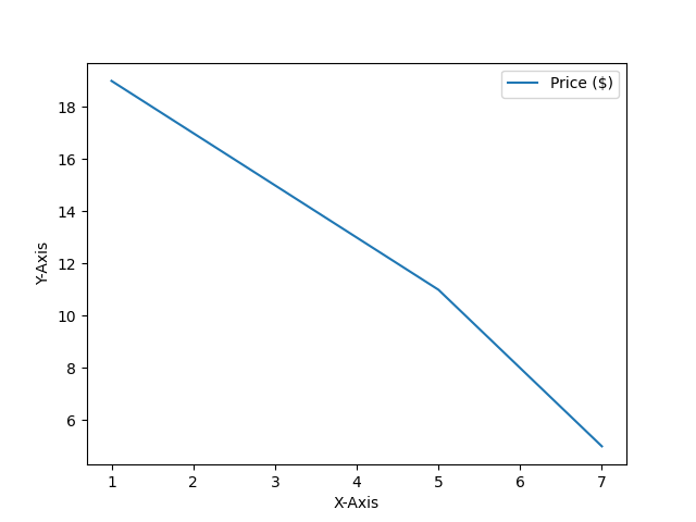
이렇게 바로 직관적으로 나오게 된다.
x축과 y축의 범위 정하기
import matplotlib.pyplot as plt

plt.plot([9,7,5,3,1],[3,5,11,15,19], label='Price ($)')
# "sm"을 추가하면 산점도가 된다
plt.xlabel('X-Axis')
plt.ylabel('Y-Axis')
plt.xlim(0,10)
plt.ylim(0,100)
[xmin, xmax, ymin, ymax] = plt.axis()

plt.legend()
plt.show()

#plt.bar() -> 바 형태로 출력된다
#plt.pie() -> 파이 차트 형태로 출력된다.- plt.axis('auto') : 데이터에 맞게 축의 범위 조절
- plt.axis('equal') : x축,y축의 비율을 동일하게 설정한다.(정사각형, 원)
- plt.axis('off') : 축을 숨긴다
선 종류 정하기
import matplorlib.pyplot as plt

plt.plot([1, 2, 3], [4, 4, 4], '-', color='C0', label='Solid')
plt.plot([1, 2, 3], [3, 3, 3], '--', color='C0', label='Dashed')
plt.plot([1, 2, 3], [2, 2, 2], ':', color='C0', label='Dotted')
plt.plot([1, 2, 3], [1, 1, 1], '-.', color='C0', label='Dash-dot')
plt.xlabel('X-Axis')
plt.ylabel('Y-Axis')
plt.axis([0.8, 3.2, 0.5, 5.0])

plt.legend(loc='upper right', ncol=4)
plt.show()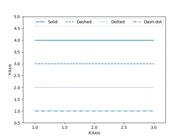
이런식으로 -,--를 이용해 선의 종류를 정할 수 있다.
numpy
import matplotlib.pyplot as plt
import numpy as np

#start부터 end까지 num개의 점을 균일하게 찍는다.
x = np.linspace(start,end,num)
#start부터 end까지 num만큼의 간격으로 찍는다.(end포함 x)
x = np.arange(start,end,num)
#그리드 설정
plt.grid(True)
#여러 그래프 한번에 그리기
plt.plot(x,y1,'r--',x,y2,'bo',x,y3,'g-.')#막대 그래프 그리는 법
plt.bar(x,values,align='edge',edgecolor='lightgray',linewidth = 1, tick_label=years)산점도 그래프 그리기
# Matplotlib 산점도 그리기
import matplotlib.pyplot as plt
import numpy as np
np.random.seed(0)
n = 100
x = np.random.rand(n)
y = np.random.rand(n)
area = (50 * np.random.rand(n))**2
colors = np.random.rand(n)
plt.scatter(x, y, s=area, c=colors, alpha=0.8, cmap='Spectral')
plt.colorbar()
plt.show()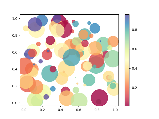
plt.pie ~ #파이 차트 그리기
3차원 그래프
from mpl_toolkits import mplot3d
import numpy as np
import matplotlib.pyplot as plt

axis = plt.axes(projection='3d')
plt.show()

Z = np.linspace(0, 1, 100)
X = Z * np.sin(30 * Z)
Y = Z * np.cos(30 * Z)

axis.plot3D(X, Y, Z)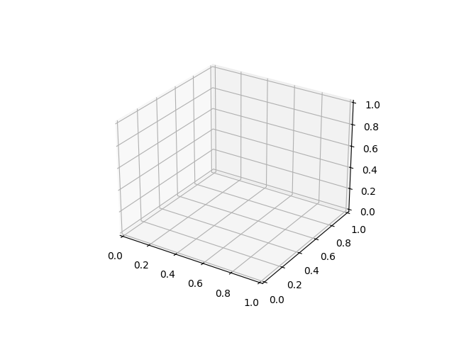
이런식으로 3D그래프도 구현할 수 있다.

제가 관심있고 공부하고 싶은걸 정리하는 저만의 노트입니다.