
정렬의 마술사,
CSS 계의 마에스트로,
float로 낑낑대던 나의 빛과 소금...
flex에 대해 배웠다.
앞으로 주구장창 쓰게 될 개념이라고 하니 확실하게 이해하고 넘어가도록 하자.
flex
display: flex
.container {
	display: flex;
}
부모 요소 .container에 flex를 부여하면, 내부의 자식 요소들이 가로 방향(기본값)으로 나란히 정렬하게 된다.
이 상태에서 flex와 관련된 속성을 추가로 부여해 다양한 형태로 정렬할 수 있다.
주요 속성
flex-direction
.container {
	display:flex;
	flex-direction: row; /* 왼->오(기본값) */
	flex-direction: row-reverse; /* 오->왼 */
	flex-direction: column; /* 위->아래 */
	flex-direction: column-reverse; /* 아래->위 */
}
정렬 방향을 결정하는 속성이다.
그런데 row = 가로 정렬 / column = 세로 정렬이라고 생각하고 써먹다보니, justify-content나 align-items를 적용할 때 헷갈리는 부분이 많더라.
💡 그러니까
flex-direction= 주축이 될 방향을 지정하는 속성이라고 기억하기로 했다.
예를 들어 row(기본) 상태에서는 주축이 가로, 교차축이 세로가 되는 것이고
column 상태에서는 주축이 세로, 교차축이 가로가 되는 것.
justify-content (주축 정렬)
.container{
	display:flex;
	justify-content: flex-start; /* 왼쪽 정렬(기본값) */
	justify-content: flex-end; /* 오른쪽 정렬 */
	justify-content: center; /* 중앙 정렬 */
	justify-content: space-between; /* 양 끝 정렬 */
	justify-content: space-around; /* 요소 주변 여백 균등 */
	justify-content: space-evenly; /* 요소 간격 균등 */
}
align-items (교차축 정렬)
.container{
	display: flex;
	align-items: flex-start; /* 위쪽 정렬 */
	align-items: flex-end; /* 아래쪽 정렬 */
	align-items: center; /* 중앙 정렬 */
	align-items: stretch; /* 높이를 자동 조절(기본값) */
	align-items: baseline; /* 텍스트 기준선 맞춤 */
}
flex 이해하기

뉴진스가 무대를 한다고 생각해보자.
갑자기 왜? 라고 생각할 수 있겠지만 암튼 해보자.
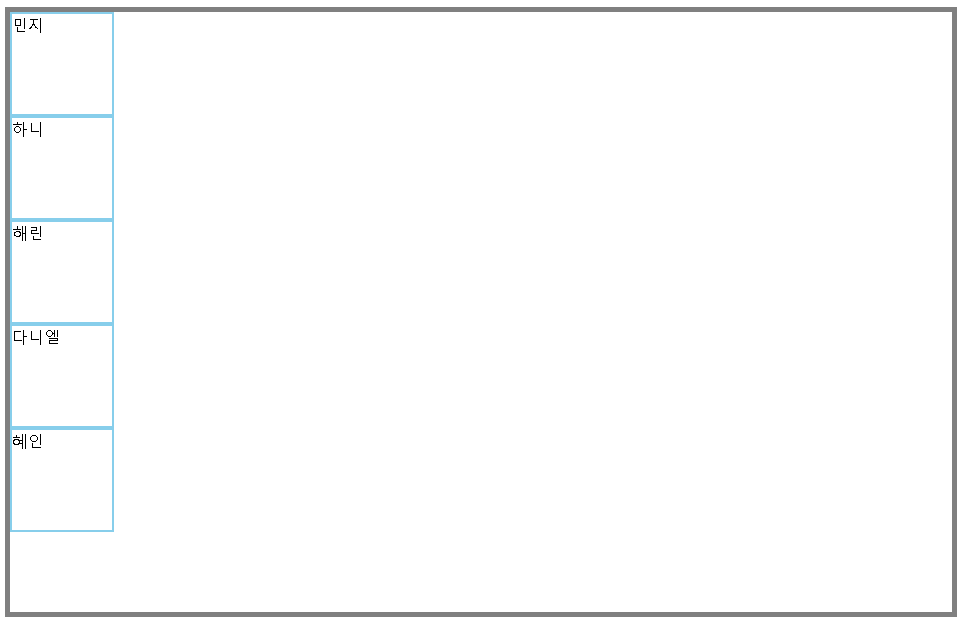
<div id="stage">
        <div id="newjeans">

            <div>민지</div>
            <div>하니</div>
            <div>해린</div>
            <div>다니엘</div>
            <div>혜인</div>

        </div>
    </div>
뉴진스는 현재 위와 같이 서있는 상태다.
뉴진스에게 '어떤 대형으로 서달라'고 요청해야 한다면, 어떻게 지시할 것인가?
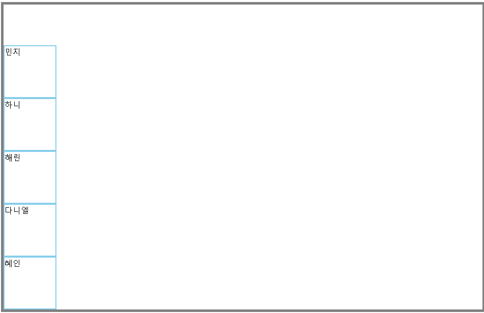
1️⃣ 일렬로 서주세요
가로(기본값) 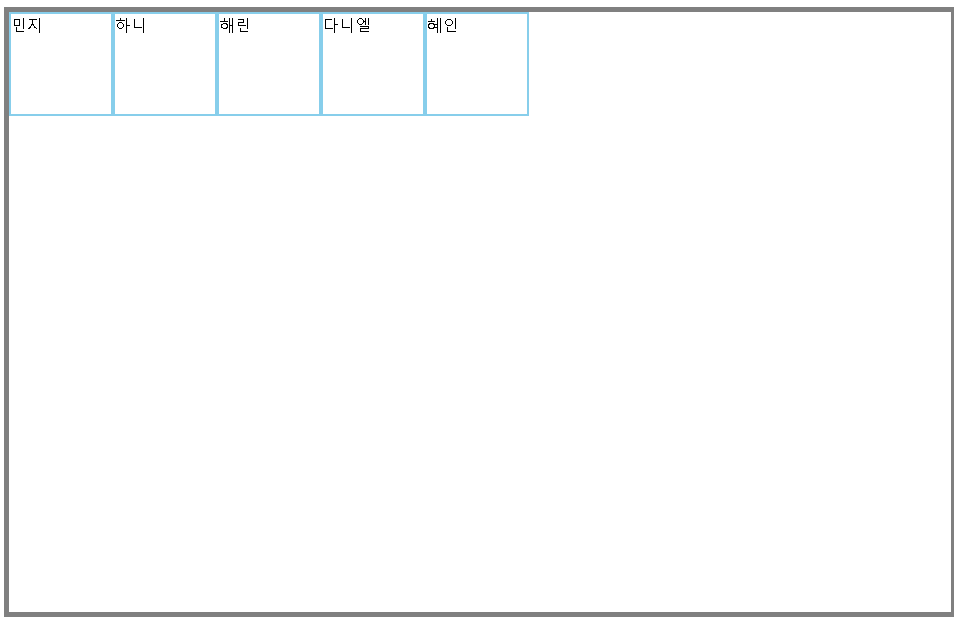 | 세로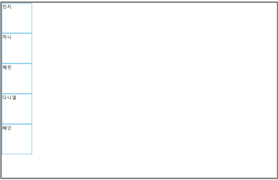 |
|---|---|
#newjeans { | #newjeans { |
display: flex; | display: flex; |
flex-direction: row; } | flex-direction: column; } |
가로 역순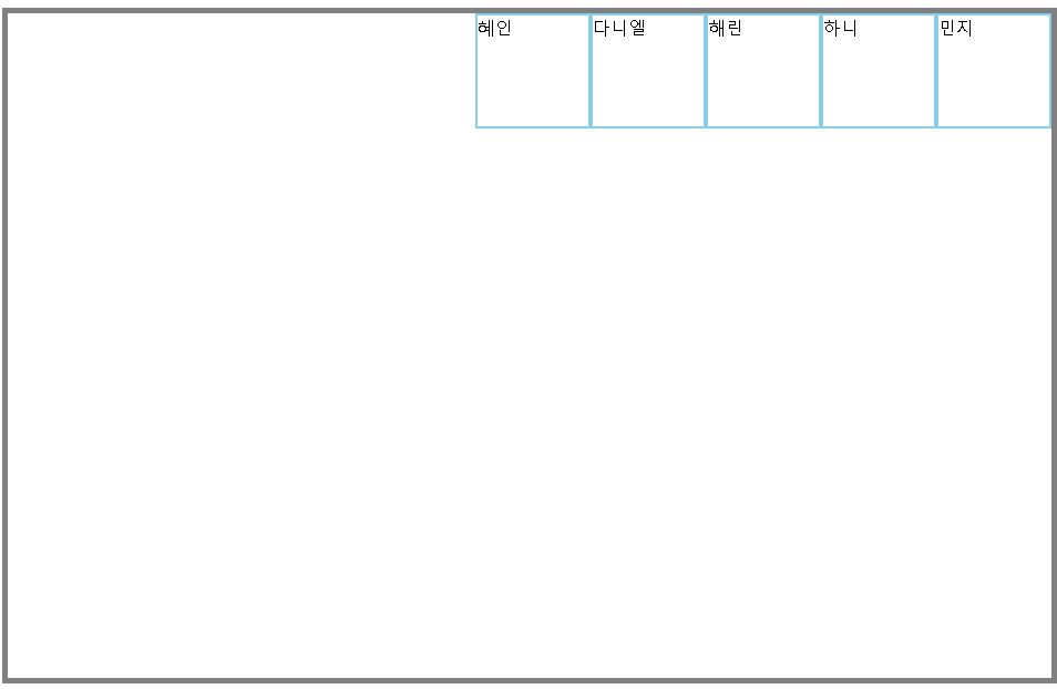 | 세로 역순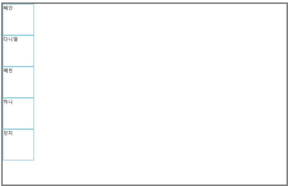 |
|---|---|
#newjeans { | #newjeans { |
display: flex; | display: flex; |
flex-direction: row-reverse; } | flex-direction: column-reverse; } |
아주 가지런하게 잘 정렬했다.
정렬 순서를 역방향으로 설정할 수도 있다.
여기서 한 가지 명심해야 할 것이 있다.
💡
flex를 적용할 때 가장 중요한 것은 부모 - 자식관계를 확인하는 것!
뉴진스, 일렬로 서주세요~ 해야 다들 인식하지,
하니! 일렬로 서주세요~ 한다고 해서 뉴진스 모두가 일렬로 서지 않는 것처럼
부모 요소에 flex를 적용하면 → 자식 요소들이 정렬한다는 것을 기억하자.
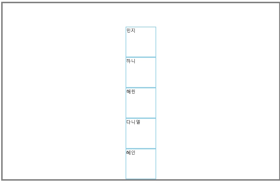
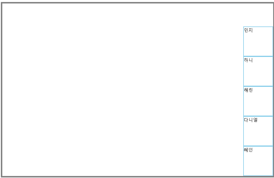
2️⃣ 가운데로 서주세요~
가로 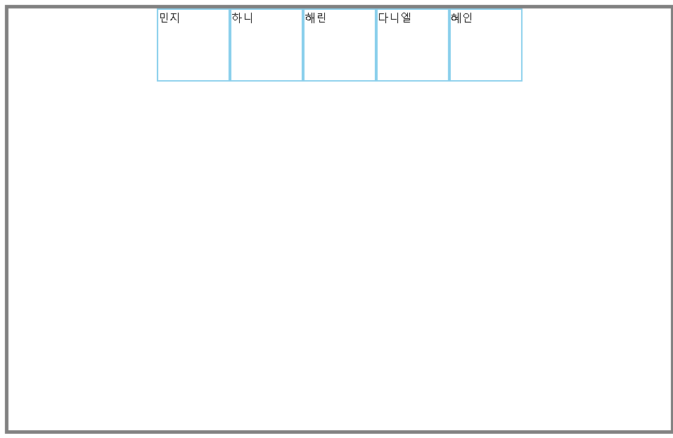 | 세로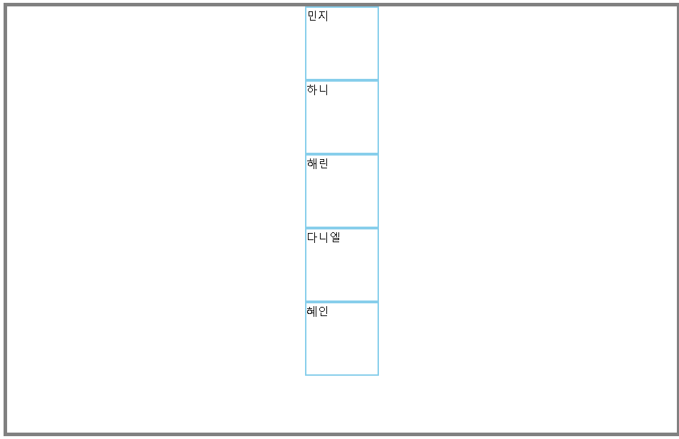 |
|---|---|
#newjeans { | #newjeans { |
display: flex; | display: flex; |
flex-direction: row; | flex-direction: column-reverse; |
justify-content: center; } | align-items: center; } |
💡왜 두 예시에서 사용하는 속성이 다를까?
우리의 목표는 뉴진스를 무대의 가로축 중앙으로 정렬하는 것이다.
앞서 말했던 것처럼, flex-direction을 단순히 정렬 방향이라고 생각하면 헷갈린다.
주축을 어느 방향으로 설정했는지 생각하고 접근해보자.
-
flex-direction: row주축 = 가로축 / 교차축 = 세로축
우리의 목표는 가로축 중앙으로 정렬하는 것이므로, 이 경우 주축을 가운데 정렬하면 된다.
즉, 주축을 정렬하는 속성인justify-content을 이용
-
flex-direction: column주축 = 세로축 / 교차축 = 가로축
이 경우 가로축은 교차축으로 지정되었기 때문에, 교차축을 가운데 정렬한다.
즉, 교차축을 정렬하는 속성인align-items를 이용
<
3️⃣ 앞으로 나와주세요
💡정렬하기 전에, 아무리 속성값을 바꿔도 #newjeans가 이동하지 않는 문제를 겪었다.
-> 공간이 충분하지 않은가? 라는 생각이 들어, #newjeans가 부모요소인 #stage의 모든 공간을 쓸 수 있도록 #newjeans의 너비와 높이를 모두 100%로 설정하는 과정이 필요했다.
그랬더니, 문제가 해결됐다! 얏호
#newjeans {
            width: 100%;
            height: 100%;
        }
암튼 이런 과정을 거쳤지만, 표에서는 위 코드까지 포함하진 않겠다.
이제 다시 뉴진스를 앞(뷰포트 기준 bottom)으로 정렬해보자.
왼쪽 하단 | 중앙 하단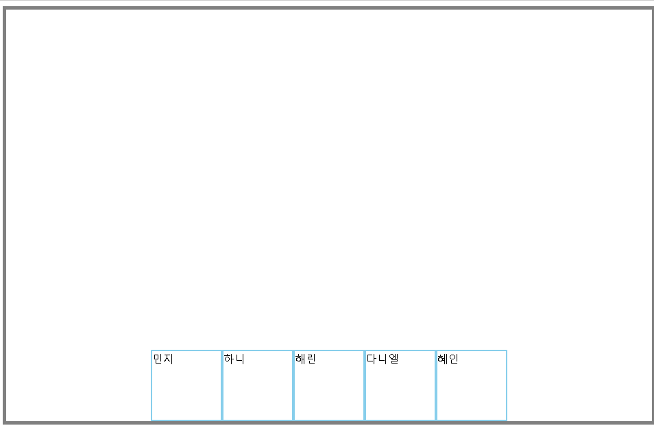 | 오른쪽 하단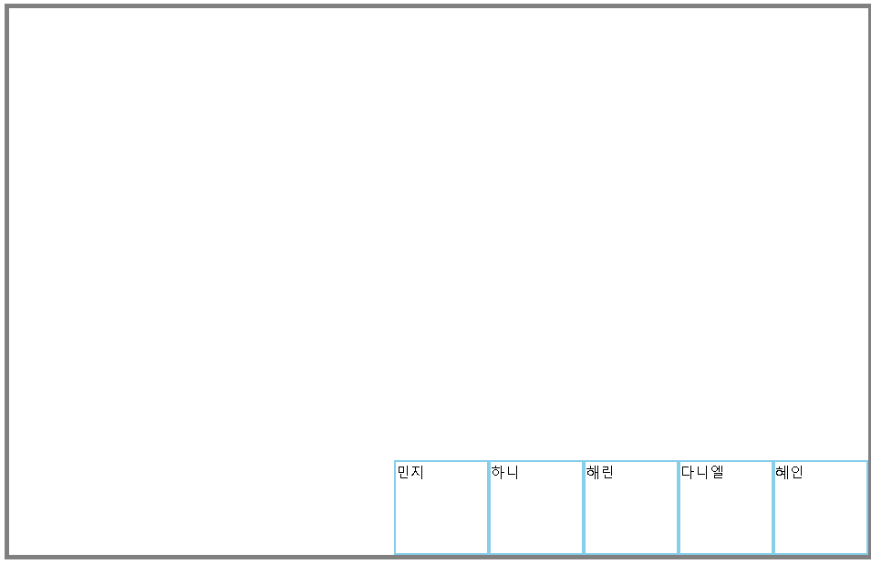 |
|---|---|---|
#newjeans { | #newjeans { | #newjeans { |
display: flex; | display: flex; | display: flex; |
flex-direction: row; | flex-direction: row; | flex-direction: row; |
justify-content: flex-start; | justify-content: center; | justify-content: flex-end; |
align-items: flex-end; } | align-items: flex-end; } | align-items: flex-end; } |
 |  |  |
|---|---|---|
#newjeans { | #newjeans { | #newjeans { |
display: flex; | display: flex; | display: flex; |
flex-direction: row; | flex-direction: row; | flex-direction: row; |
justify-content: flex-end; | justify-content: flex-end; | justify-content: flex-end; |
align-items: flex-start; } | align-items: center; } | align-items: flex-end; } |
💡이 예시에서도 마찬가지로, 주축 / 교차축이 가로인지, 세로인지에 따라 flex-end를 고정적으로 사용한 속성이 다르다.
flex-direction: row
: 세로축 = 교차축이므로, align-items: flex-end로 고정 후 justify-content 값 조절
flex-direction: column
: 세로축 = 주축이므로, justify-content: flex-end로 고정 후 align-items 값 조절
4️⃣ 간격을 두고 퍼져주세요
space-between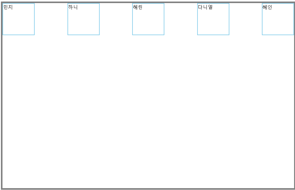 요소 간 여백 균등, 요소 간 여백 균등, 양 끝은 여백 없음 | space-around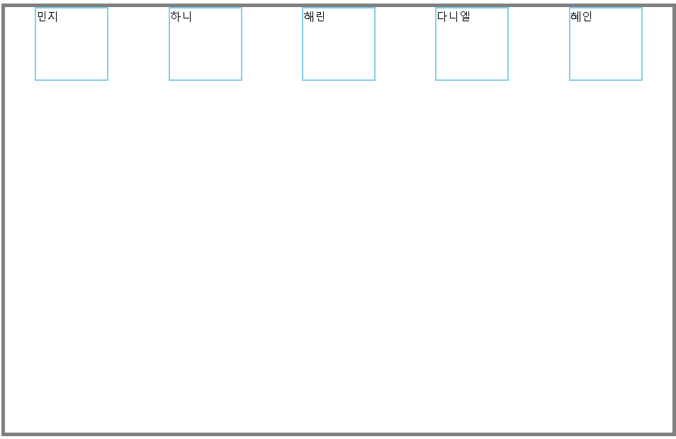 요소 간 여백 균등, 요소 간 여백 균등, 양 끝 여백은 절반 | space-evenly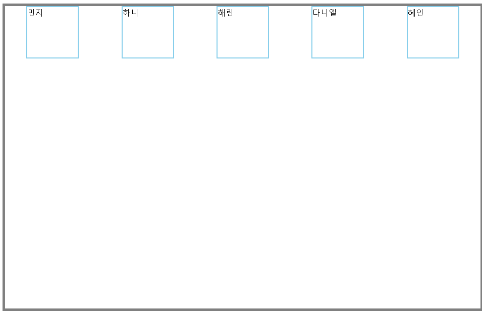 양 끝 여백까지 포함해서 양 끝 여백까지 포함해서 요소 간 여백 균등 |
|---|---|---|
#newjeans { | #newjeans { | #newjeans { |
display: flex; | display: flex; | display: flex; |
flex-direction: row; | flex-direction: row; | flex-direction: row; |
justify-content: space-between; } | justify-content: space-around; } | justify-content: space-evenly; } |
space-between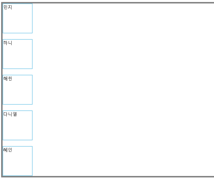 요소 간 여백 균등, 요소 간 여백 균등, 양 끝은 여백 없음 | space-around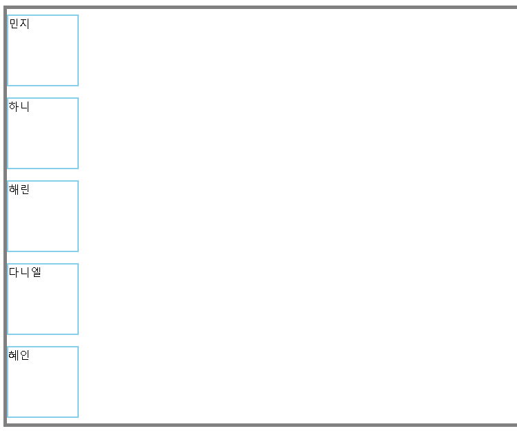 요소 간 여백 균등, 요소 간 여백 균등, 양 끝 여백은 절반 | space-evenly 양 끝 여백까지 포함해서 양 끝 여백까지 포함해서 요소 간 여백 균등 |
|---|---|---|
#newjeans { | #newjeans { | #newjeans { |
display: flex; | display: flex; | display: flex; |
flex-direction: row; | flex-direction: row; | flex-direction: row; |
justify-content: space-between; } | justify-content: space-around; } | justify-content: space-evenly; } |
이 경우에는 각각 정렬 방향(=주축)이 간격을 두고자하는 방향과 일치하기 때문에 모든 예시에서 주축을 정렬하는 justify-content가 쓰였다.
이렇게 뉴진스와 함께하는 `flex` 기본 요소 정리가 끝났다.
프론트엔드 배우시는 분들 슬쩍 보니까 flex-grow, flex-shrink도 많이 사용한다던데,
표 때문에 글이 굉장히 헤비해지고 있기 때문에 다음에 다시 다뤄봐야겠다!
노션만 쓰다가 레이아웃 제약 많은 벨로그 쓰려니까 영... 그래도 적응중