시작하며 👏
사실 이미 완성은 됐는데, 어쩌다 보니 밀렸습니다. (...)
다름 아니라, 기존에 React로 작성한 일기 블로그를 좀 유지보수해야겠다는 생각도 들기도 했고, 이 프로젝트 역시 너무나 조잡해서, 유지보수하느라 정신이 없었네요. 😂
최근에는 또 코딩테스트를 2번을 보고, 디자인 패턴에 관해서도 새롭게 책을 읽고 있느라 정신이 없지만.. 그래도 블로그를 미루면 안되니까! 항상 꾸준히 하는 습관을 길러야겠습니다. 그럼, 시작할게요!
본론
일단 이 포스팅에서 다룰 건, 다음과 같은 페이지입니다!

1~3을 클릭하면, 파란색으로 active되고, 이미지가 바뀌는 걸 알 수 있어요.
또, 다음과 같이 특정 breakpoint 미만에서는 따로 토글버튼이 생성됩니다!
그렇다면, 먼저 html부터 살펴볼게요!
index.html
<section class="about">
<header class="about__header">
<h1 class="about__main-copy">우리의 관심은 당신의 <strong>코드</strong></h1>
<h3 class="about__sub-copy">"디벨로퍼스는 말이죠, 이렇게 도와드려요!"</h3>
</header>
<ul class="about__btns">
<li class="about__btn about__btn--active" data-btn-number="1"></li>
<li class="about__btn" data-btn-number="2"></li>
<li class="about__btn" data-btn-number="3"></li>
</ul>
<section class="about__features">
<ul class="about__cards">
<li class="about__card about__card--active" data-card-number="1">
<h4 class="about__card-title" >
<div class="about__card-number" data-title-number="1"></div>
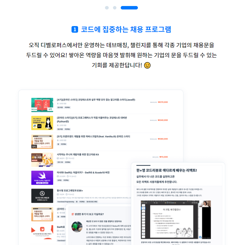
<span>코드에 집중하는 채용 프로그램</span>
</h4>
<h5 class="about__card-description">
오직 디벨로퍼스에서만 운영하는 데브매칭, 챌린지를 통해 각종 기업의 채용문을 두드릴 수 있어요! 쌓아온 역량을 마음껏 발휘해 원하는 기업의 문을 두드릴 수 있는 기회를 제공한답니다! 😉
</h5>
</li>
<li class="about__card" data-card-number="2">
<h4 class="about__card-title">
<div class="about__card-number" data-title-number="2"></div>
<span>실전을 위한 트레이닝 시스템</span>
</h4>
<h5 class="about__card-description">
수많은 기업과의 코딩테스트 운영 경험이 그대로 녹아있는 ‘코딩테스트 연습’ 기능과, 챌린지나 데브매칭에 실제로 출제되었던 과제를 풀어보는 ‘과제관' (출시 예정)을 통해 실전 감각을 익혀보아요!
</h5>
</li>
<li class="about__card" data-card-number="3">
<h4 class="about__card-title">
<div class="about__card-number" data-title-number="3"></div>
<span>코드리뷰 중심의 교육과정</span>
</h4>
<h5 class="about__card-description">
각종 실무 주제를 토대로 운영되는 디벨로퍼스의 온라인 스터디는 단순한 강의를 넘어, 코드리뷰에 중심을 두고 있어요! 상호 피드백을 통한 코드의 개선에 집중하며, 결과적으로 더 나은 코드를 작성해 볼까요?
</h5>
</li>
</ul>
<ul class="about__card-images">
<li class="about__image-box about__image-box--active" data-img-number="1">
<img src="https://programmers.co.kr/packs/media/images/img-root-feature-1-67a799d8.png" alt="디벨로퍼스 설명 이미지" class="about__image">
</li>
<li class="about__image-box" data-img-number="2">
<img src="https://programmers.co.kr/packs/media/images/img-root-feature-2-0705b218.png" alt="디벨로퍼스 설명 이미지" class="about__image">
</li>
<li class="about__image-box" data-img-number="3">
<img src="https://programmers.co.kr/packs/media/images/img-root-feature-3-37493d41.png" alt="디벨로퍼스 설명 이미지" class="about__image">
</li>
</ul>
</section>
</section>최대한 의미있게 작성하려 노력해봤어요!
이제 뭔가, h1~h6과 ul, li, section, article은 정말 많이 친숙해진 느낌이 드네요 😉
main.scss
아, 최근에 styles.scss가 아닌, main.scss로 이름을 바꿨습니다!
뭔가, main이라는 이름의 어감이 좀 더 핵심이라는 게 느껴진 게 이유입니다.
.about {
    @include _setMarginAuto();
    padding-bottom: 8rem;
    &__header {
        display: flex;
        flex-direction: column;
        align-items: center;
        padding-bottom: 4rem;
        strong {
            color: $blue-color;
        }
        .about__main-copy {
            margin: 0;
            font-size: 2rem;
        }
        .about__sub-copy {
            font: {
                size: 1.25rem;
                weight: 400;
            }
            color: darken($program-gray-color, 10%);
        }
    }
    &__btns {
        @include _setPageBtn('about__btn');
        display: none;
        padding: {
            top: 0;
            bottom: 3rem;
        }
    }
    &__features {
        display: flex;
    }
    &__cards,
    &__card-images {
        padding: 0 1rem;
        margin: 0;
        width: 50%;
        box-sizing: border-box;
    }
    &__cards {
        .about__card {
            padding: 1.5rem 1.5rem;
            margin-bottom: 1rem;
            border-radius: 0.5rem;
            box-sizing: border-box;
            transition: all 0.3s;
            &-title {
                margin: 0;
                padding-bottom: 1rem;
                display: flex;
                align-items: center;
                font-size: $font-xl;
                color: darken($program-gray-color, 30%);
            }
            &-number {
                display: flex;
                position: relative;
                top: 0.0625rem;
                justify-content: center;
                align-items: center;
                background: darken($program-gray-color, 30%);
                width: $font-l;
                height: $font-l;
                border-radius: 0.25rem;
                margin-right: 0.5rem;
                &::after {
                    position: relative;
                    content: attr(data-title-number);
                    bottom: 0.0625rem;
                    font-size: 0.875rem;
                    color: white;
                }
            }
            &-description {
                margin: 0;
                font: {
                    size: 1rem;
                    weight: 400;
                }
                line-height: 1.75;
                word-break: keep-all;
            }
            &:hover {
                cursor: pointer;
                background: lighten($program-gray-color, 50%);
            }
            &--active {
                background: lighten($blue-color, 47%);
                .about__card-title {
                    color: $blue-color;
                }
                .about__card-number {
                    background: $blue-color;
                }
                &:hover {
                    background: lighten($blue-color, 47%);
                }
            }
        }
    }
    &__card-images {
        overflow: hidden;
        box-sizing: border-box;
        .about__image-box {
            display: none;
            width: 100%;
            &--active {
                display: block;
            }
            .about__image {
                width: 100%;
            }
        }
    }
    @include customMedia("tablet") {
        &__btns {
            display: flex;
            padding-bottom: 1rem;
            .about__btn {
                margin: 0 0.375rem;
            }
        }
        &__features {
            flex-direction: column;
            align-items: center;
            .about__cards,
            .about__card-images {
                width: auto;
                max-width: 40rem;
            }
            .about__cards {
                .about__card {
                    display: none;
                    background: transparent;
                    &-title {
                        display: flex;
                        justify-content: center;
                    }
                    &-description {
                        text-align: center;
                    }
                    &--active {
                        display: block;
                        background: transparent;
                    }
                    &:hover {
                        background: transparent;
                        cursor: auto;
                    }
                }
            }
        }
    }
    @include customMedia("mobile-and-tablet") {
        &__header {
            padding-bottom: 2rem;
            .about__main-copy {
                font-size: 1.75rem;
            }
            .about__sub-copy {
                font-size: $font-l;
            }
        }
        &__cards {
            padding: 0;
            .about__card {
                &-description {
                    font-size: 0.9375rem;
                }
            }
        }
    }
    @include customMedia("mobile") {
        &__cards {
            .about__card {
                padding: {
                    left: 0;
                    right: 0;
                }
            }
        }
    }
}
아무래도 반응형으로 바뀌는 게 많은지라, 여간 작은 컴포넌트인데도 코드가 길군요 😂
About.ts (수정 전)
수정 전에 썼던 코드입니다! 기능 구현에 초점을 맞췄던지라, 굉장히 난잡하네요...!
일단 먼저 본 컴포넌트에서는 2가지 이벤트가 있었습니다.
- ~태블릿 반응형 크기: 버튼 클릭 시 토글
- 데스크탑 반응형 크기: 카드 클릭 시 토글
따라서 이를 구현하기 위해 다음과 같이 작성했는데요!
interface Names{
    [key: string]: string;
}
export default class About {
    private readonly names: Names;
    constructor() {
        this.names = {
            aboutBtns: `about__btns`,
            aboutBtn: `about__btn`,
            aboutCards: `about__cards`,
            aboutCard: `about__card`,
            aboutImageBox: `about__image-box`,
        }
        this.handleBtnClick();
        this.handleCardClick();
    }
    handleBtnClick():void {
        const $aboutBtns = document.querySelector(`.${this.names.aboutBtns}`);
        $aboutBtns.addEventListener('click', (e: MouseEvent) => {
            const target = e.target as HTMLElement;
            if (!target.classList.contains(this.names.aboutBtn)) return;
            const idx = target.dataset.btnNumber;
            const $btnElems: NodeListOf<HTMLElement>= document.querySelectorAll(`.${this.names.aboutBtn}`)
            $btnElems.forEach(elem => {
                elem.classList.toggle(`${this.names.aboutBtn}--active`, e.target === elem);
            });
            const $cardElems: NodeListOf<HTMLElement>= document.querySelectorAll(`.${this.names.aboutCard}`);
            $cardElems.forEach((elem:HTMLElement) => {
                elem.classList.toggle(`${this.names.aboutCard}--active`, idx === elem.dataset.cardNumber)
            })
            const $imgBoxElems: NodeListOf<HTMLElement>= document.querySelectorAll(`.${this.names.aboutImageBox}`);
            $imgBoxElems.forEach((elem:HTMLElement) => {
                elem.classList.toggle(`${this.names.aboutImageBox}--active`, idx === elem.dataset.imgNumber)
            })
        })
    }
    handleCardClick() {
        if (window.innerWidth < 991) return;
        const aboutCardArr: NodeListOf<HTMLElement> = document.querySelectorAll(`.${this.names.aboutCard}`);
        const that = this;
        aboutCardArr.forEach((aboutCard:HTMLElement) => {
            aboutCard.addEventListener('click', function (e) {
                const target = e.currentTarget as HTMLElement;
                const idx = target.dataset.cardNumber;
                aboutCardArr.forEach((elem) => {
                    elem.classList.toggle(`${that.names.aboutCard}--active`, elem === this);
                })
                const $imgBoxElems: NodeListOf<HTMLElement>= document.querySelectorAll(`.${that.names.aboutImageBox}`);
                $imgBoxElems.forEach((elem:HTMLElement) => {
                    elem.classList.toggle(`${that.names.aboutImageBox}--active`, idx === elem.dataset.imgNumber)
                })

            });
        })
    }
}
일단 굉장히 겹치는 부분이 존재합니다.
저같은 경우 data속성을 이용하여 토글을 구현하였는데요, 그래서인지 이벤트 처리에 있어 어떤 하나의 패턴이 보였습니다!
- 이벤트 리스너를 통해
target의data속성 확인 후- 여러 노드들 중
data키의 속성값이 같은 노드를 찾아 토글
따라서, 이를 toggleElement라는 함수로 공통된 부분을 처리하여 리팩토링을 진행해봤습니다!
About.ts (수정 후)
interface Names{
    [key: string]: string;
}
export default class About {
    private readonly names: Names;
    constructor() {
        this.names = {
            aboutBtns: `about__btns`,
            aboutBtn: `about__btn`,
            aboutCards: `about__cards`,
            aboutCard: `about__card`,
            aboutImageBox: `about__image-box`,
        }
        this.handleBtnClick();
        this.handleCardClick();
    }
    handleBtnClick():void {
        const $aboutBtns = document.querySelector(`.${this.names.aboutBtns}`);
        $aboutBtns.addEventListener('click', (e: MouseEvent) => {
            const target = e.target as HTMLElement;
            if (!target.classList.contains(this.names.aboutBtn)) return;
            const idx = target.dataset.btnNumber;
            this.toggleElement(this.names.aboutBtn, idx, 'btnNumber')
            this.toggleElement(this.names.aboutCard, idx, 'cardNumber');
            this.toggleElement(this.names.aboutImageBox, idx, 'imgNumber');
        })
    }
    handleCardClick():void {0
        // Event Delegation을 시도했으나, e.target이 button이 아닌 하위 요소들이 찍힘. 따라서 각각에 이벤트리스너 넣음.
        const aboutCardArr: NodeListOf<HTMLElement> = document.querySelectorAll(`.${this.names.aboutCard}`);
        aboutCardArr.forEach((aboutCard:HTMLElement) => {
            aboutCard.addEventListener('click', (e: MouseEvent) => {
                if(window.matchMedia("(max-width: 990px)").matches) return;
                const target = e.currentTarget as HTMLElement;
                const idx = target.dataset.cardNumber;
                this.toggleElement(this.names.aboutCard, idx, 'cardNumber');
                this.toggleElement(this.names.aboutImageBox, idx, 'imgNumber');
            });
        })
    }
    toggleElement(name: string, idx: string, dataKey:string): void {
        const nodeList = document.querySelectorAll(`.${name}`);
        nodeList.forEach((elem: HTMLElement) => {
            elem.classList.toggle(`${name}--active`, idx === elem.dataset[dataKey]);
        })
    }
}
코드가 더 간단명료해진 듯한 느낌입니다! (거의 20%를 줄인데다, 메서드로 표기하니 더욱 기능이 명료해지네요!)
마치며 🌈
결과적으로 잘 동작한 게 위의 이미지입니다!
사실, 캐러셀 이후로는 크게 걱정되는 게 없었어요. 실제로도 캐러셀 이후에 그냥 단숨에 끝났....😅
그래도 항상 느끼는 건, 기술 구현은 쉽지만 이를 더욱 최적화하는 건 어렵다는 걸 실감합니다.
계속해서 블로그 프로젝트 하면서, 유지보수할 부분은 해야겠습니다. 그게, 저를 성장시켜주는 듯 하거든요.
다음은 앞으로 이 주제로 게재할 게 3개가 남았네요. 달려봅시다!
.jpg)