- 기본적으로 직사각형 막대를 사용하여 데이터의 값을 표현하는 차트/그래프
- 막대 그래프, bar chart, bar graph 등의 이름으로 사용됨
- 범주에 따른 수치 값을 막대로 표현하고 막대들을 서로 비교하는 방법
막대의 방향에 따른 분류
- 수직(vertical) : bar()를 통해 그리며, x축에 범주, y축에 값을 표기
- 수평(horizontal) : barh()를 통해 그리며, y축에 범주, x축에 값을 표
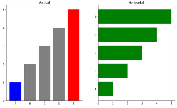
fig, axes = plt.subplots(1, 2, figsize=(12, 7))

x = list('ABCDE')
y = np.array([1, 2, 3, 4, 5])

clist = ['blue', 'gray', 'gray', 'gray', 'red'] # 개별 막대 색 지정
color = 'green' # 전체 막대 색 지정
axes[0].bar(x, y, color=clist) # Vertical
axes[1].barh(x, y, color=color) # Horizontal
axes[0].set_title("Vertical") # 제목 추가
axes[1].set_title("Horizontal")

plt.show()
Multiple Bar Plot
- 비교에 가장 좋은 방법은 한 개의 플롯에 동시에 여러개의 막대를 나타내는 것
Stacked Bar Plot
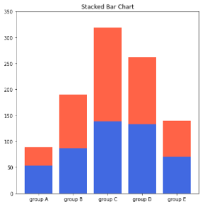
- 2개 이상의 그룹을 쌓아서 표현하는 bar plot
- 위의 사진과 같이 파란색의 분포는 파악하기 쉽지만, 그 외의 빨간색의 분포는 파악하기 어렵다는 단점이 있다.
- 만약 그룹이 2개만 있을 경우 축 자체를 positive/negative하게 나타낼 수 있다.
fig, axes = plt.subplots(1, 2, figsize=(15, 7))

group_cnt = student['race/ethnicity'].value_counts().sort_index()
axes[0].bar(group_cnt.index, group_cnt, color='darkgray')
axes[1].bar(group['male'].index, group['male'], color='royalblue') # 남성 그래프 추가
axes[1].bar(group['female'].index, group['female'], bottom=group['male'], color='tomato') # 여성 그래프 추가
axes[1].set_title("Stacked Bar Chart")

for ax in axes:
    ax.set_ylim(0, 350)

plt.show()
Percentage Stacked Bar Chart
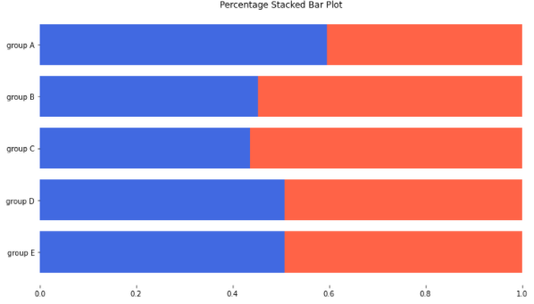
- 각각의 범주의 전체 비율을 나타내어 비율 정보를 좀 더 잘 나타내기 위한 차트
fig, ax = plt.subplots(1, 1, figsize=(12, 7))

group = group.sort_index(ascending=False) # 역순 정렬
total=group['male']+group['female'] # 각 그룹별 합

ax.barh(group['male'].index, group['male']/total,
        color='royalblue')

ax.barh(group['female'].index, group['female']/total,
        left=group['male']/total,
        color='tomato')
ax.set_title("Percentage Stacked Bar Plot")

# 공백 제거
ax.set_xlim(0, 1)

# 테두리 제거
for s in ['top', 'bottom', 'left', 'right']:
    ax.spines[s].set_visible(False)

plt.show()
Overlapped Bar Plot
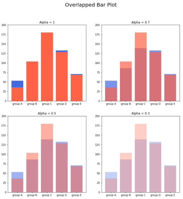
- 기본적인 Stacked Bar chart의 경우 맨 아래의 색의 분포만 파악할 수 있었던 단점이 있었는데, 이를 해결하기 위해 겹쳐서 그리는 방법이 바로 Overlapped Bar Plot이다.
- alpha를 이용해 투명도를 조절하여 겹치는 부분을 파악할 수 있다.
- 같은 축을 사용하니 비교가 쉽다는 장점이 있지만, 3개 이상의 그룹을 비교한다면 보기가 어렵다는 단점이 있다.
- 3개 이상의 그룹을 비교한다면 Area plot을 사용하는 것이 더 효과적이다.
group = group.sort_index()

fig, axes = plt.subplots(2, 2, figsize=(12, 12))
axes = axes.flatten()
plt.suptitle("Overlapped Bar Plot",size=20)
for idx, alpha in enumerate([1, 0.7, 0.5, 0.3]):
    axes[idx].bar(group['male'].index, group['male'],
                  color='royalblue',
                  alpha=alpha)
    axes[idx].bar(group['female'].index, group['female'],
                  color='tomato',
                  alpha=alpha)
    axes[idx].set_title(f'Alpha = {alpha}')

for ax in axes:
    ax.set_ylim(0, 200)
plt.show()
Grouped Bar Plot
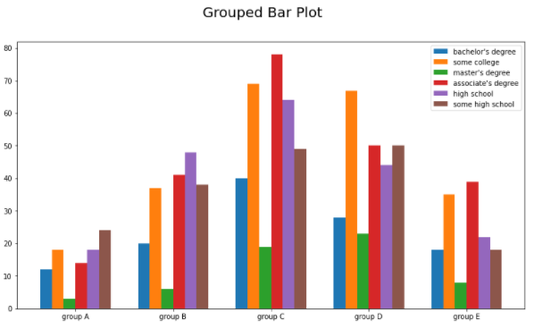
- 그룹별 범주에 따른 bar를 이웃되게 배치하는 방법으로 가장 추천하는 방법이다.
- Matplotlib으로는 앞의 차트들에 비해 비교적으로 구현이 까다롭지만, 나중에 배울 seaborn을 통해 편하게 구현할 수 있다.
- 그룹이 5~7개 이하일 때 효과적이며, 그룹이 너무 많아지면 적은 범주는 ETC로 분류하여 나타내는 것이 좋다.
group = student.groupby('parental level of education')['race/ethnicity'].value_counts().sort_index()
group_list = sorted(student['race/ethnicity'].unique())
edu_lv = student['parental level of education'].unique()

fig, ax = plt.subplots(1, 1, figsize=(13, 7))

x = np.arange(len(group_list))
width=0.12
plt.suptitle("Grouped Bar Plot",size=20)

# x축과 width 조정
for idx, g in enumerate(edu_lv):
    ax.bar(x+(-len(edu_lv)+1+2*idx)*width/2, group[g],
       width=width, label=g)

ax.set_xticks(x)
ax.set_xticklabels(group_list) # x축 이름 지정
ax.legend() # 범례추가

plt.show()
정확한 Bar Plot
Principle of Proportion Ink(잉크량 비례 원칙)
- 실제 값과 그에 표현되는 그래픽으로 표현되는 잉크 양은 비례해야 한다.
- 이 말은 비교를 위한 막대그래프의 x축의 시작이 0이 아니게 되면 전체적인 양에 대한 비교가 어렵다는 말로, 항상 x축의 시작은 0이어야 한다는 의미이다.
- 이 원칙은 막대그래프에만 한정되는 원칙은 아니고, 다른 다양한 차트에서도 이 원칙이 적용된다.
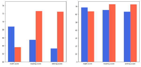
- 왼쪽의 차트는 시각적으로는 첫번째 막대가 마지막 막대보다 2배이상 커보이지만, 실제로는 그렇지 않다는 것을 확인할 수 있다.
- 가독성은 왼쪽이 좋아 보이지만, 사람들의 인지에 방해를 주지 않기 위해서는 오른쪽 차트를 사용하는 것이 좋으며, 세로를 늘려서 나타내면 더 효과 적이다.
fig, axes = plt.subplots(1, 2, figsize=(15, 7))

idx = np.arange(len(score.index))
width=0.3

for ax in axes:
    ax.bar(idx-width/2, score['male'],
           color='royalblue',
           width=width)

    ax.bar(idx+width/2, score['female'],
           color='tomato',
           width=width)

    ax.set_xticks(idx)
    ax.set_xticklabels(score.index)

axes[0].set_ylim(60, 75)
plt.show()
데이터 정렬
- 시각화를 진행하면서 더 정확한 정보를 전달하기 위해서는 정렬이 필수이다.
- pandas의 sort_values(), sort_index()를 사용하여 정렬한다.
| 데이터 | 정렬 |
|---|---|
| 시계열 | 시간 순 |
| 수치형 | 크기 순 |
| 순서형 | 범주의 순서 |
| 명목형 | 범주의 값에 따라 정렬 |
적절한 공간 활용
- 여백과 공간을 조정하여 가독성을 높이는 차트를 그리자
| 의미 | 코드 |
|---|---|
| X/Y 축 조정 | set_xlim(), set_ylim() |
| 마진 조정 | margins() |
| 막대 두께 조절 | width |
| 테두리 변 제거 | spines[spine].set_visible() |
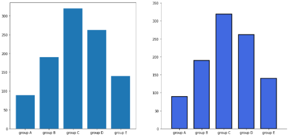
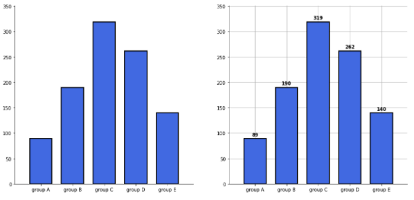
group_cnt = student['race/ethnicity'].value_counts().sort_index()

fig = plt.figure(figsize=(15, 7))

ax_basic = fig.add_subplot(1, 2, 1)
ax = fig.add_subplot(1, 2, 2)

# 기본적인 막대 그래프
ax_basic.bar(group_cnt.index, group_cnt)

# 막대 설정
ax.bar(group_cnt.index, group_cnt,
       width=0.7,
       edgecolor='black',
       linewidth=2,
       color='royalblue'
      )

# 막대 두께 조절
ax.margins(0.1, 0.1)

# 테두리 설정
for s in ['top', 'right']:
    ax.spines[s].set_visible(False)

plt.show()
복잡함과 단순함
- 우리가 알리고자 하는 인사이트를 표현하는데 있어서 불필요한 복잡함을 줄여야 한다.
- 3차원 이상의 시각화인 경우 사람마다 거리 감각이나 깊이 감각이 달라지기 때문에 이해가 어려워 질 수 있으므로 지양해주는 것이 좋다.
ETC
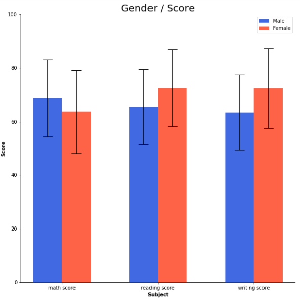
- 오차 막대를 추가하여 Uncertainty 정보를 추가할 수 있다.
- Bar 사이의 Gap을 0으로 주는 히스토그램으로 연속된 느낌을 줄 수 있다.