회귀
특성값 결과가 연속적인 값을 갖는다.
선형회귀
주어진 학습 데이터와 가장 잘 맞는 hypothesis함수 h를 찾는 문제
간단한 데이터로 선형회귀를 실습해보자
#설치
!pip install statsmodels

import pandas as pd

data = {'x': [1, 2, 3, 4, 5], 'y': [1, 3, 4, 6, 5]}
df = pd.DataFrame(data)

import statsmodels.formula.api as smf

lm_model = smf.ols(formula='y ~ x', data=df).fit()

#seaborn으로 plot
import matplotlib.pyplot as plt
import seaborn as sns

plt.figure(figsize=(12,10))
sns.lmplot(x='x', y='y', data=df)
plt.xlim([0, 5])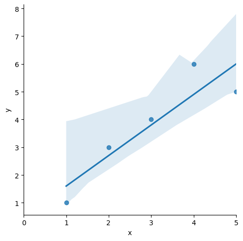
잔차확인
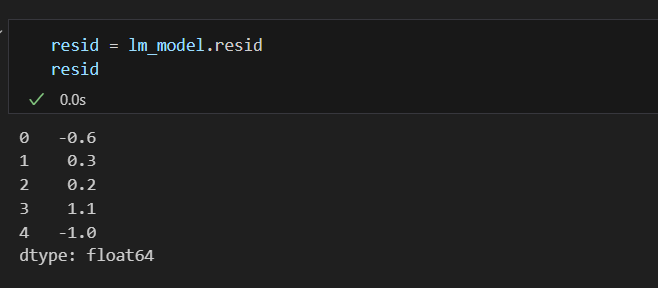
결정계수 R-Squared을 구해보자
결정계수 R-Squared : 예측값으로부터의 오차 제곱 / 평균으로부터의 오차
import numpy as np

mu = np.mean(df['y'])
y = df['y']

y_hat = lm_model.predict()
np.sum((y_hat - mu)**2) / np.sum((y - mu)**2)

lm_model.rsquared #간단하게 구하는 법

0.8175675675675677

sns.distplot(resid, color='black')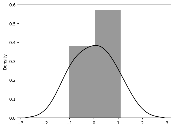
통계적 회귀
import
import pandas as pd
import numpy as np
import matplotlib.pyplot as plt
import seaborn as sns
데이터 불러오기
data_url ='https://raw.githubusercontent.com/PinkWink/ML_tutorial/master/dataset/ecommerce.csv'
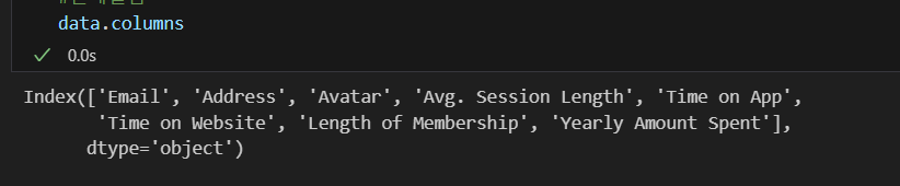
data = pd.read_csv(data_url)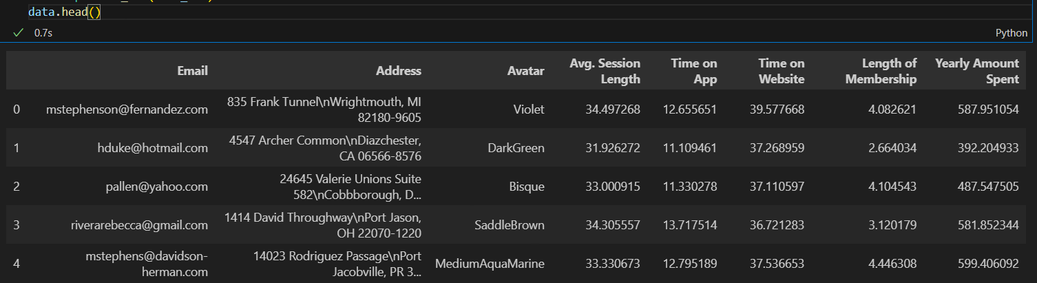 현재 컬럼
현재 컬럼
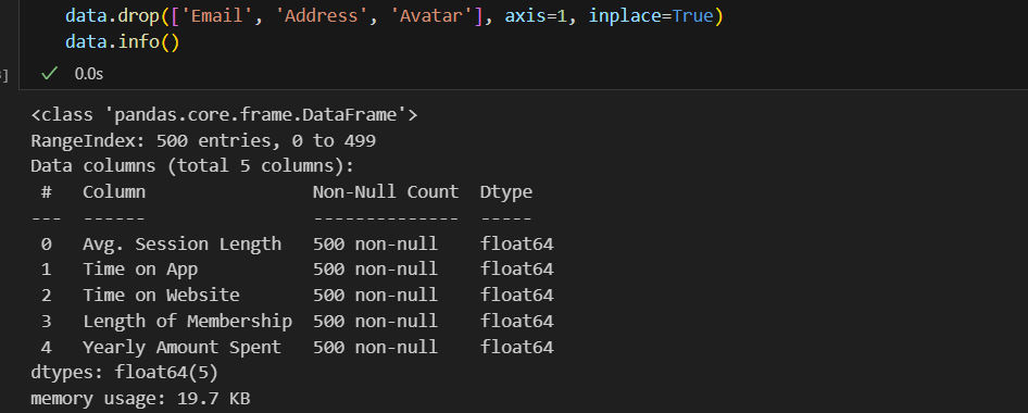
 불필요한 컬럼 삭제
컬럼별 boxplot : 모든 컬럼이 숫자형태여야함
plt.figure(figsize=(12,6))
sns.boxplot(data=data)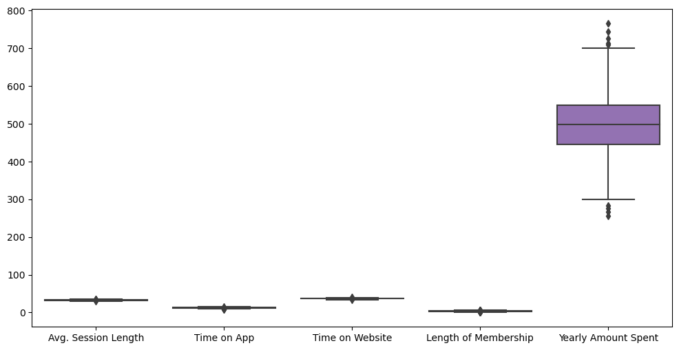
특성들만 다시 boxplot
# yearly amount spent를 제외한 특성들만 다시 boxplot
plt.figure(figsize=(12,6))
sns.boxplot(data=data.iloc[:, :-1])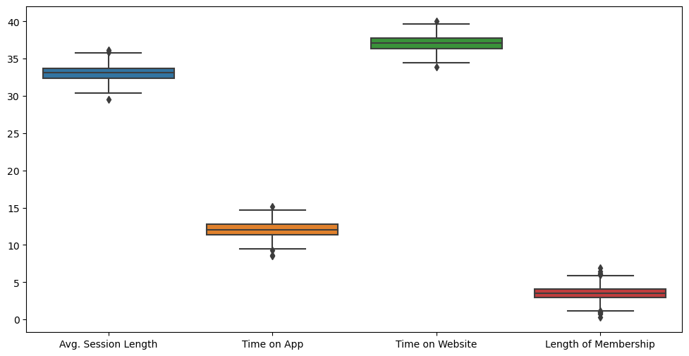 label 값에 대한 boxplot
plt.figure(figsize=(12,6))
sns.boxplot(data=data['Yearly Amount Spent'])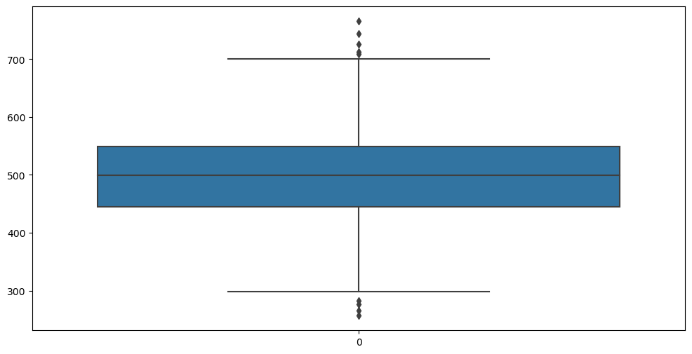 pairplot으로 경향 확인
plt.figure(figsize=(12,6))
sns.pairplot(data=data)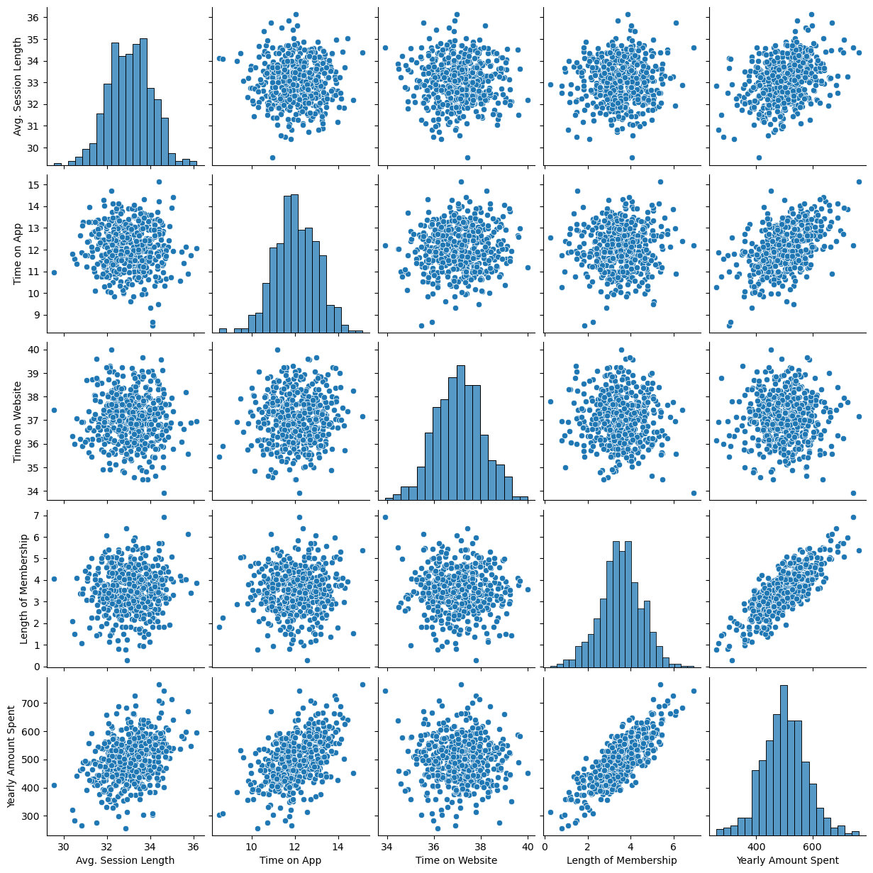 관련성이 있어보이는 것만 강조해서 그려보면
plt.figure(figsize=(12,6))
sns.lmplot(x='Length of Membership', y='Yearly Amount Spent', data=data)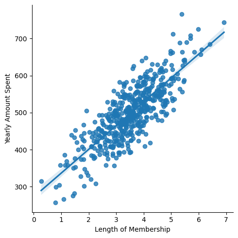 상관이 높은 멤버쉽 유지기간만 가지고 통계적 회귀
import statsmodels.api as sm

X = data['Length of Membership']
y = data['Yearly Amount Spent']
lm = sm.OLS(y,X).fit()
lm.summary()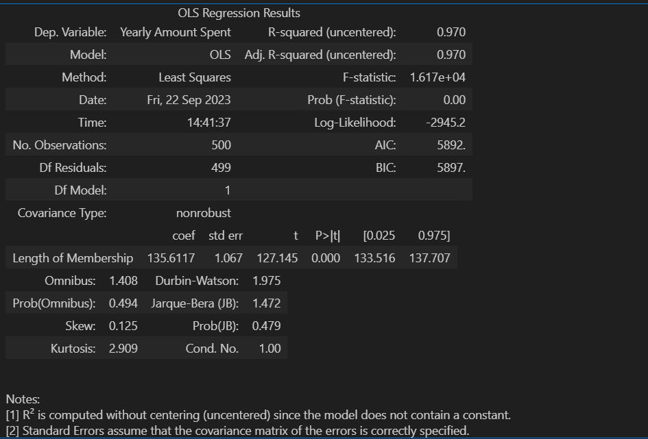
다음은 상수항이 없는 그래프이다
pred = lm.predict(X)

sns.scatterplot(x=X, y=y)
plt.plot(X, pred, 'r', ls='dashed', lw=3)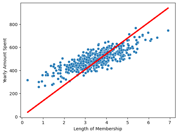
참값 vs 예측값을 그려보자
sns.scatterplot(x=y, y=pred)
plt.plot([min(y), max(y)], [min(y), max(y)], 'r', ls='dashed', lw=3)
sns.scatterplot(x=y, y=pred)
plt.plot([min(y), max(y)], [min(y), max(y)], 'r', ls='dashed', lw=3)
plt.plot([0, max(y)], [0, max(y)], 'b', ls='dashed', lw=3)
plt.axis([0, max(y), 0, max(y)])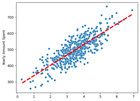
그러면 상수항을 넣어주자
#c_를 이용하면 열로 추가 가능
X = np.c_[X, [1]*len(X)]
X[:5]

다시 모델 fit
lm = sm.OLS(y,X).fit()
lm.summary() 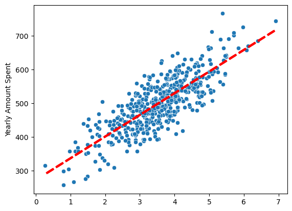
선형회귀결과
pred = lm.predict(X)

sns.scatterplot(x=X[:, 0], y=y)
plt.plot(X[:, 0], pred, 'r', ls='dashed', lw=3)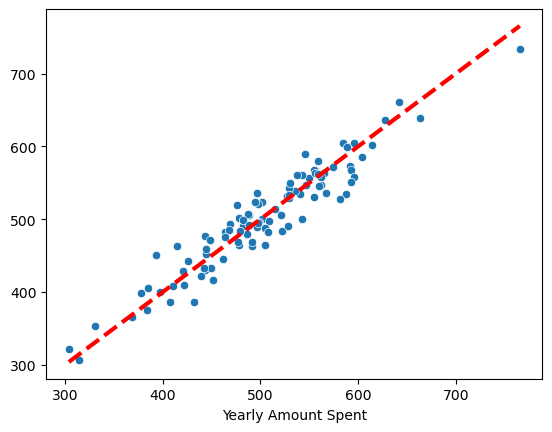
데이터 분리 후 평가
#데이터 분리
from sklearn.model_selection import train_test_split

X = data.drop('Yearly Amount Spent', axis=1)
y = data['Yearly Amount Spent']

X_train, X_test, y_train, y_test = train_test_split(X, y, test_size=0.2, random_state=13)

#fit
import statsmodels.api as sm

lm = sm.OLS(y_train, X_train).fit()
lm.summary()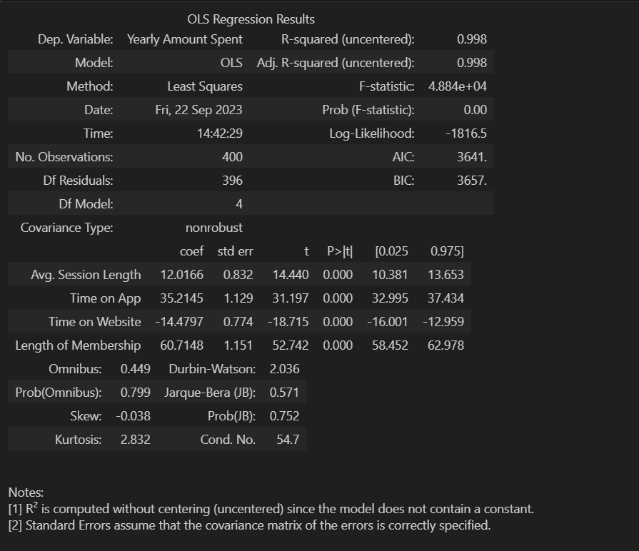
참값, 예측값 비교
pred = lm.predict(X_test)

sns.scatterplot(x=y_test, y=pred)
plt.plot([min(y_test), max(y_test)], [min(y_test), max(y_test)], 'r', ls='dashed', lw=3)
Cost Function
=1/3{}
- cost fnc을 최소화할 수 있다면, 최적의 직선을 찾을 수 있다.
- J를 최소화 하는 방법은 미분하여 J가 0이되는 θ 값을 찾으면 된다.
- 에러를 표현하는 도구
이를 코드로 실행해보자 - 실제 데이터는 아주 복잡하고 양이 많아서 손으로 풀기 어렵다. 그래서 gradient descent를 이용한다.
gradient descent
- 미분을 통해서 cost fnc의 최솟값(목표)을 찾는 것
- 랜덤하게 임의의 점을 선택하여 그 지점에서 미분을 한다.
- 임의의 점이 목표점의 오른쪽이라면 왼쪽으로, 목표점의 왼쪽이라면 오른쪽으로 이동하면서 목표를 찾는다.
- 학습률이 작다면 : 최솟값을 찾으러 가는 간격이 작게되고, 여러번 갱신해야하지만 최솟값에 잘 도달할 수 있다.
- 학습률이 크다면 : 최솟값을 찾으러 가는 간격이 크고, 최솟값을 찾았다면 갱신횟수는 상대적으로 적을 수 있으나 수렴하지 않고 진동할 수 있다.
cost function 실습
설치 !pip install sympy
다항식 표현
import numpy as np

np.poly1d([2,-1])**2 + np.poly1d([3,-5])**2 + np.poly1d([5,-6])**2
np.poly1d([1, -1])**2 => 이렇게 연산하는 것,
poly1d에 들어가는 좌표는 다항식에서 계수, 상수라고 보면 됨
Symbolic 으로 미분
import sympy as sym

th = sym.Symbol('th')
diff_th = sym.diff(38*th**2 - 94*th + 62, th)
다변수 데이터에 대한 회귀
여러 개의 특성, 다변수 선형 회귀 문제로 일반화할 수 있다.
boston 집값 예측 예제로 실습해보자
이제 sklearn에서 제공하는 datasets에서 boston 데이터가 없어져서 load_boston() 명령이 작동하지 않는다
구글링하여 url로부터 데이터를 가져왔다.
import pandas as pd
boston_url = 'https://raw.githubusercontent.com/blackdew/tensorflow1/master/csv/boston.csv'
boston_pd = pd.read_csv(boston_url, sep=',')
boston_pd.rename(columns={'medv':'price'},inplace=True)
for c in boston_pd.columns:
    boston_pd.rename(columns={c:c.upper()},inplace=True) #원본 데이터에서 데이터명이 소문자로 돼있어서 대문자로 바꿈
집값에 대한 히스토그램
import plotly.express as px

fig = px.histogram(boston_pd, x='PRICE')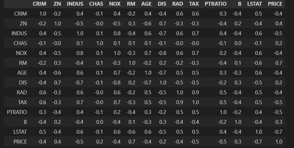
상관계수 확인
import matplotlib.pyplot as plt
import seaborn as sns

corr_mat = boston_pd.corr().round(1)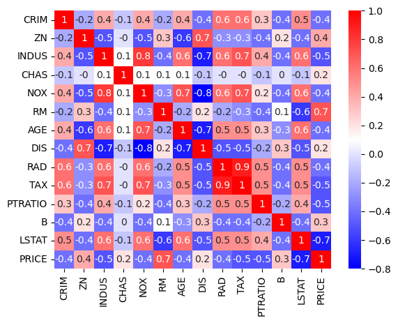
히트맵으로 상관관계 확인
sns.heatmap(data=corr_mat, annot=True, cmap='bwr')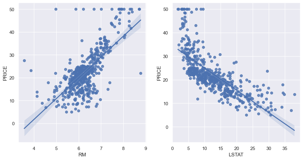
price와 방의 수(RM), 저소득층 인구(LSTAT)와 높은 상관관계가 보임
RM과 LSTAT와 PRICE 관계에 대해 살펴보자
sns.set_style('darkgrid')
sns.set(rc={'figure.figsize':(12,6)})

fig, ax = plt.subplots(ncols=2)
sns.regplot(x='RM', y='PRICE', data=boston_pd, ax=ax[0])
sns.regplot(x='LSTAT', y='PRICE', data=boston_pd, ax=ax[1])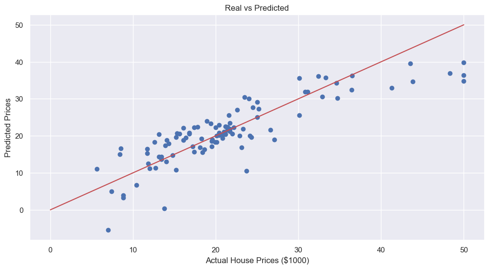
하지만 첫번째 그래프에서 방의 수가 적은데도 불구하고 가격이 아주 높은 곳이 몇개 있다.
히스토그램에서 가격이 높은 부분에서 y값은 작은 부분이 여기에 해당한다.
모델 분석
#데이터 나누기
from sklearn.model_selection import train_test_split

X = boston_pd.drop('PRICE', axis=1)
y = boston_pd['PRICE']

X_train, X_test, y_train, y_test = train_test_split(X, y, test_size=0.2, random_state=13)

#선형회귀모델 적용
from sklearn.linear_model import LinearRegression

reg = LinearRegression()
reg.fit(X_train, y_train)

#모델 평가는 RMS로
import numpy as np
from sklearn.metrics import mean_squared_error

pred_tr = reg.predict(X_train)
pred_test = reg.predict(X_test)

rmse_tr = np.sqrt(mean_squared_error(y_train, pred_tr))
rmse_test = np.sqrt(mean_squared_error(y_test, pred_test))

print('RMES of Train Data : ', rmse_tr)
print('RMES of Test Data : ', rmse_test)
RMES of Train Data : 4.642806069019824
RMES of Test Data : 4.931352584146715
#성능확인
plt.scatter(y_test, pred_test)
plt.xlabel('Actual House Prices ($1000)')
plt.ylabel('Predicted Prices')
plt.title('Real vs Predicted')
plt.plot([0,50], [0,50], 'r')
plt.show()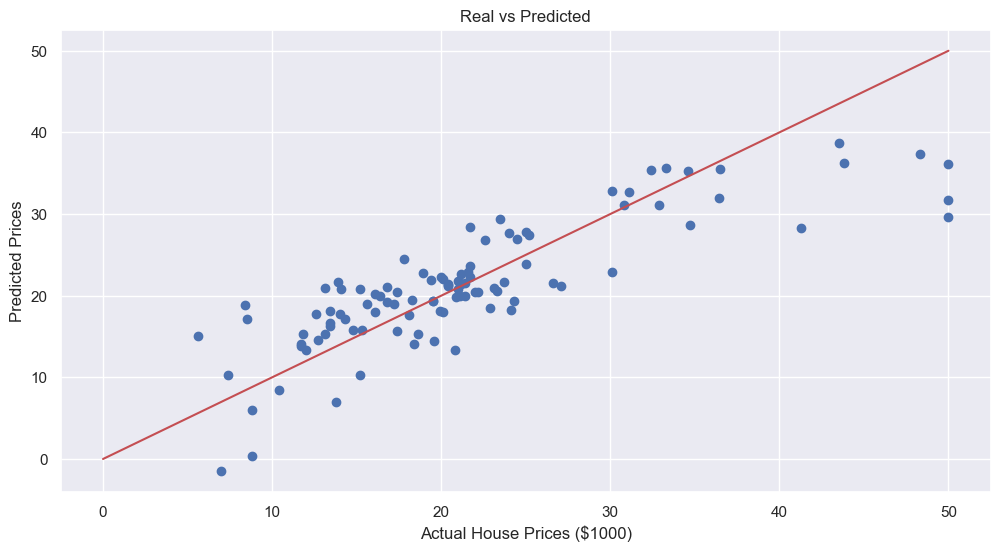
LSTAT 특성을 사용하는 것이 맞을까? LSTAT를 빼고 테스트 해보자
X = boston_pd.drop(['PRICE','LSTAT'], axis=1)
y = boston_pd['PRICE']

X_train, X_test, y_train, y_test = train_test_split(X, y, test_size=0.2, random_state=13)

reg.fit(X_train, y_train)

pred_tr = reg.predict(X_train)
pred_test = reg.predict(X_test)

rmse_tr = np.sqrt(mean_squared_error(y_train, pred_tr))
rmse_test = np.sqrt(mean_squared_error(y_test, pred_test))

print('RMES of Train Data : ', rmse_tr)
print('RMES of Test Data : ', rmse_test)
RMES of Train Data : 5.165137874244864
RMES of Test Data : 5.295595032597161
RMS가 약간 상승했다.
RMS가 상승한 것은 성능이 나빠진 것이지만 LSTAT를 제외할지는 더 고민해봐야 할 것 같다.
#성능확인
plt.scatter(y_test, pred_test)
plt.xlabel('Actual House Prices ($1000)')
plt.ylabel('Predicted Prices')
plt.title('Real vs Predicted')
plt.plot([0,50], [0,50], 'r')
plt.show()