☀️ [UIUX] 1218 HTML + CSS Coding, 코딩 중급 16
✏️ 2024. 12월 18일 / html + css 언어, 코딩 중급 16
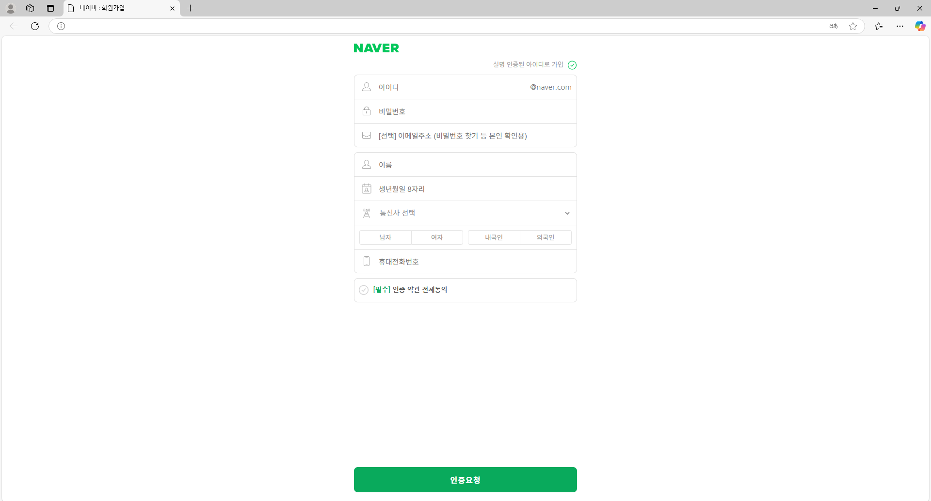
👀 네이버 회원가입 만들기 / 실습
<!DOCTYPE html>
<html lang="en">
  <head>
    <meta charset="UTF-8" />
    <meta name="viewport" content="width=device-width, initial-scale=1.0" />
    <title>네이버 : 회원가입</title>
    <!-- css -->
    <link rel="stylesheet" href="./css/account.css" />
  </head>
  <body>
    <div class="container">
      <!-- 로고 -->
      <h1><a href="https://www.naver.com">naver</a></h1>
      <!-- 회원가입 폼 -->
      <form action="#" method="post" autocomplete="on">
        <div class="certification">
          <label for="join_toggle">실명 인증된 아이디로 가입</label>
        </div>
        <!-- 아이디, 비밀번호, 이메일 -->
        <div class="info_wrap">
          <!-- 아이디 -->
          <div class="input_box">
            <label for="user_id">
              <input
                type="text"
                name="user_id"
                id="user_id"
                required
                placeholder="아이디"
              />
            </label>
            <span>@naver.com</span>
          </div>
          <!-- 비밀번호 -->
          <div class="input_box">
            <label for="user_pw">
              <input
                type="password"
                name="user_pw"
                id="user_pw"
                required
                placeholder="비밀번호"
              />
            </label>
          </div>
          <!-- 이메일 -->
          <div class="input_box">
            <label for="user_email">
              <input
                type="email"
                name="user_email"
                id="user_email"
                placeholder="[선택] 이메일주소 (비밀번호 찾기 등 본인 확인용)"
              />
            </label>
          </div>
        </div>
        <!-- 이름, 생년월일, 통신사, 전화번호 -->
        <div class="info_wrap">
          <!-- 이름 -->
          <div class="input_box">
            <label for="user_name">
              <input
                type="text"
                name="user_name"
                id="user_name"
                required
                placeholder="이름"
              />
            </label>
          </div>
          <!-- 생년월일 -->
          <div class="input_box">
            <label for="birth">
              <input
                type="text"
                name="birth"
                id="birth"
                required
                placeholder="생년월일 8자리"
              />
            </label>
          </div>
          <!-- 통신사 -->
          <div class="input_box agency_box">
            <label for="agency">
              <select name="agency" id="agency" required>
                <option>통신사 선택</option>
                <option>SKT</option>
                <option>KT</option>
                <option>LG U+</option>
                <option>SKT 알뜰폰</option>
                <option>KT 알뜰폰</option>
                <option>LG U+ 알뜰폰</option>
              </select>
            </label>
          </div>
          <!-- 성별 / 국적 -->
          <div class="input_box">
            <div class="button_box">
              <button type="button" value="male">남자</button>
              <button type="button" value="female">여자</button>
            </div>
            <div class="button_box">
              <button type="button" value="local">내국인</button>
              <button type="button" value="foreigner">외국인</button>
            </div>
          </div>
          <!-- 전화번호 -->
          <div class="input_box">
            <label for="phone">
              <input
                type="tel"
                name="phone"
                id="phone"
                required
                placeholder="휴대전화번호"
              />
            </label>
          </div>
        </div>
        <!-- 필수 인증 약관 -->
        <div class="required_terms">
          <p><span>[필수]</span> 인증 약관 전체동의</p>
        </div>
        <!-- 인증 요청 버튼 -->
        <button class="certification_button">인증요청</button>
      </form>
    </div>
  </body>
</html>
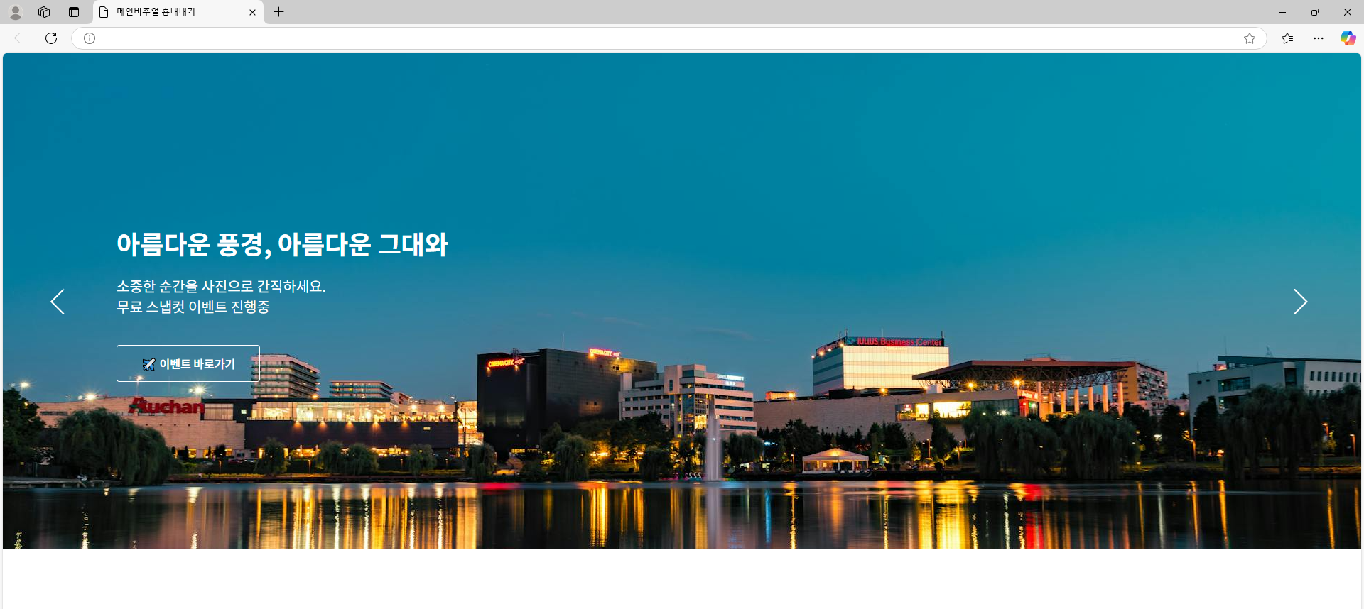
👀 position 속성을 이용하여 메인베너 만들기 / 미리보기
<!DOCTYPE html>
<html lang="en">
  <head>
    <meta charset="UTF-8" />
    <meta name="viewport" content="width=device-width, initial-scale=1.0" />
    <title>메인비주얼 횽내내기</title>
    <style>
      * {
        margin: 0;
        padding: 0;
      }
      body {
        color: #fff;
      }
      section {
        width: 1920px;
        height: 700px;
        overflow: hidden;
        /* 상대위치 */
        position: relative;
      }
      section > div {
        /* 절대위치 */
        position: absolute;
        width: 1600px;
        height: fit-content;
        /* background-color: aliceblue; */
        /* 좌표 */
        left: 50%;
        /* div의 넓이 반만큼 다시 끌어당김 */
        margin-left: -800px;
        padding: 242px 0;
      }
      /* 양옆 버튼 */
      section > div::before {
        content: "prev";
        font-size: 0px;
        display: block;
        width: 52px;
        height: 52px;
        background-image: url(./img/prev.svg);
        background-repeat: no-repeat;
        /* 절대좌표 */
        position: absolute;
        top: 50%;
        left: -95px;
        margin-top: -26px;
      }
      section > div::after {
        content: "next";
        font-size: 0px;
        display: block;
        width: 52px;
        height: 52px;
        background-image: url(./img/next.svg);
        background-repeat: no-repeat;
        position: absolute;
        top: 50%;
        right: -95px;
        margin-top: -26px;
      }
      section > div > h2 {
        font-size: 36px;
        margin-bottom: 20px;
        font-weight: 700;
      }
      section > div > p {
        font-size: 20px;
        margin-bottom: 40px;
      }
      .event_btn {
        width: 200px;
        height: 50px;
        text-align: center;
        border: 1px solid #fff;
        line-height: 50px;
        border-radius: 4px;
      }
      .event_btn a {
        text-decoration: none;
        color: #fff;
        font-size: 16px;
        display: block;
        font-weight: 600;
      }
    </style>
  </head>
  <body>
    <section>
      <!-- 텍스트 영역 -->
      <div>
        <h2>아름다운 풍경, 아름다운 그대와</h2>
        <p>소중한 순간을 사진으로 간직하세요.<br />무료 스냅컷 이벤트 진행중</p>
        <div class="event_btn">
          <a href="#">✈️ 이벤트 바로가기</a>
        </div>
      </div>
      <!-- 이미지 -->
      <img src="./img/city.jpg" alt="메인비주얼" />
    </section>
  </body>
</html>
✨ 위치 속성에 대해 알아봅시다.
👻 position
웹 페이지를 작업할 때 요소의 위치를 2가지 방법으로 설정합니다.
위치를 설정할때에는 x축과 y축 좌표를 이용하여 설정할 수 있습니다.
position을 사용할 때에는 '상대위치'로 요소의 위치를 정하거나 '절대위치'로 요소의 위치를 지정할 수 있습니다.
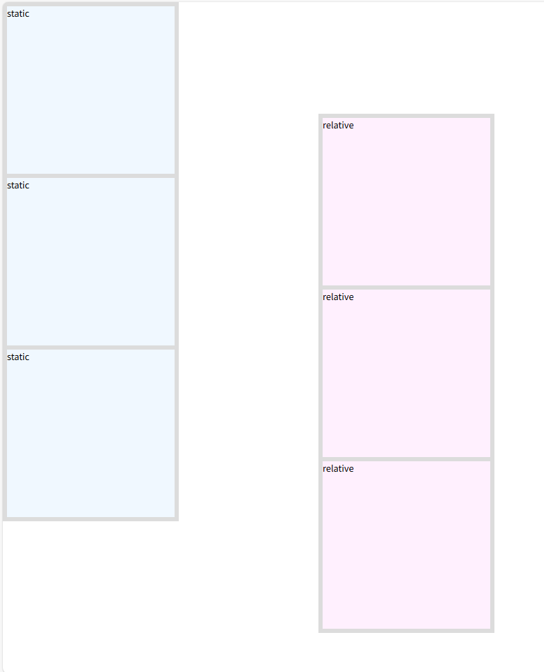
- 상대위치 : 태그가 출력된 위치를 기준으로 새롭게 위치를 지정합니다. (상대적으로 지정합니다.)
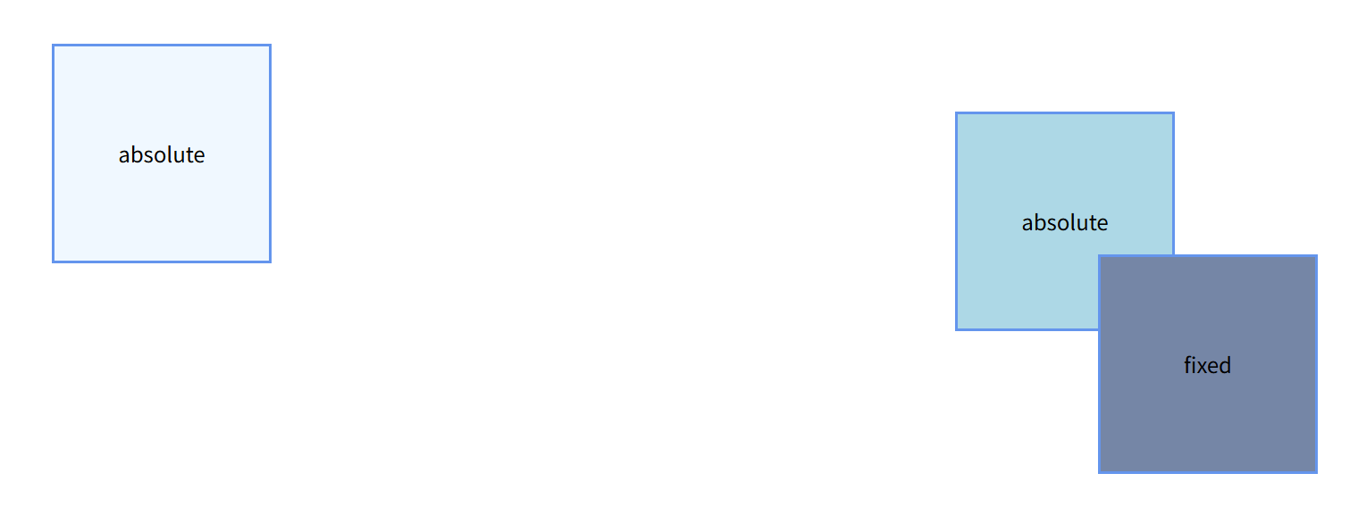
- 절대위치 : 태그가 0점을 기준으로 새롭게 위치를 지정합니다.[속성값] - relative : 상대적으로 위치를 잡습니다. 태그가 출력된 현재 위치를 기준으로 상하 좌우로 움직입니다. - absolute : 절대적인 위치로 이동합니다. (무조껀 0점을 찾아갑니다.) 부모 박스가 relative라면 부모의 0점으로 이동합니다. - static : 태그가 위에서 아래로 출력되며(block) 좌표를 인식할 수 없습니다. 기본값입니다. - fixed : 화면을 기준으로 절대 위치 좌표를 잡습니다. 문서의 길이와는 상관 없이 화면을 기준으로 합니다.
position을 relative나, absolute나 fixed를 적용하게 되면 그때부터 해당 태그는 좌표를 인식할 수 있게 됩니다.
static은 position의 기본 값으로 좌표를 인식할 수 없기 때문에 위치를 설정하려면 margin이나 padding이나 flex를 이용하여 위치를 설정할 수 있습니다.
즉, position:static은 position 속성을 안쓴 것과 같습니다.
static을 제외한 나머지 속성값을 쓰게 되면 좌표를 인식할 수 있으며, 좌표 속성에 따라 태그의 위치를 지정할 수 있습니다.[좌표속성] - left : 부모박스 또는 브라우저의 왼쪽을 기준으로 오른쪽으로 좌우로 움직일 수 있습니다. 양수를 쓸 경우 오른쪽으로 이동합니다. - right : 부모박스 또는 브라우저의 오른쪽을 기준으로 왼쪽으로 좌우로 움직일 수 있습니다. 양수를 쓸 경우 왼쪽으로 이동합니다. - top : 부모박스 또는 브라우저의 위쪽을 기준으로 왼쪽으로 상하로 움직일 수 있습니다. 양수를 쓸 경우 아래쪽으로 이동합니다. - bottom : 부모박스 또는 브라우저의 아래쪽을 기준으로 왼쪽으로 상하로 움직일 수 있습니다. 양수를 쓸 경우 위쪽으로 이동합니다.
position:relative의 경우 left, top 좌표만 사용이 가능합니다.
position:absolute/fixed의 경우에는 좌표속성을 모두 사용할 수 있습니다.<style> * { margin: 0; padding: 0; } .static_box { width: fit-content; height: fit-content; background-color: aliceblue; float: left; /* 기본값으로 좌표를 인식할 수 없다. */ position: static; top: 200px; left: 200px; } .relative_box { width: fit-content; height: fit-content; background-color: rgb(255, 240, 254); float: left; margin-left: 50px; /* 상대좌표, 현재 출력된 위치부터 이동합니다. */ position: relative; top: 200px; left: 200px; } div { width: 300px; height: 300px; border: 4px solid gainsboro; } </style>
    <style>
      * {
        margin: 0;
        padding: 0;
      }
      div {
        width: 300px;
        height: 300px;
        border: 4px solid cornflowerblue;
        font-size: 30px;
        text-align: center;
        line-height: 300px;
      }
      div:first-child {
        background-color: aliceblue;
        /* 절대 좌표, 브라우저의 0점을 찾아감 */
        position: absolute;
        /* 좌표 */
        left: 400px;
        top: 400px;
      }
      div:nth-child(2) {
        background-color: lightblue;
        position: absolute;
        right: 400px;
        bottom: 400px;
      }
      div:nth-child(3) {
        background-color: rgb(117, 134, 166);
        /* 절대 좌표 */
        position: fixed;
        right: 200px;
        bottom: 200px;
      }
      body {
        height: 5000px;
      }
    </style>
  </head>
  <body>
    <div>absolute</div>
    <div>absolute</div>
    <div>fixed</div>
  </body>
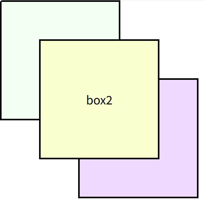
✨ 겹쳐져있는 박스의 순서를 바꾸고 싶을 때 사용하는 속성에 대해 알아봅시다.
👻 z-index
position을 이용해 요소의 위치를 잡을 때 특정 박스끼리 좌표를 이용해 겹칠 수 있습니다.
겹쳐져있는 박스의 순서를 바꾸고 싶을 때 z-index 속성을 사용합니다.
z-index의 값은 단위 없이 숫자만 사용하고, 숫자가 클수록 앞으로 나옵니다.
z-index의 기본값은 0이고, 9999까지 쓸 수 있습니다.
만약 박스들에 z-index가 지정되지 않았다면 모두 기본값으로 0을 갖습니다.<style> * { margin: 0; padding: 0; } div { width: 300px; height: 300px; font-size: 30px; text-align: center; line-height: 300px; border: 4px solid #000; /* 절대 좌표 */ position: absolute; } div:nth-child(1) { background-color: rgba(242, 255, 241, 0.879); left: 0; top: 0; } div:nth-child(2) { background-color: rgb(249, 255, 207); left: 100px; top: 100px; z-index: 1; } div:nth-child(3) { background-color: rgb(240, 217, 255); left: 200px; top: 200px; } </style>