1. padding, margin
margin은 해당 요소의 외부 여백을, padding은 해당 요소의 내부 여백을 조절하는 데 사용해!!
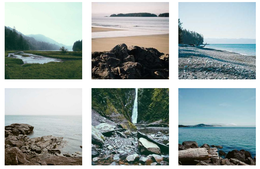
이미지들을 정렬 해서 깔끔하게 보여주려면 어떤 방법들이 있을까?! -> 바로 padding과 margin을 이용해서 할 수 있어.
<nav>
  <div>
    <img src="https://picsum.photos/id/11/600/600" alt="">
    <img src="https://picsum.photos/id/12/300/300" alt="">
    <img src="https://picsum.photos/id/13/300/300" alt="">
  </div>
  <div>
    <img src="https://picsum.photos/id/14/600/600" alt="">
    <img src="https://picsum.photos/id/15/300/300" alt="">
    <img src="https://picsum.photos/id/16/300/300" alt="">
  </div>
</nav>
nav > div {
text-align:center;
}
nav > div > img {
width:300px;
margin:15px;
}-
자 html과 css 코드인데 html에서 nav> div 안에 img태그로 img들을 집어 넣고
-
css 부분에서 사진들을 중앙으로 정렬 한 후, margin을 15px씩 주면 사진들 사이의 공간이 15씩 벌어지는거야. 만약 옆에 사진이 있다면 둘의 사이는 30px이 되겠지?
-
padding을 하면 보이는건 똑같은데 margin은 사진 바깥의 공간을 늘리는 거라면 padding은 내부의 공간을 늘리는거라고 생각하면 돼.
2. nth-child
nth-child는 부모안에 들어있는 요소중 n번째 태그를 말하는거야 !
선택자:nth-child(n) // n번
선택자:nth-last-child(n) //뒤에서 n번째
선택자:nth-child(2n) // 2의배수번째 2,4,6,8.......번째들 모두
선택자:nth-child(odd) //홀수번째 모두 선택
선택자:nth-child(even) //짝수번째 모두 선택
약간 이런식으로? 사용할 수 있어.
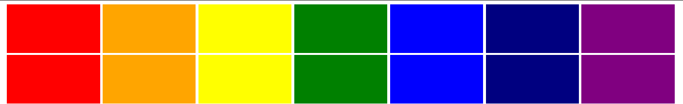
그래서 우리가 할거는! 이런 무지개 블럭들을 만들어보는거야.
<section>
  <div></div>
  <div></div>
  <div></div>
  <div></div> ...// 조금만 할게용
</section>- 우리가 div에 color를 주면 모든 div태그들의 색깔이 똑같은 색으로 변하잖아? 사진처럼 div마다 다른 색이 나오려면 어떻게 해아할까? -> 바로 nth-child를 이용해보자.
section {
  text-align:center;
}
section > div {
  width:13%;
  background-color:red;
  height:100px;
  display:inline-block;
}
section > div:nth-child(7n + 2) {
  background-color:orange;
}
section > div:nth-child(7n + 3) {
  background-color:yellow;
}
section > div:nth-child(7n + 4) {
  background-color:green;
}
section > div:nth-child(7n + 5) {
  background-color:blue;
}
section > div:nth-child(7n + 6) {
  background-color:navy;
}
section > div:nth-child(7n + 7) {
  background-color:purple;
}- nth-child를 사용하는 방법은 우리가 div의 태그마다 색을 다르게 하고싶은거니까 section>div:nth-child라고 div에 붙여주면 돼!
- 그리고 ()안에는 몇번째 인지 알려줘야되는데 여기서는 7개씩 한줄마다 색이 다르니까 7n을 하고 +2 ...+3 이런식으로 번호를 붙여주면 저 사진처럼 나오겠찌?
3. block 요소 정렬
우리가 inlne-block을 정렬할 때 inlne-block은 글자형태니까 text-align :center 로 해서 가운데 정렬을 할 수 있는데 block은 그게 안돼....
흐긓ㄱ그래서 정렬하는 방법을 알아보자.
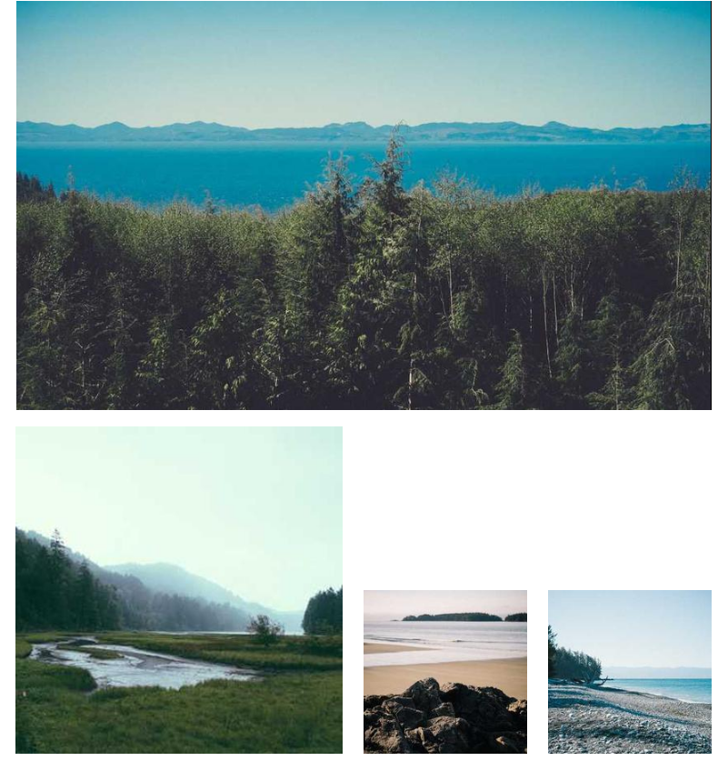
이렇게 사진들을 가운데로 졍렬 하려면 바로 아까 배운 margin이랑 padding을 사용하면 돼.
<img src="https://picsum.photos/id/10/850/500" alt="">
<img src="https://picsum.photos/id/11/400/400" alt="">
<img src="https://picsum.photos/id/12/200/200" alt="">
<img src="https://picsum.photos/id/13/200/200" alt="">
body {
text-align:center;
}
img:first-child {
display:block;
margin-left:auto;
margin-right:auto;
margin-bottom:20px;
}
img:nth-child(3) {
margin-left:20px;
margin-right:20px;
}-
보면 frist-child가 겁나 큰 사진이겠지? 왜냐하면 첫번째니까. 또 첫번 째 그림은 display를 block 으로 주었기 때문에 text-align:center;이게 안먹어!! 그러므로 margin-left:auto; margin-right:auto; 이렇게 왼쪽과 오른쪽을 auto로 주면 알아서 얘가 가운데 정렬을 할거야.
-
그리고 밑에있는 작은 그림들은 text형태니까 text-align:center;이게 먹겠지? 그래서 가운데 있는 사진, img:nth-child(3)얘한테 오른쪽 왼쪽에 20px씩 margin을 주면 예쁘게 정렬을 할 수 있다~!