📌 WIZWID Mobile
- 사이트명 : WIZWID 모바일
- 작업기간 : 2일
- 사용언어 : HTML5,CSS3,Jquery
- 라이브러리 : Swiper,GSAP
- 분류 : 모바일 적응형 웹사이트
- URL : https://yunazzi.github.io/wizwid/
Point ✅
✔️ header
✔️ submenu
✔️ 네비게이션바 보이는 screen에 맞추기
✔️ A태그위 A태그 띄우기 (+like버튼 이미지변경)
✔️ Swiper (+pagination, 맨앞 요소만 크기가 다를때 적용방법)
✔️ 디데이계산하기
✔️ json으로 데이터 처리하기 (+ 천단위로 콤마 함수 적용하기)
✔️ Slidechange이벤트
🔖 HEADER
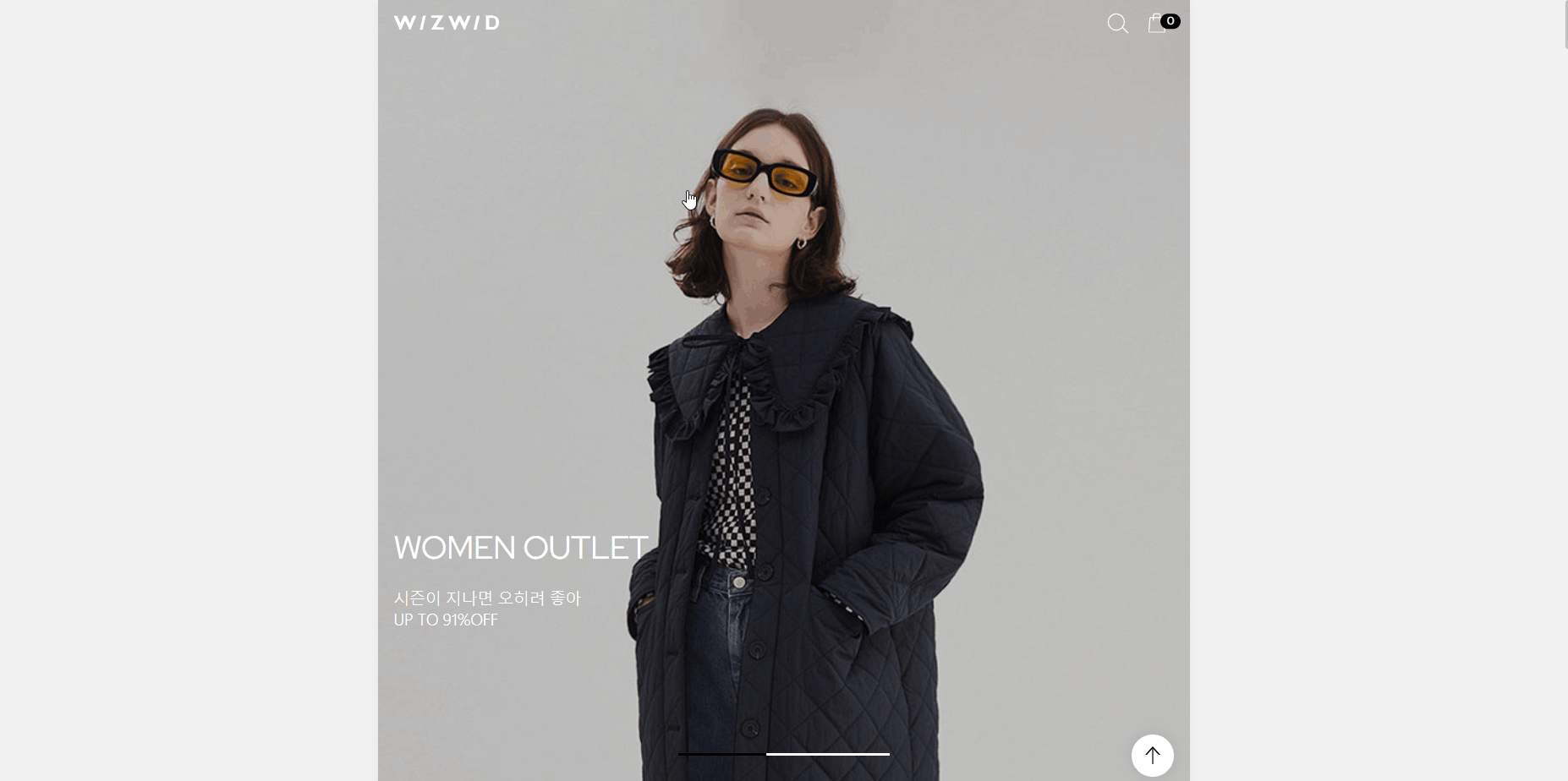
Wizwid 헤더는 스크롤을 내리면 헤더의 로고와 버튼의 색상이 바뀌면서 페이지 상단에 고정되고, 스크롤 영역이 sub-menu에 도달하게 되면 스크롤다운시에는 없어졌다가 스크롤업하면 나타난다.
let lastScrollTop = 0;

$(window).scroll(function(){

  	const curr=$(this).scrollTop();
    const contentOffset = $('.content-wrapper').offset().top;

    if(curr > 30){
        $('.header').addClass('fix');
    }else{
        $('.header').removeClass('fix');
    }
    if (curr >= contentOffset-45) {
        $('.header').addClass('hide')
    } else {
        $('.header').removeClass('hide')
    }

    if (curr > contentOffset) {
        if (curr > lastScrollTop) {$('.header,.main-content').removeClass('down')}
      	else {$('.header,.main-content').addClass('down')}
    }
  	else {$('.header').removeClass('down')}
< ① 스크롤시 반복재생 오류방지>
🖍 let lastScrollTop = 0; - window.scroll위에 있어야 초기값이 0으로 잡힘, 안에 있으면 스크롤시 마다 0이 되어서 오류가 발생함. (이때, let으로 둔 이유 : 변하는 값이여서)
< ② 상단위에 고정하고 로고, 버튼색상변경>
🖍 const curr=$(this).scrollTop(); - 현재의 스크롤값을 curr라는 변수값에 담아준다.
🖍 if ( curr > 30 ){ // 만약에 현재스크롤값이 30보다 크다면, (참)
$( ".header" ).addClass( "fix" );
} else { // 30보다 작다면 (거짓, if의 반댓값)
$( ".header" ).removeClass( "fix" );
} - 참일 경우 .fix 추가하고, 거짓일 경우 .fix를 제거
< ③ 스크롤시 sub-menu에 도달했을때 값이 크거나 같다면, header숨기고 값이 적으면 나타남>
🖍 const contentOffset = $('.content-wrapper').offset().top; - 화면상에서 .content-wrapper의 y축 위치 (문서 시작부터 .content-wrapper까지의 거리)
🖍 if ( curr >= contentOffset-45 ) { // curr값이 contentOffset-45한 값보다 크거나 같다면, (참)
$( ".header" ).addClass( "hide" )
} else { // curr값이 contentOffset-45한 값보다 작다면, (거짓, if의 반댓값)
$( ".header" ).removeClass( "hide" )
} - 참일 경우 .hide 추가하고, 거짓일 경우 .hide를 제거
<④ 스크롤 다운시 header와 main-content에 .down이 없다가, 스크롤 업시 header와 main-content에 .down이 생김.
이때, main-visual섹션에 스크롤이 들어갔을때 header값에 .down만 없어짐}>
🖍 if ( curr > contentOffset ){ // curr가 contentOffset보다 클때 (참)
if( curr > lastScrollTop ){ // curr가 lastScrollTop보다 클때 (참) - 둘다 참이여야 아래 적용가능
$('.header,.main-content').removeClass('down')
}else{ // lastScrollTop값이 curr보다 클때
$('.header,.main-content').addClass('down')
}
}else{ // curr가 contentOffset보다 작을때 (거짓, if의 반댓값)
$('.header').removeClass('down')
} - if 두갯값이 참일 경우 .down을 제거하고, 거짓이면 .down을 추가한다 (추가시 header가 보임) contentOffset이 더 클때, header에 .down을 제거한다.(.down - 내려오는거 방지)
.header.down - {transform: translateY(0%);}
.main-content.down - {top: 45px;}
🔖 submenu
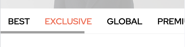
li갯수가 많아 넘쳐날 경우 overflow-x:auto를 주어 스크롤바가 생기게하고,
li a에 태그안 글자크기 만큼의 영역만 표시하는 display:inline대신 display:inline-block를 쓴다.(line-height값과 padding값을 인정해줌)
.main-content .sub-menu{ border-bottom: 1px solid #f3f3f3; background: #fff; height: 45px; overflow: hidden; overflow-x: auto; }
.main-content .sub-menu ul{ display: flex; }
.main-content .sub-menu li{ padding: 0 13px; }
.main-content .sub-menu li a{ display: inline-block; font-size: 15px; line-height: 45px; font-weight: 500; }
.main-content .sub-menu li:nth-child(2) a{ color: #ff6a52; }
🔖 네비게이션바 보이는 screen에 맞추기
max-width와 min-width를 이용하여 네비게이션바가 웹상에서 보이는 모바일페이지에 맞춰 꽉차게 조절했다.
.nav-bar{ position: fixed; left: 0; right: 0; width: 100%; bottom: 0; z-index: 99; transition-duration: 0.3s; transform: translateY(100%); will-change: transform; }
.nav-bar .wrap{ display: flex; max-width: 768px; min-width: 320px; margin: 0 auto; width: 100%; padding: 0 15px 10px; }
.nav-bar .tab-left{ margin-right: 6px; background: #000; width: 50px; height: 50px; border-radius: 50%; font-size: 0; }
.nav-bar .tab-left a{ display: inline-block; background: url(이미지) no-repeat center center; width: 50px; height: 50px; }
.nav-bar .tab-right{ display: flex; flex: 1 1 auto; justify-content: space-between; background: #000; padding: 0 20px; font-size: 0; height: 50px; border-radius: 25px; }
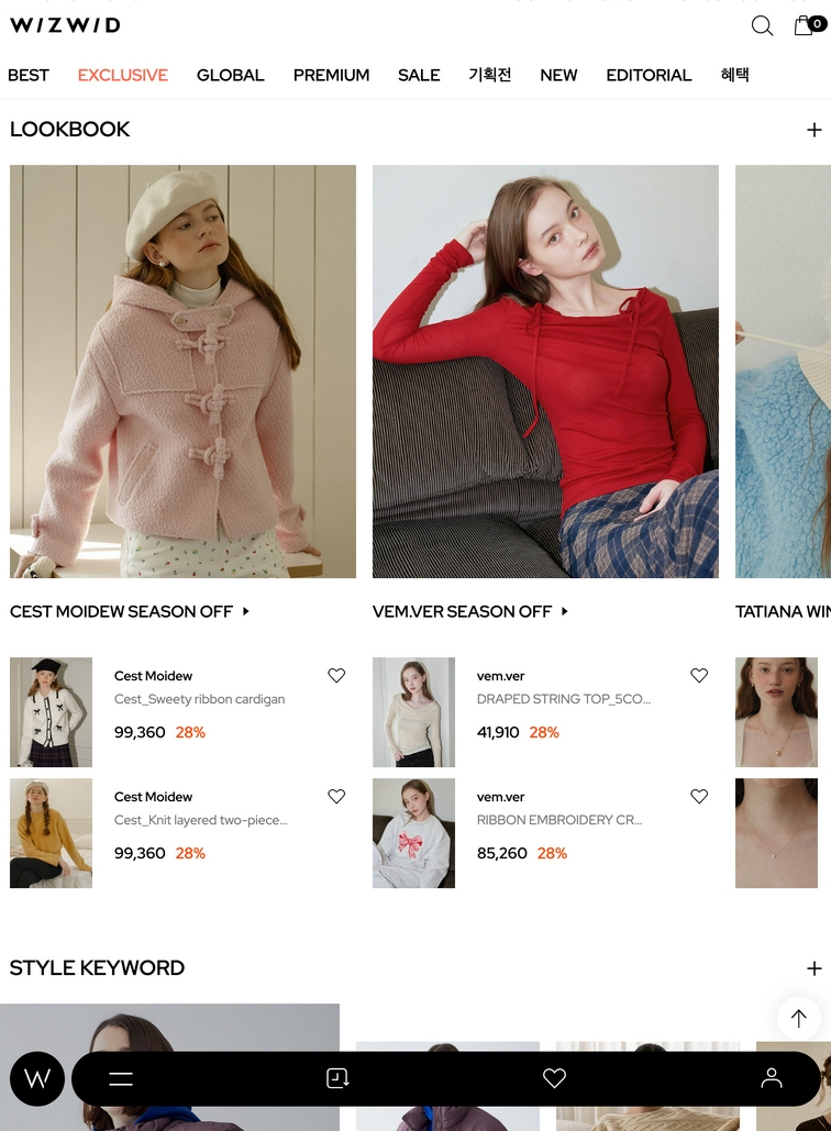
.nav-bar .tab-right [class*=btn-]{ display: block; background-repeat: no-repeat; background-position: center center; width: 50px; height: 50px; }🔖 A태그위 A태그 띄우기 (+like버튼 이미지변경)
① 아이템의 전체정보는 해당링크로 이동하게끔 a태그를 최상단에 둔다.
② 전체링크 영역의 위치를 잡아준다
→ position: absolute;로 위치를 잡아주고, top: 0,left:0,right: 0,bottom:0으로 모든 네 가장자리 끝에 맞춰 위치시켜 영역이 꽉 채워지도록 조절한다.
③ a태그안에 button으로 버튼영역을 표시해준다.
🖍 이때, a태그안에 a태그를 사용하는것은 문법상오류다!
<li>
	<a href=""></a>
	<div class="img-area">
		<img src="이미지" alt>
	</div>
	<div class="product-area">
		<div class="brand">Cest Moidew</div>
		<div class="p-name">Cest_Sweety ribbon cardigan</div>
		<div class="price">
			<div class="price-curr">99,360</div>
			<div class="price-sale">28%</div>
		</div>
	</div>
	<button class="like"> <span class="blind">찜하기</span> </button>
</li> 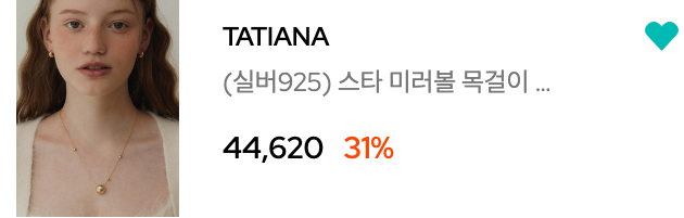
.like를 눌렀을때에 이미지가 변경되게 css에 .change을 추가하여 기초를 잡는다.
.like{ position: absolute; top: 0; right: 0; background-image: url(이미지); background-repeat: no-repeat; background-position: center center; width: 36px; height: 34px; }
.change{ position: absolute; top: 0; right: 0; background-image: url(이미지); background-repeat: no-repeat; background-position: center center; width: 36px; height: 34px; }$('.like').click(function(){
if ($(this).hasClass('change')) {
$(this).removeClass('change')
} else {
$(this).addClass('change')
}
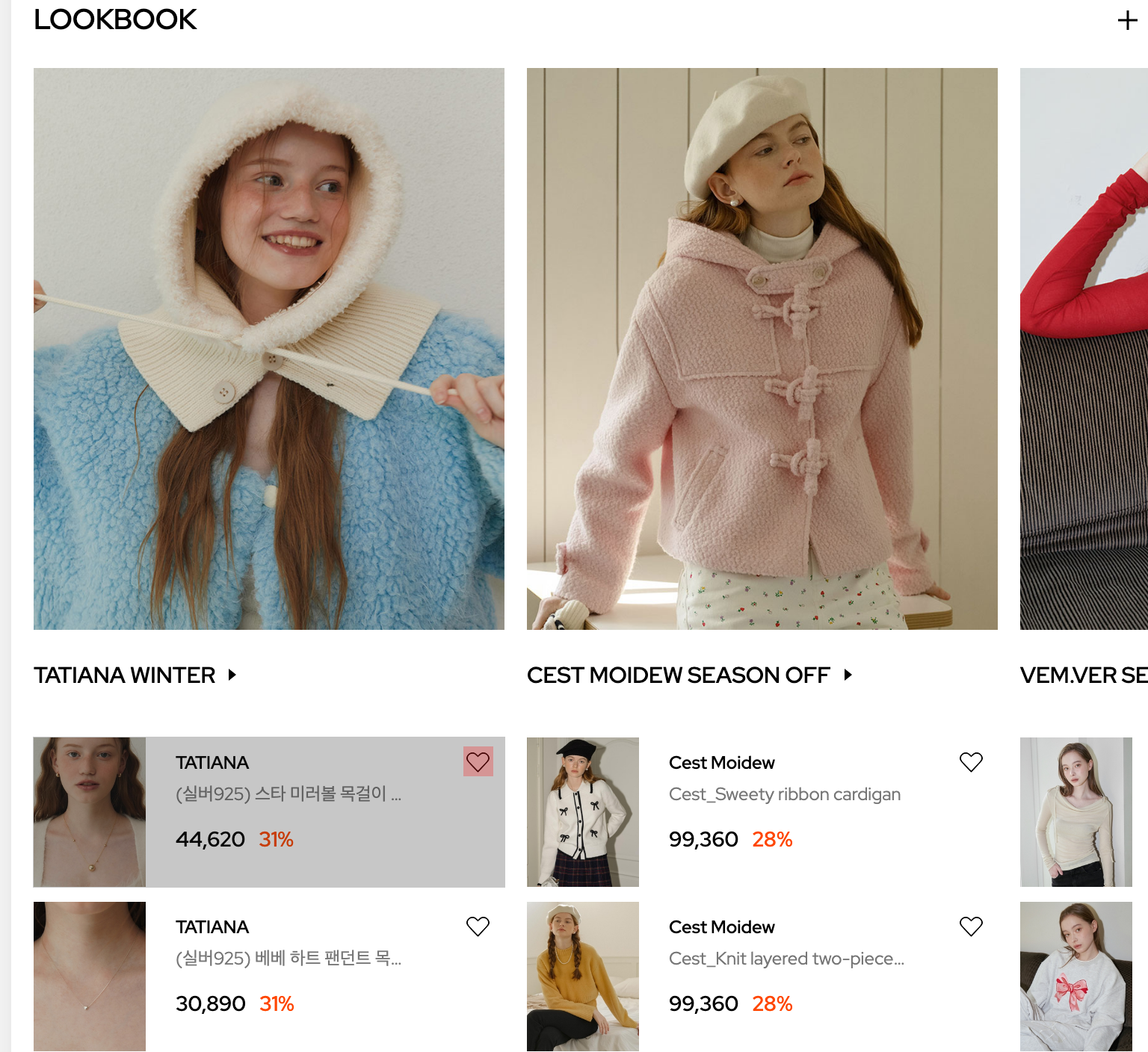
})🔖 Swiper (+pagination, 맨앞 요소만 크기가 다를때 적용방법)
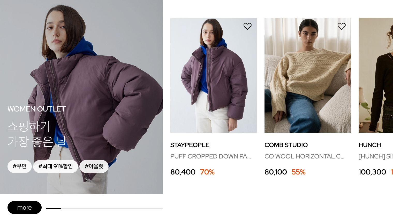
① 다른 스타일의 li를 두개를 만들고 클래스명을 부여하고, swiper-slide의 width를 지정해준다.
→ swiper-slide.big{width: 315px;}
→ swiper-slide{width: 167px;}
<ul class="swiper-wrapper">
	<li class="swiper-slide big">
		<a href="">
			<div class="img-big">
				<img src="이미지" alt>
			</div>
		</a>
	</li>

	<li class="swiper-slide">
		<a href="">
			<div class="img-area">
				<img src="이미지" alt>
			</div>
		</a>
	</li>
</ul>.sc-keyword{position: relative;}
.sc-keyword .swiper-wrapper{ align-items: center; }
.sc-keyword .keyword-slide{ position: relative; margin-bottom: 40px; }
.sc-keyword .keyword-slide .swiper-slide.big{/* 첫번째꺼 */ width: 315px; }
.sc-keyword .keyword-slide .img-big::before{ position: absolute; content: ""; top: 0; bottom: 0; left: 0; right: 0; background: rgba(0, 0, 0, .2); }
.sc-keyword .img-area{ position: relative; margin-bottom: 15px; display: flex; justify-content: center; align-items: flex-start; overflow: hidden; }
.sc-keyword .swiper-slide{ width: 167px; }
② pagination
.btn-more를 position: relative를 사용해 기준삼고, top:auto,bottom:12px,left:90px를 넣어 위치를 조정해준다. (🖍 이때, top:0을 쓴다고 무시되는게 아니라 auto를 써야 없어진다.) 그리고 width와 height로 크기조절을 해준다.
③ pagination안에 진행상황바에 색상을 넣으려면, swiper-pagination-progressbar-fill에 background색을 넣으면 된다.
<div class="pagination"></div>
<button class="btn-more">more</button>
.sc-keyword .keyword-slide .btn-more{ position: relative; bottom: 0; left: 0; background: #000; color: #fff; width: 66px; height: 25px; border-radius: 12.5px; font-size: 12px; margin: 15px 0 0 15px; }
.sc-keyword .pagination{ display: flex; position: absolute; width: 225px; height: 2px; background-color: #e5e5e5; top: auto; bottom: 12px; left: 90px; }
.sc-keyword .pagination .swiper-pagination-progressbar-fill{ background: #000; }④ swiper
var swiper6 = new Swiper('.keyword-slide',{
    slidesPerView:'auto',
    spaceBetween:15,
    pagination:{
        el:'.pagination',
        type: 'progressbar',
        clickable: true
    }
})
🖍 loop가 되기 때문에 first-child를 잡으면 안됨 -> first-child가 슬라이드 될때마다 바뀜
🔖 디데이계산하기
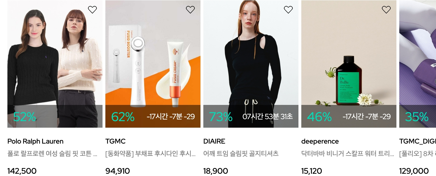
function diffDay(set,frame) {
    setInterval(() => {
        const setTime = new Date(set);
        const todayTime = new Date();
        const diff = setTime - todayTime;
        const diffDay = String(Math.floor(diff / (1000*60*60*24)));
        const diffHour =String( Math.floor((diff / (1000*60*60)) % 24)).padStart(2,"0");
        const diffMin = String(Math.floor((diff / (1000*60)) % 60)).padStart(2,"0");
        const diffSec = String(Math.floor(diff / 1000 % 60)).padStart(2,"0");
        $(frame).html(`${diffHour}시간 ${diffMin}분 ${diffSec}초`);
    }, 1000);
}

    $('.sc-flash .time').each(function(){
        diffDay($(this).data('set'),$(this))
    })
🔖 json으로 데이터 처리하기 (+ 천단위로 콤마 함수 적용하기)
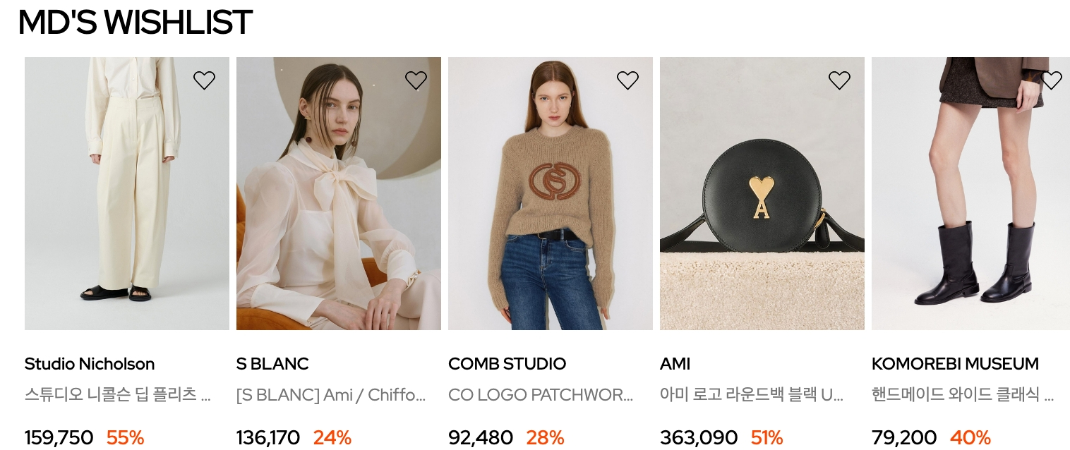
html에 고유한 id값을 적는다.
<section class="sc-wishlist">
	<h2 class="headline">MD'S WISHLIST</h2>
	<div class="swiper wish-slide">
		<ul class="swiper-wrapper" id="wishDataList">
		</ul>
	</div>
</section>
id:0 - 상품번호 코드값 (고유한 넘버링)
thumb:http://cdn~~ - 썸네일 경로 이미지
brand:Studio Nicholson - 브랜드명
name:스튜디오 니콜슨 딥 플리츠 볼륨 앵클 팬츠 크림 여성 DORDONI SNW 145 - 제품명
price:{} - 가격 안에 세부사항들있음
ori...
{
    "items":[
        {
            "id":0,
            "thumb":"https://cdn.wizwid.com/goods/WWBR/23/05/16/GM202305161755799_0_ORGINL.jpg?w=466&h=620",
            "brand":"Studio Nicholson",
            "name":"스튜디오 니콜슨 딥 플리츠 볼륨 앵클 팬츠 크림 여성 DORDONI SNW 145",
            "price":{
                "ori":159750,
                "curr":159750,
                "sale":55
            }
        }
      ]
}
fetch문 사용 (데이터통신)
fetch('경로')
🖍forEach문으로 배열반복 돌릴 수 있음
data.forEach(element=>{ → json의 내용
① html+=`` → html = html+'1'; 증감
② 내용이 바뀌어야 하는 것 들은 ${element.@@}로 적기
fetch('./assets/data/product.json')
    .then((res)=>res.json())
    .then(json=>{
        // console.log(json); 객체
        data=json.items;//배열

        console.log(data);

        let html=``;

        data.forEach(element => {
            html+=`<li class="swiper-slide">
            <a href=""></a>
            <div class="img-area">
                <img src="${element.thumb}" alt>
                <button class="like"> <span class="blind">찜하기</span> </button>
            </div>
            <div class="product-area">
                <div class="brand">${element.brand}</div>
                <div class="p-name">${element.name}</div>
                <div class="price">
                    <div class="price-curr">${numFormat(element.price.curr)}</div>
                    <div class="price-sale">${element.price.sale}%</div>
                </div>
            </div>
        </li>`;
        });//반복문끝

        $('#wishDataList').html(html)
    })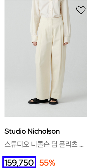
여기서 콤마의 위치를 바꾸고 싶다면, d{3}에서 괄호안 숫자를 바꾸면 된다.
function numFormat(x){
        return x.toString().replace(/\B(?=(\d{3})+(?!\d))/g,",");
    }
🔖 Slidechange이벤트
<div class="brand-tab swiper">
	<ul class="swiper-wrapper">
    	<li class="swiper-slide on">
          	<div class="img-box">
            	<img src="이미지" alt>
          	</div>
          	<p class="title">COMB STUDIO</p>
      	</li>
        <li class="swiper-slide">
          	<div class="img-box">
            	<img src="이미지" alt>
          	</div>
          	<p class="title">Jacquemus</p>
      	</li>
  	</ul>
</div>

<div class="area1 swiper">
  	<ul class="swiper-wrapper">
      	<li class="swiper-slide"></li>
       	<li class="swiper-slide"></li>
  	</ul>
</div>
var brand1 = new Swiper('.sc-brand .brand-tab.swiper',{
slidesPerView:'auto',
spaceBetween:10,
})① 탭영역과 이미지상품영역을 각기 swiper로 넘어가게끔 처리를 해준다.
② 탭영역
-
ⓐ .swiper-slide.on{opacity:1;}
그대신 swiper-slide한 곳에 on을 넣어둔다. -
ⓑ
$('.sc-brand .brand-tab .swiper-slide').click(function(){
	$(this).addClass('on').siblings().removeClass('on')
    brand2.slideTo($(this).index())
}
→ tab 부분을 클릭하면, 클릭한(this)영역에 .on이 들어가고, this의 형제부분에는(on이 안들어간 곳) .on을 제거
→ 선택한(this)영역에 맞춰 똑같은 index의 이미지상품영역(brand2)로 이동시켜줘!
∴ 탭영역에 맞춰 이미지 상품영역이 바뀌나, 이미지 상품영역을 Swiper했을때는 탭영역의 .on이 활성화되지않음.
그래서 체인지됐을때의 이벤트를 주면됨!
③ 이미지 상품영역
적는 방식은 2가지가 있다.
// 안에서 이벤트할때
var brand2 = new Swiper('.sc-brand .area1.swiper',{
on:{
    "slideChange":function(){
      	alert()
      	$('.sc-brand .brand-tab .swiper-slide').eq(brand2.realIndex).addClass('on').siblings().removeClass('on')
        brand1.slideTo(brand2.realIndex)
    }
}
})
//밖에서 이벤트할때
brand2.on('slideChange',function(){
$('.sc-brand .brand-tab .swiper-slide').eq(brand2.realIndex).addClass('on').siblings().removeClass('on')
brand1.slideTo(brand2.realIndex)
})- ⓐ
alert()를 넣어서 초기로 확인를 하면, 슬라이드가 바뀔때마다 알럿창이 나온다. - ⓑ
$('.sc-brand .brand-tab .swiper-slide').eq(brand2.realIndex).addClass('on').siblings().removeClass('on')→ .swiper-slide의 선택되는 index(=brand2.realIndex)에 .on이 들어가고, this의 형제부분에는 .on을 제거
→ 선택한 영역에 맞춰 똑같은 index의 탭영역(brand1)로 이동시켜줘!
→ eq는 (인덱스 몇번째를 구할 수 있음)
∴ 이미지 상품영역을 Swiper했을때는 탭영역의 .on이 활성화됨.
참고사이트
https://velog.io/@dom9316/inline-inline-block-block-%EC%B0%A8%EC%9D%B4
https://m.blog.naver.com/ksseo63/222043631993
https://parkjh7764.tistory.com/85
https://hianna.tistory.com/441
https://www.relation.co.kr/html_board/board_view.php?par_no=5&no=303