📌 우아한형제들 (Media Query)
- 사이트명 : 우아한형제들 (Media Query)
- 작업기간 : 3.5일
- 사용언어 : HTML5,CSS3,Jquery
- 라이브러리 : Swiper, GSAP
- 분류 : pc, mobile 미디어 쿼리 사이트
- URL : https://yunazzi.github.io/woowahan/
Point ✅
✔️ pc버전 - GNB
✔️ mobile버전 - GNB & 햄버거바
✔️ 타이핑효과
✔️ prop disabled로 버튼 활성화/비활성화 하기
✔️ 스크롤 이벤트
✔️ Swiper (+ 호버시, 슬라이드 멈추게하기)
✔️ 버튼클릭으로 비디오 멈추고, 재시작하기
✔️ background-attachment:fixed
✔️ toggleClass
🔖 pc버전 - GNB

//html
 <nav class="gnb">
	<ul class="nav-list">
		<li class="nav-item"><a href="" class="nav">회사소개</a>
			<ul class="sub-list">
				<li class="sub-item"><a href="">우아한 문화</a></li>
				<li class="sub-item"><a href="">히스토리</a></li>
				<li class="sub-item"><a href="">지속가능경영</a></li>
			</ul>
		</li>
		<li class="nav-item"><a href="" class="nav">서비스</a>
			<ul class="sub-list">
				<li class="sub-item"><a href="">배달/포장</a></li>
				<li class="sub-item"><a href="">커머스</a></li>
				<li class="sub-item"><a href="">사장님/라이더</a></li>
				<li class="sub-item"><a href="">컬처</a></li>
			</ul>
		</li>
	</ul>
</nav>
//javascript
$('.gnb .nav-item').hover(function(){
if($(this).find('.sub-list').length){
//내가 마우스 올린 sub-list(자식)의 길이가 있다면(=true면 1 // false = 0)
$('.header').addClass('on');
$(this).find('.sub-list').addClass('on')
}
},function(){
$('.header').removeClass('on')
$(this).find('.sub-list').removeClass('on')
})
function firstChk(){
$('.gnb .sub-item:first-child').addClass('on').siblings().removeClass('on')
}
firstChk();
//초기세팅으로 한번 실행시킴
$('.gnb .sub-item').hover(function(){
$(this).addClass('on').siblings().removeClass('on')
},function(){
firstChk();
})① (초기설정) 첫번째 sub-item에 .on을 추가한다.
//css
.header .gnb .sub-item{ padding: 0 15px; color: #d6d7da; }
.header .gnb .sub-item.on{ font-weight: bold; color: #232324; }
//javascript
function firstChk(){
$('.gnb .sub-item:first-child').addClass('on').siblings().removeClass('on')
}② nav-item에 마우스호버시, header와 sub-list에 .on이 추가된다
- ⓐ header - border-bottom 값이 sub-list의 크기만큼 늘어남
- ⓑ sub-list - nav-list아래로 sub-list가 나옴
//css
.header::before{ position: absolute; top: 100%; left: 0; width: 100%; height: 0px; background: #fff; content: ''; transition: 0.3s; border-bottom: 1px solid rgba(0, 0, 0, 0.1); }
.header.on::before{ height: 64px; }

.header .gnb .sub-list{ display: flex; position: absolute; visibility: hidden; opacity: 0; align-items: center; height: 64px; top: 100%; left: 50%; transform: translateX(-50%); white-space: nowrap; }
.header .gnb .sub-list.on{ visibility: visible; opacity: 1; transition: 0.3s 0.1s; }
//javascript
$('.gnb .nav-item').hover(function(){
if($(this).find('.sub-list').length){
//내가 마우스 올린 sub-list(자식)의 길이가 있다면(=true면 1 // false = 0)
$('.header').addClass('on');
$(this).find('.sub-list').addClass('on')
}
},function(){
$('.header').removeClass('on')
$(this).find('.sub-list').removeClass('on')
})③ sub-item에 호버시, 현재 호버중인 곳 (this)에는 .on을 추가하고 this가 아닌곳(형제 sub-item) .on을 제거한다.
//css
.header .gnb .sub-item{ padding: 0 15px; color: #d6d7da; }
.header .gnb .sub-item.on{ font-weight: bold; color: #232324; }
//javascript
$('.gnb .sub-item').hover(function(){
$(this).addClass('on').siblings().removeClass('on')
},function(){
firstChk();
})🔖 mobile버전 - GNB & 햄버거바
디바이스별 해상도 분기점에 따라 반응형 미디어쿼리를 짯다. (참고사이트)
🖍 브라우저크기가 980px이하가 되면 미디어쿼리가 되게끔 설정해두어 PC화면에서는 있던 GNB메뉴가 사라지고, 햄버거바가 나타나게 된다.
[pc버전]

나는 3개의 분기점으로 나누어 미디어쿼리를 정리했다.
[미디어쿼리]
(정확한 비교를 위해 같은 섹션에 있는 이미지를 첨부함)
① @media (max-width:980px)
전체를 감싸고 있는 wrapper에 padding-top을 주어 header의 height높이에 맞췄다.
gnb와 util-area영역은 display:none으로 보이지 않게 설정하고 btn-category인 햄버거바를 보이게해준다.
브라우저의 크기가 작아진 만큼 폰트크기도 pc화면보다 작은비중을 차지하게 바꿔주고 섹션의 제목들의 줄바꿈요소도 바꿔준다.
@media (max-width:980px) {
    .wrapper{ padding-top: 63px; }
    .header .logo svg{height: 23px;}
    .header .group-header{height: 63px;}
    .header .group-header .gnb{display: none;}
    .header .util-area{display: none;}
    .header .btn-category{display: block;}

    .sc-visual .sm-title{ font-size: 17px; }
    .sc-visual .title{ font-size: 52px; }
    .sc-visual .video-text{ gap: 30px; }
    .sc-visual .video-text .cate{ font-size: 14px; font-weight: 500; }
    .sc-service .play-wrap{ width: 100%; }
    .sc-service .group-video video{ width: 100%; height: auto; }
    .sc-font .font-list ul{ animation: marquee 20s linear infinite; }
    br.t{display: block;}
}
② @media (max-width:750px)

브라우저의 크기가 작아진 만큼 폰트크기도 줄여주고, 줄바꿈요소도 다르게 잡아준다.
footer에 .group-footer섹션의 아래로 쌓이게 바꾸고, 관련사이트 버튼을 화면에 100%로 차게 설정해준다.
@media (max-width:750px) {
	section .group-title .headline { font-size: 30px; line-height: 1.4; }
    section .control-btn { margin: 60px auto 0; }
    .sc-visual .title{ font-size: clamp(42px, 9.6vw ,72px); }
    .sc-news .news-item a { padding: 30px 24px; gap: 16px; }
    .sc-news .news-item .img-box { width: 100px; height: 80px; }
    .sc-news .news-item .title { font-size: 16px; margin-bottom: 5px; }
    .sc-news .news-item .date { font-size: 12px; margin-bottom: 8px; }
    br.m{display: none;}
    br.t{display: none;}

    .footer .group-footer{ flex-direction: column-reverse; align-items: flex-start; gap: 0; }
    .footer .footer-relate { max-width: none; width: 100%; }
    .footer .footer-relate { position: relative; margin: 40px 0; right: 0; }
    .footer .footer-addr{ margin-right: 0; margin-top: 0; }
}
③ @media (max-width:480px)
모바일 브라우저에 알맞게 각 섹션과 섹션의 컨텐츠의 여백을 줄이고 .sc-news에서 넘치는 텍스트들은 2줄이상 넘으면 말줄임을 표시해준다.
footer-nav-item의 other의 리스트들이 같이 있던 footer-nav-item들과 떨어져 위치한다.
@media (max-width:480px) {
	section .group-title { margin-bottom: 80px;}
    .sc-green .group-greendesc {width: 100%;}
    .sc-news .group-title { margin: 0; }
    .sc-news .news-item .title { display: -webkit-box; color: #232324; text-overflow: ellipsis; overflow: hidden; -webkit-box-orient: vertical; -webkit-line-clamp: 2; }
    .sc-font.group-title { margin-bottom: 60px;}
    .sc-font .font-list ul{ animation: marquee 40s linear infinite; }
    br.m{display: block;}

    .footer .footer-nav { justify-content: normal; }
    .footer .footer-nav-item { flex: none; -webkit-box-flex: 0; -ms-flex: none; min-width: 33.3334%; margin-bottom: 40px; }
    .footer .footer-nav-item.other{ flex-basis: 100%; color: #6c6d6f; font-size: 12px; line-height: 1.6666666667; -ms-flex-preferred-size: 100%; margin-top: 6px; padding-top: 40px; border-top: 1px solid #d6d7da; }
    .footer .footer-nav-item.other ul{ display: flex; flex-wrap: wrap; }
    .footer .footer-nav-item.other li{ flex-basis: 50%; }
    .footer .group-footer{ margin-top: 0; }
    .footer .group-footer i{ display: none; }
    .footer address span{ display: block; font-size: 12px; }
    .footer .footer-addr p { font-size: 12px; line-height: 1.6666666667; }
}
🔖 타이핑효과
🔖 prop disabled로 버튼 활성화/비활성화 하기
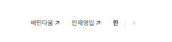
html버튼태그에는 disabled 속성이 존재
버튼에 disabled:true로 설정하면 버튼 비활성화, 클릭불가능 ( 🖍 disabled가 있는 곳에 마우스커서를 기본값으로 설정하면 클릭불가능여부를 좀 더 편리하게 볼수있음 )
<ul class="lang-area">
	<li><button disabled="disabled">한</button></li>
	<li><button>A</button></li>
</ul>
.header .util-area .lang-area{ display: flex; color: #d6d7da; font-weight: 700; align-items: center; }
.header .util-area .lang-area li{ position: relative; }
.header .util-area .lang-area button{ display: inline-block; font-size: 12px; width: 36px; height: 36px; }
.header .lang-area [disabled] { color: #232324; cursor: default; }
.header .lang-area li:not(:first-child):after { position: absolute; content: ""; top: 50%; left: 0; width: 1px; height: 10px; margin-top: -5px; background-color: #d6d7da; }.lang-area의 button을 클릭하면, 먼저 button전체의 disabled:false로 바꿔주고
클릭한 부분(this)의 disabled:true로 바꿔준다.
$('.lang-area button').click(function(){
	$('.lang-area button').prop('disabled', false);
	$(this).prop('disabled', true);
})
🔖 스크롤 이벤트
스크롤 다운시에는 .header가 보이게하고, 스크롤 업시에는 .header를 숨긴다.
 let lastScroll = 0;

$(window).scroll(function(){
	curr = $(this).scrollTop();

	if(curr>lastScroll){
		$('.header').addClass('hide')
	}else{
		$('.header').removeClass('hide')
	}
	lastScroll = curr;
})
let lastScroll = 0; - 스크롤 이벤트를 처리할 때 사용할 변수 lastScroll을 초기화한다. 이 변수는 이전 스크롤 위치를 저장하기 위해 사용된다. (이때, let으로 변수선언방식을 지정한 이유는 변수재할당을 위해서 let으로 지정함)
curr = $(this).scrollTop(); - 현재 스크롤 위치를 변수 curr에 저장$(this).scrollTop() - 현재 문서의 맨 위에서 스크롤된 거리를 반환한다.
if(curr > lastScroll) { ... } else { ... } - 현재 스크롤 위치와 이전 스크롤 위치를 비교하여 사용자가 아래로 스크롤했는지 또는 위로 스크롤했는지를 판단한다.
$('.header').addClass('hide') - 사용자가 아래로 스크롤할 때(현재 스크롤 위치가 이전 스크롤 위치보다 큰 경우), .header에 .hide를 추가한다.
$('.header').removeClass('hide') - 사용자가 위로 스크롤할 때(현재 스크롤 위치가 이전 스크롤 위치보다 작은 경우), .header에 .hide를 제거한다.(if와 반댓값)
lastScroll = curr; - 현재 스크롤 위치를 lastScroll 변수에 저장하여 다음 스크롤 이벤트에서 비교에 사용한다.
🔖 Swiper (+ 호버시, 슬라이드 멈추게하기)
스와이퍼 해석
var storyslide = new Swiper(".sc-workstory .group-content",{
	freeMode:true,
	speed:3000,
	slidesPerView:'auto',
	spaceBetween:15,
	autoplay:{
		delay:0,
		disableOnInteraction:false
	},
	// touchRatio:0,손컨트롤안됨
	loop:true
})
스와이퍼(변수명 storyslide)에 있는 autoplay의 재생을 호버시로 정함
//호버시 슬라이드 재생 멈추기
$('.sc-workstory .group-content').hover(function(){
	storyslide.autoplay.stop();
},function(){
	storyslide.autoplay.start();
})
🔖 버튼클릭으로 비디오 멈추고, 재시작하기
동영상 위에 재생/일시정지버튼이 생기고 버튼을 클릭시 영상이 멈췄다가 다시 버튼을 클릭하면 맨 처음부터 영상이 재생된다.
//html
<div class="group-video">
	<div class="play-wrap">
		<video muted="muted" autoplay loop="loop" playsinline="">
			<source src="https://woowahan-cdn.woowahan.com/static/media/main_service.878a686a.mp4" type="video/mp4">
			"Sorry, your browser doesn't support embedded videos."
		</video>
		<div class="control-playbtn" >
			<button class="btn-play" id="btnPlay">

				<svg id="pauseSVG" width="80" height="80" fill="none" xmlns="http://www.w3.org/2000/svg" class="pause">
					<rect width="80" height="80" rx="20" fill="#000" fill-opacity=".5"></rect>
					<path d="M26 24h8v32h-8zM46 24h8v32h-8z" fill="#fff"></path>
				</svg>

				<svg width="80" height="80" fill="none" xmlns="http://www.w3.org/2000/svg" class="play">
					<rect width="80" height="80" rx="20" fill="#000" fill-opacity=".5"></rect>
					<path d="M56 40.32L30 57.642V23l26 17.32z" fill="#fff"></path>
				</svg>
			</button>
		</div>
	</div>
</div>
//javascript
$('.btn-play').click(function(){
videoEl = $('.sc-service video').get(0);
// 비디오에 접근하는 문법
if($('.control-playbtn').hasClass('on')){
videoEl.currentTime = 0;
videoEl.play();
}else{
videoEl.pause();
}
$('.control-playbtn').toggleClass('on')
})videoEl = $('.sc-service video').get(0); - sc-service의 첫번째 video요소에 접근하여 videoEl 변수에 저장
videoEl.currentTime = 0; - 비디오의 현재 재생 시간을 0으로 설정 (처음부터 재생)
videoEl.play(); - 비디오 재생
videoEl.pause(); - 비디오 일시정지
$('.control-playbtn').toggleClass('on') - .control-playbtn에 .on을 toggle한다. (재생상태를 변경)
🔖 background-attachment:fixed
배경이미지의 위치를 position: absolute;로 잡고 각 끝에 맞추어 위치를 고정시킨후, 배경이미지의 스크롤을 고정시킨다.(배경이미지는 멈춰있음)
.sc-green .group-greenimg{
position: absolute; top: 0; left: 0; right: 0; bottom: 0;
background-image: url(이미지); background-attachment: fixed;
background-position: 50% 50%; background-size: cover; min-height: 100%;}
🔖 toggleClass
toggleClass - 가져온 요소에서 () 안에 지정한 클래스명이 없으면 추가하고, 있으면 삭제한다는 의미의 메소드
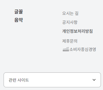
관련사이트가 나오는 버튼을 클릭했을때, 관련사이트 리스트들이 주르륵나오고 화살표모양도 바뀐다.
$('.footer-relate button').click(function(){
	let ul = $(this).siblings('ul')

	$('.btn-open').toggleClass('active')
	ul.toggleClass('active')
    })
참고사이트
https://withthisclue.tistory.com/entry/jQuery-prop-attr-%EC%82%AC%EC%9A%A9%ED%95%B4%EC%84%9C-%EB%B2%84%ED%8A%BCbutton-%EB%B9%84%ED%99%9C%EC%84%B1%ED%99%94%EC%82%AC%EC%9A%A9%EC%95%88%ED%95%98%EA%B8%B0-disabled-%EC%B2%98%EB%A6%AC%ED%95%98%EA%B8%B0
https://devyj.tistory.com/26
https://m.blog.naver.com/cung91/221727989139
https://yeonzzy.tistory.com/21
https://velog.io/@yunazzi/device-media-query
https://www.codingfactory.net/10576
https://blog.naver.com/teeny__/222165707571
https://homzzang.com/b/js-1895
https://velog.io/@brgndy/%EC%9E%90%EB%B0%94%EC%8A%A4%ED%81%AC%EB%A6%BD%ED%8A%B8-Video-%EC%86%8D%EC%84%B1-%EC%A0%95%EB%A6%AC
https://www.codingfactory.net/10315