동적 인라인 스타일 설정하기
아무것도 입력하지 않고 Add Goal을 입력했을 때, 공백이 입력되는 상황이다. 이 때 공백을 입력하면 사용자에게 피드백을 줘야 한다.
// 기존의 input 컴포넌트

const CourseInput = props => {
  const [enteredValue, setEnteredValue] = useState('');

  const goalInputChangeHandler = event => {
    setEnteredValue(event.target.value);
  };

  const formSubmitHandler = event => {
    event.preventDefault();
    props.onAddGoal(enteredValue);
  };

  return (
    <form onSubmit={formSubmitHandler}>
      <div className="form-control">
        <label>Course Goal</label>
        <input type="text" onChange={goalInputChangeHandler} />
      </div>
      <Button type="submit">Add Goal</Button>
    </form>
  );
};

export default CourseInput;
SubmitHandler에서 input목록을 추가하는 함수를 실행하기 전에 입력 값을 체크한 후 공백이면 바로 return해주면 우선 해결되는 것 같으나 사용자에게 어떤 피드백도 전달하지 않는 문제가 있다.
바로 여기서 스타일링이 필요하다.
  const formSubmitHandler = (event) => {
    event.preventDefault();
    if (enteredValue.trim().length === 0) {
      return; // 사용자가 공백을 입력하면 바로 return
    }
    props.onAddGoal(enteredValue);
  };
1. 스타일 지정을 위한 state추가
const [isValid, setIsValid] = useState(true);2. SubmitHandler에서 inValid한 input을 입력받았을 경우 setIsValid실행
const formSubmitHandler = (event) => {
  event.preventDefault();
  if (enteredValue.trim().length === 0) {
    setIsValid(false);
    return; // 사용자가 공백을 입력하면 바로 return
  }
  props.onAddGoal(enteredValue);
};
3. inline style추가 (이 때, inline스타일 props는 값으로 객체를 갖는다.)
 <label style={{ color: !isValid ? "red" : "black" }}>Course Goal</label>
// 삼항 연산자를 통해 isValid의 상태에 따라 표출할 style이 결정된다.
4. 타이핑 시작할 시 reset
const goalInputChangeHandler = (event) => {
  if (event.target.value.trim().length > 0) {
    setIsValid(true);
  }
  setEnteredValue(event.target.value);
};
결과

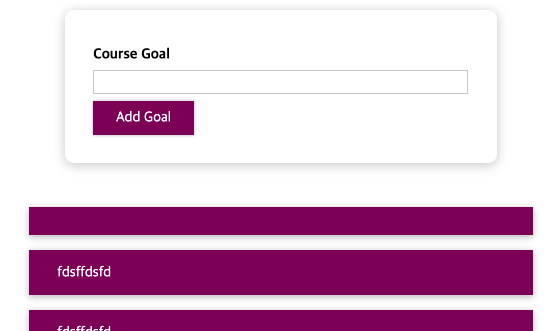
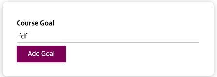
<아무것도 입력하지 않고 AddGoal을 눌렀을 때, 빨간 글씨>
<무언가 입력하고 AddGoal을 눌렀을 때, 검정 글씨>
주의사항
jsx에서 style의 프로퍼티 이름을 입력할 때, 아래처럼 기존 css에서 '-'로 이어주는 부분에서 카멜케이스를 사용해야 정상적으로 작동한다.
<input
  style={{
    borderColor: !isValid ? "red" : "black",
    background: !isValid ? "salmon" : "transparent",
  }}
  type="text"
  onChange={goalInputChangeHandler}
/>
border-color => borderColor 혹은 "border-color"
이런식의 inline스타일은 기존에 짜둔 css를 활용하지 못하고, 규모가 커질 수록 중복 요소가 많아질 수 있어서 권장되지 않는다.
동적으로 CSS클래스 설정하기
1. invalid input입력 시 동적으로 적용할 css추가
.form-control.invalid input {
  border-color: red;
  background: rgb(228, 214, 214);
}

.form-control.invalid label {
  color: red;
}
2. 동적으로 css클래스 설정
2-1 기존 코드
    <form onSubmit={formSubmitHandler}>
      <div className="form-control">
        <label>Course Goal</label>
        <input type="text" onChange={goalInputChangeHandler} />
      </div>
      <Button type="submit">Add Goal</Button>
    </form>
2-2 css클래스 동적 적용
// 아래의 두 가지 상태가 동적으로 반영되어야 한다.
<div className={'form-control'}>
<div className={'form-control invalid'}>

// 이와같이 하면 isValid상태에 따라 class가 동적으로 반영되고, 위에서 작성한 css에 따라 타겟인 모든 요소들이 동적으로 스타일링 된다.
<div className={`form-control ${!isValid ? "invalid" : ""}`}>
이런식으로 작업하면 클래스만으로 모든 것을 작업할 수 있다.
Style Components
커다란 프로젝트에서는 많은 개발자가 같은 코드에서 작업하게 된다. 그래서 하나의 이름이 두 번 사용될 수도 있다. 그럴 경우 컴포넌트에 의도하지 않은 스타일이 적용될 수도 있다.
이런 상황을 피하기 위한 방법은 두 가지로 하나는 Style Components를 사용하는 것이다.
style Components는 특정 스타일이 첨부된 컴포넌트를 구축할 수 있도록 도와주는 패키지로서 이 스타일이 첨부되는 컴포넌트에만 영향을 미치고 다른 컴포넌트에는 영향을 미치지 않는다.
style components설치 명령어는 다음과 같다.
npm install --save styled-components

yarn add styled-components
// package.json에 다음 코드를 추가하도록 권장
// 아래의 코드를 추가하면 여러 버전의 Styled Components가 설치되어 발생하는 문제를 줄여준다.
{
"resolutions": {
"styled-components": "^5"
}
}Style Components 사용법
익숙한 형태의 button컴포넌트
import React from 'react';

import './Button.css';

const Button = props => {
  return (
    <button type={props.type} className="button" onClick={props.onClick}>
      {props.children}
    </button>
  );
};

export default Button;
테그드 템플릿 리터럴
참조 : https://medium.com/@su_bak/javascript-tagged-template-literals%EB%9E%80-d7dca9461a45
import styled from 'styled-components';
const Button = styled.Button``;
위 코드는 테그드 템플릿 리터럴이며 원래 자바스크립트에서 제공하는 문법이다. 우항의 Button은 styled객체 속에 있는 메소드다. 이것을 실행하면 새로운 버튼을 반환한다. 원래의 메소드 처럼 ()를 붙이지 않고 백틱을 붙인다. 이것은 결국 뒷단에서 메소드로 실행될 것이다.
- styled에는 모든 html요소가 존재한다.
아래는 원래의 css요소를 styled components로 적용한 것이다. 해당 컴포넌트에만 적용될 것이므로 class이름을 빼주고, hover focus 시 실행할 가상선택자는 &기호를 쓴다.
.button {
  font: inherit;
  padding: 0.5rem 1.5rem;
  border: 1px solid #8b005d;
  color: white;
  background: #8b005d;
  box-shadow: 0 0 4px rgba(0, 0, 0, 0.26);
  cursor: pointer;
}

.button:focus {
  outline: none;
}

.button:hover,
.button:active {
  background: #ac0e77;
  border-color: #ac0e77;
  box-shadow: 0 0 8px rgba(0, 0, 0, 0.26);
}
모든 작업을 해준 후 기존의 jsx로 짠 코드를 지워주면 아래의 코드만 남는다. 이 코드는 기존의 버튼컴포넌트와 동일하게 작동한다.
import styled from "styled-components";

const Button = styled.button`
  font: inherit;
  padding: 0.5rem 1.5rem;
  border: 1px solid #8b005d;
  color: white;
  background: #8b005d;
  box-shadow: 0 0 4px rgba(0, 0, 0, 0.26);
  cursor: pointer;

  &:focus {
    outline: none;
  }

  &:hover,
  &:active {
    background: #ac0e77;
    border-color: #ac0e77;
    box-shadow: 0 0 8px rgba(0, 0, 0, 0.26);
  }
`;

export default Button;
이 때 브라우저의 element를 통해 버튼을 확인하면 아래처럼 설정하지 않은 class명이 나오는데, styled components가 우리가 짠 스타일을 보고, 생성된 클래스 이름으로 스타일을 감싸는데, 이렇게 생성된 클래스는 고유한 이름을 갖게되기 때문에 다른 컴포넌트에 영향을 주지 않는다.
<button type="submit" class="sc-bczRLJ dsImlA">Add Goal</button>Styled Components & 동적 props
스타일 컴포넌트를 통한 동적 스타일 지정
- div요소에 스타일을 입혀 놓은 후, isValid의 상태에 따라 className에 invalid를 추가하거나 추가하지 않음으로서 스타일을 동적으로 제어하고 있다.
const FormControl = styled.div`
  margin: 0.5rem 0;

  & label {
    font-weight: bold;
    display: block;
    margin-bottom: 0.5rem;
  }

  & input {
    display: block;
    width: 100%;
    border: 1px solid #ccc;
    font: inherit;
    line-height: 1.5rem;
    padding: 0 0.25rem;
  }

  & input:focus {
    outline: none;
    background: #fad0ec;
    border-color: #8b005d;
  }

  &.invalid input {
    border-color: red;
    background: rgb(228, 214, 214);
  }

  &.invalid label {
    color: red;
  }
`;

const CourseInput = (props) => {
  const [enteredValue, setEnteredValue] = useState("");
  const [isValid, setIsValid] = useState(true);

  const goalInputChangeHandler = (event) => {
    if (event.target.value.trim().length > 0) {
      setIsValid(true);
    }
    setEnteredValue(event.target.value);
  };

  const formSubmitHandler = (event) => {
    event.preventDefault();
    if (enteredValue.trim().length === 0) {
      setIsValid(false);
      return; // 사용자가 공백을 입력하면 바로 return
    }
    props.onAddGoal(enteredValue);
  };

  return (
    <form onSubmit={formSubmitHandler}>
      <FormControl className={!isValid && "invalid"}>
        <label>Course Goal</label>
        <input type="text" onChange={goalInputChangeHandler} />
      </FormControl>
      <Button type="submit">Add Goal</Button>
    </form>
  );
};
스타일 컴포넌트에 props를 추가하여 백틱안에서 props를 사용하는 방법.
- FormControl에 invalid라는 이름의 프로퍼티에 isValid상태를 담은 후 스타일 컴포넌트의 백틱 속에서 props를 내려받아 스타일을 동적으로 제어하고 있다.
const FormControl = styled.div`
margin: 0.5rem 0;
& label {
font-weight: bold;
display: block;
margin-bottom: 0.5rem;
color: ${(props) => (props.invalid ? "red" : "black")};
}
& input {
display: block;
width: 100%;
border: 1px solid ${(props) => (props.invalid ? "red" : "#ccc")};
background: ${(props) => (props.invalid ? "#ffd7d7" : "transparent")};
font: inherit;
line-height: 1.5rem;
padding: 0 0.25rem;
}
& input:focus {
outline: none;
background: #fad0ec;
border-color: #8b005d;
}
`;
const CourseInput = (props) => {
const [enteredValue, setEnteredValue] = useState("");
const [isValid, setIsValid] = useState(true);
const goalInputChangeHandler = (event) => {
if (event.target.value.trim().length > 0) {
setIsValid(true);
}
setEnteredValue(event.target.value);
};
const formSubmitHandler = (event) => {
event.preventDefault();
if (enteredValue.trim().length === 0) {
setIsValid(false);
return; // 사용자가 공백을 입력하면 바로 return
}
props.onAddGoal(enteredValue);
};
return (
<form onSubmit={formSubmitHandler}>
<FormControl invalid={!isValid}>
<label>Course Goal</label>
<input type="text" onChange={goalInputChangeHandler} />
</FormControl>
<Button type="submit">Add Goal</Button>
</form>
);
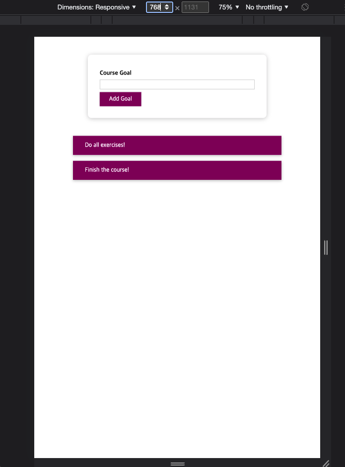
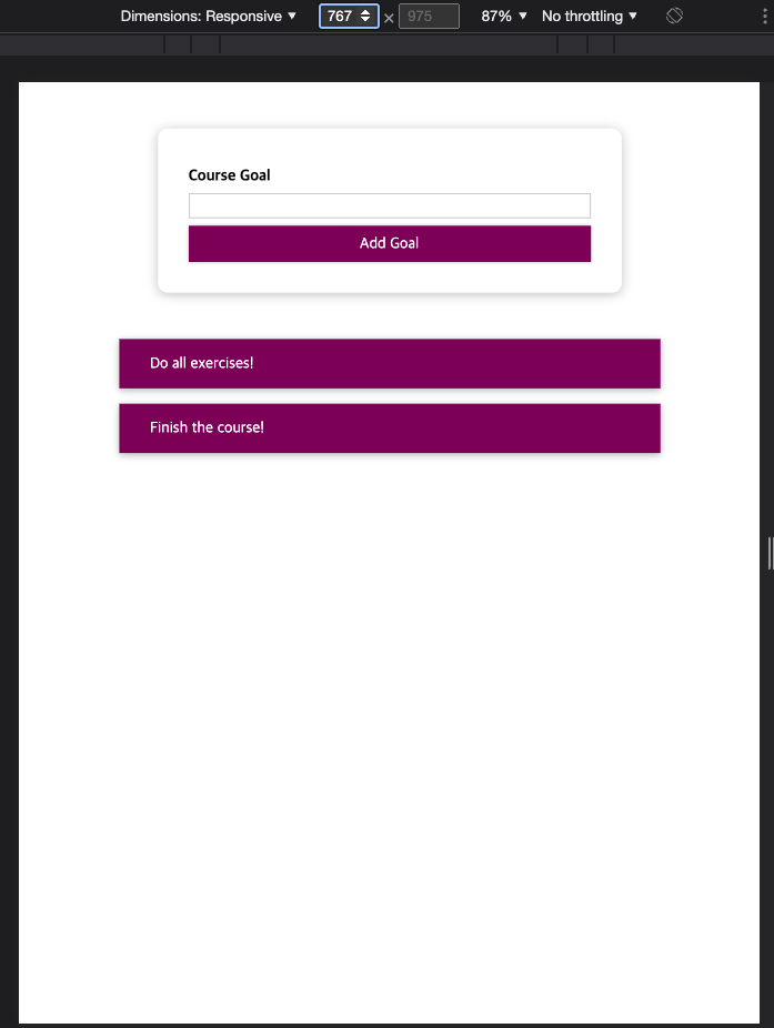
};Styled Components & 미디어쿼리
미디어 쿼리는 특정한 조건을 주면 그 조건일 때 적용할 스타일을 지정하는 것이다.
아래는 최소 너비를 768px라는 조건을 주었고, 만약 768px이상이면 width: auto가 된다.
const Button = styled.button`
	// 생략
 	width: 100%;
	// 생략

	@media (min-width: 768px) {
  		width: auto;
	}

	// 생략
}
`
아래는 실제로 768px일 때, 767px일 때 버튼 크기가 동적으로 변하는 모습이다.
CSS모듈
스타일 컴포넌트를 사용하는 것은 취향이다. 컴포넌트 내에서 스타일을 지정하고 싶으면 스타일 컴포넌트를 사용하면 된다. 하지만 js파일과 css파일을 분리하는 것을 좋아하고, 깔끔한 자바스크립트 파일이나 기본 css파일을 좋아한다면 css모듈을 사용하면 된다. css모듈은 전역 스타일에 의해 발생하는 문제를 해결할 수 있다.
하지만 css모듈을 지원하도록 설정된 프로젝트에서만 사용 가능하다. 리액트는 이를 지원한다.
css모듈을 사용하기 위해선 먼저 css파일 이름 중간에 module이 들어가도록 설정해야한다. 이는 기본적으로 css모듈이 작동하도록 코드를 변환하라고 컴파일 프로세스에게 보내는 신호가 된다.
ex) Button.css => Button.module.css
다음은 아래와 같이 import한 후 스타일을 적용할 Element의 className에 css파일에서 적용할 부분을 지정하면 된다.
import styles from "./Button.module.css";

const Button = (props) => {
  return (
    <button
      type={props.type}
      className={styles.button}
      sonClick={props.onClick}
    >
      {props.children}
    </button>
  );
};
실행시킨 후 element를 확인하면 클래스 이름이 아래와 같은 것을 확인할 수 있다. 이는 css모듈 기능으로 import한 css파일의 모든 클래스 이름이 컴파일러에 의해 고유하게 바꾼 것이다. 이는 css스타일의 범위가 이 파일에 import하는 컴포넌트에 한정된다는 것을 확실하게 해준다.
<button type="submit" class="Button_button__2lgkF">Add Goal</button>CSS모듈을 사용한 동적 스타일
import styles from "./CourseInput.module.css";

<div className={styles["form-control"]}> // 기본 적용

// 동적 스타일 적용
<div className={`${styles["form-control"]} ${!isValid && styles.invalid}`}>
CSS모듈에서 미디어 쿼리 설정하는 방법
아래는 위의 버튼 스타일 컴포넌트에서 설정한 미디어 쿼리와 동일한 동작을 하도록 css파일 내에서 설정한 것이다. 큰 화면에서는 button이 auto고, 768px이하의 작은화면에선 100%가 된다.
.button {
  width:100%;
  font: inherit;
  padding: 0.5rem 1.5rem;
  border: 1px solid #8b005d;
  color: white;
  background: #8b005d;
  box-shadow: 0 0 4px rgba(0, 0, 0, 0.26);
  cursor: pointer;
}

@media (min-width: 768px) {
  .button {
    width: auto;
  }
}