npx create-react-app projectname
npx storybook init
// /src/stories 폴더가 생성
이 명령어는 package.json 을 보고 사용 중인 프론트엔드 라이브러리에 맞는 Storybook 사용 환경을 알아서 만들어주기 때문에, 꼭 React가 아니더라도 다양한 프론트엔드 라이브러리에서 사용할 수 있다.
npm run storybook // 스토리 북 실행
Storybook을 실행하면 /src/stories 폴더 안에 있던, Storybook에서 만들어놓은 예시 스토리를 확인할 수 있다. 이렇게 Storybook을 사용하면 애플리케이션을 실행하고 이벤트를 통해 상태를 변경하는 과정을 거치지 않아도 상태 변화에 따른 컴포넌트의 변화를 확인할 수 있다.
테스트 방법
테스트 할 컴포넌트 생성
// Title.js
import React from "react";

const Title = ({ title, textColor }) => (
  <h1 style={{ color: textColor }}>{title}</h1>
);
export default Title;
스토리 작성
// Title.stories.js
import Title from "./Title";
// title : 컴포넌트 이름으로, '/'를 넣어 카테고리화 할 수 있다.
// component : 어떤 컴포넌트를 가져와서 스토리로 만들 것인지 명시합니다.
// argTypes : 컴포넌트에 필요한 전달인자의 종류와 타입을 정해줍니다.
// 지금은 title이라는 전달인자에 text 타입이 필요함을 의미합니다.
export default {
title: "Practice/Title",
component: Title,
argTypes: {
title: { control: "text" },
},
};
// 템플릿을 만들어준다. 이 템플릿에서는
// Title 컴포넌트가 args를 전달받아 props로 내려준다.
const Template = (args) => <Title {...args} />;
// Storybook에서 확인하고 싶은 컴포넌트는 export const로 작성한다.
// 템플릿을 사용하여 Storybook에 넣어줄 스토리를 하나 만들었다.
// Template.bins({}); 는 정해진 문법이다.
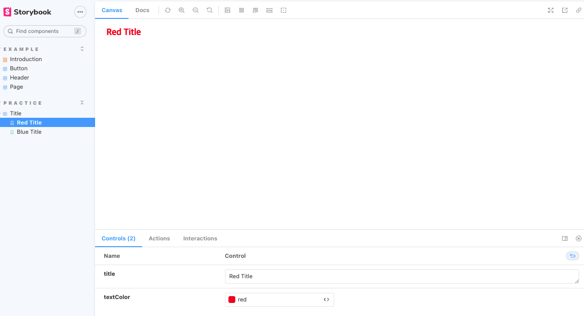
export const RedTitle = Template.bind({});
// 만들어준 스토리의 전달인자를 작성.
RedTitle.args = {
title: "Red Title",
textColor: "red",
};
// 스토리를 하나 더 생성.
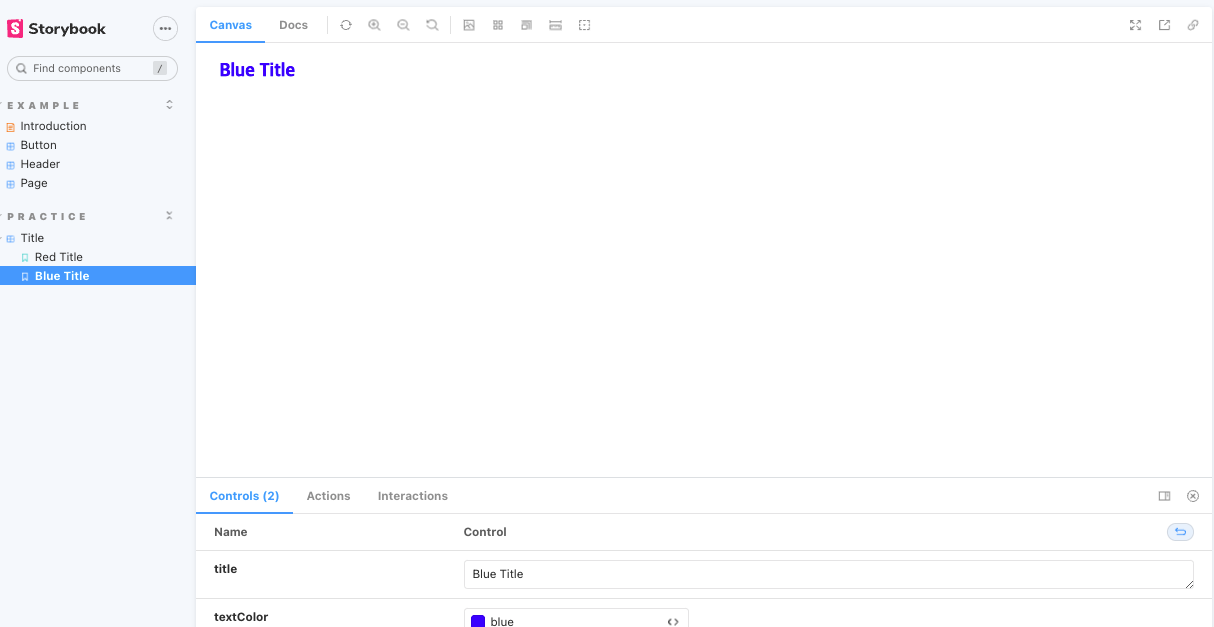
export const BlueTitle = Template.bind({});
// 스토리의 전달인자를 작성
BlueTitle.args = {
title: "Blue Title",
textColor: "blue",
};
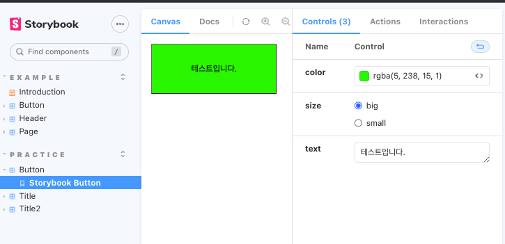
결과창 확인
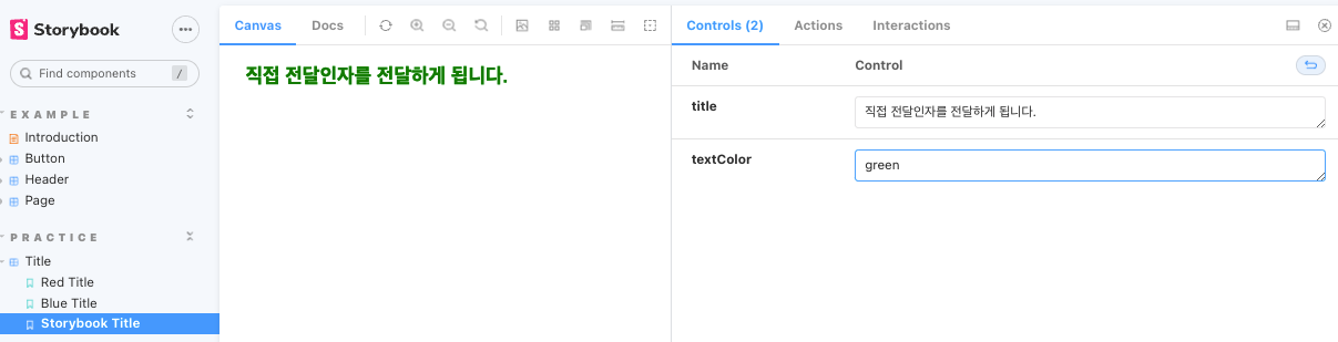
전달인자에 값을 직접 받는 스토리를 만들 수도있다.
// 전달 인자를 직접 받는 스토리
export const StorybookTitle = (args) =>{
  return <Title {...args} />
}
결과
styled component 테스트 방법
// Button.js
import React from "react";
import styled from "styled-components";

const StyledButton = styled.button`
  background: ${(props) => props.color || "white"};
  width: ${(props) => (props.size === "big" ? "200px" : "100px")};
  height: ${(props) => (props.size === "big" ? "80px" : "40px")};
`;

const Button = ({ color, size, text }) => (
  <StyledButton color={color} size={size}>
    {text}
  </StyledButton>
);

export default Button;
// 컴포넌트를 불러옵니다.
import Button from "./Button";
export default {
title: "Practice/Button",
component: Button,
// 이번에 작성한 전달인자의 타입은 Storybook을 보고 직접 확인해보세요.
argTypes: {
color: { control: "color" },
size: { control: { type: "radio", options: ["big", "small"] } },
text: { control: "text" },
},
};
export const StorybookButton = (args) => <Button {...args}></Button>;결과