next-themes
next-themes는 Next.js 애플리케이션에서 다크 모드 또는 다양한 테마 전환 기능을 간편하게 구현할 수 있도록 지원하는 경량 라이브러리이다.
이 라이브러리는 브라우저의 prefers-color-scheme 미디어 쿼리와 함께 작동하며, 사용자가 설정한 테마를 localStorage에 저장하고, 이를 기반으로 페이지를 렌더링한다.
사용 방법
1. 설치
npm install next-themes
yarn add next-themes
2. tailwind css와 연동
// tailwind.config.ts

const config: Config = {
  darkMode: 'class', // 다크 모드를 클래스 기반으로 설정
  content: [
    "./src/pages/**/*.{js,ts,jsx,tsx,mdx}",
    "./src/components/**/*.{js,ts,jsx,tsx,mdx}",
    "./src/app/**/*.{js,ts,jsx,tsx,mdx}",
  ],
  theme: {
    extend: {},
  },
  plugins: [],
};
Tailwind CSS에서 다크 모드를 활성화하기 위해 tailwind.config.ts 파일에 darkMode 옵션을 설정해준다.
darkMode를 class로 설정해줬기에 HTML 요소의 class 속성을 통해 다크 모드를 제어하게 될 것이다.
3. ThemeProvider 설정
// app/layout.tsx

export default function RootLayout({
  children,
}: Readonly<{
  children: React.ReactNode;
}>) {
  return (
    <html lang="ko">
      <body>
        <ThemeProvider attribute="class">
          <Header />
          <main>{children}</main>
          <Footer />
        </ThemeProvider>
      </body>
    </html>
  );
ThemeProvider는 next-themes가 제공하는 컴포넌트로, 테마 전환 상태를 관리한다.
attribute="class"로 설정하면 활성화된 테마에 따라 <html> 태그에 class="dark" 또는 class="light"가 자동으로 추가된다.
이를 통해 Tailwind CSS 같은 프레임워크가 테마에 따라 스타일을 변경할 수 있게 되며, ThemeProvider를 최상위 레이아웃에 배치함으로써, 모든 페이지에 다크 모드 기능을 적용할 수 있다.
4. 다크모드 토글 버튼 생성
'use client'

import { Moon, Sun } from "lucide-react";
import { useTheme } from "next-themes"

export default function DarkMode(){
    const {theme, setTheme} = useTheme();

    return (
        <button onClick={() => setTheme(theme === 'dark' ? 'light' : 'dark')}>
            {theme === 'dark' ? <Sun /> : <Moon />}
        </button>
    )
}useTheme은 현재 테마 상태를 확인하고 변경할 수 있는 훅이다. 이 훅을 활용하여 위와 같이 간단하게 다크 모드 토글 버튼을 구현할 수 있다.
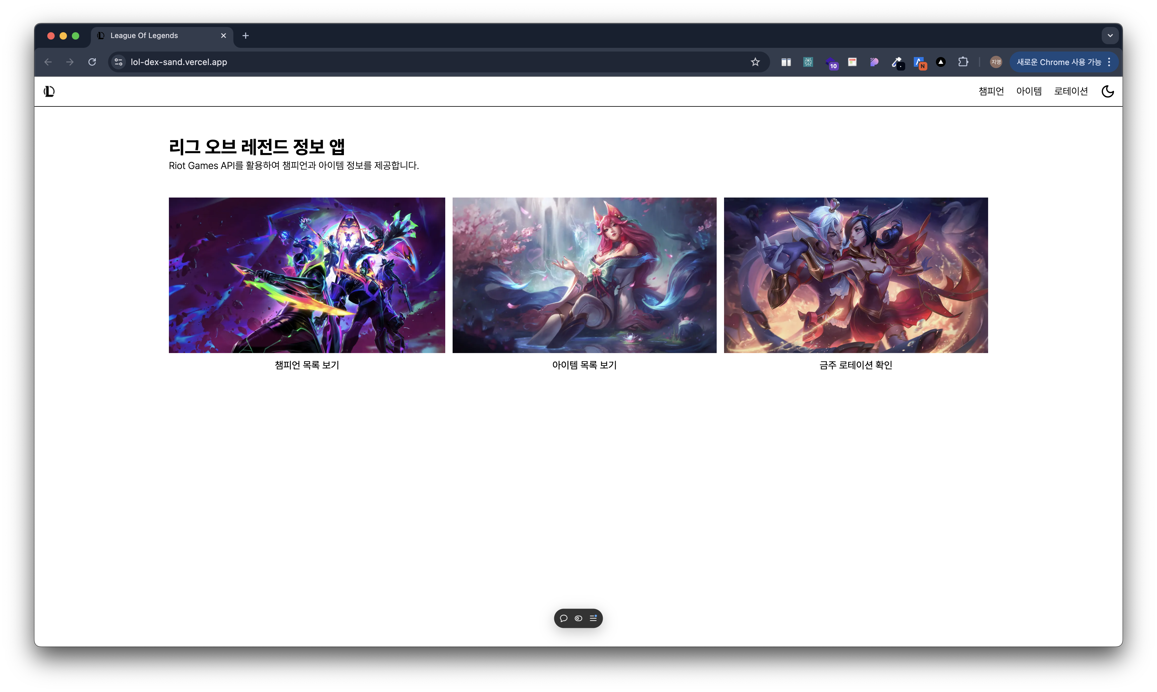
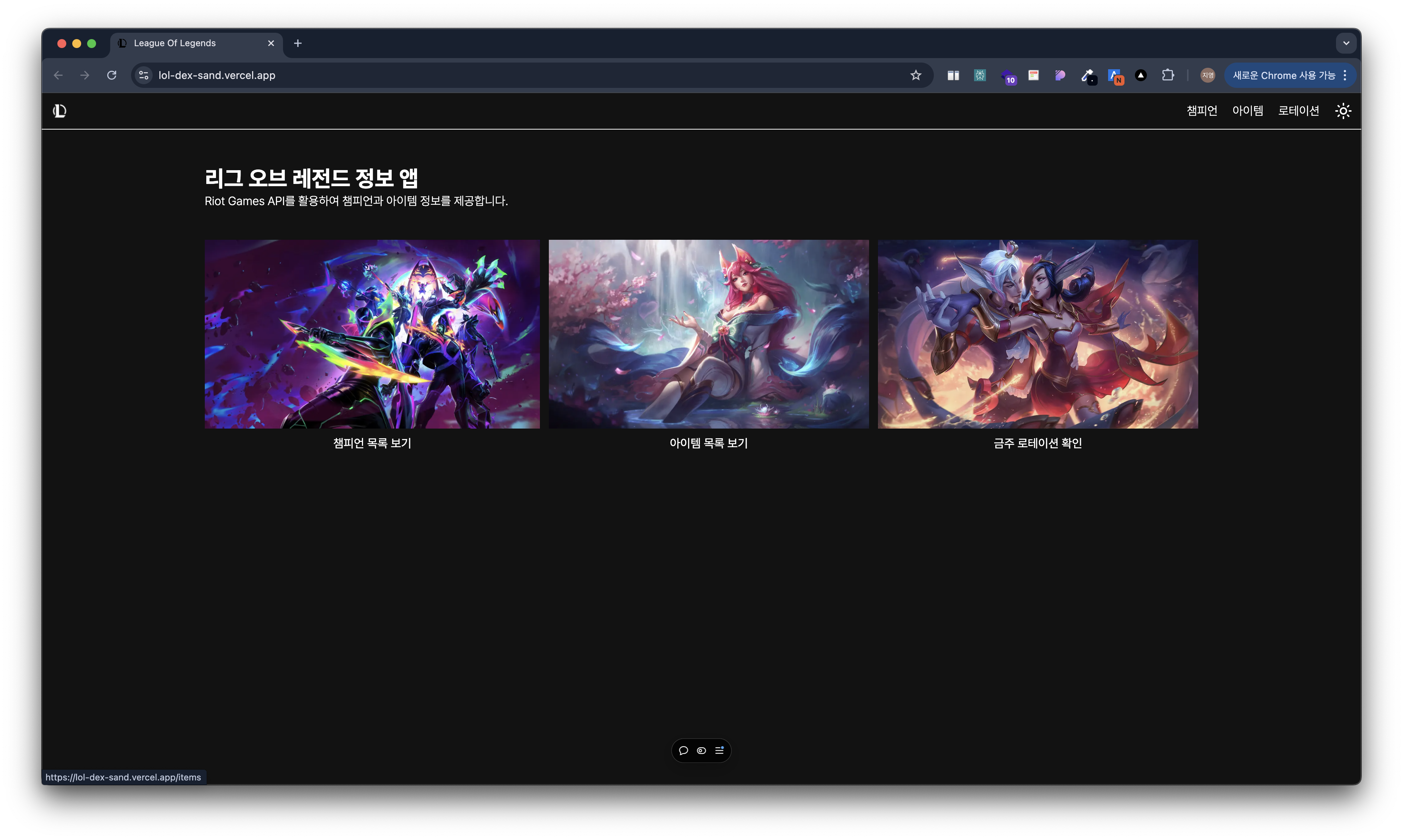
구현 성공!