프로젝트 중 alert을 띄워야 하는데 기본 alert은 예쁘지 않은 것 같아 더 나은 UI를 위해 SweetAlert2 라이브러리를 사용하게 됐다.
우선 SweetAlert2 를 다운받기 위해 터미널에 다음과 같은 명령어를 입력해준다.
yarn add sweetalert2그 다음에 사용할 파일에서 import 하기
import Swal from "sweetalert2";
import "sweetalert2/dist/sweetalert2.min.css";
css도 꼭!! 같이 import 해줘야한다.
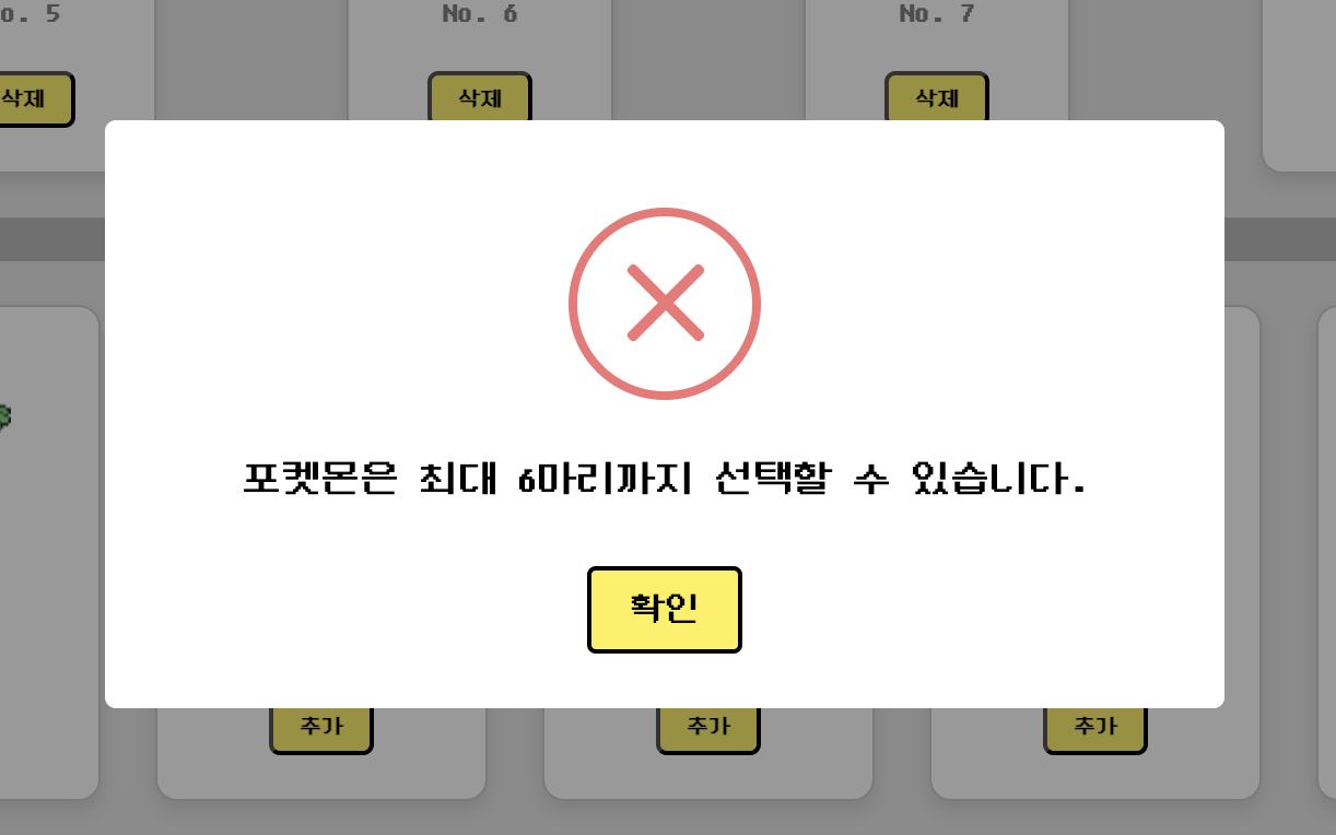
      Swal.fire({
        icon: "error",
        text: "포켓몬은 최대 6마리까지 선택할 수 있습니다.",
        confirmButtonText: "확인",
        confirmButtonColor: "#fef152",
        customClass: {
          confirmButton: "custom-confirm-button",
          htmlContainer: "custom-text",
        },
      });
위와 같이 alert 대신 Swal.fire 를 적어주고 안에 필요한 내용들을 적어주면 된다.
보통 title, text, icon, confirmButtonText를 주로 사용하고, 그 외에도 많은 옵션들이 있으니 필요할 때 공식 문서에서 찾아서 사용하면 된다!
https://sweetalert2.github.io/#download
제공되는 아이콘은 총 다섯가지인데 다음과 같다.
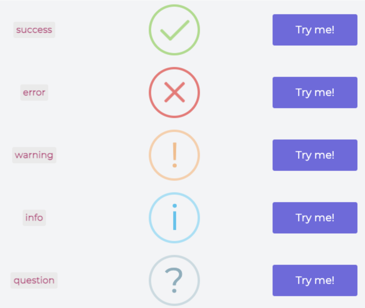
상황에 따라 적절하게 선택해 사용하면 된다.
그리고 기본 옵션으로 변경이 불가능한 부분은 customClass를 통해 변경할 수 있다.
const CustomSwalStyles = css`
  .custom-confirm-button {
    font-family: "DungGeunMo";
    color: black;
    border: 2px solid black;
  }

  .custom-text {
    font-family: "DungGeunMo";
    color: black !important;
  }
`;

export const GlobalStyles = createGlobalStyle`
    ${reset}
    ${CustomSwalStyles}
    @font-face {
        font-family: 'DungGeunMo';
        src: url('https://fastly.jsdelivr.net/gh/projectnoonnu/noonfonts_six@1.2/DungGeunMo.woff') format('woff');
        font-weight: normal;
        font-style: normal;
}
`;
나는 styled-components를 사용해 다음과 같이 코드를 작성했지만 그냥 css 파일에 작성해도 된다. 이런식으로 폰트를 설정해주거나, 버튼 테두리를 설정하는 등 유연하게 사용할 수 있다.
Tip: 스타일 적용이 잘 되지 않는 경우에는 !important를 통해 CSS 우선순위를 높여주면 해결될 것이다.
위 코드처럼 작성하면 이런 alert창을 얻을 수 있다!