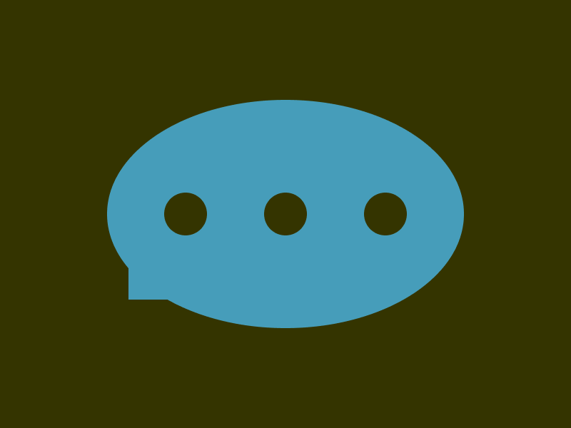
문제
풀이
말풍선의 꼬리 부분의 직각 삼각형은 border로 만들어 봤습니다.
삼각형의 빗변의 길이는 윗 쪽 border-width으로 정하고, 밑변의 길이는 왼쪽 border-width으로 정합니다.
윗 쪽 border-color를 transparent로 하여 대각선으로 보이게 합니다.
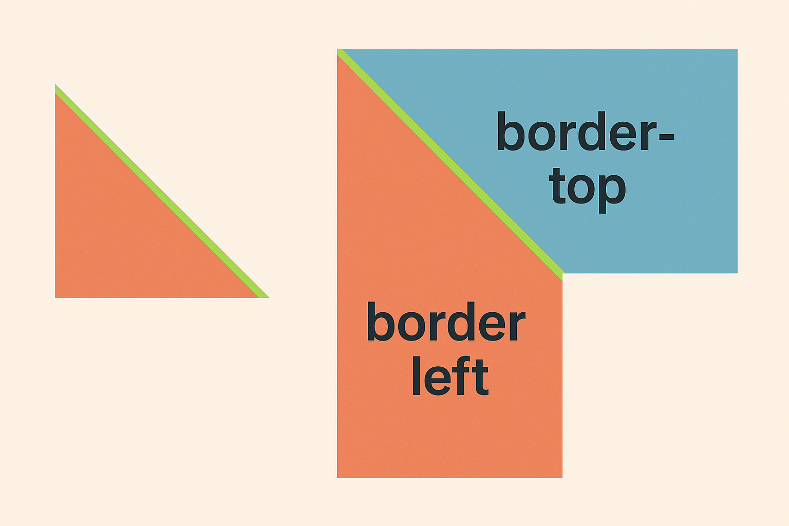
아래쪽 border-width는 0px로 하여 아래쪽 대각선이 생기지 않게 합니다.

width과 height를 0px로 하여 content 없는 순수 border만 사용하며, 사다리꼴의 높이를 줄여 삼각형 처럼 보이게 합니다.
HTML
<div class="container">
  <div class="speech-bubble">
    <div class="dots">
      <span></span>
      <span></span>
      <span></span>
    </div>
  </div>
</div>
CSS
* {
  box-sizing: border-box;

  margin: 0;
}

.container {
  display: flex;
  justify-content: center;
  align-items: center;

  width: 100vw;
  height: 100vh;

  background: #343400;
}

.speech-bubble {
  position: relative;

  display: flex;
  justify-content: center;
  align-items: center;

  width: 250px;
  height: 160px;

  border-radius: 50%;

  background: #469DBA;
}

.speech-bubble::after {
  content: "";
  position: absolute;
  bottom: 20px;
  left: 15px;

  width: 0px;
  height: 0px;

  border-style: solid;
  /* top, right, bottom, left */
  border-width: 22px 0px 0px 28px;
  border-color: transparent transparent transparent #469DBA;
}

.dots {
  display: flex;
  gap: 40px;
}

.dots span {
  width: 30px;
  height: 30px;

  border-radius: 50%;

  background: #343400;
}