문제
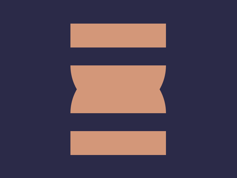
풀이
실패한 방법
중앙 가로선을 기준으로 위 아래 대칭을 사용하는 방법을 사용했어요.
중앙 round 주는 부분을 작은 직사각형 두 개로 하고 각도를 조정해봤는데, 아무리 해도 각도가 나오지 않았어요.
<div class="container">
  <div class="wrapper">
    <div class="square"></div>
    <div class="rounded-square"></div>
  </div>
  <div class="wrapper flipped">
    <div class="square"></div>
    <div class="rounded-square"></div>
  </div>
</div>
* {
box-sizing: border-box;
margin: 0;
}
.container {
display: flex;
flex-direction: column;
justify-content: center;
align-items: center;
width: 100vw;
height: 100vh;
background: #2B2A4A;
}
.wrapper {
display: flex;
flex-direction: column;
justify-content: space-between;
width: 160px;
height: 110px;
}
.square {
width: 100%;
height: 40px;
background: #DE9473;
}
.rounded-square {
width: 100%;
height: 40px;
background: #DE9473;
border-radius: 0 0 8% 8% / 0 0 100% 100%;
}
.flipped {
transform: rotate(180deg);
}성공한 방법
위, 중앙, 아래로 나누는 방법으로 바꿨어요.
중앙은 반원을 만든 다음에 뒤집힌 반원과 겹치는 방법으로 하니 정답의 각도가 나왔어요.
<div class="container">
  <div class="wrapper">
    <div class="square"></div>
    <div class="half-circles">
      <div class="half-circle"></div>
      <div class="half-circle flipped"></div>
    </div>
    <div class="square"></div>
  </div>
</div>
* {
box-sizing: border-box;
margin: 0;
}
.container {
display: flex;
flex-direction: column;
justify-content: center;
align-items: center;
width: 100vw;
height: 100vh;
background: #2B2A4A;
}
.wrapper {
display: flex;
flex-direction: column;
justify-content: space-between;
width: 160px;
height: 220px;
}
.square {
width: 100%;
height: 40px;
background: #DE9473;
}
.half-circles {
position: relative;
width: 100%;
height: 80px;
}
.half-circle {
position: absolute;
top: 0;
width: 100%;
height: 100%;
border-radius: 0 0 80px 80px;
background: #DE9473;
}
.flipped {
transform: rotate(180deg);
}