문제

풀이
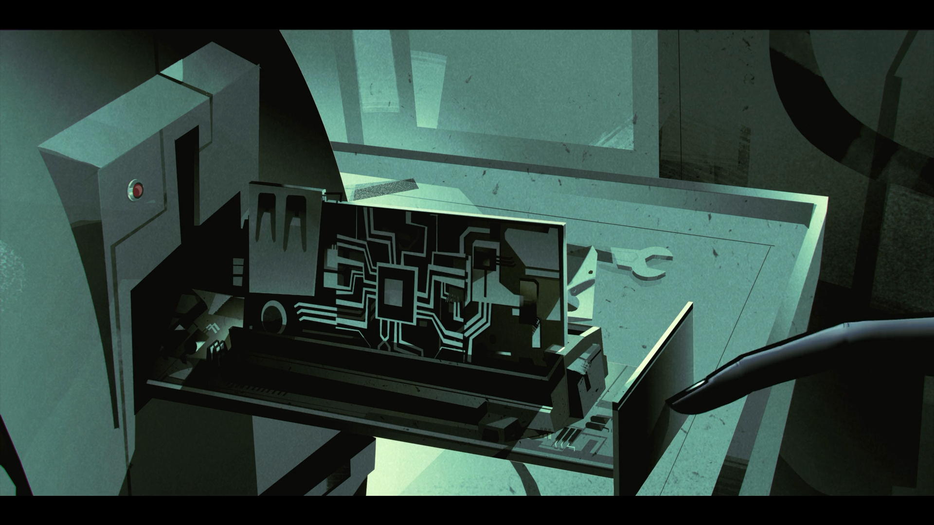
발생한 문제
이번 문제를 풀면서 중앙에 배치된 요소의 위치를 margin으로 조정하려고 했어요.
아래 이미지의 보라색 사각형에 margin-top을 주었는데, 보라색 사각형 상위에 위치한 검정색 배경도 함께 margin-top이 생겼어요.
.container {
  width: 100vw;
  height: 100vh;

  background: #FEFAED;
}

.wrapper {
  width: 160x;
  height: 160px;

  margin: 70px 80px;

  background: #9A5DCB;
}
하지만 개발자 모드로 보니 검정색 배경에는 margin이 없었고 마진 상쇄로 발생한 문제라는 것을 알게 되었어요.
해결
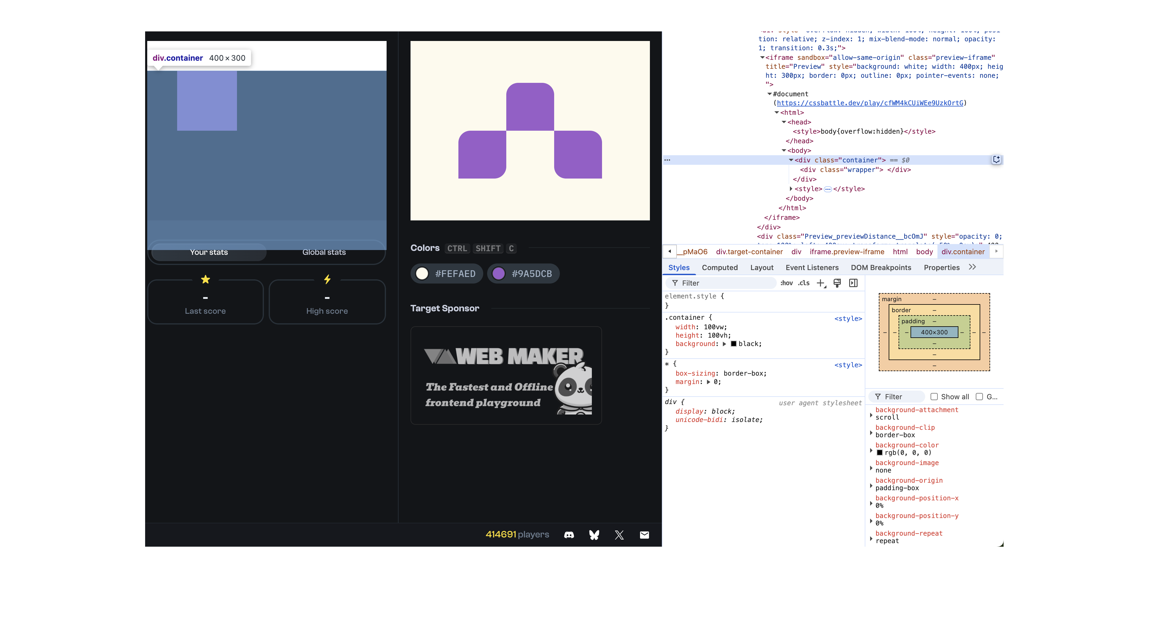
해결 방법은 여러가지가 있었지만 container의 속성을 overflow: hidden;으로 해서 해결했어요.
자식 요소가 넘치지 않는게 확실하다면 가장 단순한 해결방법이기 때문이에요.
.container {
  overflow: hidden; /* 추가 */

  width: 100vw;
  height: 100vh;

  background: #FEFAED;
}

.wrapper {
  width: 160x;
  height: 160px;

  margin: 70px 80px;

  background: #9A5DCB;
}
완성
HTML
<div class="container">
  <div class="wrapper">
    <div class="block top"></div>
    <div class="block left"></div>
    <div class="block right"></div>
  </div>
</div>
CSS
* {
  box-sizing: border-box;

  margin: 0;
}

.container {
  overflow: hidden;

  width: 100vw;
  height: 100vh;

  background: #FEFAED;
}

.wrapper {
  display: grid;
  grid-template-columns: repeat(3, 1fr);
  grid-template-rows: repeat(2, 1fr);

  width: 240px;
  height: 160px;

  margin: 70px 80px;
}

.block {
  background: #9A5DCB;
}

.top {
  grid-column: 2;
  grid-row: 1;

  border-radius: 20px 20px 0 0;
}

.left {
  grid-column: 1;
  grid-row: 2;

  border-radius: 20px 0 20px 0;
}

.right {
  grid-column: 3;
  grid-row: 2;

  border-radius: 0 20px 0 20px;
}